Try Our Live Demo

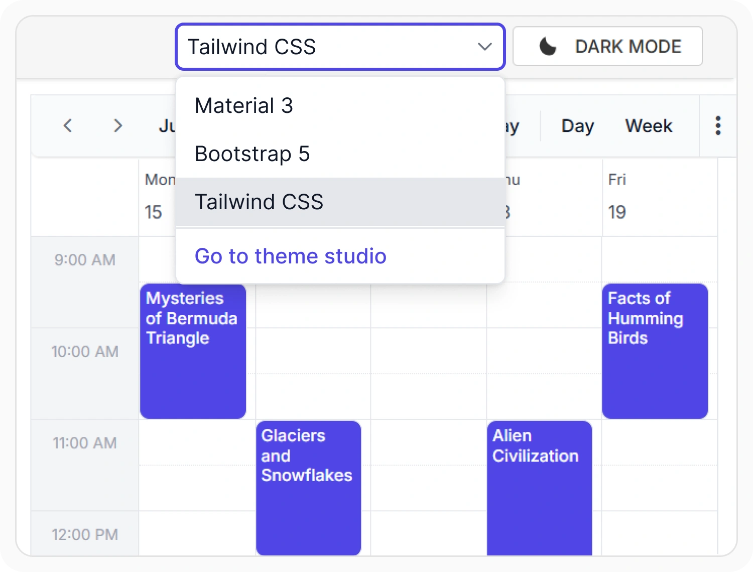
Apply built-in themes
Built-in themes such as Bootstrap, Tailwind CSS, Material, Fluent, and High Contrast provide predefined visual styles for the Scheduler. This helps maintain a consistent appearance across scheduling interfaces. Use it when applications require a standardized design with minimal customization.
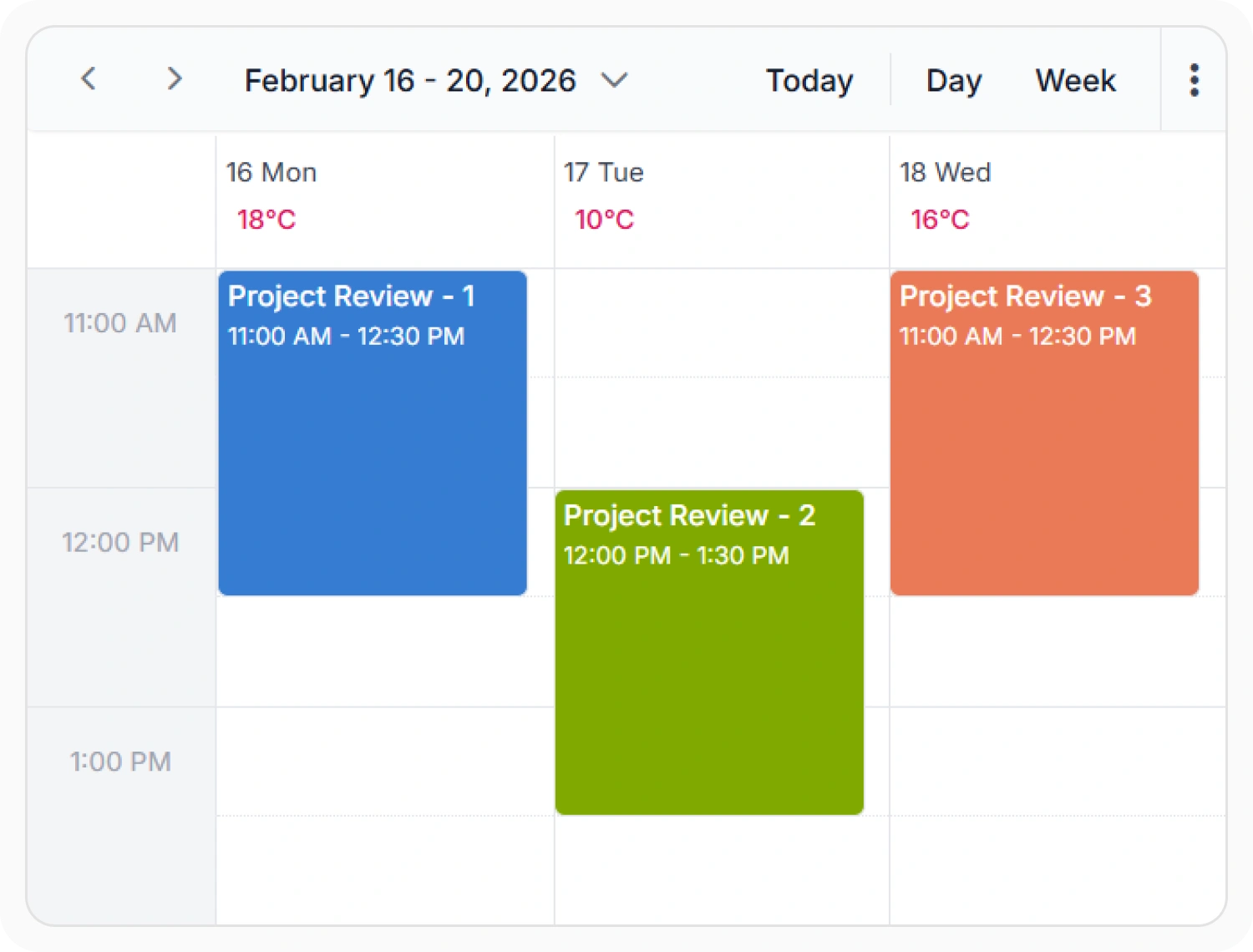
Customize Scheduler styles
CSS customization and CSS variables control the appearance of Scheduler elements. This enables styling beyond built-in themes. Use it when applications require custom branding or design-system-specific styling.
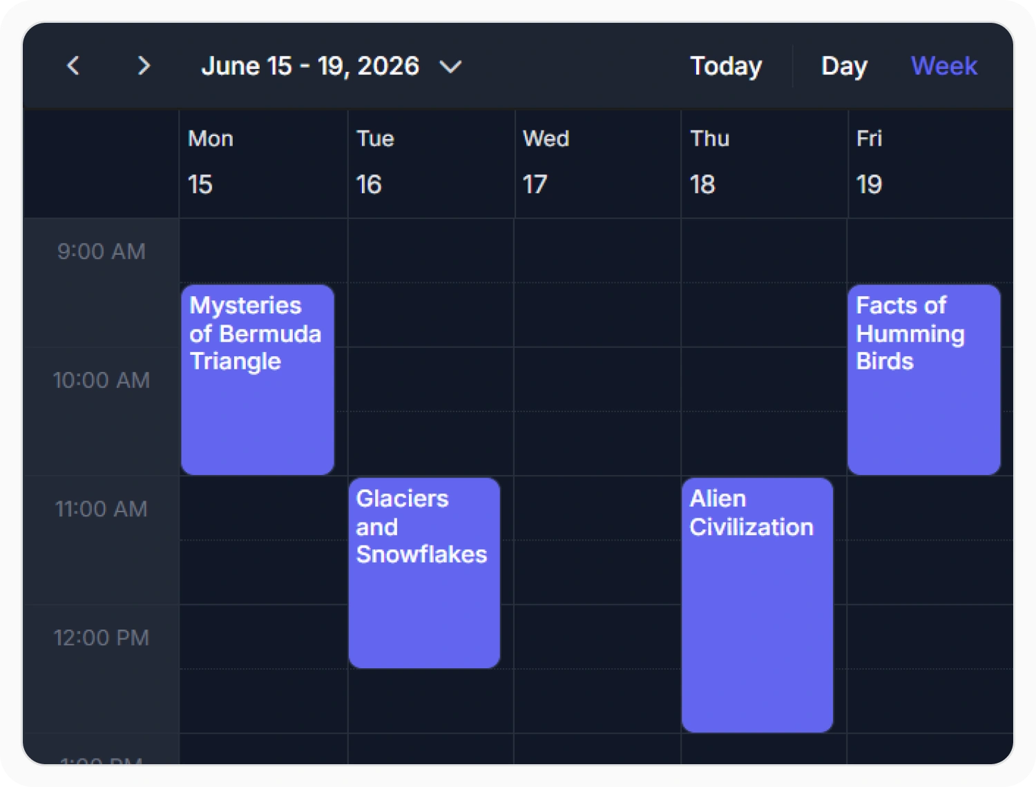
Enable dark mode for low-light and system-preference support
Dark mode applies an alternative color scheme for low-light viewing. This provides a consistent experience across light and dark interfaces. Use it when applications support dark themes or users work in varying lighting conditions.
Frequently Asked Questions
What theming options does Syncfusion provide for the React Scheduler?
Multiple built-in themes aligned with popular design systems enable rapid implementation. Additional options include color customization, dark mode support, CSS-level overrides, and custom theme creation for unique branding requirements.
Does the React Scheduler support dark mode?
Yes. Complete dark mode themes provide comfortable low-light viewing while covering all scheduler surfaces including the calendar view, appointment details, navigation, and menus. Light and dark themes can be switched dynamically.
Does theming affect React Scheduler functionality?
No. Theming changes only visual appearance while preserving all scheduler features, capabilities, and interactions. Functionality remains unchanged regardless of the applied theme or styling approach.
Can I customize React Scheduler colors?
Yes. Color palettes, font families, font sizes, spacing, and other visual properties can be customized across all scheduler elements. These modifications apply to headers, appointments, resource rows, calendars, and all supporting interface components.
How can I apply React Scheduler styling aligned with my design system?
Use built-in themes for quick design-system alignment, and customize colors for brand reflection, apply dark mode for modern preferences, or use CSS overrides for advanced branding requirements. This layered approach supports rapid implementation through enterprise-level customization.
Resources
Learn more about the React Scheduler
Explore demos, KB articles, and documentation to get the most out of our React Scheduler.
Explore guides, APIs, and quick-start tips.
Experience Real-Time Style Customization.
Ask, share, and connect with peers
Find solutions and best practices fast
Get expert help when you need it
Feature requests and bug reports
Track issues and suggest improvements
Awards
Greatness—it’s one thing to say you have it, but it means more when others recognize it. Syncfusion® is proud to hold the following industry awards.