Take a look at our next generation ASP.NET Core Color Picker component.

ASP.NET Core Color Picker Control
- Flexible inputs supporting HEX, RGBA, and HSVA.
- Highly customizable color picker with smooth selection.
- Easy-to-use preset colors in inline mode and fluent API to configure presets.
Trusted by the world’s leading companies

Overview
The color picker control provides a rich visual interface for color selection. The user can select the color from the professionally designed palettes or a custom color. By clicking on a point of a color, we can change the active color to that which is located under the pointer. Users can also choose colors in different specifications; red-green-blue-alpha (opacity) (RGBA), hue-saturation-value (HSV) and hexadecimal (HEX). The color picker provides a selection of basic colors, standard presets, custom colors, and color swatches.
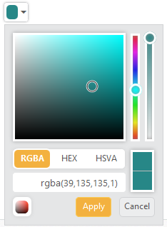
Standard Color Picker
The color picker displays a drop-down with multiple ways to pick a specific color in a WYSIWYG manner. The selected color is displayed at the top of the control. Users can also adjust the opacity value and hue value using corresponding sliders.
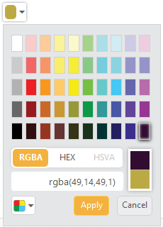
Standard Color Palette
The color picker palette model has 12 different palette patterns. Each pattern consists of 50 colors, so over 600 colors are available by default.
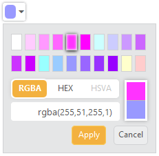
Custom Palette
Custom palettes are created by passing a comma-delimited string of HEX values or an array of colors.
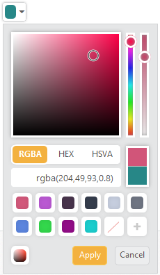
Recent Color Swatches
The color picker will keep up to 11 colors in a custom list. Users will simply click the Add button to add a color to the list.
85+ ASP.NET CORE UI CONTROLS
ALL CONTROLS
Business Intelligence
GRIDS
DATA VISUALIZATION
DATA SCIENCE
NOTIFICATION
EDITORS
NAVIGATION
Rated by users across the globe
Awards
Greatness—it’s one thing to say you have it, but it means more when others recognize it. Syncfusion® is proud to hold the following industry awards.

