Try Our Live Demo
Tailor chart presentation to every application
Combine design-system themes, custom content, accurate axis configuration, and gradient effects to create readable and visually consistent charts.
Match application design systems
Apply built-in themes, light and dark modes, high-contrast styling, and custom colors to keep charts consistent with the surrounding application.
Present business-specific content
Use templates to display formatted values, icons, metadata, units, and contextual information in labels, tooltips, and legends.
Refine scales and visual effects
Choose suitable axis types and add linear or radial gradients to improve accuracy, hierarchy, emphasis, and brand alignment.
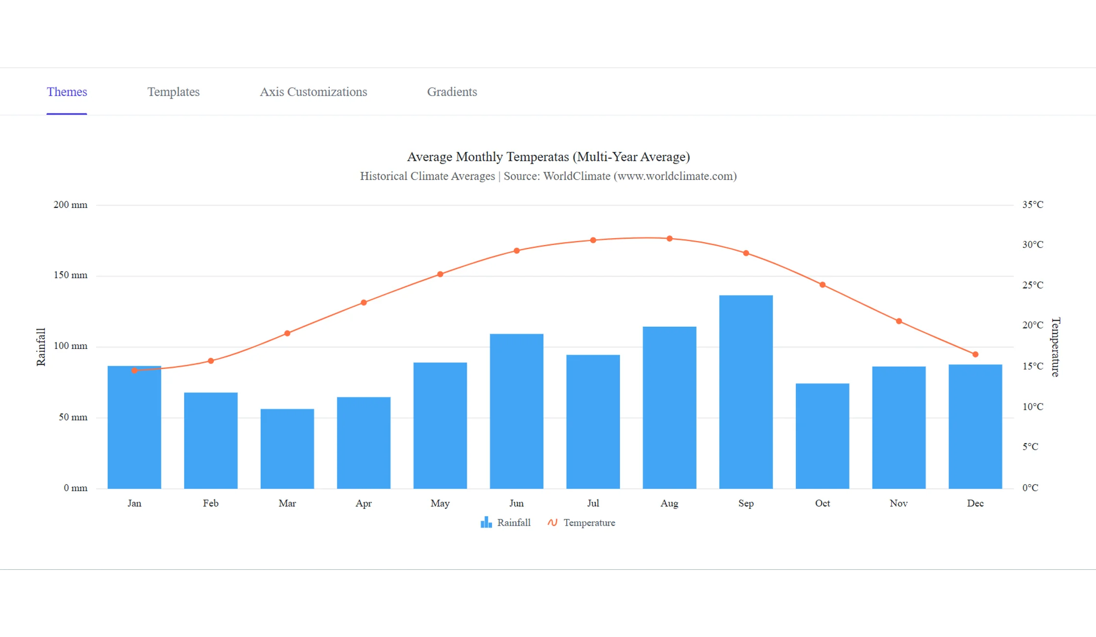
Create cohesive visualizations with Themes
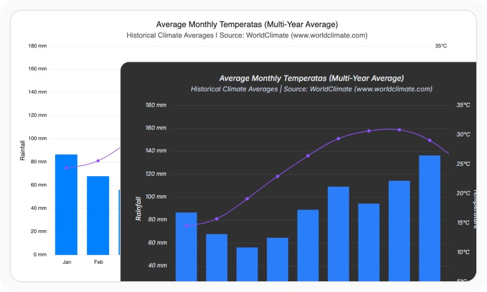
Apply Material, Fluent, Bootstrap, Tailwind, Fabric, and other built-in themes to coordinate chart colors, typography, backgrounds, axes, and legends with established design systems.
- Support light, dark, and high-contrast interfaces with coordinated theme variants.
- Customize colors, fonts, and visual properties to reflect application branding.
- Switch themes at runtime when user preferences or application settings change.
- Ensure visual consistency across charts used throughout an application.
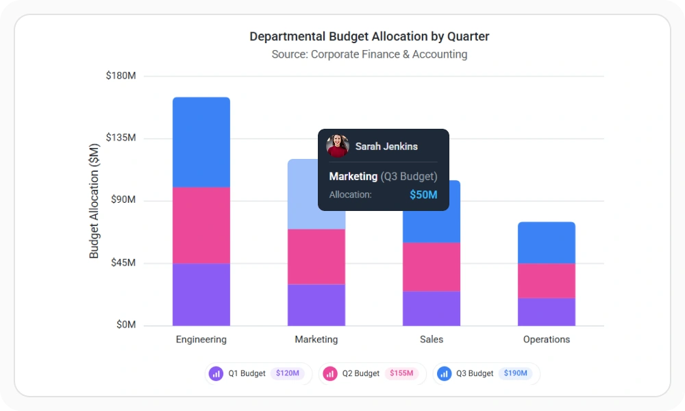
Add context-rich content with Templates
Customize data labels, axis labels, tooltips, and legends with formatted values, icons, metadata, and business-specific information. Reuse templates across charts to maintain a consistent presentation.
- Keep important values visible with customized data label templates.
- Format axis labels with abbreviations, units, localized values, and custom layouts.
- Provide on-demand details and richer series identification with tooltip and legend templates.
- Ensure consistent presentation across multiple charts using reusable templates.
Represent diverse data with Axis Customizations
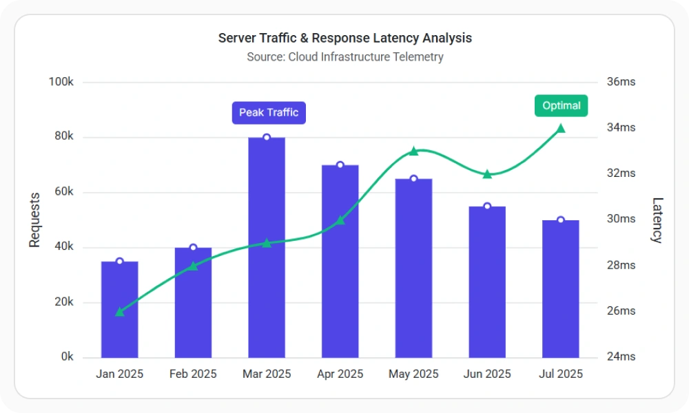
Configure numeric, date-time, date-time category, category, logarithmic, and multiple axes to match the structure and scale of business, scientific, financial, and time-series datasets.
- Select an axis type for continuous, categorical, chronological, irregular-date, or wide-range data.
- Customize labels, intervals, formats, gridlines, tick lines, and logarithm bases independently.
- Bind series to separate axes when datasets use different units, scales, or magnitudes.
- Ensure effective visualization of complex and multi-dimensional data.
Add visual emphasis with Gradients
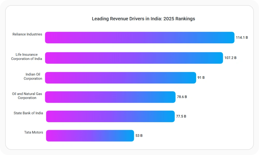
Apply linear and radial gradients to chart series, trendlines, and technical indicators. Configure colors, opacity, transition points, and direction to create depth and align charts with branded dashboard designs.
- Use linear gradients to emphasize progression, rankings, and directional trends.
- Use radial gradients to create focal points and draw attention to important regions.
- Customize color stops, transparency, and direction, then reuse styling across chart elements.
- Ensure consistent visual hierarchy across analytical dashboards.
Frequently Asked Questions
What capabilities are included in Customization & Styling?
Customization & Styling includes Themes, Templates, Axis Customizations, and Gradients for controlling chart appearance, content, scales, and visual emphasis.
What chart elements support templates?
Templates can customize data labels, axis labels, tooltips, and legends with formatted values, icons, metadata, units, and other business-specific content.
Can different chart series use separate axes?
Yes. Individual series can bind to specific x-axes or y-axes, allowing one chart to compare datasets with different units, scales, and magnitudes.
Which design-system themes are available?
Syncfusion Charts includes themes for Material, Fluent, Bootstrap, Tailwind, Fabric, and other design systems, with support for light, dark, and high-contrast experiences.
Which axis types can be configured?
Charts support numeric, date-time, date-time category, category, logarithmic, and multiple axes for accurately representing different data structures and scales.
What gradient types are supported?
Syncfusion Charts supports linear and radial gradients with customizable colors, opacity, transition points, and direction for series, trendlines, and technical indicators.
Resources
Learn more about Customization & Styling
Explore demos, KB articles, and documentation to get the most out of Themes, Templates, Axis Customizations, and Gradients.
Explore guides, setup details, and quick-start tips
See live use cases in action
Ask, share, and connect with peers
Find solutions and best practices fast.
Get expert help when needed.
Feature requests and bug reports
Track issues and suggest improvements
Awards
Greatness—it’s one thing to say you have it, but it means more when others recognize it. Syncfusion® is proud to hold the following industry awards.