Try Our Live Demo
Choose the right axis for the data
Choose from six axis types to represent any dataset and let users read trends, comparisons, and time-based patterns with confidence.
Visualize continuous values with precision
Numeric axes display continuous values such as revenue, measurements, scores, and sales metrics with consistent scaling.
Track data changes over time
Date-time axes preserve chronological order and make time-based patterns easier to understand for any time-stamped data.
Compare categories with greater clarity
Category axes surface product, regional, departmental, and other group-based comparisons at a glance.
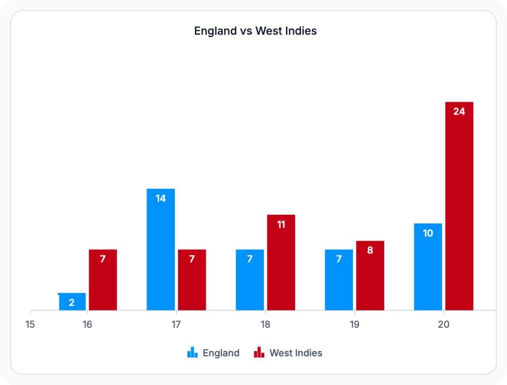
Numeric axes for precise continuous values
Numeric axes display continuous values with consistent, linear scaling. Use them when data is represented by precise numeric values, since consistent scaling supports accurate comparison across a chart.
- Display continuous values with consistent, linear scaling.
- Compare values accurately across a single chart.
- Apply custom number formats, intervals, and labels per axis.
- Combine with gridlines and tick lines for readable plots.
Date-time axes for time-series data
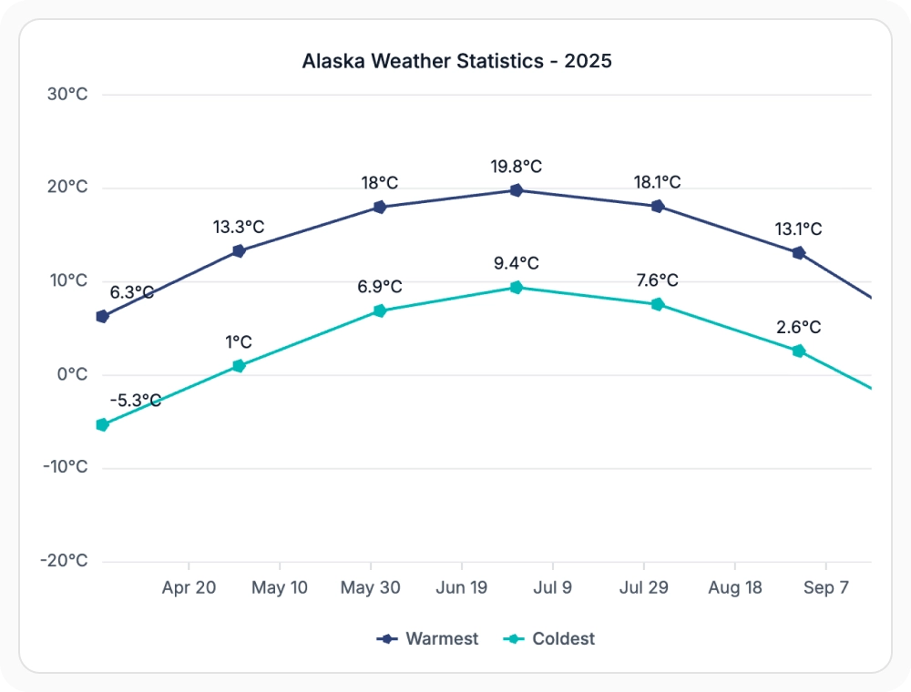
Date-time axes help visualize events and trends over time while preserving chronological order. Use them for time-stamped data, since chronological order and consistent spacing are preserved even when no value exists for a particular date.
- Maintain chronological order across the entire chart.
- Preserve consistent spacing between dates with no missing gaps.
- Support custom date formats, intervals, and label rotation.
- Track trends, seasonality, and time-based comparisons clearly.
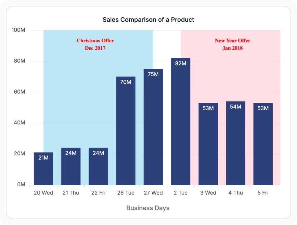
Date-time category axes for irregular dates
Date-time category axes arrange dates in chronological order while displaying data points with equal spacing. They’re ideal when date-based data should appear in sequence regardless of missing dates or uneven time intervals, helping visualize irregular or non-continuous date sequences without introducing empty intervals.
- Display irregular dates at equal intervals without gaps.
- Maintain chronological order even when dates are missing.
- Avoid visual gaps caused by weekends, holidays, or non-trading days.
- Compare values across unevenly spaced date sequences.
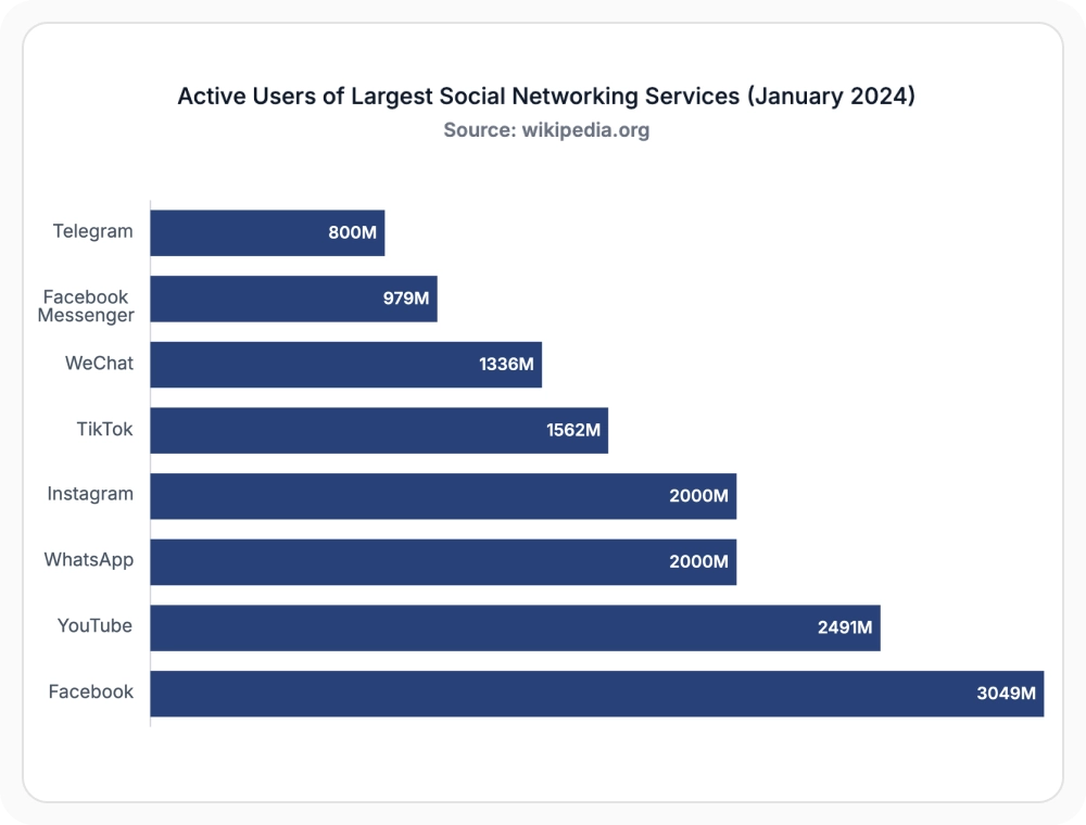
Category axes for clear group comparisons
Category axes organize products, regions, departments, and other groups into distinct, comparable categories. Use them when data falls into named groups, since text-based labels support clear comparison at a glance.
- Compare distinct products, regions, or departments at a glance.
- Display text-based labels instead of continuous numeric values.
- Apply custom label rotation, intervals, and formatting.
- Combine with tooltips and legends for clearer reading.
Logarithmic axes for large ranges
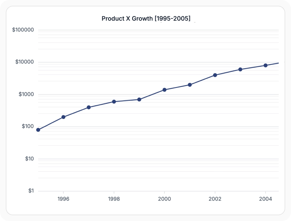
Logarithmic axes display data using a logarithmic scale to compare values that differ significantly in magnitude. Use them when datasets span multiple orders of magnitude, since the scale makes small and large values readable on the same chart.
- Visualize data spanning multiple orders of magnitude.
- Reveal patterns hidden by standard linear scaling.
- Customize the logarithm base to fit the dataset.
- Keep small and large values readable on the same chart.
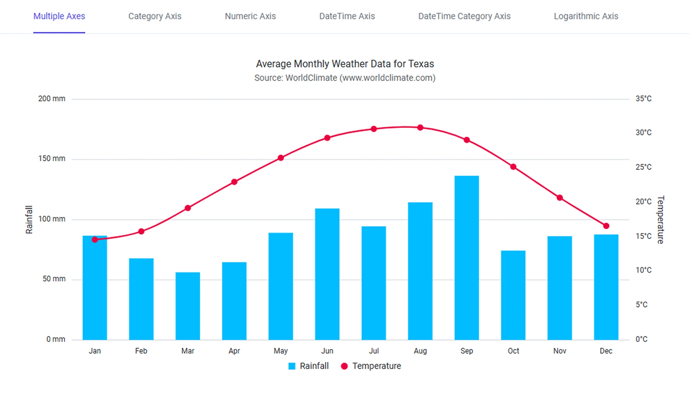
Multiple axes for independent scales
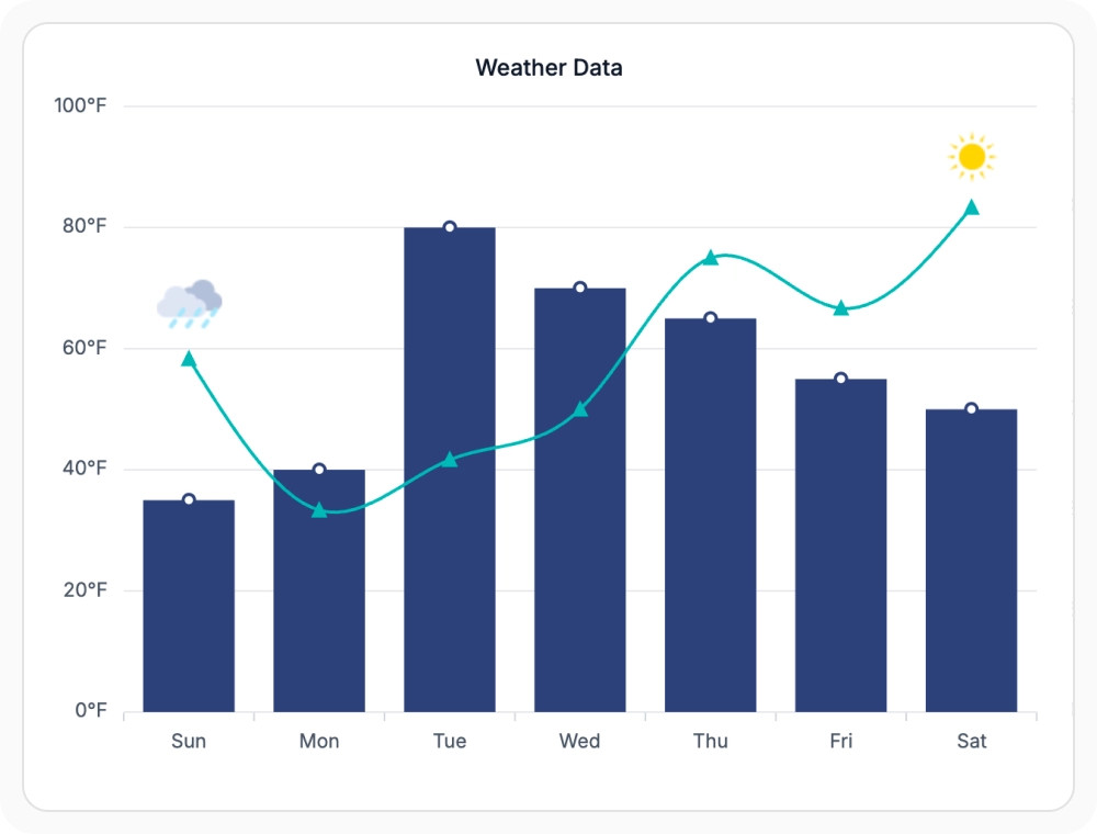
Multiple axes allow different series to use separate scales and measurement units within the same chart. For datasets that require independent scaling or different units of measurement, this approach visualizes related metrics together while preserving accuracy and readability for each one.
- Combine series with different units in a single chart.
- Maintain independent scaling and formatting for each axis.
- Bind individual series to a specific x-axis or y-axis.
- Compare datasets with different magnitudes clearly.
GUIDED AXIS SELECTION
Match the axis type to the dataset
Developers can evaluate the structure of their data, choose the most appropriate axis type, configure formatting and scaling, and combine multiple axes when visualizing data with different units or measurement ranges.
01
Analyze the dataset
Determine whether the data contains continuous values, categories, timestamps, irregular dates, or values that span large ranges.
02
Select the appropriate axis
Choose numeric axes for continuous values, category axes for grouped data, date-time axes for time-series data, date-time category axes for irregular dates, logarithmic axes for large value ranges, or multiple axes for mixed units.
03
Configure formatting and scaling
Customize labels, intervals, number formats, date formats, gridlines, and scaling options to improve readability and interpretation.
04
Visualize and compare data
Bind series to the configured axes, render the chart, and present trends, comparisons, and relationships with the appropriate scale and context.
PLATFORM SUPPORT
Configure axes across platforms
Charts axis types are available across web, desktop, and cross-platform frameworks. Availability of advanced capabilities such as date-time category, logarithmic scaling, and multiple axes may vary by platform.
| Capability | JS, React, Angular, Vue | Blazor | ASP.NET Core & MVC | WPF & WinForms | .NET MAUI | Flutter |
|---|---|---|---|---|---|---|
| Numeric axis | ||||||
| Date-time axis | ||||||
| Date-time category axis | ||||||
| Category axis | ||||||
| Logarithmic axis | ||||||
| Multiple axes |
Frequently Asked Questions
Which Charts axis type works best for time-series data?
The date-time axis is the right choice among Charts axis types when each data point is associated with an exact time. It maintains consistent spacing between dates, even when no value exists for a particular date.
Can Charts display multiple axes in a single visualization?
Yes. Multiple x-axes and y-axes are supported, allowing series with different units or scales to coexist in the same chart while maintaining independent scaling and formatting for each axis.
Are axis labels, intervals, and gridlines customizable in Charts?
Yes. Labels, intervals, number formats, tick lines, and gridlines can be customized per axis, and individual elements like gridlines can be hidden while the axis continues to control chart scaling.
How does the date-time category axis differ in Charts?
The date-time category axis spaces dates evenly without gaps for missing dates, while the date-time axis inserts gaps for periods with no data. Use the date-time category axis when dates should appear uniformly spaced.
When is a logarithmic axis useful in Chart visualizations?
Use a logarithmic axis when data spans several orders of magnitude and values vary widely. This scale makes both small and large values easy to interpret without one compressing the other.
Can different series within a chart use separate axes in Charts?
Yes. Individual series can be bound to a specific x-axis or y-axis, allowing one chart to combine series with different units or magnitudes.
Resources
Learn more about our Charts
Explore demos, KB articles, and documentation to get the most out of the Charts.
Explore guides, APIs, and quick-start tips
See live use cases in action
Ask, share, and connect with peers
Find solutions and best practices fast
Get expert help when you need it
Feature requests and bug reports
Track issues and suggest improvements
Awards
Greatness—it’s one thing to say you have it, but it means more when others recognize it. Syncfusion® is proud to hold the following industry awards.