Try Our Live Demo
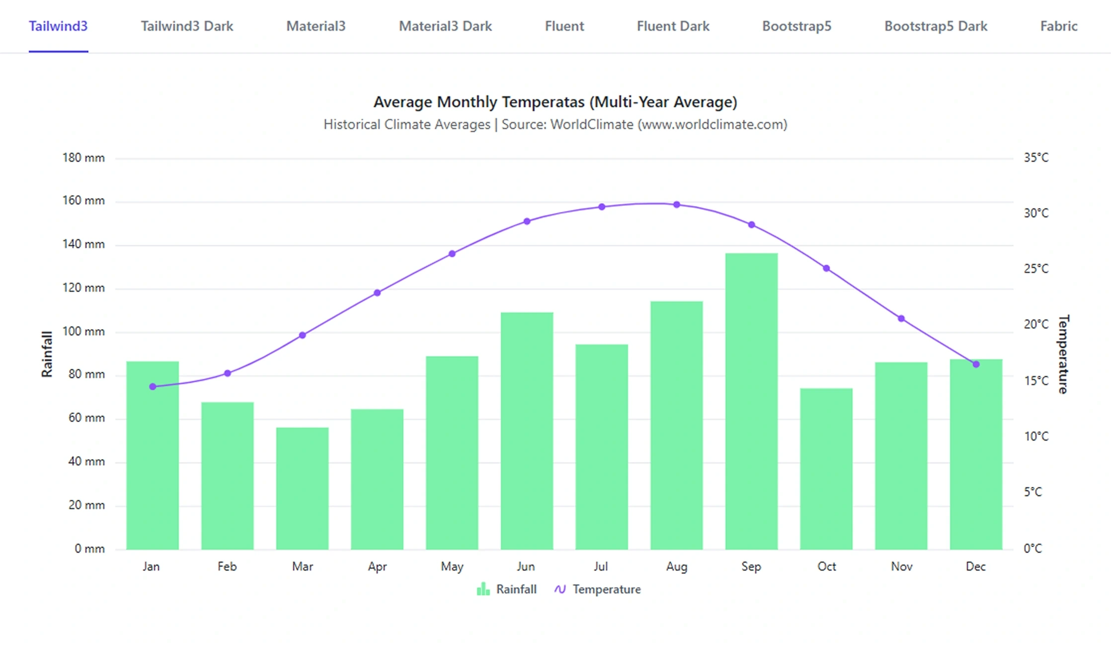
Keep charts aligned with application design
Choose from four theming capabilities: design-system themes, light and dark mode support, brand-aligned color styling, and runtime theme controls, to keep data visualizations consistent with the surrounding application.
Match established design systems
Apply Material, Fluent, Bootstrap, Tailwind, Fabric, and other built-in themes to integrate charts with familiar application design languages.
Support user display preferences
Use light, dark, and high-contrast styling to maintain readability and visual consistency across different viewing environments and preferences.
Align charts with your brand
Customize colors, fonts, and visual properties, and switch themes at runtime to keep chart styling synchronized with application branding.
Match Design-System Themes
Apply built-in themes to make Charts feel native to applications based on established design systems. Theme-level styling coordinates chart colors, typography, backgrounds, axes, legends, and other visual elements. Use them when charts must align with a chosen design language.
- Use Material and Fluent themes for modern application interfaces.
- Apply Bootstrap and Tailwind themes in applications using those styling systems.
- Use Fabric styling for Office-inspired and productivity-focused experiences.
- Coordinate typography, backgrounds, axes, and legends through theme-level controls.
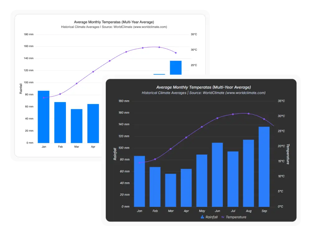
Light and Dark Modes
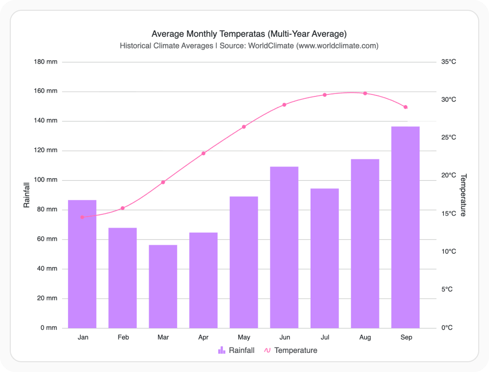
Keep charts visually aligned when the surrounding application changes between light and dark interfaces. Coordinated theme variants help preserve contrast, hierarchy, and readability across viewing modes. Use them when the application must support light and dark preferences.
- Match chart backgrounds and foreground elements to the active application mode.
- Maintain readable labels, axes, legends, and data series in light and dark interfaces.
- Provide a consistent experience when users change their display preference.
- Switch between light, dark, and high-contrast variants based on user preference.
Customize Chart Colors
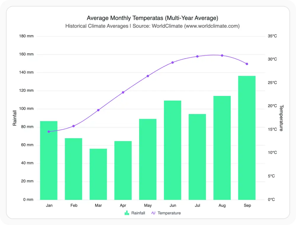
Adapt built-in themes to application branding and visualization requirements. Styling controls help teams coordinate series colors and supporting chart elements without rebuilding the complete visual system. Use them when charts must match brand guidelines.
- Customize color palettes for data series and categories.
- Adjust fonts and visual properties to follow brand guidelines.
- Keep styling consistent across different chart types in the application.
- Apply custom palettes per chart type to maintain branded color hierarchy.
Runtime Theme Switching
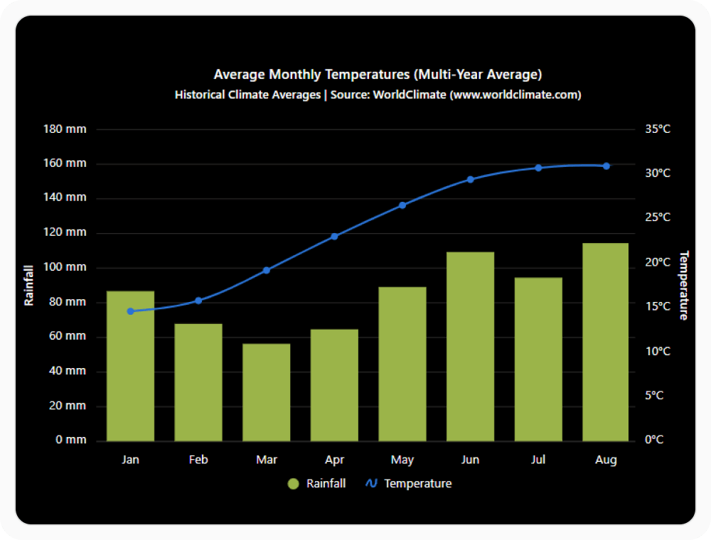
Update chart themes at runtime as application settings change, and use high-contrast styling when stronger visual distinction is needed. This helps charts respond to user preferences without requiring a page reload. Use them when the application must support dynamic theme changes and accessibility.
- Change the active theme when the application theme changes.
- Use high-contrast styling to increase distinction between chart elements.
- Preserve a cohesive visual experience across interactive application states.
- Preserve chart state and interactions across theme changes.
GUIDED CHART THEMING
Create a consistent visual experience
Teams can select a design-system theme, align charts with application appearance settings, customize branding, and update styles dynamically as preferences change.
01
Select a theme
Choose a built-in theme that matches the application’s design language.
02
Match display preferences
Apply light, dark, or high-contrast variants based on user and accessibility requirements.
03
Customize visual styling
Adjust colors, fonts, and chart properties to align with branding guidelines.
04
Update dynamically
Switch themes at runtime to keep charts synchronized with application settings and user preferences.
THEMING SUPPORT
Style Syncfusion Charts for different application experiences
Syncfusion Charts provide built-in themes, customizable styling, light and dark modes, runtime theme switching, and high-contrast options for creating consistent chart experiences across supported platforms.
| Capability | JS, React, Angular, Vue | Blazor | ASP.NET Core & MVC | WPF & WinForms | .NET MAUI | Flutter |
|---|---|---|---|---|---|---|
| Built-in themes | ||||||
| Light and dark modes | ||||||
| Custom color palettes | ||||||
| Font and visual customization | ||||||
| Runtime theme switching | ||||||
| High-contrast styling |
Frequently Asked Questions
Which design systems are supported by Syncfusion Charts themes?
Syncfusion Charts includes built-in themes for Material, Fluent, Bootstrap, Tailwind, and Fabric design systems, each with matching light and dark variants.
Do all built-in Syncfusion Charts themes include dark mode?
Most built-in themes include matching dark mode variants, providing a consistent visual experience across both light and dark interfaces.
Are Syncfusion Charts themes consistent across chart types?
Yes. All chart types share the same underlying theme system, maintaining a consistent appearance across the entire application interface.
How can themes be switched dynamically in Syncfusion Charts?
Themes can be changed at runtime without reloading the page, allowing charts to stay aligned with application theme changes instantly.
Can built-in Syncfusion Charts themes be customized?
Yes. Colors, fonts, and styling properties can be customized to match branding guidelines and specific application design requirements easily.
Are high-contrast themes available for Syncfusion Charts accessibility?
Yes. High-contrast themes are also available to improve readability and support accessibility requirements for users with visual impairments.
Resources
Learn more about our Syncfusion Charts
Explore demos, knowledge base articles, and documentation to get the most out of Syncfusion Charts theming and styling.
Explore guides, APIs, and quick-start tips
See live use cases in action
Ask, share, and connect with peers
Find solutions and best practices fast
Get expert help when needed
Feature requests and bug reports
Track issues and suggest improvements
Awards
Greatness—it’s one thing to say you have it, but it means more when others recognize it. Syncfusion® is proud to hold the following industry awards.