Try Our Live Demo
Build context-rich chart experiences
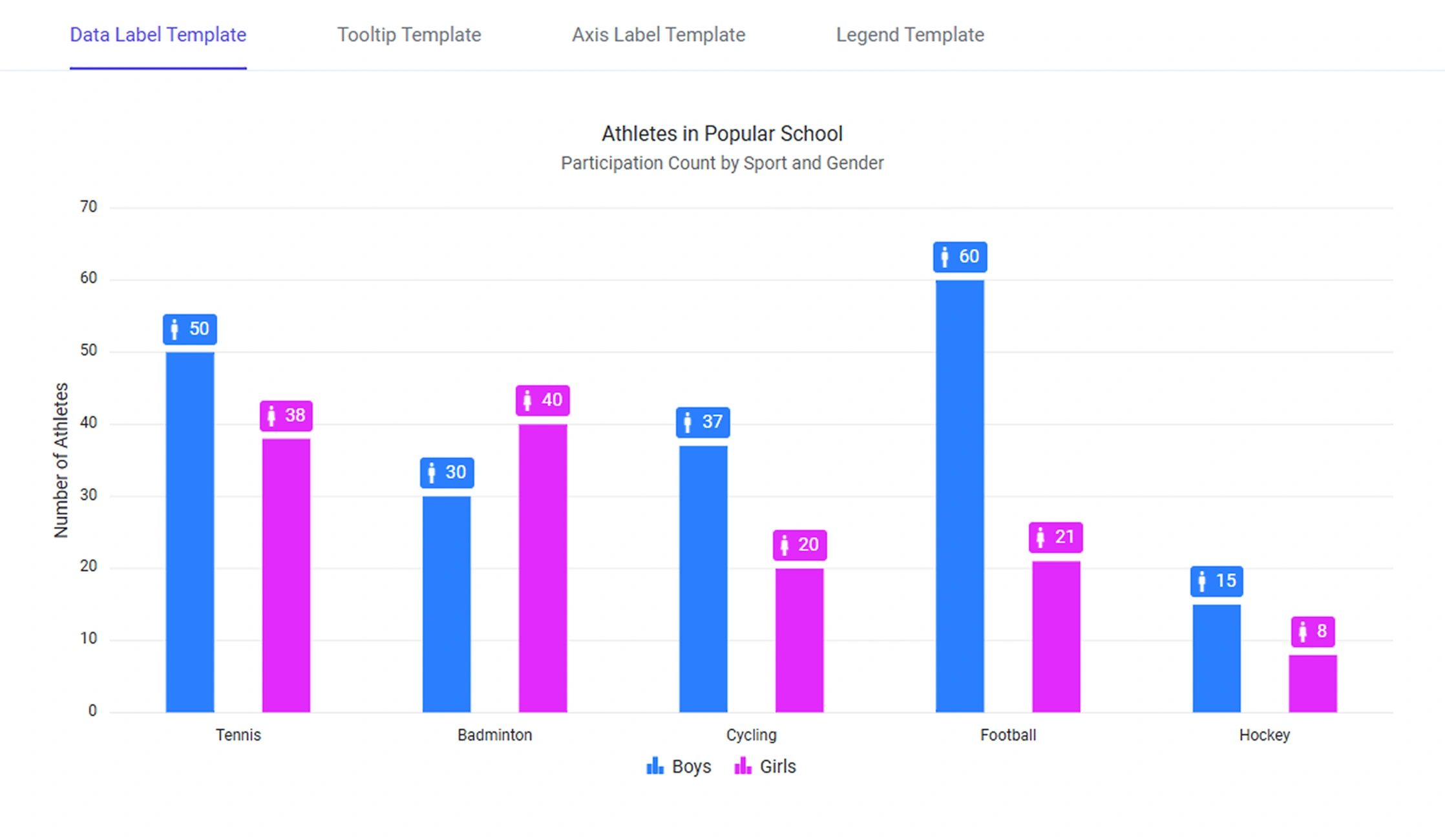
Choose from four template types: data labels, axis labels, tooltips, and legends, to add formatted values, icons, metadata, and business-specific content to your visualizations.
Data Label Templates
Show formatted values, currency, percentages, and contextual content directly on data points through data label templates.
Axis Label Templates
Apply formatting, abbreviations, units, and localized values to category, numeric, and date labels through templates.
Tooltip Templates
Surface additional details, formatted data, and contextual information through tooltip templates.
Data Label Templates
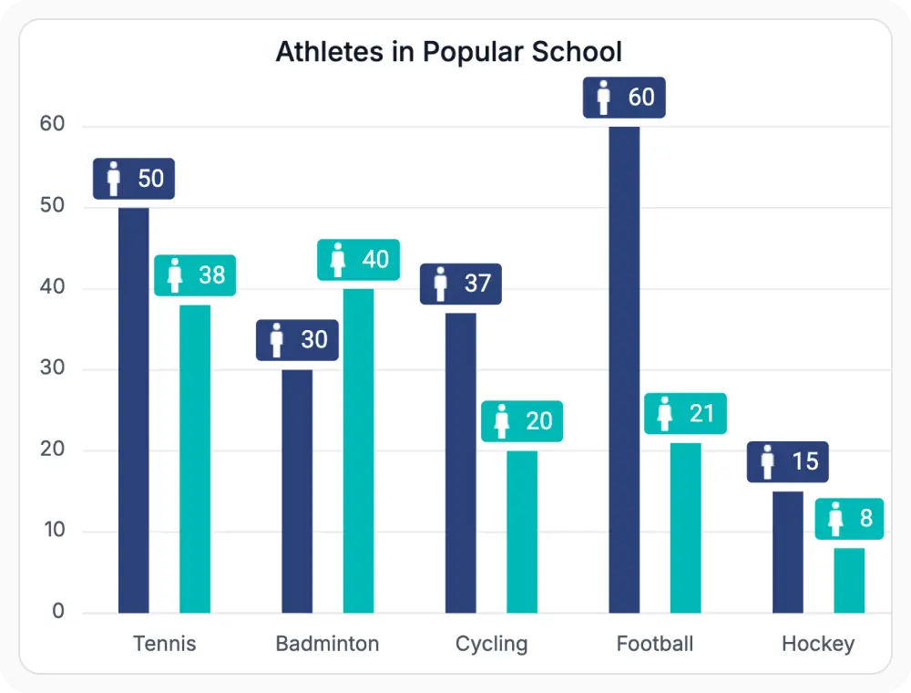
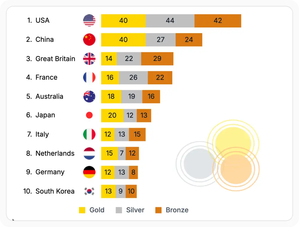
Data label templates customize the information displayed directly on chart data points. Use them when key values or indicators must remain visible, since templates keep key information visible without requiring user interaction.
- Show formatted values, currency symbols, and percentages directly on data points.
- Add icons, badges, and contextual content to highlight specific values or categories.
- Keep key information visible without requiring user interaction.
- Include icons, badges, and contextual indicators alongside values.
Axis Label Templates
Axis label templates customize category, numeric, and date-time labels with formatting, abbreviations, units, and localized values. Use them when formatted axes are required, since templates improve readability without adding visual clutter.
- Apply custom formatting, abbreviations, and units along chart axes.
- Localize labels for different languages and regions.
- Improve axis readability without adding visual clutter to the chart.
- Display custom text, abbreviations, and units through axis label templates.
Tooltip Templates
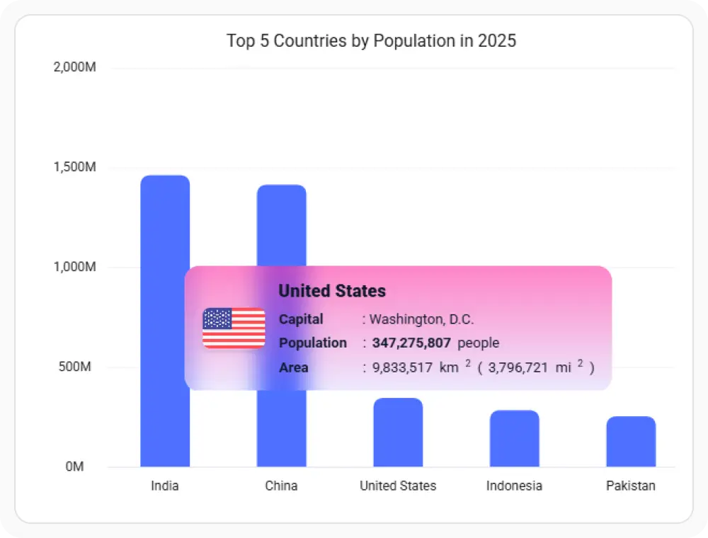
Tooltip templates customize the content displayed when users hover over or interact with chart elements. Use them when on-demand detail is required, since templates surface additional context without cluttering the chart.
- Customize tooltip content with formatted data, descriptions, and metadata.
- Surface additional details on hover without cluttering the chart.
- Keep the chart clean while making detailed information available on demand.
- Combine values, formatted descriptions, and metadata within tooltips.
Legend Templates
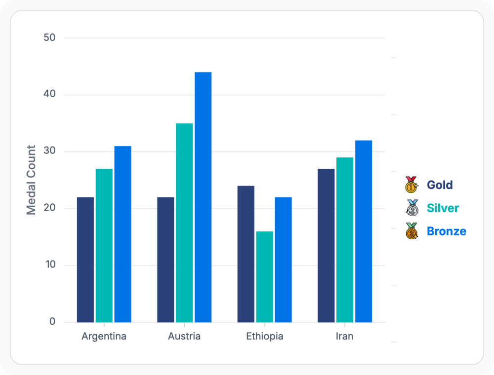
Legend templates customize how series information is displayed within chart legends. Use them when richer series identification is required, since templates support custom text, icons, and metadata to distinguish multiple series.
- Customize legend entries with custom text, icons, and metadata.
- Add status indicators and visual markers to identify series quickly.
- Improve series identification in charts with many overlapping series.
- Reuse legend templates across charts for consistent identification.
GUIDED TEMPLATE CUSTOMIZATION
Present information more effectively
Developers can choose the appropriate template type, define custom business content, apply templates to chart elements, and maintain a consistent presentation style across applications.
01
Identify the information to display
Determine whether users need additional values, business context, metadata, icons, or custom formatting.
02
Select a template type
Use data label, axis label, tooltip, or legend templates depending on where the information should appear.
03
Apply custom content
Configure formatted values, units, icons, business metadata, and presentation rules.
04
Create a consistent experience
Reuse templates across dashboards and reports to maintain a consistent visual and informational style.
PLATFORM SUPPORT
Customize chart templates across platforms
Template support for data labels, axis labels, tooltips, and legends is available across web, desktop, and cross-platform frameworks. Availability varies by feature for advanced template bindings and per-platform template rendering.
| Capability | JS, React, Angular, Vue | Blazor | ASP.NET Core & MVC | WPF & WinForms | .NET MAUI | Flutter |
|---|---|---|---|---|---|---|
| Data label templates | ||||||
| Axis label templates | ||||||
| Tooltip templates | ||||||
| Legend templates | ||||||
| Formatted values and units in templates | ||||||
| Custom icons and metadata in templates |
Frequently Asked Questions
What are Syncfusion Charts templates?
Charts templates customize how labels, tooltips, legends, and other chart elements display information. They support custom layouts, formatting, icons, and metadata for greater control over chart presentation.
When should axis label templates be used?
Axis label templates improve overall readability when tick values need special formatting, unit abbreviations, or when long category labels need better alignment and spacing.
When should legend templates be used?
Legend templates help complex multi-series charts by adding customized series names, dynamic status indicators, and extra metadata for quick and clear identification at a glance.
Can templates display custom content?
Yes. Templates fully support custom text, icons, formatted numbers, and conditional styling rules to display business-specific data in the format required by your application.
When should tooltip templates be used?
Tooltip templates are best when detailed information, formatted metrics, or extra contextual descriptions should only display dynamically when users hover over specific chart items.
When should data label templates be used?
Data label templates work best when specific values, formatted currency, percentages, or custom visual indicators must stay continuously visible directly on your data points.
Resources
Learn more about Syncfusion Charts templates
Explore demos, KB articles, and documentation to get the most out of chart template customization.
Explore guides, APIs, and quick-start tips
See live use cases in action
Ask, share, and connect with peers
Find solutions and best practices fast
Get expert help when you need it
Feature requests and bug reports
Track issues and suggest improvements
Awards
Greatness—it’s one thing to say you have it, but it means more when others recognize it. Syncfusion® is proud to hold the following industry awards.