
 Rajendran R
We are glad to inform you that our Essential Studio® 2021 Volume 3 release is available now!
Syncfusion offers the largest selection of components for the Blazor platform, featuring popular components like Charts, DataGrid, Scheduler, Diagram, Word Processor, and Maps as well as unique file-format libraries for manipulating Excel, Word, PDF, and PowerPoint files.
In this blog, we’ll look at the new features, components, and performance enhancements in the Blazor platform for the 2021 Volume 3 release.
New theme-Bootstrap V5
You can enjoy the new Bootstrap v5 theme for all our Blazor UI components. This theme was developed based on the official Bootstrap v5 standard to handle styles, fonts, and icons. It comes with both light and dark variants.
Render the Blazor components with the Bootstrap 5 theme by referencing the corresponding CSS file.
For data visualization components like Charts and Maps, use the Theme property to choose the required theme.
Note: For more details, check out the Bootstrap V5 theme demo.
.NET 6 Release Candidate 1—compatibility
We have included .NET 6 RC1 compatibility support for our Blazor components along with its preview version releases. Also, you can start experimenting with our Blazor components in Visual Studio 2022 (Preview) and .NET 6 SDK.

Breadcrumb (preview)
The new Blazor Breadcrumb component is a graphical user interface that identifies or highlights the current location within the hierarchical structure of a website. It includes all the required features, which work in real-time applications:
- Breadcrumb with overflow
- Bind to location
- Active last Breadcrumb
- Template and customization

Note: For more details, check out the Blazor Breadcrumb live demo.
Icon (preview)
The new Blazor Icon is a simple UI component that helps render an icon in a web application. The Syncfusion Blazor Icon library provides a set of base64-formatted icons in order of theme (Bootstrap V5, Tailwind CSS). The component comes with options to customize an icon’s title, size, and color, and it supports third-party icon integration such as OpenIconic. You can integrate this Icon component within existing Syncfusion Blazor components.
Note: For more detail, refer to the Blazor Icons library integrated as Toolbar item demo and documentation.
Ignore script isolation for PDF Viewer, Diagram, and Word Processor
In the 2021 Volume 2 release, we provided the option to load necessary scripts from the application end to improve initial loading performance. At that time, this option was not applicable to the Word Processor, PDF Viewer, or Diagram components.
Now, we are extending this support to these components based on customer requests.
You can use the same IgnoreScriptIsolation property by setting it to true to skip the JS Isolation and load the scripts from the application end itself.
Using CDN
| Scripts | CDN | Components |
| syncfusion-blazor.min.js | <script src="https://cdn.syncfusion.com/documentation/19.3.43/syncfusion-blazor.min.js" type="text/javascript"></script> | This script contains all the Blazor components except PDF Viewer and Word Processor. |
| syncfusion-blazor-pdfviewer.min.js | <script src="https://cdn.syncfusion.com/documentation/19.3.43/syncfusion-blazor-pdfviewer.min.js" type="text/javascript"></script> | This script contains PDF Viewer and its dependency component scripts. |
| syncfusion-blazor-documenteditor.min.js | <script src="https://cdn.syncfusion.com/documentation/19.3.43/syncfusion-blazor-documenteditor.min.js" type="text/javascript"></script> | This script contains Word Processor and its dependency component scripts. |
Blazor CRG
You can select the PDF Viewer, Word Processor, and Diagram components in the Blazor custom resource generator (CRG). You can generate the required component script and styles and reference them in your application.
Follow these steps to reference the scripts from the application end:
- First, ignore the script isolation using the global option in the Startup.cs or Program.cs file for the Blazor Server and Blazor WASM apps, respectively.
Refer to the following code.services.AddSyncfusionBlazor(options => { options.IgnoreScriptIsolation = true; } - Then, load the corresponding scripts from the application end in the _Host.cshtml page or index.html for the Blazor Server or WASM app.
Refer to the following code example.@* For Syncfusion Blazor overall Package*@ <script src="_content/Syncfusion.Blazor/scripts/syncfusion-blazor.min.js" type="text/javascript"></script> @*PDF viewer package*@ <script src="https://cdn.syncfusion.com/documentation/19.3.43/syncfusion-blazor-pdfviewer.min.js" type="text/javascript"></script> @*Document Editor Package*@ <script src="https://cdn.syncfusion.com/documentation/19.3.43/syncfusion-blazor-documenteditor.min.js" type="text/javascript"></script>
Charts
The Blazor Charts component can render millions of data points in seconds without any performance degradation. Its performance has been enhanced to meet the following scenarios:
- Easily load huge volumes of data.
- Dynamic updates like chart-type changes, legend customization, axis range customization, and annotations. They are now faster since they’re element-specific.
- Quick and smooth zooming and panning facilities.
Server-side performance metrics.
| No. of Points | 10K | 50K | 100K | 1000K |
| Improvement | 2X | 3X | 3X | 4X |
WebAssembly performance metrics.
| No. of Points | 10K | 50K | 100K | 1000K |
| Improvement | 2X | 4X | 4X | 5X |
Note: Take a look at our Blazor Charts demo to check out its performance enhancement.
Text boxes and pickers
Previously, we had some delay on initial loading and two-way binding while rendering multiple text boxes or picker components in a single page. Now, we’ve improved the performance of these components:
For more details, refer to the following table of performance metrics.
| Components | Vol-2, 2021 Release | Vol-3, 2021 Release |
| 30 Textboxes and 960 Numeric TextBoxes | 12-15 sec | 8-10 sec |
| 1000 Textboxes and 1000 Numeric TextBoxes | 25-27 sec | 17-20sec |
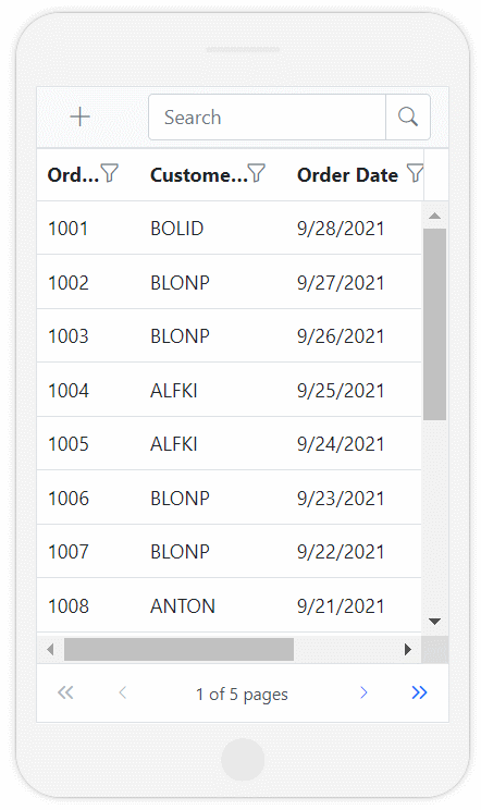
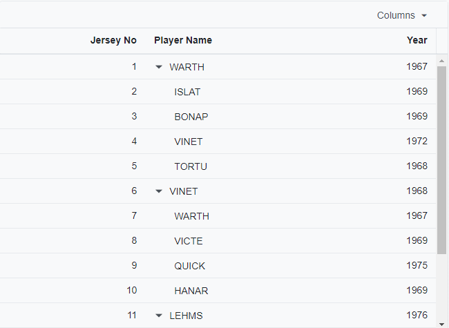
DataGrid
In the 2021 Volume 3 release, the Blazor DataGrid has the following useful updates.
Adaptive UI
A major feature in this release is the adaptive support for the Blazor DataGrid component. We have redesigned the UI to provide an optimal and user-friendly viewing experience on small screens. This interface will render the filter, sort, and edit dialogs adaptively and have an option to render the grid row elements vertically. You can set the EnableAdaptiveUI property to true to use this feature.
Note: For more details, refer to the Adaptive Layout in Blazor DataGrid Component documentation and demo.
Column chooser template
You can use the content template support for a column chooser using the Template and FooterTemplate properties in the Blazor DataGrid.
Refer to the following code.
<SfGrid>
   <GridColumnChooserSettings>
        <Template>
        </Template>
        <FooterTemplate>
        </FooterTemplate>
    </GridColumnChooserSettings>
</SfGrid>
Note: For more details, check out the Example of Column Chooser Template in Blazor DataGrid Component.
Custom sort comparer
This feature helps to customize the default sort action for specific columns in the Blazor DataGrid by defining the SortComparer property.
Note: For more details, refer to the Example of Custom Sorting in Blazor DataGrid Component and documentation.
Other enhancements
- You can show or hide the clear icon in the search text box of the toolbar item.
- Bind custom data sources to the checkbox or Excel filter lists.
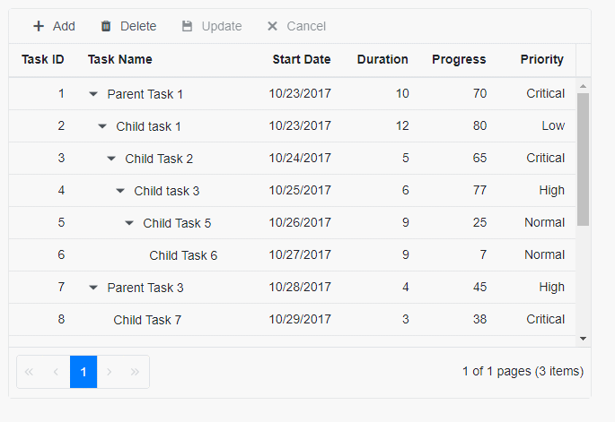
Gantt Chart
The Blazor Gantt Chart delivers the following new features and enhancements in this 2021 Volume 3 release.
Performance
You can avoid unnecessary rerendering of the Blazor Gantt Chart using the PreventRender method. This will enhance the initial loading performance of the Gantt Chart in Blazor WebAssembly (WASM) applications.
Height and width in percentage values
Now, you can set the values of Blazor Gantt Chart’s width and height properties in percentages. The Gantt Chart performance is based on the client’s browser or the parent element’s width and height.
Other enhancements
There are a few more enhancements in the Blazor Gantt Chart:
- Header template support to customize the header cell content.
- Update the noncolumn fields with the add action.
- Handle dependency validation on the client-side.
- Use the OnCellSave event, which determines whether to save the edited cell value or not.
- Use the EnableAutoLinkValidation property in OnActionBegin event arguments. Based on the AutoLinkValidate value, you can enable or disable validation on a predecessor drawing.
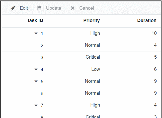
TreeGrid
Column virtualization
In the 2021 Volume 3 release, we added column virtualization support to enhance the performance of the Blazor TreeGrid.
Note: Refer to the Virtual Scrolling in Blazor TreeGrid demo and documentation.
Paste and AutoFill
Now, you can enjoy the Paste and AutoFill functionalities in our Blazor TreeGrid like in the Microsoft Office Excel.
Column chooser template
You can easily customize the content and footer of the column chooser in the Blazor TreeGrid. You can also group checkbox items, display them in tree view, and more.
Custom validation
The Blazor TreeGrid provides custom validation support during CRUD operations.
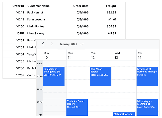
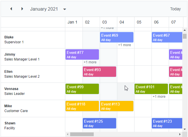
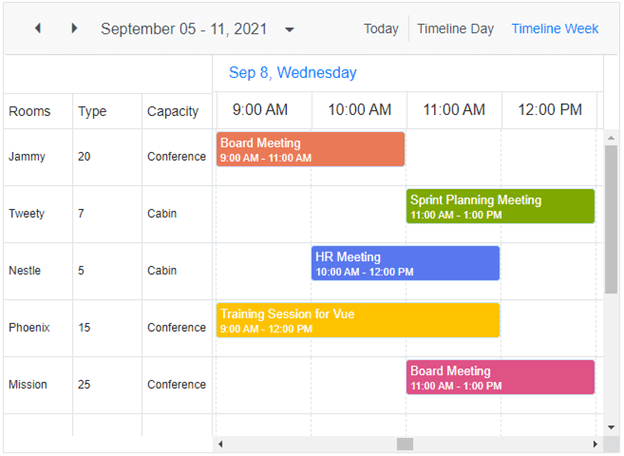
Scheduler
The Blazor Scheduler has the following features in the 2021 Volume 3 release.
Virtual mask
This feature displays a placeholder during virtualization. A loading placeholder will be shown on the schedule until the new data is populated.
Note: For more details, refer to the Example of Virtual Mask in Blazor Scheduler component.
Header indent template
Now, you can enjoy the template support for header indent cells using the HeaderIndentTemplate property.
Note: Refer to the Customizing header indent cells documentation.
Other enhancements
There are a few more enhancements to the Blazor Scheduler:
- You can sort appointments by priority instead of time using the SortBy property.
- There is time zone support for the current time indicator.
Reminders
We have published a demo about creating a schedule calendar with event reminders.
Word Processor
The Blazor Word Processor has these new features and enhancements in the 2021 Volume 3 release:
- Added support for widow/orphan control, keep with next, and keep lines together properties. For more details, refer to the Example of Paragraph Formatting in Blazor Word Processor demo.
- Improved the accuracy of text-size measurements to match the Microsoft Word pagination for most Word documents.
- Added preservation of tables with position properties. Refer to the Example of Table Formatting in Blazor Word Processor.
- Made DocIO’s word documents directly convertible into SFDT format and vice-versa.
Observable and dynamic data binding
The Blazor Kanban and Scheduler components support Observable Collection, and dynamic data binding (ExpandoObjects and dynamic objects).
Note: Check out the live demos for Kanban Board and Scheduler components.
Conclusion
Thanks for reading! In this blog post, we have seen the new, useful features and enhancements in our Syncfusion Blazor suite in the 2021 Volume 3 release. You can check out the list of all the new features in our release notes and on the What’s New pages. Try out these user-friendly updates and leave your feedback in the comments below!
If you are not yet a Syncfusion customer, you can try our 30-day free trial to check out these features.
You can reach us through our support forums, Direct-Trac, or feedback portal. We are always happy to assist you!


 No spam, just valuable updates.