 Karthick Mani
TL;DR: Meet the new Syncfusion .NET MAUI Bottom Sheet control, a new way to display contextual information through interactive slide-up panels. Learn how to customize its appearance, configure swipe behavior, manage expansion states, and build a task-details panel in your .NET MAUI application.
Want to display additional information in your .NET MAUI app without navigating users away from their current screen? A Bottom Sheet makes this possible by presenting content in a panel that slides up from the bottom, keeping the underlying screen within reach.
Creating this interaction from scratch means handling layouts, gestures, animations, and different presentation states. The new Syncfusion .NET MAUI Bottom Sheet control simplifies the process with a customizable panel, built-in interaction states, and programmatic control.
Available through the Syncfusion.Maui.BottomSheet NuGet package, the control is included in Essential Studio® 2026 Volume 3 SP.
In this article, we’ll explore its key features and build a task management example that displays task details in a Bottom Sheet.
When should you use a Bottom Sheet?
A Bottom Sheet works well when you want to show additional content without taking users away from their current page. Here are some common scenarios:
- Product details and quick actions in e-commerce applications
- Filter and sorting panels
- Location details in mapping applications
- Item previews in lists and dashboards
- Media playback controls
- Task details and editing forms
Instead of opening another page, users can access the information they need and return to their current task without extra navigation.
Key features of the .NET MAUI Bottom Sheet
The .NET MAUI Bottom Sheet includes several features to help you customize its appearance and behavior:
- Grabber customization
- Custom content width
- Header-only swiping for scrollable content
- Modal, non-modal, and overlay tap behavior
- Allowed states to control how users can drag the sheet
- Hidden, collapsed, half-expanded, and full-expanded states with adjustable heights
- Background, corner radius, padding, and light and dark themes
- Programmatic open, close, and state-change events
- Support for hosting any .NET MAUI view
Let’s see how these features work and where they can help.
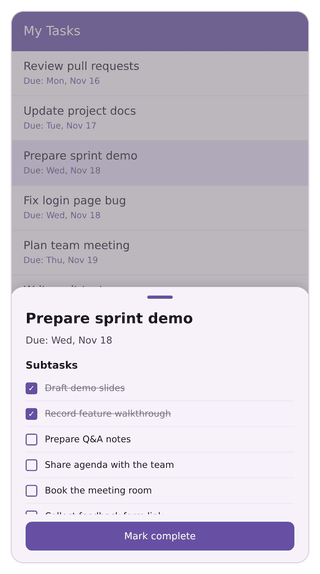
Customize the grabber
The grabber is the small handle at the top of the sheet. It gives users a visual cue that they can drag the Bottom Sheet.
Use ShowGrabber to show or hide it. You can also customize its appearance with GrabberWidth, GrabberHeight, GrabberCornerRadius, GrabberBackground, and GrabberAreaHeight to match your app’s design.
Control the content width
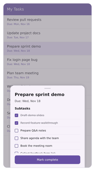
A full-width Bottom Sheet can look stretched on larger screens, such as tablets and desktops. You can adjust its content width to create a more balanced layout.
To customize the width:
- Set
ContentWidthModetoCustom. - Specify the desired width using
BottomSheetContentWidth.
By default, ContentWidthMode is set to Full, which stretches the sheet across the available width.
Swipe without scroll conflicts
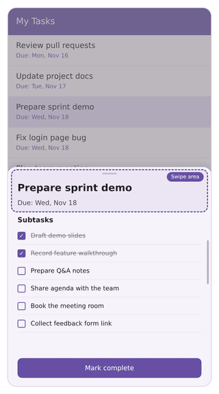
What happens when a Bottom Sheet contains a scrollable view? Users should be able to scroll through the content without accidentally dragging the entire sheet.
Swiping is enabled by default through the EnableSwiping property. To avoid gesture conflicts, set:
SwipeFromHeaderOnly="True"
This restricts drag gestures to the grabber area, allowing users to scroll through the content independently.
Configure modal and non-modal behavior
Not every Bottom Sheet needs to block the rest of the application. For example, payment confirmation flows often require modal interaction, while music players and utility panels may work better as non-modal overlays.
The IsModal property controls this behavior. By default, it is set to True, displaying an overlay that prevents interaction with the page underneath. Set it to False to let users continue interacting with the underlying page while the sheet remains open.
You can also set CollapseOnOverlayTap to True to collapse the sheet when users tap outside it.
Limit which states users can reach
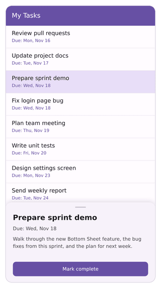
Some Bottom Sheets need only a compact view, while others may need more room to display detailed content. You can control these expansion options using the State property.
The control supports four states:
HiddenCollapsedHalfExpandedFullExpanded
The default state is Hidden.
To restrict the states users can access, use the AllowedState property:
AllHalfExpandedFullExpanded
For example, setting AllowedState to HalfExpanded prevents users from dragging the sheet into full-screen mode.
Adjust the sheet height
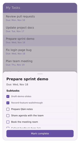
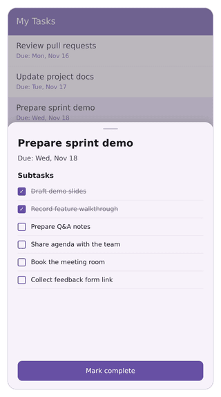
The ideal sheet height depends on the available screen space and the content you want to display. The Bottom Sheet provides three properties to control its expansion heights:
FullExpandedRatiocontrols the percentage of screen height used in the fully expanded state.HalfExpandedRatiocontrols the height of the half-expanded state.CollapsedHeightspecifies the height of the collapsed state.
The default values are:
FullExpandedRatio = 1HalfExpandedRatio = 0.5CollapsedHeight = 100
Style the sheet and apply themes
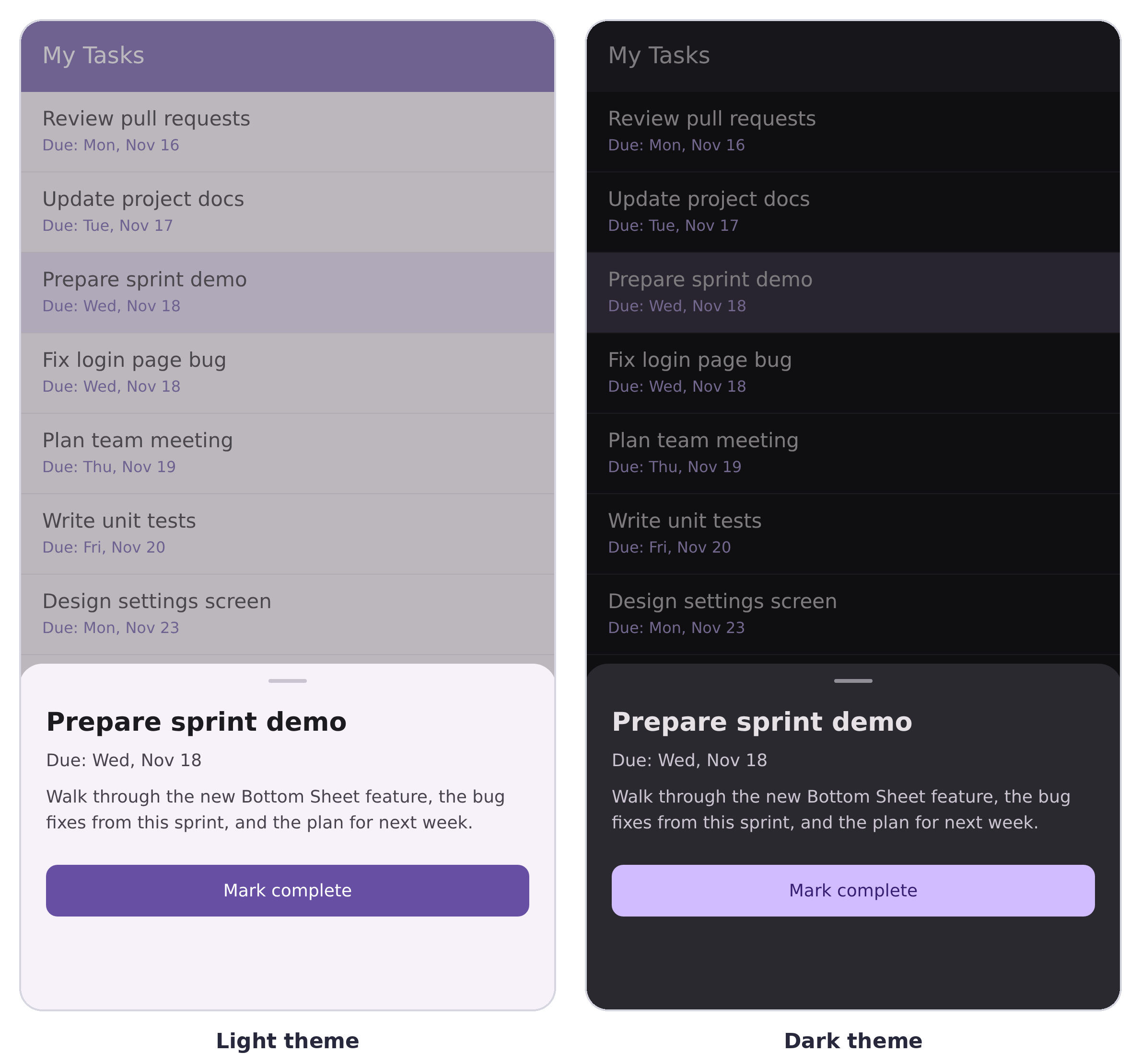
Want the Bottom Sheet to blend seamlessly with your application’s interface? You can customize its appearance using the following properties:
BackgroundCornerRadiusContentPadding
The control also supports light and dark themes, making it easier to maintain a consistent appearance in applications that offer theme switching.
Open, close, and track state changes
You can control the Bottom Sheet programmatically in a few ways:
- Call
Show()to open it. - Call
Close()to close it. - Bind the
IsOpenproperty to control its visibility.
You can also use AnimationDuration to adjust the opening and closing animation speed. Its default value is 150 milliseconds.
Need to respond to user interactions, such as expansion changes? Handle the StateChanged event. For example, you can use it to load additional content when the sheet reaches a particular state.
Build a task-details Bottom Sheet in .NET MAUI
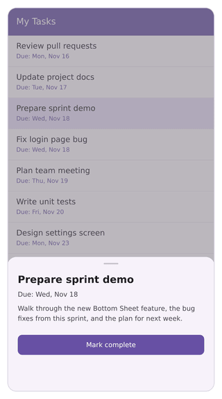
Now, let’s put these features into practice. We’ll build a simple task management interface where selecting a task from a list opens a Bottom Sheet with its details.
Create a project and install the package
Create a new .NET MAUI application in Visual Studio and install the Syncfusion.Maui.BottomSheet package using the NuGet Package Manager.
You can also install it from the .NET CLI:
dotnet add package Syncfusion.Maui.BottomSheet
Register Syncfusion Core
Next, register the Syncfusion Core handler in the MauiProgram.cs file:
using Syncfusion.Maui.Core.Hosting;

public static class MauiProgram
{
    public static MauiApp CreateMauiApp()
    {
        var builder = MauiApp.CreateBuilder();
        builder.ConfigureSyncfusionCore();
        // ...
        return builder.Build();
    }
}
Create the task model
Let’s start with a simple model for each task and a view model to hold the task list:
using System.Collections.ObjectModel;

public class TaskItem
{
    public string Title { get; set; } = string.Empty;
    public string Due { get; set; } = string.Empty;
    public string Notes { get; set; } = string.Empty;
}

public class TasksViewModel
{
    public ObservableCollection<TaskItem> Tasks { get; } = new()
    {
        new() { Title = "Review pull requests", Due = "Due: Mon, Nov 16", Notes = "Check the open pull requests and leave feedback." },
        new() { Title = "Prepare sprint demo", Due = "Due: Wed, Nov 18", Notes = "Walk through the new features and the plan for next week." },
        new() { Title = "Fix login page bug", Due = "Due: Wed, Nov 18", Notes = "Resolve the error shown after an incorrect password." }
    };
}
Add the namespace and control
First, import the Bottom Sheet namespace into your XAML page:
xmlns:bottomSheet="clr-namespace:Syncfusion.Maui.BottomSheet;assembly=Syncfusion.Maui.BottomSheet"
Next, add the SfBottomSheet control. Place the main page content inside the Content property and the view displayed in the sheet inside BottomSheetContent:
<Grid>
    <Grid.BindingContext>
        <local:TasksViewModel />
    </Grid.BindingContext>
    <bottomSheet:SfBottomSheet x:Name="bottomSheet"
                               HalfExpandedRatio="0.35"
                               CornerRadius="15,15,0,0">
        <bottomSheet:SfBottomSheet.Content>
            <CollectionView ItemsSource="{Binding Tasks}"
                            SelectionMode="Single"
                            SelectionChanged="OnTaskSelected">
                <CollectionView.ItemTemplate>
                    <DataTemplate x:DataType="local:TaskItem">
                        <VerticalStackLayout Padding="16,12">
                            <Label Text="{Binding Title}" FontSize="18" />
                            <Label Text="{Binding Due}" FontSize="14" TextColor="Gray" />
                        </VerticalStackLayout>
                    </DataTemplate>
                </CollectionView.ItemTemplate>
            </CollectionView>
        </bottomSheet:SfBottomSheet.Content>
        <bottomSheet:SfBottomSheet.BottomSheetContent>
            <VerticalStackLayout x:DataType="local:TaskItem" Padding="16" Spacing="8">
                <Label Text="{Binding Title}" FontSize="20" FontAttributes="Bold" />
                <Label Text="{Binding Due}" />
                <Label Text="{Binding Notes}" />
                <Button Text="Mark complete" Margin="0,12,0,0" />
            </VerticalStackLayout>
        </bottomSheet:SfBottomSheet.BottomSheetContent>
    </bottomSheet:SfBottomSheet>
</Grid>
Show the Bottom Sheet
Finally, handle the task selection event to display the selected task’s details:
private void OnTaskSelected(object sender, SelectionChangedEventArgs e)
{
    if (e.CurrentSelection.FirstOrDefault() is TaskItem task)
    {
        bottomSheet.BottomSheetContent.BindingContext = task;
        bottomSheet.Show();
        // Clear the selection so the same task can be tapped again.
        ((CollectionView)sender).SelectedItem = null;
    }
}
Run the application and select a task from the list. The Bottom Sheet slides up to display its details, and you can swipe it between the available states.
GitHub reference
Want to explore the control with a working example? Check out the Bottom Sheet demo on GitHub. For API details, configuration options, and more examples, refer to the .NET MAUI Bottom Sheet documentation.
Frequently asked questions
Which platforms does the .NET MAUI Bottom Sheet support?
The Bottom Sheet works on all supported .NET MAUI platforms: Android, iOS, macOS, and Windows.
Can I place a list or scrollable content inside the Bottom Sheet?
Yes. The Bottom Sheet can host any .NET MAUI view. Set SwipeFromHeaderOnly to True so users can start swipe gestures from the grabber area without interfering with content scrolling.
Can I stop users from expanding the sheet to full screen?
Yes. Set AllowedState to HalfExpanded. The sheet can then move between the collapsed and half-expanded states.
Can users interact with the page behind the Bottom Sheet?
Yes. Set IsModal to False to allow interaction with the underlying page. By default, the Bottom Sheet is modal and blocks that interaction.
How do I open the Bottom Sheet from a ViewModel?
Bind the IsOpen property to a Boolean property in your ViewModel. Setting it to True opens the sheet, while setting it to False closes it.

Conclusion
Displaying additional information without taking users away from their current page is a common requirement in cross-platform applications. Instead of building layouts, animations, gestures, and overlays from scratch, you can use the .NET MAUI Bottom Sheet to bring these capabilities together in one control.
In this article, we explored how to customize the Bottom Sheet’s appearance, manage its interaction and expansion states, and use it in a practical task management scenario. Whether you’re building filter panels, item previews, location details, or task views, the control makes it easier to present contextual information while keeping users on the same page.
Ready to explore more? Check out the Bottom Sheet documentation and demo. You can also browse the complete What’s New and Release Notes documentation to discover other features relevant to your projects.
Existing Syncfusion customers can get the latest Essential Studio version from the License and Downloads page. New users can explore the control with a 30-day free trial.
Have questions or feedback? Reach out through our support forums, feedback portal, or support portal.




Be the first to get updates