 Manikanda Akash Munisamy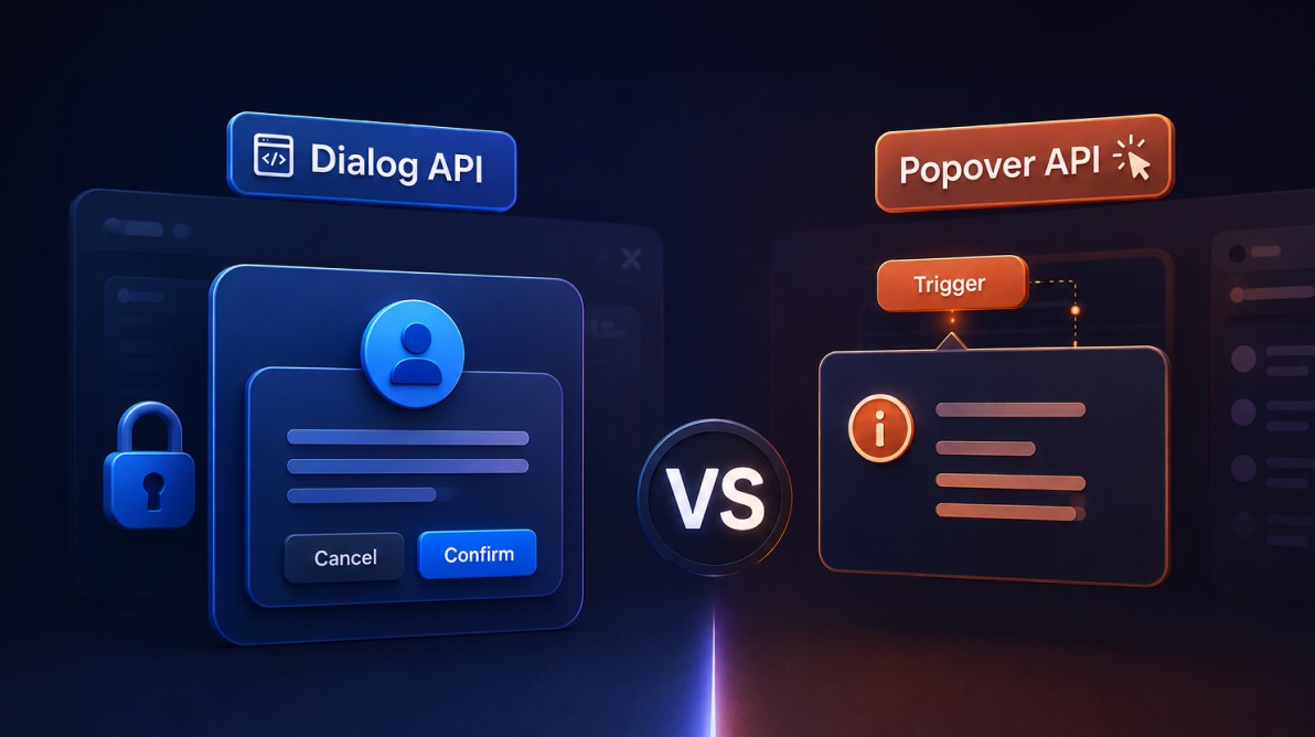
TL;DR: The Dialog API and Popover API both create native browser overlays, but they serve different purposes. Learn how accessibility, focus management, inert background behavior, and showModal() influence the choice between modals, tooltips, menus, and other interactive UI components. By understanding when to use each API, developers can build more accessible, maintainable, and user-friendly web applications.
Modern browsers now provide two native ways to build overlays: the Popover API and the Dialog API.
At first glance, they seem remarkably similar. Both place content above the page. Both can be opened and dismissed by users. Both reduce the amount of custom JavaScript needed to build overlays.
That visual similarity is exactly why developers often choose the wrong one.
The real difference isn’t how they look. It’s how users interact with them.
Important nuance: The Popover API generally provides stronger built-in focus management, automatic ARIA connections (e.g. implied aria-expanded), and light-dismiss behavior for non-modal overlays compared to a non-modal <dialog>. Use Popover for most tooltips, menus, etc.
In this article, we’ll compare the Dialog API and Popover API, look at their accessibility implications, and identify the scenarios where each one makes the most sense.
Quick decision table
| Use Case | Recommended API | Why |
| Tooltip | Popover API | Non-blocking and lightweight |
| Dropdown menu | Popover API | Users can continue interacting with the page. |
| Cookie banner | Popover API | Informational, not disruptive |
| Custom combobox | Popover API | Works as an interactive overlay |
| Confirmation dialog | Dialog API | Requires deliberate action |
| Login modal | Dialog API | Must capture user attention |
| Form modal | Dialog API | Focus should stay inside the modal |
| Destructive action confirmation | Dialog API | Background interaction should be blocked |
| Lightbox | Dialog API | Users should focus on the content being displayed |
A common mistake developers make
Many overlays look like modals but behave like popovers.
The UI appears correct. The overlay opens in the middle of the screen. The page behind it may even look visually disabled.
But keyboard users can still navigate through the underlying page. Screen readers can still access content behind the overlay.
Because the problem isn’t visible, it often survives testing and gets shipped to production.
Whenever an overlay must prevent users from interacting with the rest of the page, a modal dialog is the correct choice. A popover was never designed for that job.
Popover API: For overlays that don’t interrupt the page
Overview
The Popover API provides a native way to display non-modal overlays such as menus, tooltips, teaching hints, and dropdowns.
A basic popover can be created entirely with HTML:
<button popovertarget="my-tooltip">Show info</button>
<div popover id="my-tooltip">This is additional information.</div>
For simple scenarios, no JavaScript is required. The browser handles opening, closing, top-layer rendering, and common dismissal behavior.
Because popovers are placed in the browser’s top layer, they naturally appear above page content without complicated z-index management.
Strengths
The Popover API automates behaviors that previously required significant JavaScript:
- Automatic light dismiss: You can dismiss a popover by clicking outside it or pressing Escape. No custom event listeners are necessary.
- Less Boilerplate: The browser automatically manages relationships between triggers and popovers, reducing the amount of accessibility plumbing developers typically write.
- Focus Restoration: When a popover closes, focus returns to the triggering element automatically.
Ideal for lightweight interactions
Popovers work particularly well for:
- Tooltips
- Dropdown menus
- User profile menus
- Notification banners
- Contextual help
- Custom select components
Limitations
The Popover API does not make background content inaccessible.
Users can continue interacting with the page behind the overlay, which is exactly the intended behavior.
That makes popovers unsuitable for:
- Confirmation dialogs
- Login modals
- Critical alerts
- Multi-step forms
- Any workflow that requires immediate action
If an overlay should prevent interaction with the rest of the page, a popover is the wrong tool.
Dialog API: For interactions that require attention
Overview
The Dialog API is built around the HTML <dialog> element.
Its biggest advantage comes from showModal(), which turns the dialog into a true modal experience.
<button class="open-dialog" aria-haspopup="dialog">Delete item</button>
<dialog id="confirm-delete">
  <h2>Confirm deletion</h2>
  <p>This action cannot be undone.</p>
  <button class="close-dialog">Cancel</button>
  <button>Confirm</button>
</dialog>const dialog = document.querySelector('#confirm-delete');
const opener = document.querySelector('.open-dialog');
const closer = dialog.querySelector('.close-dialog');
opener.addEventListener('click', () => dialog.showModal());
closer.addEventListener('click', () => {
dialog.close();
opener.focus();
});Note: showModal() automatically moves focus into the dialog and restores it on close. However, for best results, ensure the dialog has a clear initial focusable element (e.g. a primary action button) and consider manually restoring focus to the trigger element on close, as shown in the example.
Strengths
- Background content becomes inert
- Users cannot tab to elements outside the dialog.
- The browser treats background content as inert, preventing normal keyboard and assistive technology interaction.
- This is one of the biggest accessibility benefits of the Dialog API.
- Built-in keyboard support: Pressing Escape closes a modal dialog without additional JavaScript.
- Native backdrop support: Dialogs support the
::backdroppseudo-element, making it easy to create a proper modal overlay. - Improved accessibility defaults: The browser handles much of the behavior developers previously implemented manually, including focus movement into the modal when it opens.
Limitations
Dialogs typically require more setup than popovers.
You will often need:
- Open and close logic
- Focus restoration after closing
- Appropriate trigger labeling
- Visible close controls
Modal dialogs block outside interaction by design (via inert background), so outside-click dismissal is usually not needed. Non-modal dialogs and popovers handle light-dismiss differently.
Ideal use cases
- Confirmation dialogs before destructive actions such as deletion
- Forms that require user completion before continuing
- Authentication prompts or login forms
- Legal agreements or terms that require explicit acknowledgment
- Error states that require user acknowledgment before proceeding
When should you choose each API?
The decision usually comes down to a single question:
Should users be able to continue interacting with the page while the overlay is open?
If the answer is yes, use the Popover API.
Examples:
- Tooltips
- Navigation menus
- Help panels
- Informational notifications
If the answer is no, use the Dialog API with showModal().
Examples:
- Delete confirmations
- Checkout interruptions
- Authentication prompts
- Terms acceptance flows
- Critical warnings
This approach aligns both accessibility expectations and user experience expectations from the start.
Advanced tip: You can combine both with <dialog popover> to get dialog semantics + popover behaviors (such as declarative popover target triggering). This is useful in some complex components. This is an advanced pattern and should be used only when both dialog semantics and declarative popover behavior are required.
Frequently Asked Questions
Can a project use both APIs?
Absolutely. In fact, many applications should. A navigation menu may use the Popover API, while a delete confirmation uses the Dialog API. They’re complementary tools rather than competing solutions.
What if browser support is a concern?
Both APIs are supported in current Chrome, Edge, Firefox, and Safari. If your audience includes older iOS Safari versions or enterprise environments, check Can I use before proceeding without a fallback.
Conclusion
Developers often compare the Dialog API and Popover API because both create overlays. The browser, however, treats them very differently.
- Use the Popover API when users should be able to ignore the overlay and continue working with the page.
- Use the Dialog API when attention is required, and interaction with the rest of the interface should stop.
Everything else follows from that decision.
Choose the API that matches the behavior you want, and the browser will handle much of the accessibility and interaction complexity for you.




 No spam, just valuable updates.