Trusted by the world’s leading companies

Overview
The Angular Toast is a small, nonblocking notification pop-up. It is a readable message displayed at the bottom of the screen or at a specific target and disappears automatically after a few seconds (time out) with different animation effects. The control has various built-in options for customizing visual elements, animations, durations, and dismissing toasts.
Angular Toast Code Example
Easily get started with the Angular Toast using a few simple lines of HTML and TSX code as demonstrated below. Also explore our Angular Toast example that shows you how to render and configure the Toast in Angular.
<div id="action-description">
    <p>
        This sample demonstrates the basic layout of a <code>Toast</code> to show simple notification and hide them.
    </p>
</div>
<div class="col-lg-12 control-section toast-default-section">
    <div class="e-sample-resize-container">
        <ejs-toast #defaulttoast id='defaulttoast' [position]="position" (created)="onCreate()"
            (close)="onClose($event)" icon="e-meeting" (beforeOpen)="onBeforeOpen()">
            <ng-template #content>
                <div>Conference Room 01 / Building 135 10:00 AM-10:30 AM</div>
            </ng-template>
            <ng-template #title>
                <div>Adaptive Tiles Meeting</div>
            </ng-template>
        </ejs-toast>
        <div class="col-lg-12 col-sm-12 col-md-12 center">
            <div id="toastBtnDefault" style="margin: auto;text-align: center">
                <button ejs-button #toastBtnShow class="e-btn" id="toastBtnShow" (click)='showToast()'>Show
                    Toasts</button>
                <button ejs-button #toastBtnHide class="e-btn" id="toastBtnHide" (click)='hideToast()'>Hide
                    All</button>
            </div>
        </div>
    </div>
</div>
import { Component, ViewEncapsulation, ViewChild, HostListener, ElementRef, Inject, Injector } from '@angular/core';
import { ToastComponent, ToastCloseArgs, ToastPositionModel } from '@syncfusion/ej2-angular-notifications';
import { ButtonComponent } from '@syncfusion/ej2-angular-buttons';
/**
* Sample for Basic Toast
*/
@Component({
selector: 'control-content',
templateUrl: 'default.html',
styleUrls: ['default.css'],
encapsulation: ViewEncapsulation.None
})
export class DefaultController {
@ViewChild('defaulttoast')
public toastObj: ToastComponent;
@ViewChild('toastBtnHide')
public btnEleHide: ButtonComponent;
@ViewChild('toastBtnShow')
public btnEleShow: ButtonComponent;
public position: ToastPositionModel = { X: "Right" };
constructor(@Inject('sourceFiles') private sourceFiles: any) {
sourceFiles.files = ['default.css'];
}
public onCreate = (): void => {
setTimeout((): void => {
this.toastObj.show();
}, 200);
}
public onClose = (e: ToastCloseArgs): void => {
if (e.toastContainer.childElementCount === 0) {
this.btnEleHide.element.style.display = 'none';
}
}
public onBeforeOpen = (): void => {
this.btnEleHide.element.style.display = 'inline-block';
}
public showToast = (): void => {
this.toastObj.show();
}
public hideToast = (): void => {
this.toastObj.hide('All');
}
@HostListener('document:click', ['$event'])
documentClick = (e: MouseEvent): void => {
if (e.target !== this.btnEleShow.element && this.toastObj.target === document.body) {
this.toastObj.hide('All');
}
}
}Interactive toasts
Users can create a more interactive toast message by configuring inputs and buttons on the notification pop-up that help them react quickly (for example, users can reply to a chat message directly from the toast pop-up).
Visual elements
A normal toast notification can be designed with plain text and optional images, icons, inputs, and buttons. Users can load HTML content and change the content dynamically inside the toast with templates.
Positioning notifications
The Angular Toast notifications component is easily positioned wherever you want by using built-in positions or custom axis values (X, Y).
Animation
Users can configure different animations to show or hide the toast and and modify the animation duration based on the content length of the notification message and reading time.
Dismiss toasts
Users can dismiss all Angular Toast notifications through user input or timeouts. Notifications can also be dismissed by swiping or tapping them.
Multiple notifications
Users can display multiple toast notifications in a sequence (queue up) within a set duration. Also, users can change the order of a toast notification sequence to place the newest on top.
Toast message types
Users can easily design common Angular toast notifications using built-in classes such as alert, success, warning, information, and error.
Timing (duration)
The Angular Toast notification component can be configured with a duration time for a complete message to be read before it is hidden. You can extend the timeout dynamically after focusing on it.
Progress bar
Users can enable a progress bar inside the toast to track the progress of an operation and the expiration of a toast message.
Toast message verification
Users can verify duplicate toast notifications and allow only distinct messages on the screen. They can restrict the maximum number of toasts to be displayed. Also, users can prevent toast messages from hiding and make them stick with the screen.
Appearance
Customize the look and feel of the Toast by changing its fill color, background, border, and item opacity.
Accessibility
- Fully supports WAI-ARIA accessibility, making it accessible to screen readers and assistive devices.
- Follows the WCAG 2.0 standards in the design of its UI visual elements, such as foreground color, background color, line spacing, text, and images.
Developer-friendly API
Developers can control the appearance and behaviors of the Toast notification component, including its positioning, using a rich set of APIs.
Other supported frameworks
Toast is also available for the Blazor, React, JavaScript, and Vue frameworks. Check out the different Toast versions from the links below:


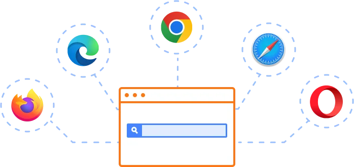
Supported browsers
The Angular Toast notification works well with all modern web browsers, including Chrome, Firefox, Edge, Safari, and Opera.
Not sure how to create your first Angular Toast? Our documentation can help.
I’d love to read it now145+ ANGULAR UI COMPONENTS
ALL COMPONENTS
SMART COMPONENTS
GRIDS
DATA VISUALIZATION
DROPDOWNS
FILE VIEWERS & EDITORS
BUTTONS
INTERACTIVE CHAT
INPUTS
NAVIGATION
FORMS
NOTIFICATION
Frequently Asked Questions
Why should you choose the Syncfusion Angular Toast?
Toast is a small, animated notification pop-up.
Fully customizable alert messages with timing and a progress bar.
Predefined standard notification types such as success, error, warning, and information.
- One of the best Angular Toast in the market that offers feature-rich UI to interact with the software.
- Simple configuration and API.
- Support all modern browsers.
Expansive learning resources such as demos and documentation to learn quickly and get started with Angular Toast.
Where can I find the Syncfusion Angular Toast demo?
You can find our Angular Toast demo here, which demonstrates how to render and configure the Toast.
What is a toast in Angular?
A toast in Angular is a lightweight UI component that displays brief, non-intrusive notifications. Syncfusion’s Angular Toast component offers customizable templates, multiple positions, and built-in options for auto-hide or sticky messages.
What is the difference between an alert and a toast?
Alerts block user interaction until dismissed, while toasts are non-intrusive notifications that auto-hide or stay in place without interrupting the user’s workflow.
Can I download and utilize the Syncfusion Angular Toast for free?
No, this is a commercial product and requires a paid license. However, a free community license is also available for companies and individuals whose organizations have less than $1 million USD in annual gross revenue, 5 or fewer developers, and 10 or fewer total employees.
How do I get started with the Syncfusion Angular Toast?
A good place to start would be our comprehensive getting started documentation.
How do I add a Toast in Angular using Syncfusion?
Install @syncfusion/ej2-angular-notifications, import ToastModule, and use the
Our Customers Love Us
Having an excellent set of tools and a great support team, Syncfusion® reduces customers’ development time.Here are some of their experiences.

An amazing toolset to accelerate UI development
The number of components available is the best thing about this library. We think of a UI component, and the Angular JS library already offers it. We use the Angular JS library to accelerate development. The experience using and implementing has been great. The support is also excellent.

Shrikant P,

Customer Success Manager, Small-Business
A giant framework with great pricing options
I have loved the components and options that Syncfusion has, besides, its documentation, demos, and Support are excellent.

Alejandro Javier V,
CEO, Small-Business
See Real Success Stories
Developers around the world trust Syncfusion’s Essential Studio to simplify complex projects and speed up delivery. With a vast library of UI controls, powerful SDKs, and reliable support, Essential Studio helps teams build enterprise-ready applications with confidence.
Explore Case StudiesIndustry
Software development
75% Cost reduction
50% Faster development
Industry
Utilities (oil and gas)
450+ hours saved
Streamlined processes and hours of development effort saved.
Advanced, flexible features
Empowered users through robust and versatile functionality.
Industry
Software and technology
1000+ of hours saved
Accelerated development with enterprise-ready UI components.
Efficient file management
Streamlined workflows with document libraries without building them from scratch.
Industry
Software and technology
2 Years of delay avoided
Two years of delays prevented with proactive planning.
On-time delivery
Projects delivered on schedule using trusted controls.
Industry
IT services and IT consulting
Improved performance
Large datasets handled with easy customization and quick debugging.
Highly customizable
Plug-and-play controls with quick template integration.
Industry
Professional services
Instant access
Quick availability of features and resources.
Reduced dependencies
Fewer dependencies for faster development.
Rated by users across the globe
Syncfusion Angular Resources
Learning
 Documentation
 Documentation


Awards
Greatness—it’s one thing to say you have it, but it means more when others recognize it. Syncfusion® is proud to hold the following industry awards.

