Flutter HiLo Chart - Visualize Stock Highs and Lows Easily
Overview
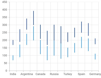
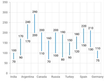
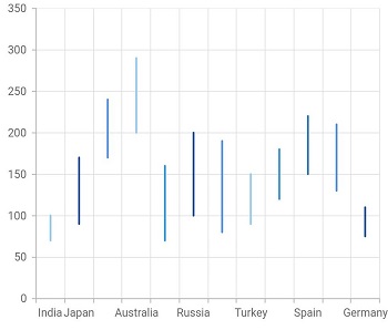
The Flutter HiLo Chart is similar to OHLC, but shows the high and low values of the stock over the given period of time. You can create beautiful, animated, real-time and high-performance hilo chart that also supports the interactive features such as zooming and panning, trackball, crosshair, tooltip and selection.

Key features
Multi series
Allows you to plot multiple series in a single chart to compare different data sets. Enabling legend and tooltip gives more information about the individual series.
Data label
Data labels display information about data points. Add a template to display data labels with any custom widgets for more informative data labels. You can rotate a data label by its given angle.
Customization
Customize the color, thickness, and dash array of the Flutter HiLo Chart using built-in APIs.
Code example
Easily get started with the Flutter High Low (HiLo) Chart using a few simple lines of DART code example as demonstrated below,
import 'package:flutter/material.dart';
import 'package:syncfusion_flutter_charts/charts.dart';

@override
    Widget build(BuildContext context) {
        return Scaffold(
            body: Center(
                child: Container(
                    child: SfCartesianChart(
                        primaryXAxis: DateTimeAxis(),
                        series: <CartesianSeries>[
                            // Renders bar chart
                            HiloSeries<SalesData, DateTime>(
                                dataSource: chartData,
                                xValueMapper: (SalesData sales, _) => sales.year,
                                lowValueMapper: (SalesData sales, _) => sales.low,
                                highValueMapper: (SalesData sales, _) => sales.high
                            )
                        ]
                    )
                )
            )
        );
    }