Overview
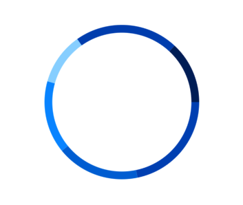
The Flutter doughnut Chart (a.k.a Flutter Donut Chart) is a circular graphic, which is ideal for displaying proportional values in different categories. You can create beautiful, animated, real-time and high-performance doughnut chart that also supports the interactive features such as explode, tooltip and selection.

Key features

Center view
Any view can be added to the center of the Flutter Doughnut Chart.

Explode on touch
Explode a single segment in the Flutter Doughnut chart to differentiate it from others.

Grouping
Group smaller segments in the Flutter doughnut chart that are below the previously set value into a single segment called “others”.
Custom inner radius
You can customize the inner radius of the chart to make it pleasing. Making inner radius to 0 will change the doughnut to pie chart. You can customize both the radius and inner radius of the doughnut.

Customization
Customize the color and border of the Flutter Doughnut Chart using the built-in APIs to make it visually unique.

Start and End Angle
Customize the start angle and end angle of a chart to create a semi-pie chart.

Smart labels
Arrange data labels smartly to avoid overlapping when the data point values are at close range.
Code example
Easily get started with the Flutter Doughnut Chart using a few simple lines of DART code example as demonstrated below,
import 'package:flutter/material.dart';
import 'package:syncfusion_flutter_charts/charts.dart';

void main() {
  return runApp(_ChartApp());
}

class _ChartApp extends StatelessWidget {
  @override
  Widget build(BuildContext context) {
    return MaterialApp(
      theme: ThemeData(primarySwatch: Colors.blue),
      home: _MyHomePage(),
    );
  }
}

class _MyHomePage extends StatefulWidget {
  // ignore: prefer_const_constructors_in_immutables
  _MyHomePage({Key? key}) : super(key: key);

  @override
  _MyHomePageState createState() => _MyHomePageState();
}

class _MyHomePageState extends State<_MyHomePage> {
  late List<_ChartData> data;
  late TooltipBehavior _tooltip;

  @override
  void initState() {
    data = [
      _ChartData('David', 25),
      _ChartData('Steve', 38),
      _ChartData('Jack', 34),
      _ChartData('Others', 52)
    ];
    _tooltip = TooltipBehavior(enable: true);
    super.initState();
  }

  @override
  Widget build(BuildContext context) {
    return Scaffold(
        appBar: AppBar(
          title: const Text('Syncfusion Flutter chart'),
        ),
        body: SfCircularChart(
            tooltipBehavior: _tooltip,
            series: <CircularSeries<_ChartData, String>>[
              DoughnutSeries<_ChartData, String>(
                  dataSource: data,
                  xValueMapper: (_ChartData data, _) => data.x,
                  yValueMapper: (_ChartData data, _) => data.y,
                  name: 'Gold')
            ]));
  }
}

class _ChartData {
  _ChartData(this.x, this.y);

  final String x;
  final double y;
}