
 Sivakumar R
We at Syncfusion are glad to announce the last major release of this year, Essential Studio® 2020 Volume 4. This is the second major release for Syncfusion Essential Studio® for WinUI. If you are new to the WinUI platform, check out our previous blog post about the features included in the first release.
Let’s see about the new controls and features included in the Syncfusion WinUI platform in this release!
WinUI 3 Preview 3 support
Syncfusion WinUI controls are now compatible with WinUI 3 Preview 3.
Accessibility support
Accessibility support has been provided for the following controls. Now, these controls can be used by assistive technologies, such as screen readers.
- DataGrid
- TreeGrid
- Radial Gauge
- Color Picker and Dropdown Color Picker
- Color Palette and Dropdown Color Palette
- Ribbon
- Barcode
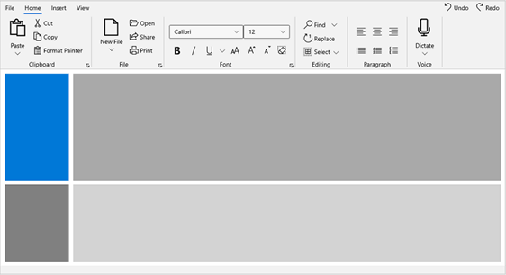
WinUI Ribbon (New)
The Ribbon control for WinUI is a command bar that organizes an application’s commands and tools into a series of tabs. It also supports a backstage view like Microsoft Office products.
The features of the WinUI Ribbon control are as follows.
Tabs and groups: Commands can be categorized using the ribbon tabs and groups features. The ribbon groups can host both ribbon items and custom items. A ribbon group contains a launcher button that reveals additional tools in a group.
Built-in ribbon items: Support has been provided for built-in command items, like buttons, drop-down buttons, and split buttons. These buttons support the following three size modes to fit into the available space:
- Large
- Normal
- Small
Custom ribbon items: A ribbon group can host and display any kind of custom control, such as combo boxes, text boxes, radio buttons, check boxes, and more.
Backstage: The file menu button and backstage view can hold an application’s information and basic settings. The backstage view contains tabs, buttons, and separators that are placed between backstage view items to create groups. The ribbon backstage view also hosts custom views inside the backstage, like a navigation view.
Themes: Support for both light and dark themes has been added. Refer to the following screenshot.
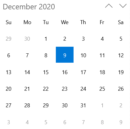
WinUI Calendar (new)
The new WinUI Calendar control allows you to easily navigate to specific dates using month, year, decade, and century views. By using this control, a user can select a single date or multiple dates. The control’s rich feature set includes functionalities such as different calendars, date formatting, blackout dates, localization, etc.
Refer to the following screenshot.
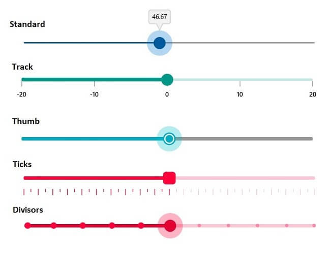
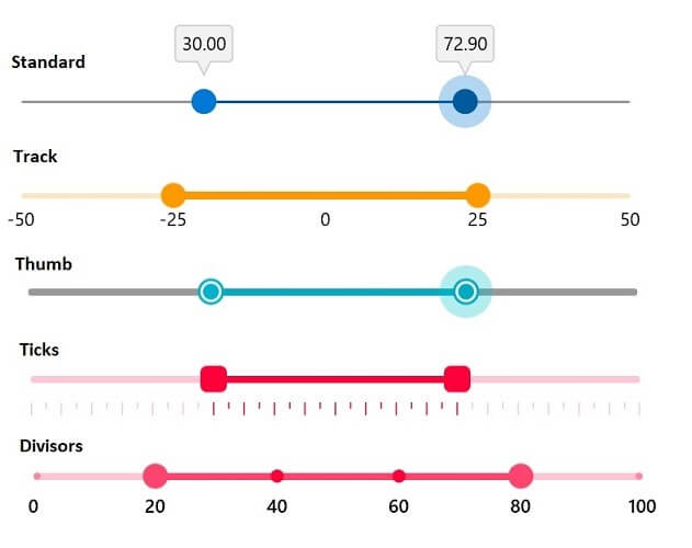
WinUI Slider (new)
The WinUI Slider control is a highly interactive UI control that allows users to select a single value from a range of values. It also provides rich features such as labels, ticks, divisors, thumb styles, and tooltips.
Numeric value support: Provides functionality to select numeric values in any range.
Labels: Labels display numeric values, and their formats and styles can be customized based on user requirements.
Ticks and divisors: Ticks and divisors can be displayed based on slider interval values. Also, minor ticks can be enabled to indicate the values between each interval. These options present the selected value in a more intuitive way for end users.
Thumb icon: This icon provides various built-in thumb icons and options to customize the thumb style.
Tooltip: Tooltips show selected values more clearly. The tooltip’s format and text can be customized, and it can be placed either at the top or bottom of the track. Also, tooltips can be shown on both thumbs or only on the active thumb.
Highly customizable: The Slider control supports a wide range of options for full customization. Refer to the following screenshot.
WinUI Range Slider (new)
The WinUI Range Slider is a highly interactive UI control that allows users to select a smaller range from a larger data set. The range can be selected by moving the thumb along the track. The slider provides rich features such as labels, ticks, divisors, thumb styles, and tooltips.
Numeric value support: Numeric values can be selected in any range.
Labels: Labels for numeric values can be added with the option to customize their format and style based on user requirements.
Ticks and divisors: This feature shows ticks and divisors based on slider interval values. Also, minor ticks can be enabled to indicate the values between each interval. These options present the selected value in a more intuitive way for end users.
Thumb icon: This feature provides various built-in thumb icons and options to customize the thumb style.
Tooltip: Tooltips show a selected value more clearly. You can also customize the format of the text shown in the tooltip and place the tooltip either at the top or bottom of the track. Also, you can show the tooltip on both thumbs or only on the active thumb.
Highly customizable: The tooltip supports a wide range of options to fully customize the Range Slider control. Refer to the following screenshot.
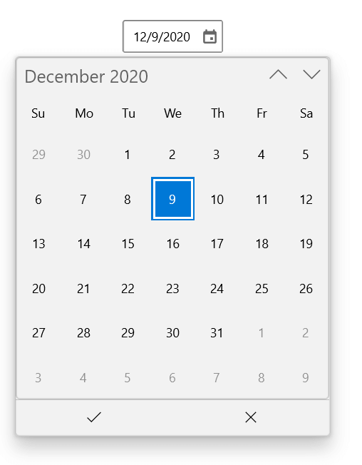
WinUI CalendarDatePicker (new)
The WinUI CalendarDatePicker control is a drop-down control that is optimized to pick a single date from a calendar control. Its rich feature set includes different calendars, date formatting, watermarks, editing, localization, etc.
Refer to the following screenshot.
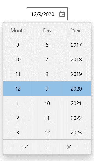
WinUI DatePicker (new)
The WinUI DatePicker control gives you a standardized way to pick a date value using touch, mouse, or keyboard input. Its rich feature set includes date formatting, headers, watermarks, editing, and custom templates.
Refer to the following screenshot.
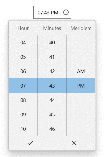
WinUI TimePicker (new)
The WinUI TimePicker control gives you a standardized way to pick a time value using touch, mouse, or keyboard input. Its rich feature set includes date formatting, headers, watermarks, editing, and custom templates.
Refer to the following screenshot.
Feature enhancements
WinUI Charts
The following new chart types have been added to the WinUI Charts control.
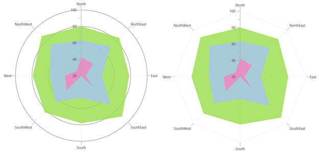
Polar and Radar charts
The Polar and Radar charts are used to visually compare several quantitative or qualitative aspects of a situation. Refer to the following screenshot.
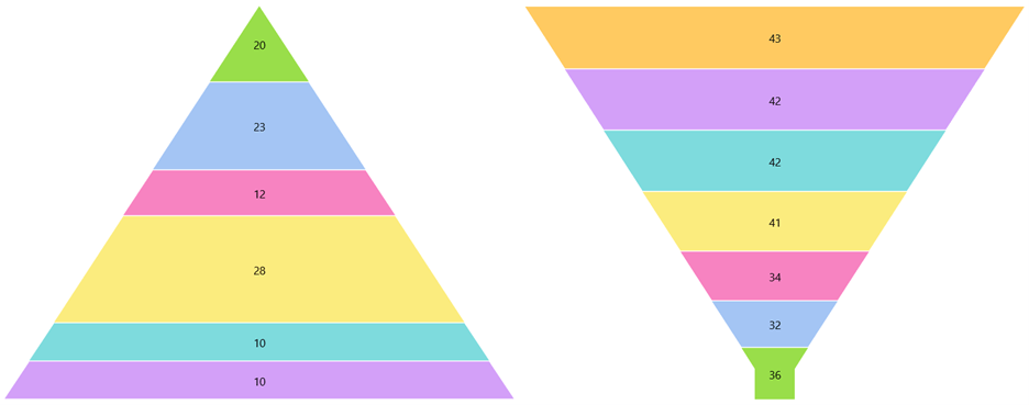
Pyramid and Funnel charts
Pyramid chart: This chart type visually represents hierarchies in a pyramid-like structure that shows proportions of the total.
Funnel chart: This chart type plots streamlined data to show various stages in a process.
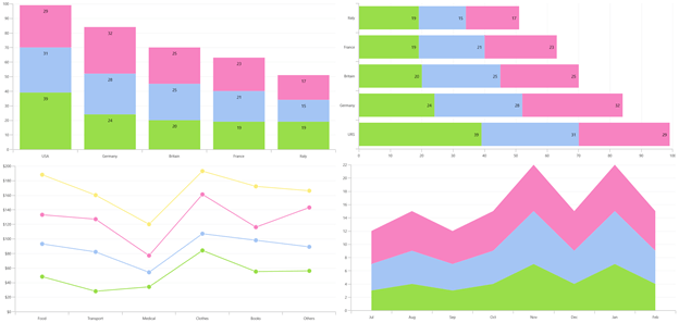
Stacked and stacked 100% charts
The following stacked and stacked 100% chart types are provided in the WinUI Charts control:
- Stacked area chart
- Stacked bar chart
- Stacked column chart
- Stacked line chart
- 100% stacked area chart
- 100% stacked bar chart
- 100% stacked column chart
- 100% stacked line chart
WinUI DataGrid
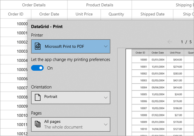
Printing
With the 2020 Volume 4 release, users can print data displayed in the WinUI DataGrid control. Refer to the following screenshot.
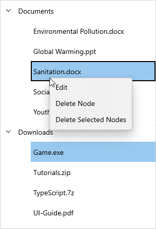
WinUI TreeView
Context menu
Now, the WinUI TreeView control allows you to show a context menu in a fly-out with built-in commands to edit and delete nodes when a node is right-clicked. Refer to the following screenshot.
WinUI Radial Gauge
Range label
This feature allows labels to be added to ranges in the WinUI Radial Gauge control.
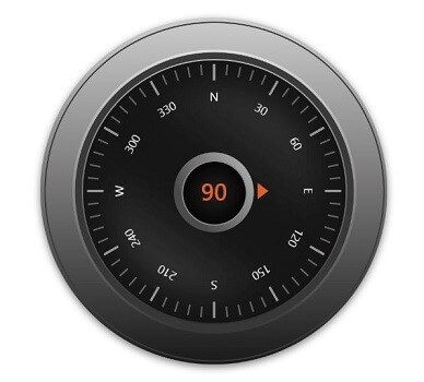
Axis background content
With this release, the radial gauge axis supports loading a frame image or any kind of custom content as a background to the axis, as seen in the following screenshot.
Various pointer animation types
Now, pointer animation can be customized using various easing animation types.
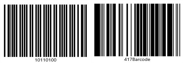
WinUI bar codes
New GS1Code128Barcode and PDF417 bar code symbology
The following new barcode symbologies are supported in the WinUI Barcode control:
- GS1Code128Barcode
- PDF417 bar code
Auto-module
Now, you can render both QR bar codes and Data Matrix bar codes based on the control size using the auto-module feature.
Note: All the new controls in the WinUI platform support both light and dark themes. You can also check out demos for them in the Microsoft App Center.
What’s next
We plan to provide the following new controls in the WinUI platform in the next release:
- Scheduler
- Linear Gauge
Conclusion
Thanks for reading! In this blog, we discussed the new controls and feature enhancements rolled out for Syncfusion WinUI controls in the 2020 Volume 4 release. You can check out a list of all the features in our release notes and on the What’s New page.
Explore samples of the WinUI control from this GitHub location. Additionally, you can download and check out our demo app in the App Center.
For current customers, the new version is available for download from the License and Downloads page. If you are not yet a Syncfusion customer, you can try our 30-day free trial to check out our newest features.
Also, if you need specific feature in our WinUI controls, please let us know in the comments section below. You can also contact us through our support forums, Direct-Trac, or feedback portal. We are always happy to assist you!
 No spam, just valuable updates.