
 Selva Ganapathy Kathiresan
In this blog post, we’ll be replicating a Facebook UI in Xamarin.Forms. The Facebook app contains some basic modules like a login page, timeline/wall page, profile page, and some other pages for modifying the settings and creating commercial pages. In this blog, we are going to focus on designing the following three pages:
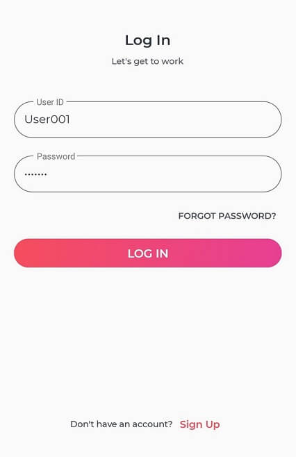
- Login page: Requests username and password to log in.
- Timeline page: Shows all active posted content, such as videos, images, and texts with react and comments sections.
- Profile page: Shows user information, media, and a friend list.
Designing the login page
To create the login page, I am going to use the Syncfusion Xamarin.Forms Button and Text Input Layout controls.
To start, let’s divide the screen into the following controls:
- A label to show the text Log In.
- A label to show a simple description.
- Text Input Layout with Entry to get User ID.
- Text Input Layout with Entry to get Password.
- Button for FORGOT PASSWORD? option.
- Button to LOG IN.
Code for layout
Use stack and grid layouts to place the controls appropriately.
<StackLayout Margin="{core:OnPlatformOrientationThickness PhonePortrait='20,32', PhoneLandscape='150,32', TabletPortrait='200,50', TabletLandscape='300,50', Desktop='30'}" Spacing="0" VerticalOptions="FillAndExpand" WidthRequest="{OnPlatform Default='-1', UWP='350'}">
<Grid RowSpacing="0" VerticalOptions="CenterAndExpand">
<Grid.RowDefinitions> <RowDefinition Height="Auto" /> <RowDefinition Height="Auto" /> <RowDefinition Height="Auto" /> <RowDefinition Height="Auto" /> <RowDefinition Height="Auto" /> <RowDefinition Height="Auto" /> <RowDefinition Height="Auto" /> <RowDefinition Height="Auto" /> <RowDefinition Height="Auto" /> </Grid.RowDefinitions>
<!-- Label to display the title of this page. -->
<Label FontSize="20" Style="{StaticResource TitleLabelStyle}" Text="Log In" />
<!-- Label to display the description of this page. -->
<Label Grid.Row="1" Margin="0,8" Style="{StaticResource SimpleLabelStyle}" Text="Let's get to work" HorizontalOptions="CenterAndExpand" TextColor="{DynamicResource Gray-800}" />
<Label Grid.Row="2" Margin="0,8" Style="{StaticResource SimpleLabelStyle}" Text="{Binding ErrorText, Mode=TwoWay}" HorizontalOptions="CenterAndExpand" TextColor="Red" />
<!-- Entry to get user ID from user. -->
<textInputLayout:SfTextInputLayout Grid.Row="3" OutlineCornerRadius="25" ContainerType="Outlined" Hint="User ID" >
<Entry x:Name="UserIDEntry" Style="{StaticResource EntryStyle}" Text="{Binding UserID}" />
</textInputLayout:SfTextInputLayout>
<!-- Entry to get password from user. -->
<textInputLayout:SfTextInputLayout Grid.Row="4" OutlineCornerRadius="25" ContainerType="Outlined" Hint="Password">
<Entry x:Name="PasswordEntry" IsPassword="True" Style="{StaticResource EntryStyle}" Text="{Binding Password}" />
</textInputLayout:SfTextInputLayout>
<!-- Forgot password link. -->
<buttons:SfButton x:Name="ForgotPasswordLabel" Grid.Row="5" FontSize="12" HorizontalOptions="End" Style="{StaticResource TransparentButtonStyle}" Text="FORGOT PASSWORD?" TextColor="{DynamicResource Gray-800}" Command="{Binding ForgotPasswordCommand}"/>
<!-- Log in button. -->
<buttons:SfButton Grid.Row="6" Margin="0,16" Command="{Binding LoginCommand}" HorizontalOptions="Fill" Style="{StaticResource GradientButtonStyle}" Text="LOG IN" />
</Grid>
<StackLayout HorizontalOptions="Center" Orientation="Horizontal" Spacing="1" VerticalOptions="End">
<StackLayout.Padding>
<OnIdiom x:DataType="Thickness" Default="0, 48, 0, 0" Phone="0" />
</StackLayout.Padding>
<Label Style="{StaticResource SimpleLabelStyle}" Text="Don't have an account?" TextColor="{DynamicResource Gray-900}" VerticalTextAlignment="Center" />
<!-- Sign-up button. -->
<buttons:SfButton Command="{Binding SignUpCommand}" TextColor="{DynamicResource PrimaryColor}" Style="{StaticResource TransparentButtonStyle}"Text="Sign Up" />
</StackLayout>
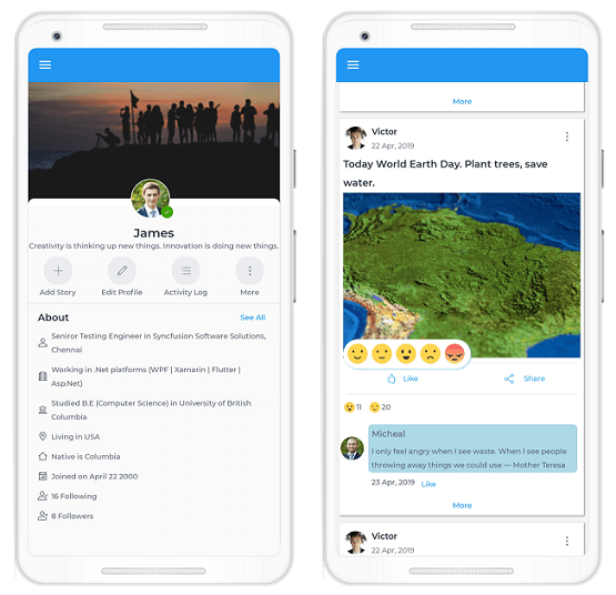
Designing profile page
Let’s move on to the second page, where the Avatar View and Badge View controls play a crucial role.
To start, let’s divide the screen into the following controls:
- Border control for basic layout with rounded corners.
- Image to show banner image.
- AvatarView to show profile picture.
- BadgeView to show availability status.
- Buttons for the options to Add Story, Edit Profile, Activity Log, More, and See all.
- Labels to display personal information.
Code for layout
Use stack and grid layouts to place the controls appropriately.
<StackLayout Spacing="0">
<Grid Margin="0" HorizontalOptions="FillAndExpand">
<!-- Profile banner image. -->
<Image HorizontalOptions="FillAndExpand" HeightRequest="200" Aspect="AspectFill" Source="{Binding BannerPicture, Converter={StaticResource ImageResourceConverter}}"/>
</Grid>
<border:SfBorder HeightRequest="13" Margin="0,-10,0,0" CornerRadius="10,10,0,0" HorizontalOptions="FillAndExpand" BorderWidth="0" BorderColor="Transparent" BackgroundColor="{DynamicResource Gray-White}" />
<badge:SfBadgeView HorizontalOptions="Center" Margin="0,-45,0,0">
<badge:SfBadgeView.Content>
<sfavatar:SfAvatarView ContentType="Default" AvatarShape="Circle" AvatarSize="ExtraLarge" HorizontalOptions="Center" VerticalOptions="Center" BorderColor="White" ImageSource="{Binding ProfilePicture, Converter={StaticResource ImageResourceConverter}}"/>
</badge:SfBadgeView.Content>
<badge:SfBadgeView.BadgeSettings>
<badge:BadgeSetting BadgeType="Success" Offset="-5,-10" FontSize="10" BadgePosition="BottomRight" BadgeIcon="Available"/>
</badge:SfBadgeView.BadgeSettings>
</badge:SfBadgeView>
<!-- Profile name. -->
<Label Style="{StaticResource TitleLabelStyle}" FontSize="20" Text="{Binding UserName}" />
<!-- Status label. -->
<Label Style="{StaticResource StatusLabelStyle}" FontSize="12" Text="{Binding StatusMessage}" />
<Grid Margin="0,10,0,0"> <Grid.ColumnDefinitions> <ColumnDefinition/> <ColumnDefinition/> <ColumnDefinition/> <ColumnDefinition/> </Grid.ColumnDefinitions>
<StackLayout Style="{StaticResource ActionBarStackLayoutStyle}">
<buttons:SfButton Text="{StaticResource Add}" Style="{StaticResource ActionIconButtonStyle}"/>
<Label Style="{StaticResource SimpleLabelStyle}" Text="Add Story" HorizontalOptions="Center"/>
</StackLayout>
<StackLayout Style="{StaticResource ActionBarStackLayoutStyle}" Grid.Column="1">
<buttons:SfButton Text="{StaticResource Edit}" Style="{StaticResource ActionIconButtonStyle}"/>
<Label Text="Edit Profile" Style="{StaticResource SimpleLabelStyle}" HorizontalOptions="Center"/>
</StackLayout>
<StackLayout Style="{StaticResource ActionBarStackLayoutStyle}" Grid.Column="2">
<buttons:SfButton Text="{StaticResource List}" Style="{StaticResource ActionIconButtonStyle}"/>
<Label Style="{StaticResource SimpleLabelStyle}" Text="Activity Log" HorizontalOptions="Center"/>
</StackLayout>
<StackLayout Style="{StaticResource ActionBarStackLayoutStyle}" Grid.Column="3">
<buttons:SfButton Text="{StaticResource More}" Style="{StaticResource ActionIconButtonStyle}"/>
<Label Style="{StaticResource SimpleLabelStyle}" Text="More" HorizontalOptions="Center"/>
</StackLayout> </Grid>
<BoxView Margin="0,10,0,0" Style="{StaticResource HorizontalSeparatorStyle}" />
<templates:FB_ProfileStoriesTemplate/>
</StackLayout>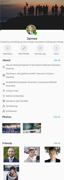
Designing a timeline page
This is the main page where the most activity takes place. This page is built using several templates designed using some interesting controls such as Rating, Avatar View, and Cards. ListView is used to create the basic layout.
To start, let’s divide the screen into the following templates:
- Message post template
- Picture post template
- Video post template
- Post comment template
- Post reaction template
Message post template
A message post template is designed with:
- A card view for a card-like layout.
- Labels for messages.
Code implementation
<cards:SfCardView HasShadow="False" BackgroundColor="LightSkyBlue" Margin="0,0,5,0">
<Label Text="{Binding Message}" TextColor="{DynamicResource Gray-White}" VerticalOptions="CenterAndExpand" Style="{StaticResource TitleLabelStyle}"/>
</cards:SfCardView>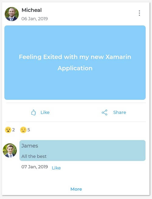
Picture post template
A picture post template is designed with:
- Labels for descriptions.
- Images to show pictures
Code implementation
<Grid Padding="0">
<Grid.RowDefinitions> <RowDefinition Height="Auto"/> <RowDefinition /> </Grid.RowDefinitions>
<Label Text="{Binding Message}" Style="{StaticResource TitleLabelStyle}" HorizontalOptions="Start" HorizontalTextAlignment="Start"/>
<Image Grid.Row="1" Aspect="AspectFill" HeightRequest="{StaticResource postContectHeight}" Source="{Binding Picture, Converter={StaticResource ImageResourceConverter}}"/>
</Grid>
Video post template
A video post template is designed with:
- Labels for descriptions.
- A media element to play videos.
- A button to pause and play.
Code implementation
<Grid Padding="0"> <Grid.RowDefinitions> <RowDefinition Height="Auto"/> <RowDefinition /> </Grid.RowDefinitions>
<Label Text="{Binding Message}" Style="{StaticResource TitleLabelStyle}" HorizontalOptions="Start" HorizontalTextAlignment="Start" Margin="5"/>
<Grid Margin="0,5,0,0" Grid.Row="1">
<MediaElement x:Name="mediaElement" Source="{Binding MediaSource}" HeightRequest="{StaticResource postContectHeight}" MediaOpened="MediaElement_MediaOpened" AutoPlay="False" BackgroundColor="AliceBlue" Aspect="AspectFill" />
<Label x:Name="loading" HorizontalOptions="CenterAndExpand" HorizontalTextAlignment="Center" Text="Loading...." Style="{StaticResource SimpleLabelStyle}"/>
<buttons:SfButton IsVisible="False" x:Name="playButton" Clicked="SfButton_Clicked" Margin="5" HorizontalOptions="EndAndExpand" VerticalOptions="EndAndExpand" Style="{StaticResource IconButtonStyle}"/>
</Grid>
Comment template
A comments template is designed with:
- Avatar View to show a picture of the owner of the comment.
- A label to show the name of the owner of the comment.
- A label to show the comment.
- Cards to hold the comment.
- Entry to get a new comment.
- Button to post the comment.
Code implementation
<Grid>
<Grid.ColumnDefinitions>
<ColumnDefinition Width="Auto"/>
<ColumnDefinition/>
</Grid.ColumnDefinitions>
<Grid.RowDefinitions>
<RowDefinition Height="*"/>
<RowDefinition Height="Auto"/>
</Grid.RowDefinitions><sfavatar:SfAvatarView ContentType="Default" AvatarShape="Circle" AvatarSize="Medium" HorizontalOptions="Center" VerticalOptions="Center" BorderColor="White" ImageSource="{Binding User.ProfilePicture, Converter={StaticResource ImageResourceConverter}}"/>
<Grid Grid.Column="1">
<cards:SfCardView HasShadow="False" BackgroundColor="LightBlue">
<StackLayout>
<Label Text="{Binding User.UserName}" Margin="5,5,0,5" VerticalOptions="CenterAndExpand" HorizontalOptions="Start" Style="{StaticResource StatusLabelStyle}"/>
<Label Text="{Binding Comment}" VerticalOptions="CenterAndExpand" Margin="5,0,5,5" Style="{StaticResource SimpleLabelStyle}"/>
</StackLayout>
</cards:SfCardView>
</Grid>
<StackLayout Orientation="Horizontal" Grid.Row="1" Grid.Column="1" HeightRequest="25" Margin="0,0,0,10">
<Label Text="{Binding DateTime, StringFormat='{}{0:dd MMM, yyyy}'}" VerticalOptions="CenterAndExpand" Margin="5,0,5,5" Style="{StaticResource SimpleLabelStyle}"/>
<buttons:SfButton Padding="0" FontSize="{OnIdiom Default=12, Desktop=14}" Command="{Binding LikeCommand}" VerticalOptions="CenterAndExpand" Style="{StaticResource TransparentButtonStyle}" >
<buttons:SfButton.Content>
<Grid>
<Label TextColor="{StaticResource HyperLink}" WidthRequest="40" HorizontalTextAlignment="Start" VerticalOptions="CenterAndExpand" Style="{StaticResource SimpleLabelStyle}" Text="{Binding LikeText, Mode=TwoWay}" />
</Grid>
</buttons:SfButton.Content>
</buttons:SfButton>
</StackLayout>
</Grid>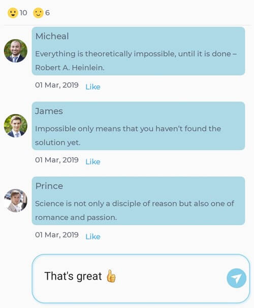
Reaction template
A reaction template is designed with:
- A Rating control with five reaction types:
- Angry
- Happy
- Neutral
- Sad
- Wow
Code implementation
<rating:SfRating.Items>
<collection:ObservableCollection x:TypeArguments="rating:SfRatingItem">
<rating:SfRatingItem>
<rating:SfRatingItem.SelectedView>
<Image Source="{Binding Converter={StaticResource ImageConverter}, ConverterParameter=Happy.png}"/>
</rating:SfRatingItem.SelectedView>
<rating:SfRatingItem.UnSelectedView>
<Image Source="{Binding Converter={StaticResource ImageConverter}, ConverterParameter=Happy.png}"/>
</rating:SfRatingItem.UnSelectedView>
</rating:SfRatingItem>
<rating:SfRatingItem>
<rating:SfRatingItem.SelectedView>
<Image Source="{Binding Converter={StaticResource ImageConverter}, ConverterParameter=Neutral.png}"/>
</rating:SfRatingItem.SelectedView>
<rating:SfRatingItem.UnSelectedView>
<Image Source="{Binding Converter={StaticResource ImageConverter}, ConverterParameter=Neutral.png}"/>
</rating:SfRatingItem.UnSelectedView>
</rating:SfRatingItem>
<rating:SfRatingItem>
<rating:SfRatingItem.SelectedView>
<Image Source="{Binding Converter={StaticResource ImageConverter}, ConverterParameter=Wonder.png}"/>
</rating:SfRatingItem.SelectedView>
<rating:SfRatingItem.UnSelectedView>
<Image Source="{Binding Converter={StaticResource ImageConverter}, ConverterParameter=Wonder.png}"/>
</rating:SfRatingItem.UnSelectedView>
</rating:SfRatingItem>
<rating:SfRatingItem>
<rating:SfRatingItem.SelectedView>
<Image Source="{Binding Converter={StaticResource ImageConverter}, ConverterParameter=Sad.png}"/>
</rating:SfRatingItem.SelectedView>
<rating:SfRatingItem.UnSelectedView>
<Image Source="{Binding Converter={StaticResource ImageConverter}, ConverterParameter=Sad.png}"/>
</rating:SfRatingItem.UnSelectedView>
</rating:SfRatingItem>
<rating:SfRatingItem>
<rating:SfRatingItem.SelectedView>
<Image Source="{Binding Converter={StaticResource ImageConverter}, ConverterParameter=Angry.png}"/>
</rating:SfRatingItem.SelectedView>
<rating:SfRatingItem.UnSelectedView>
<Image Source="{Binding Converter={StaticResource ImageConverter}, ConverterParameter=Angry.png}"/>
</rating:SfRatingItem.UnSelectedView>
</rating:SfRatingItem>
</collection:ObservableCollection>
</rating:SfRating.Items>
</rating:SfRating>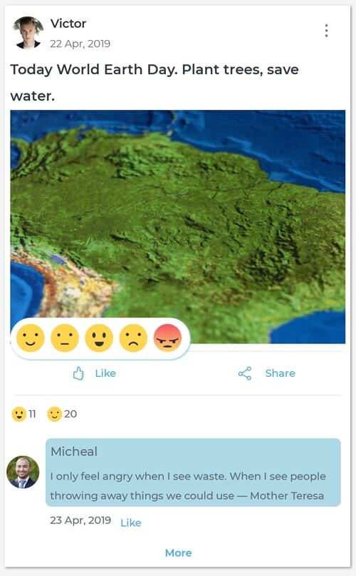
Showing a menu for a post
Displaying a menu with more options in a post is implemented using the Xamarin Popup control.
Code implementation
<sfPopup:SfPopupLayout x:Name="actionPopupLayout">
<sfPopup:SfPopupLayout.PopupView>
<sfPopup:PopupView WidthRequest="200" ShowFooter="False" HeaderTitle="Actions" AnimationMode="SlideOnRight">
<sfPopup:PopupView.ContentTemplate>
<DataTemplate>
<StackLayout>
<buttons:SfButton Text="Open this post" x:Name="openActionButton" Clicked="openActionButton_Clicked" HorizontalTextAlignment="Start" Margin="5,0,5,0" Style="{StaticResource TransparentButtonStyle}"/>
<buttons:SfButton HorizontalTextAlignment="Start" Margin="5,0,5,0" x:Name="deleteActionButton" Clicked="deleteActionButton_Clicked" Text="Delete this post" Style="{StaticResource TransparentButtonStyle}"/>
<buttons:SfButton HorizontalTextAlignment="Start" Margin="5,0,5,0" x:Name="shareActionButton" Clicked="shareActionButton_Clicked" Text="Share this post" Style="{StaticResource TransparentButtonStyle}"/>
<buttons:SfButton HorizontalTextAlignment="Start" Margin="5,0,5,0" x:Name="reportProblemButton" Clicked="reportProblemButton_Clicked" Text="Report a problem" Style="{StaticResource TransparentButtonStyle}"/>
</StackLayout>
</DataTemplate>
</sfPopup:PopupView.ContentTemplate>
</sfPopup:PopupView>
</sfPopup:SfPopupLayout.PopupView>
<sfPopup:SfPopupLayout.Content>
<Grid WidthRequest="100" >
<!-- More Icon -->
<buttons:SfButton x:Name="moreItemsButton" Text="{StaticResource More}" IsVisible="{Binding MoreIconVisibility, Mode=TwoWay}" Clicked="moreItemsButton_Clicked" VerticalOptions="StartAndExpand" HorizontalOptions="EndAndExpand" Style="{StaticResource ActionIconButtonStyle}" BackgroundColor="Transparent" />
</Grid>
</sfPopup:SfPopupLayout.Content>
</sfPopup:SfPopupLayout>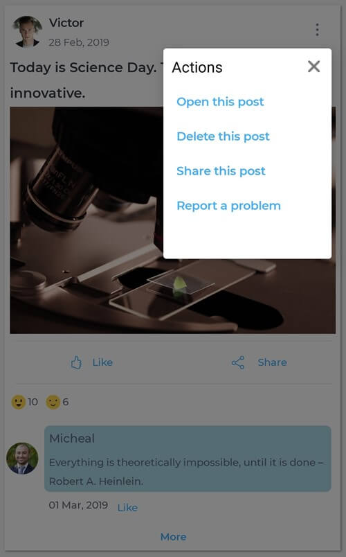
Integrating all templates
Now, integrate all the templates using a ListView.
Code implementation
<templates:PostOwnerTemplate/>

<Grid WidthRequest="50" HeightRequest="50" HorizontalOptions="EndAndExpand">
<sfPopup:SfPopupLayout x:Name="actionPopupLayout">
<sfPopup:SfPopupLayout.PopupView>
<sfPopup:PopupView WidthRequest="200" ShowFooter="False" HeaderTitle="Actions" AnimationMode="SlideOnRight">
<sfPopup:PopupView.ContentTemplate>
<DataTemplate>
<StackLayout>
<buttons:SfButton Text="Open this post" x:Name="openActionButton" Clicked="openActionButton_Clicked" HorizontalTextAlignment="Start" Margin="5,0,5,0" Style="{StaticResource TransparentButtonStyle}"/>
<buttons:SfButton HorizontalTextAlignment="Start" Margin="5,0,5,0" x:Name="deleteActionButton" Clicked="deleteActionButton_Clicked" Text="Delete this post" Style="{StaticResource TransparentButtonStyle}"/>
<buttons:SfButton HorizontalTextAlignment="Start" Margin="5,0,5,0" x:Name="shareActionButton" Clicked="shareActionButton_Clicked" Text="Share this post" Style="{StaticResource TransparentButtonStyle}"/>
<buttons:SfButton HorizontalTextAlignment="Start" Margin="5,0,5,0" x:Name="reportProblemButton" Clicked="reportProblemButton_Clicked" Text="Report a problem" Style="{StaticResource TransparentButtonStyle}"/>
</StackLayout>
</DataTemplate>
</sfPopup:PopupView.ContentTemplate>
</sfPopup:PopupView>
</sfPopup:SfPopupLayout.PopupView>
<sfPopup:SfPopupLayout.Content>
<Grid WidthRequest="100" >
<!-- More Icon -->
<buttons:SfButton x:Name="moreItemsButton" Text="{StaticResource More}" IsVisible="{Binding MoreIconVisibility, Mode=TwoWay}" Clicked="moreItemsButton_Clicked" VerticalOptions="StartAndExpand" HorizontalOptions="EndAndExpand" Style="{StaticResource ActionIconButtonStyle}" BackgroundColor="Transparent" />
</Grid>
</sfPopup:SfPopupLayout.Content>
</sfPopup:SfPopupLayout>
</Grid>

<Grid Grid.Row="1" Padding="0">
<templates:MessagePostTemplate IsVisible="{Binding PostType, Converter={StaticResource PostTypeConverter}, ConverterParameter=1}" HeightRequest="200"/>
<templates:PicturePostTemplate IsVisible="{Binding PostType, Converter={StaticResource PostTypeConverter}, ConverterParameter=2}"/>
<templates:VideoPostTemplate IsVisible="{Binding PostType, Converter={StaticResource PostTypeConverter}, ConverterParameter=3}"/>
</Grid>
<Grid Grid.Row="3">
<Grid.ColumnDefinitions>
<ColumnDefinition/>
<ColumnDefinition/>
</Grid.ColumnDefinitions>
<popup:SfPopupLayout x:Name="popupLayout" Closed="popupLayout_Closed">
<popup:SfPopupLayout.PopupView>
<popup:PopupView ShowFooter="False" ShowCloseButton="False" ShowHeader="False" BackgroundColor="Transparent" HeightRequest="35">
<popup:PopupView.ContentTemplate>
<DataTemplate>
<border:SfBorder BackgroundColor="{StaticResource Gray-White}" CornerRadius="25" HasShadow="True" Padding="5" HeightRequest="50" BorderColor="Transparent" ShadowColor="SkyBlue" WidthRequest="210">
<rating:SfRating x:Name="rating" Value="{Binding ReactionIndex, Mode=TwoWay}" EnableCustomView="True" ItemCount="5"
ValueChanged="rating_ValueChanged" ItemSize="35">
<rating:SfRating.Items>
<collection:ObservableCollection x:TypeArguments="rating:SfRatingItem">
<rating:SfRatingItem>
<rating:SfRatingItem.SelectedView>
<Image Source="{Binding Converter={StaticResource ImageConverter}, ConverterParameter=Happy.png}"/>
</rating:SfRatingItem.SelectedView>
<rating:SfRatingItem.UnSelectedView>
<Image Source="{Binding Converter={StaticResource ImageConverter}, ConverterParameter=Happy.png}"/>
</rating:SfRatingItem.UnSelectedView>
</rating:SfRatingItem>
<rating:SfRatingItem>
<rating:SfRatingItem.SelectedView>
<Image Source="{Binding Converter={StaticResource ImageConverter}, ConverterParameter=Neutral.png}"/>
</rating:SfRatingItem.SelectedView>
<rating:SfRatingItem.UnSelectedView>
<Image Source="{Binding Converter={StaticResource ImageConverter}, ConverterParameter=Neutral.png}"/>
</rating:SfRatingItem.UnSelectedView>
</rating:SfRatingItem>
<rating:SfRatingItem>
<rating:SfRatingItem.SelectedView>
<Image Source="{Binding Converter={StaticResource ImageConverter}, ConverterParameter=Wonder.png}"/>
</rating:SfRatingItem.SelectedView>
<rating:SfRatingItem.UnSelectedView>
<Image Source="{Binding Converter={StaticResource ImageConverter}, ConverterParameter=Wonder.png}"/>
</rating:SfRatingItem.UnSelectedView>
</rating:SfRatingItem>
<rating:SfRatingItem>
<rating:SfRatingItem.SelectedView>
<Image Source="{Binding Converter={StaticResource ImageConverter}, ConverterParameter=Sad.png}"/>
</rating:SfRatingItem.SelectedView>
<rating:SfRatingItem.UnSelectedView>
<Image Source="{Binding Converter={StaticResource ImageConverter}, ConverterParameter=Sad.png}"/>
</rating:SfRatingItem.UnSelectedView>
</rating:SfRatingItem>
<rating:SfRatingItem>
<rating:SfRatingItem.SelectedView>
<Image Source="{Binding Converter={StaticResource ImageConverter}, ConverterParameter=Angry.png}"/>
</rating:SfRatingItem.SelectedView>
<rating:SfRatingItem.UnSelectedView>
<Image Source="{Binding Converter={StaticResource ImageConverter}, ConverterParameter=Angry.png}"/>
</rating:SfRatingItem.UnSelectedView>
</rating:SfRatingItem>
</collection:ObservableCollection>
</rating:SfRating.Items>
</rating:SfRating>
</border:SfBorder>
</DataTemplate>
</popup:PopupView.ContentTemplate>

<popup:PopupView.PopupStyle>
<popup:PopupStyle BorderThickness="0" OverlayOpacity="0"/>
</popup:PopupView.PopupStyle>
</popup:PopupView>
</popup:SfPopupLayout.PopupView>
<popup:SfPopupLayout.Content>
<buttons:SfButton Padding="0" x:Name="reactionButton" FontSize="{OnIdiom Default=12, Desktop=14}" Clicked="reactionButton_Clicked" HorizontalOptions="CenterAndExpand" Style="{StaticResource TransparentButtonStyle}" VerticalOptions="Center" >
<buttons:SfButton.Content>
<Grid Margin="5" HorizontalOptions="CenterAndExpand">
<Label Style="{StaticResource IconLabelStyle}" Text="{StaticResource Like}" TextColor="{StaticResource HyperLink}"/>
<Label Grid.Column="1" TextColor="{StaticResource HyperLink}" HorizontalOptions="CenterAndExpand" HorizontalTextAlignment="Center" Style="{StaticResource SimpleLabelStyle}" Text="{Binding ReactionText, Mode=TwoWay}" />
</Grid>
</buttons:SfButton.Content>
</buttons:SfButton>
</popup:SfPopupLayout.Content>
</popup:SfPopupLayout>
<buttons:SfButton Padding="0" Grid.Column="1" FontSize="{OnIdiom Default=12, Desktop=14}" HorizontalOptions="CenterAndExpand" Style="{StaticResource TransparentButtonStyle}" Command="{Binding ShareCommand}" VerticalOptions="Center" >
<buttons:SfButton.Content>
<Grid Margin="5">
<Grid.ColumnDefinitions> <ColumnDefinition/> <ColumnDefinition/> </Grid.ColumnDefinitions>
<Label Style="{StaticResource IconLabelStyle}" TextColor="{StaticResource HyperLink}" Text="{StaticResource Share}" />
<Label Grid.Column="1" TextColor="{StaticResource HyperLink}" HorizontalOptions="CenterAndExpand" HorizontalTextAlignment="Center" Style="{StaticResource SimpleLabelStyle}" Text="Share" />
</Grid>
</buttons:SfButton.Content>
</buttons:SfButton>
</Grid>

<BoxView Margin="5,5,5,5" Grid.Row="4" Style="{StaticResource HorizontalSeparatorStyle}" />
<templates:PostReactionsTemplate Grid.Row="5"/>
And our UI is done!
More pages and template
If you are looking for more interesting built-in templates, you can find them in our Xamarin UI Toolkit. Some of the templates related to this app are:
Reference
To see the complete code structure of this project, refer to our Replicating Facebook like UI in Xamarin.Forms demo.
Conclusion
Thanks for reading! In this blog post, we have seen how to replicate a Facebook-like UI in Xamarin.Forms. Use these steps as a starting point to build your own UI!
Syncfusion’s Xamarin suite offers over 150 UI controls, from basic editors to powerful, advanced controls like DataGrid, Charts, ListView, and Rich Text Editor. Try them and leave your comments in this blog.
You can also contact us through our support forum, Direct-Trac, or feedback portal. We are always happy to assist you!
If you enjoyed this blog, we think you will also like:
- Crafting Beautiful Apps with Xamarin.Forms and Syncfusion with James Montemagno [Webinar video]
- 10 Reasons to Choose Syncfusion Xamarin Suite Over Others [Blog]
- Combining UI Elements with the Xamarin Chat Control to Create a Conversational UI with Microsoft MVP Codrina Merigo [Webinar show notes]
- Here Are the World’s First and Only UI Controls for Xamarin.Forms WPF [Blog]
- 5 Different Ways to Visualize A Color Picker Control in Xamarin.Forms [Blog]
- Xamarin.Forms Succinctly [Ebook]
 No spam, just valuable updates.