
 Jegan R
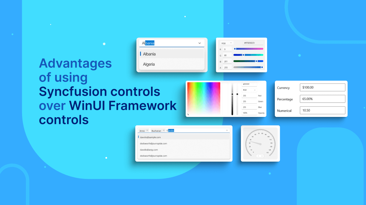
The Syncfusion WinUI toolkit includes feature-rich controls, like DataGrid, Charts, and TreeView, that embody Fluent design for building modern and seamless Windows apps.
Some of Syncfusion’s WinUI controls are also available in the WinUI framework.
| Syncfusion WinUI Controls | WinUI Framework Controls |
| NumberBox | NumberBox |
| ComboBox | ComboBox |
| AutoComplete | AutoSuggest |
| ColorPicker | ColorPicker |
| DatePicker | DatePicker |
| TimePicker | TimePicker |
| Calendar | CalendarView |
| Slider | Slider |
Let’s look at the additional features and advantages of Syncfusion’s NumberBox, ComboBox, AutoComplete, and ColorPicker controls over the corresponding WinUI framework controls, as well as the differences between them.
NumberBox
NumberBox controls are used to get numeric input from an end-user. Let’s see the differences between Syncfusion’s and the WinUI framework’s.
Input validation
Syncfusion’s NumberBox validates the input as a user types and doesn’t allow invalid input while editing. The WinUI framework’s NumberBox allows any kind of input while editing. It doesn’t validate the input as you type. Input will be validated only after editing is complete.
While editing, Syncfusion’s NumberBox accepts only numeric data. Even prefixes or suffixes, like measurement units, will not be accepted while editing. Once editing is complete, formatting (prefix/suffixes) will be automatically updated.
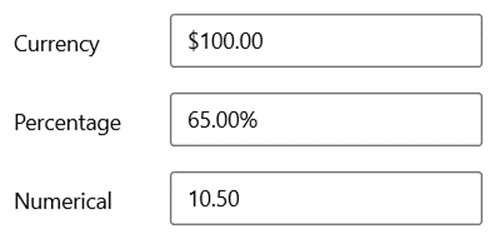
Formatting
Syncfusion’s NumberBox control supports all kinds of .NET standard number formatting. You can use this feature to present currency, percentages, measurement units, and more. You can also build a custom format. But the WinUI framework’s NumberBox supports only a limited set of formats.
Let’s see how to apply a custom format in our NumberBox control.
You can apply custom formats using the 0 and # format specifiers. With these format specifiers, you can set the minimum and the maximum numbers of fractional digits using the CustomFormat property:
- 0 (zero placeholder) replaces the zero with the corresponding digit if a digit exists there. Otherwise, zero appends to the leftmost position of the value.
- # (digit placeholder) replaces the # symbol with the corresponding digit if the digit exists. Otherwise, no digit appends the value.
Refer to the following example. The value of the CustomFormat property is ##.00##. So, it will allow a maximum of 4 fractional digits and a minimum of 2 integer digits.
stockPrice.CustomFormat = "$00.00##";
productDiscount.CustomFormat = "00.00##%";
hoursWorked.CustomFormat = "00.00##";
Hide text boxes
Both NumberBox controls support text boxes by default. We can attach a text box in the NumberBox with other controls to increase and decrease the value.
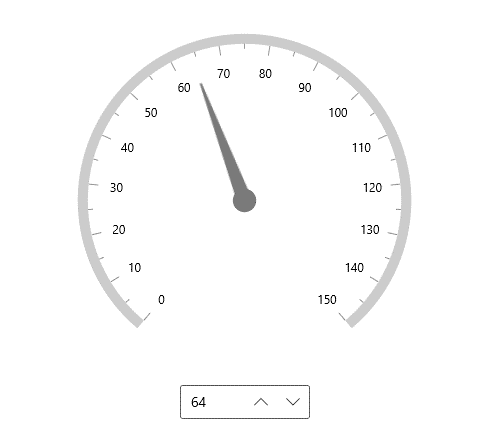
The WinUI framework’s NumberBox doesn’t allow you to hide the text box. But, Syncfusion’s does, using the TextBoxVisibility property. Refer to the following code example.
<editors:SfNumberBox
         TextBoxVisibility="Colllapsed”/>
Culture
We can manually change the culture of Syncfusion’s NumberBox control. The WinUI framework’s NumberBox control will always follow the application’s culture.
By default, our NumberBox’s culture inherits from the app’s settings. However, you can change the culture using the Culture property.
numberBox.Culture = new CultureInfo(“en-us”;
Note: For more details, refer to the NumberBox documentation.
ComboBox
ComboBox controls are primarily used to select one item from a list of options. Let’s look at the features available in Syncfusion’s ComboBox control that WinUI framework’s control doesn’t have.
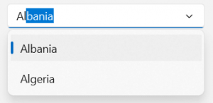
Filtering
We can easily find items in our ComboBox control using its filtering functionality. Items in the dropdown will be shortlisted based on the input given while editing.
Our ComboBox control also supports asynchronous filtering. The UI will be responsive, even when you are searching or filtering items from a huge data set.
To enable filtering in Syncfusion’s ComboBox control, set the IsFilteringEnabled and IsEditable properties to true. The dropdown will open automatically as soon as you start typing characters in.
Refer to the following code example.
<editors:SfComboBox x:Name="comboBox"
                        IsEditable="true"
                        IsFilteringEnabled="true">
</editors:SfComboBox>
Multiple selections
You can select one or more items from the dropdown list in our ComboBox control using the multiple selection feature.
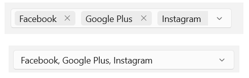 To enable the multi-select mode, set the SelectionMode property to Multiple, like in the following code example.
<editors:SfComboBox x:Name="comboBox"
                      SelectionMode="Multiple"/>
Grouping
When there are many items to choose from, you can group items so that it is easy for users to select based on the category.
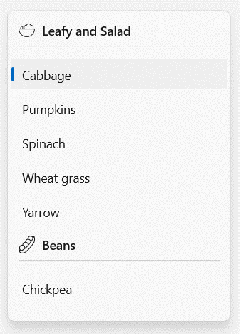 To display grouped data in Syncfusion’s ComboBox, set the ItemsSource property to a CollectionViewSource and set its IsSourceGrouped property to true. The CollectionViewSource acts as a proxy over the collection class to enable grouping support.
Refer to the following code example.
<editors:SfComboBox x:Name="comboBox">
  <editors:SfComboBox.GroupStyle>
    <GroupStyle>
      <GroupStyle.HeaderTemplate>
        <DataTemplate>
           <Grid>
             <!-- Define content as you wish -->
           </Grid>
        </DataTemplate>
      </GroupStyle.HeaderTemplate>
    </GroupStyle>
  </editors:SfComboBox.GroupStyle>
 </editors:SfComboBox >
Note: For more details, refer to the ComboBox documentation.
AutoSuggestBox and AutoComplete
Both these controls are like a text box. However, they display suggestions based on user input. Let’s see the advantages of using Syncfusion’s AutoComplete control over the AutoSuggestBox control.
Built-in searching
The AutoComplete control has built-in searching functionality. You can select an item from the suggestions and use text searching without writing any custom code. However, you can write custom code to override the default searching behavior.
The TextMemberPath and DisplayMemberPath properties of the AutoComplete control specify the property path, by which the searching must be done when custom data is bound to the ItemsSource property.
<editors:SfAutoComplete
         ItemsSource="{Binding data}"
         TextMemberPath="ID"
         DisplayMemberPath="Name"
         Width="250"
         x:Name="autoComplete"/>
Built-in filtering
The AutoComplete control also has built-in filtering functionality. The items in a list will be generated based on the user input while editing. You can write custom code for filtering if you want any further customization.
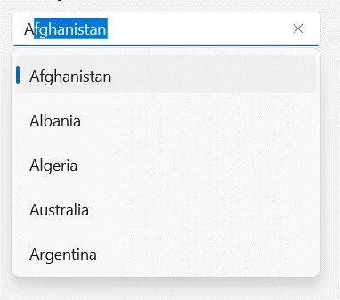
You can use the TextSearchMode property to regulate the filtering behavior when the control receives user input. The default text filtering type is StartsWith, which ignores accent and is case insensitive.
<editors:SfAutoComplete
         TextSearchMode="StartsWith"
         ItemsSource="{Binding SocialMedias}"
         DisplayMemberPath="Name"
         TextMemberPath="Name"
         Width="250"
         x:Name="autoComplete">
</editors:SfAutoComplete>
Multiple selection
You can select more than one item using the multiple selection feature.
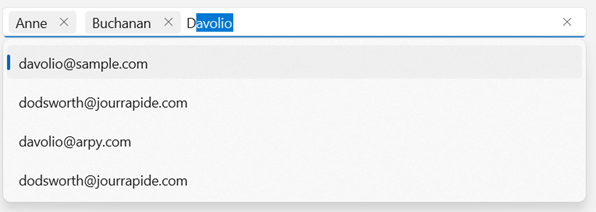
The AutoComplete control displays suggestions by matching the characters of the entered input to items in the list and enabling us to select them.
You can enable the multi-select mode by setting the SelectionMode property to Multiple. Then, the selected items will be displayed with a customizable token representation and you can remove each tokenized item by clicking its close button. The selected items can be retrieved from the SelectedItems property.
<editors:SfAutoComplete
         SelectionMode="Multiple"
         ItemsSource="{Binding SocialMedias}"
         DisplayMemberPath="Name"
         TextMemberPath="Name"
         Width="250"
         x:Name="autoComplete" />
Grouping
When there are many items to choose from, you can group items so that it is easy for users to select based on category.
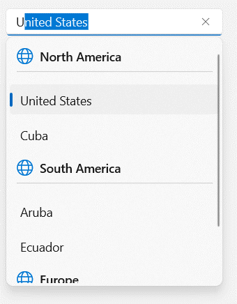
To display grouped data in the control, set the ItemsSource property to a CollectionViewSource and set its IsSourceGrouped property to true. The CollectionViewSource acts as a proxy over the collection class to enable grouping support. You can also use the Custom filter to customize the grouping.
<editors:SfAutoComplete
    PlaceholderText="Select a Vegetable"
    ItemsSource="{Binding Vegetables}">
    <editors:SfAutoComplete.GroupStyle>
      <GroupStyle>
        <GroupStyle.HeaderTemplate>
          <DataTemplate>
           <Grid>
            <!-- Define content as you wish -->
           </Grid>
          </DataTemplate>
       </GroupStyle.HeaderTemplate>
     </GroupStyle>
   </editors:SfAutoComplete.GroupStyle>

</editors:SfAutoComplete>
Note: For more details, refer to the AutoComplete documentation.
ColorPicker
ColorPicker controls are used to select a precise color. Let’s look at the features available in Syncfusion’s ColorPicker control that the WinUI framework’s control doesn’t have.
Color models
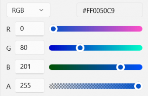
Syncfusion’s ColorPicker control supports four different color models: RGB, HSV, HSL, and CMYK. The WinUI framework’s ColorPicker control supports only RGB and HSV models.
Slider
The UI of our ColorPicker control has sliders, which give a preview of the colors corresponding to the values in the color text boxes, like in the following image.
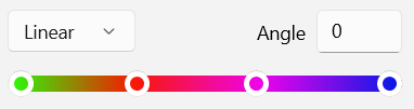
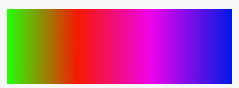
Gradient brush
Syncfusion’s ColorPicker control supports selecting a linear or radial gradient brush.
Linear gradient
A linear gradient brush enables us to adjust the gradient angle to anywhere between 0 and 365 degrees.
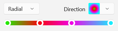
Radial gradient
A radial gradient enables us to adjust the direction of the gradient using the Direction dropdown.

Additional color controls
Aside from the ColorPicker control, Syncfusion has the following color controls, too:
- ColorPalette
- DropDown ColorPicker
- DropDown ColorPalette
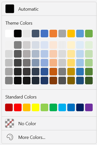
ColorPalette
The ColorPalette control allows users to select a solid color from a list of predefined standard palettes. It has 23 different palettes and a More Colors dialog to select a precise color. Also, you can quickly access recently used colors using the Recent color palette.
 DropDown controls
As the ColorPicker and ColorPalette controls take up a huge amount of space, the DropDown ColorPicker and DropDown ColorPalette were created to host these color controls inside a dropdown control.
Note: For more details, refer to the ColorPicker, DropDown ColorPicker, ColorPalette, and DropDown ColorPalette documentation.
Summary
Thanks for reading! We just saw the differences between four Syncfusion WinUI controls and WinUI Framework controls. I will compare a few more controls in the next blog. To see more, you can download and check out our demo app in the Windows Store.
For existing customers, the newest version of Essential Studio® is available for download from the license and downloads page. If you are not yet a customer, you can try our 30-day free trial to check out these new features.
For questions, you can contact us through our support forums, feedback portal, or support portal. We are always happy to assist you!
Related blogs
- Achieve Google-Like Autosuggestions with the WinUI AutoComplete Control
- What’s New in 2022 Volume 1: WPF and WinUI
- Develop an EMI Calculator WinUI Application [Webinar Show Notes]
- Multiple Selection Made Easy Using the WinUI 3 ComboBox Control
- Pick Colors Like a Boss Using Syncfusion Color Controls in WinUI
 No spam, just valuable updates.