
Blazor Succinctly®

CHAPTER 2
What is Blazor?
Blazor applications are composed of components that are constructed using C#, HTML-based Razor syntax, and CSS.
Blazor has three different hosting models: server-side Blazor, client-side Blazor (also known as Blazor WebAssembly), and Blazor Hybrid. Server-side Blazor and client-side Blazor run in all modern web browsers, including web browsers on mobile phones. Blazor Hybrid applications run natively in .NET on platforms such as Windows, macOS, and Android.
Server-side Blazor
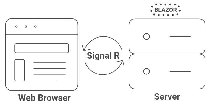
Figure 2: Server-side Blazor
Server-side Blazor renders the Razor components on the server and updates the webpage using a SignalR connection. The Blazor framework sends events from the web browser, such as button clicks and mouse movements, to the server. The Blazor runtime computes changes to the components on the server and sends a diff-based webpage back to the web browser.
The Syncfusion Help Desk sample application covered in this book will be built using server-side Blazor.
Client-side Blazor (WebAssembly)
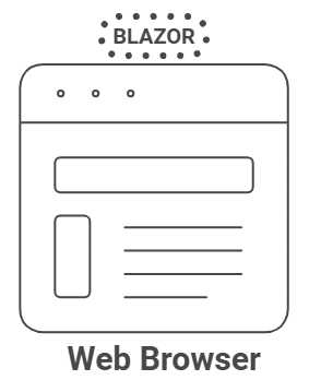
Figure 3: Client-side Blazor (WebAssembly)
Client-side Blazor is composed of the same code as server-side Blazor, but it runs entirely in the web browser using a technology known as WebAssembly.
The primary difference between applications that are created in server-side Blazor versus client-side Blazor is that the client-side Blazor applications need to make web calls to access server data, whereas the server-side Blazor applications can omit this step since all their code is executed on the server.
One way to think of Blazor is as a framework for creating single-page application webpages using one of two architectures—client-side or server-side—using Razor technology written with the C# language.
Blazor Hybrid
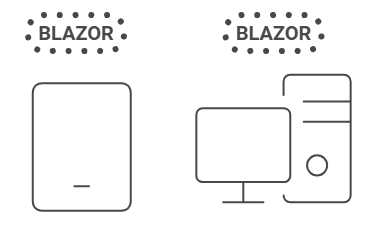
Figure 4: Blazor Hybrid
Blazor Hybrid applications, also known as .NET MAUI Blazor apps, run natively in .NET on platforms such as Windows, macOS, and Android. Unlike server-side Blazor and client-side Blazor, which run in web browsers, Blazor Hybrid leverages the native capabilities of the host platform to provide enhanced performance and functionality. This model allows developers to create applications that can run across multiple platforms using a single code base, providing a seamless and integrated experience for users.
Note: Blazor Hybrid apps can also be built with WPF and Windows Forms, but for the purposes of this book, a Blazor Hybrid app will always refer to a .NET MAUI Blazor app.
With Blazor Hybrid, developers can utilize platform-specific features and APIs, delivering a rich and responsive user experience. The Blazor framework handles the rendering of components and updates in real time, ensuring that applications remain interactive and efficient.
Render modes in Blazor
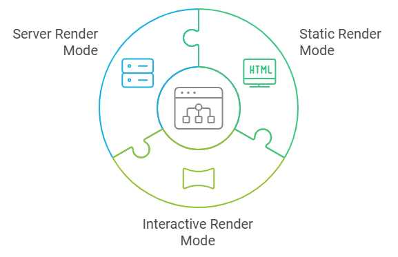
Figure 5: Blazor render modes
Blazor supports different render modes to optimize performance and user experience:
· Static render mode: Renders static HTML content without any interactivity, which is useful for content that doesn’t require dynamic updates.
· Interactive render mode: Enables full interactivity by allowing the Blazor framework to handle events and update the UI dynamically.
· Server render mode: Executes components on the server and updates the client over a SignalR connection, similar to server-side Blazor.
The following is how each render mode is used with different Blazor hosting models:
Blazor Server
· Static render mode: Not typically used; Blazor Server is designed for dynamic interactivity via SignalR.
· Interactive render mode: Fully supported, allowing full interactivity through dynamic UI updates.
· Server render mode: Default mode for Blazor Server, with components running on the server and updating the client over SignalR.
Blazor WebAssembly
· Static render mode: Usable for static content but not the primary use case; Blazor WebAssembly focuses on client-side interactivity.
· Interactive render mode: Fully supported, enabling rich client-side interactivity by running .NET code in the browser.
· Server render mode: Not applicable; Blazor WebAssembly operates entirely on the client side.
Blazor Hybrid
· Static render mode: Less relevant; Blazor Hybrid combines WebAssembly and .NET MAUI for interactive applications.
· Interactive render mode: Fully supported, allowing interactive content using both WebAssembly and .NET MAUI.
· Server render mode: Partially relevant; integrates with server-side logic for certain operations, but not like Blazor Server.
Core Blazor features
Components and routing
A Blazor application is composed of components. A component is a chunk of code consisting of the user interface and the processing logic. A Blazor component is also called a Razor component.
Blazor features routing, where you can provide navigation to your controls using the @page directive followed by a unique route in quotation marks, preceded by a slash.
The following is an example of a simple Razor component called ComponentExample.razor:
Code Listing 1: ComponentExample.razor
@page "/componentexample" <h3>This is Component Example</h3> @code { } |
Figure 6 shows what the component looks like in a running application.
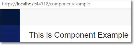
Figure 6: A simple component
A Razor component is contained in a Razor file and can be nested inside other components.
For example, we can create a component named ComponentOne.razor by using the code in Code Listing 2.
Code Listing 2: ComponentOne.razor
<h4 style="background-color:goldenrod"> This is ComponentOne </h4> @code { } |
We can alter ComponentExample.razor to contain ComponentOne.razor as in Code Listing 3.
Code Listing 3: ComponentExample.razor
@page "/componentexample" <h3>This is Component Example</h3> <ComponentOne /> @code { } |
Figure 7 shows what ComponentExample.razor now looks like when running in the application.
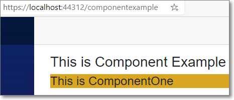
Figure 7: A nested component
Note: A component's name must start with an uppercase character.
Parameters
Razor components can pass values to other components using parameters. Component parameters are defined using the [Parameter] attribute, which must be associated with a public variable.
For example, we can create a Razor component called ParameterExampleComponent.razor that contains a parameter called Title using the following code:
Code Listing 4: ParameterExampleComponent.razor
<h4>Parameter Example Component</h4> <h5 style="color:red">@Title</h5> @code { [Parameter] public string Title { get; set; } } |
We can create another Razor component called ParameterExample.razor that consumes the ParameterExampleComponent.razor control and passes a value (Passed from Parent) to the Title parameter in the ParameterExampleComponent.razor control.
Code Listing 5: ParameterExample.razor
@page "/parameterexample" <h4>Parameter Example</h4> <ParameterExampleComponent Title="Passed from Parent" /> @code { } |
When we run the application, we get the result shown in Figure 8.
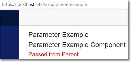
Figure 8: Parameter example
Data binding
Simple one-way binding in Blazor is achieved by declaring a parameter and referencing it using the @ symbol. An example of this is shown in Code Listing 6.
Code Listing 6: One-way binding
<b>BoundValue:</b> @BoundValue @code { private string BoundValue { get; set; } protected override void OnInitialized() { BoundValue = "Initial Value"; } } |
This displays the following when rendered:
Figure 9: One-way binding
Two-way dynamic databinding in Razor components is implemented using the @bind attribute. Code Listing 7 demonstrates this.
Code Listing 7: Two-way binding
<input @bind="BoundValue" @bind:event="oninput" /> <p>Display CurrentValue: @BoundValue</p> @code { private string BoundValue { get; set; } } |
When we run the code, it displays the value entered in the text input box as it’s typed.
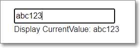
Figure 10: Two-way binding
Events
Raising events in Razor components is straightforward. Code Listing 8 demonstrates using the @onclick event handler to execute a method (IncrementCount) when the button is clicked.
Code Listing 8: A simple event
<p>Current count: @currentCount</p> <button class="btn btn-primary" @onclick="IncrementCount"> Click me </button> @code { private int currentCount = 0; private void IncrementCount() { currentCount++; } } |
When the control is rendered and the button is clicked six times, the UI looks like Figure 11.
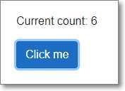
Figure 11: A simple event


- 80+ high performance Blazor components.
- Lightweight and user friendly.
- Stunning Built-in themes with customization.