Axis labels not aligned with points series
I'm having alignment issue on a line chart with datetimeonPrimaryXAxis.valueType.
The series points are not aligned to the x-axismarker and labels.
Here is the playground:http://jsplayground.syncfusion.com/q0x2j2qg
You can see that the x-axis labels are also repeated for some month, breaking the alignment
SIGN IN To post a reply.
5 Replies
DD
Dharanidharan Dharmasivam
Syncfusion Team
December 22, 2017 12:02 PM UTC
Hi Marco,
Thanks for using our products.
We have analyzed your query. Before providing solution to your scenario, we would like to let you know that, the range for the chart will be calculated based on the data points and chart size(width/height). In your case, the auto interval calculated as 15 and interval type is calculated as ‘Days’, so for each month there will be 2 labels (May 1, May 15). As you gave the primaryXAxis.labelFormat as MMM, labels generated for this case will be May, May.
If you know about the data and you want specify interval type for the axis, then kindly specify the primaryXAxis.intervalType as months as depicted below, so that the range interval will be calculated with respect to months. Find the code snippet to customize the interval type as follows.
|
JS:
$("#fcs-chart").ejChart({
primaryXAxis: {
intervalType: "Months"
}
}); |
Screenshot:

Kindly find the modified sample from below link.
For more information in interval types, kindly follow the below help documents.
kindly revert us, if you have any concerns.
Thanks,
Dharani.
MG
Marco Giorgi
December 22, 2017 01:22 PM UTC
Many thanks, intervalType has partially solved the problem.
Now the last label on the x-axis, "November", is cut.
I know that I can set rangePadding to additional to add one more point at the beginning and at the end, but I don't want to add empty points.
I'd like to have only the minimum padding to have the label correctly displayed.
DD
Dharanidharan Dharmasivam
Syncfusion Team
December 26, 2017 10:40 AM UTC
Hi Marco,
Thanks for the update.
We have analyzed your query. You requirement can be achieved using two ways.
Method 1: using edgeLabelPlacement property.
By using the edgeLabelPlacement property as shift, you can able to shift the edge labels(first & last label) of the axis, so that the labels will can be seen clearly. Find the code snippet to achieve this requirement.
|
JS:
$("#fcs-chart").ejChart({
primaryXAxis:
{
edgeLabelPlacement:"shift",
},
//...
});
|
Screenshot:

Find the modified sample from below link.
Method 2: Using plotOffset property.
By using plotOffset property, you can able to add padding for the particular axis. Here we have specified plotOffset in terms of pixels, so that the specified padding will be added at both sides of axis. Find the code snippet to achieve this requirement.
|
JS:
$("#fcs-chart").ejChart({
primaryXAxis:
{
plotOffset: 30
},
//...
});
|
Here we have specified plotOffset as 30, you can change this with respect to your requirement.
Screenshot:
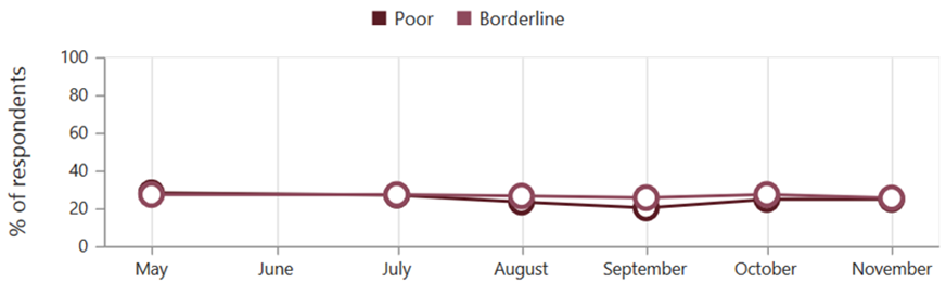
Sample for reference can be find from below link.
Kindly revert us, if you have any concerns.
Thanks,
Dharani.
MG
Marco Giorgi
December 27, 2017 10:29 AM UTC
Many thanks!
That's exactly what I need
Best,
Marco
DG
Durga Gopalakrishnan
Syncfusion Team
January 2, 2018 10:43 AM UTC
Hi Marco,
Thanks for the update. Let us know, if you need any further assistance.
Regards,
Durga
SIGN IN To post a reply.
- 5 Replies
- 3 Participants
-
MG Marco Giorgi
- Dec 21, 2017 04:21 PM UTC
- Jan 2, 2018 10:43 AM UTC

