
 Jayavigneshwaran G
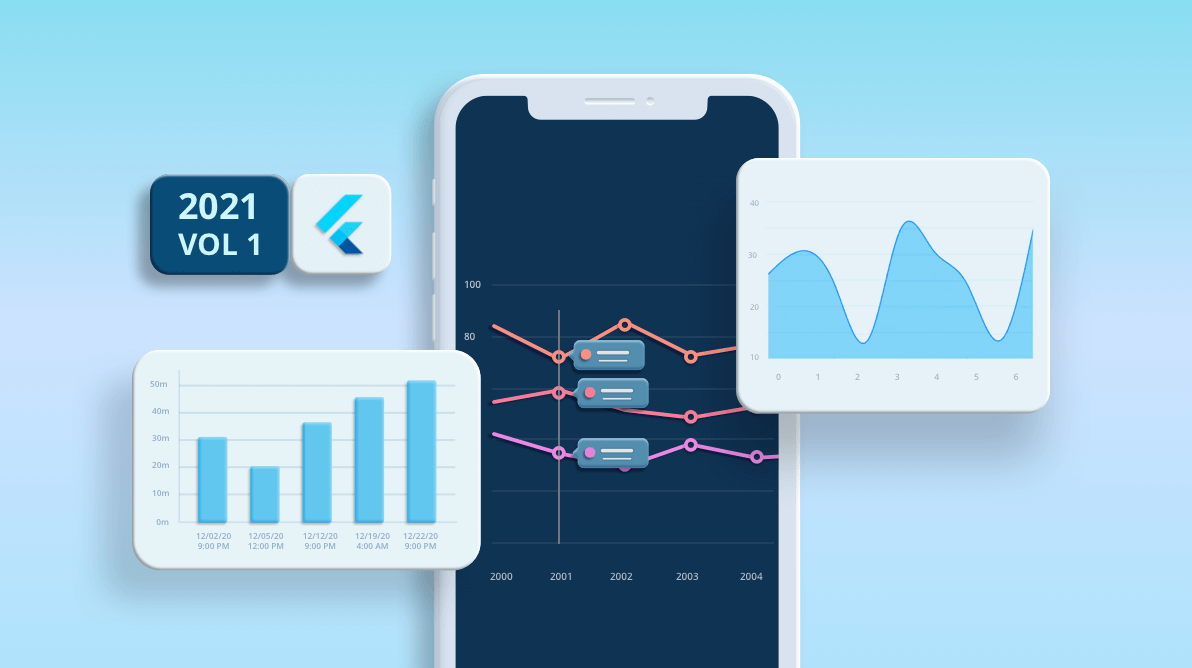
The Syncfusion Flutter Charts widget includes functionality for plotting more than 30 chart types. Each chart is easily configured with built-in support for creating stunning visual effects. In this blog post, I’ll quickly introduce the new features included in the Flutter Charts widget for the 2021 Volume 1 release.
Let’s see them!
New features in Cartesian charts
First, let’s see about the new vivid features in the Flutter Cartesian Charts (line, bar, column and area) in this release:
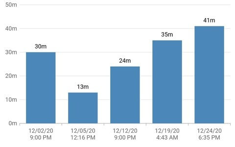
Date-time category axis
The date-time category axis is a combination of both DateTimeAxis and CategoryAxis. With this, you can easily display the date-time values with non-linear intervals.
For example, you can visualize the daily working hours of an employee in a month by excluding the holidays. This helps render the chart without any gaps in the data points.
The following example shows how to sequentially render data-time values that have unequal intervals using the Flutter Charts widget.
[Dart]
SfCartesianChart(
  primaryXAxis: DateTimeCategoryAxis(
    //...
  ),
  series: <ColumnSeries<_ChartData, DateTime>>[
    ColumnSeries<_ChartData, DateTime>(
      dataSource: <_ChartData>[
        _ChartData(DateTime(2020,12,2,21,00), 30),
        _ChartData(DateTime(2020,12,5,12,16), 13),
        _ChartData(DateTime(2020,12,12,21,00), 24)
      ],
      xValueMapper: (_ChartData data, _) => data.x,
      yValueMapper: (_ChartData data, _) => data.y,
    ),
  ],
)
Note: For more information, refer to the date-time category axis demo and documentation.
On-demand loading
This feature allows you to load a certain amount of data initially and then load more data lazily in a chart. When the horizontal scrolling reaches the start or end position in a chart, then the loadMoreIndicatorBuilder will be called. Using this, you can easily display any widget on the chart to represent loading of more data.
The following example shows how to enable infinite scrolling and display a circular progress indicator while loading more data.
[Dart]
@override
Widget build(BuildContext context) {
  return Container(
    child: SfCartesianChart(
      loadMoreIndicatorBuilder:
        (BuildContext context, ChartSwipeDirection direction) => buildLoadMoreView(context, direction),
      series: <AreaSeries<_ChartData, num>>[
        AreaSeries<_ChartData, num>(
          dataSource: chartData,
          xValueMapper: (_ChartData data, _) => data.x,
          yValueMapper: (_ChartData data, _) => data.y,
        ),
      ],
    )
  );
}

Widget buildLoadMoreView(BuildContext context, ChartSwipeDirection direction) {
  if (direction == ChartSwipeDirection.end) {
    return FutureBuilder<String>(
      future: _updateData(), /// Adding additional data using updateDataSource method
      builder: (BuildContext futureContext, AsyncSnapshot<String> snapShot) {
        return snapShot.connectionState != ConnectionState.done ?
         const CircularProgressIndicator(): SizedBox.fromSize(size: Size.zero);
      },
    );
  } else {
    return SizedBox.fromSize(size: Size.zero);
  }
}
Note: For more information, refer to the infinite scrolling demo and documentation.
Auto-scrolling
This feature helps you display a fixed number of data points in the charts and view the remaining data points by scrolling using the autoScrollingDelta property in the chart axis. It always shows the recently added data points. Scrolling will be reset to the start or end of the range based on the autoScrollingMode property’s value, whenever a new point is added dynamically. Also, in the DateTimeAxis, you can set an autoscrolling delta interval type by using the AutoScrollingDeltaType property, like in the following code example.
[Dart]
SfCartesianChart(
  primaryXAxis: DateTimeAxis(
    dateFormat: DateFormat.Hms(),
    intervalType: DateTimeIntervalType.seconds,
    autoScrollingDelta: 5,
    autoScrollingDeltaType: DateTimeIntervalType.seconds
  )
)
Note: For more information, refer to the autoscrolling demo and documentation.
Marker in trackball tooltip
Like a series tooltip, markers in a trackball tooltip can be displayed using the canShowMarker property. You can render the Markers with the series color and place them near the value in the trackball tooltip. This helps us to easily convey which value belongs to which series.
Refer to the following code example.
[Dart]
late TrackballBehavior _trackballBehavior;

@override
void initState() {
  _trackballBehavior = TrackballBehavior(
    enable: true,
    tooltipSettings: InteractiveTooltip(
      canShowMarker: true
    )
  );
  super.initState();
}

@override
Widget build(BuildContext context) {
  return SfCartesianChart(
    //...
    trackballBehavior: _trackballBehavior,
  );
}
Note: For more information, refer to the trackball tooltip with marker demo and documentation.
Swiping gesture callback
On swiping over the chart plot area, the onPlotAreaSwipe callback will be called. This provides options to get the direction of the swipe. If the chart is swiped from left to right, the direction is ChartSwipeDirection.start. If the swipe happens from right to left, the direction is ChartSwipeDirection.end.
The following example demonstrates the swiping functionality achieved using the onPlotAreaSwipe callback. In this callback, you can change the visibleMinimum and visibleMaximum values to display the next set of data in the chart.
[Dart]
SfCartesianChart(
  onPlotAreaSwipe: (direction) => performSwipe(direction),
)


void performSwipe(ChartSwipeDirection direction) {
//...
}
Note: For more information, refer to the pagination demo and documentation.
New features in Circular charts
Lets’ see about the new features in the Flutter Circular chart types (pie, doughnut, and radial bar) in the 2021 Volume 1 release:
Shader fill
You can fill the circular charts with attracting gradients or images by considering all the data points as a single segment. The onCreateShader callback will be called while rendering the circular chart, and you can return shaders in it. You can also fill the data points of pie, doughnut and radial bar charts with any type of gradient (such as linear, sweep and radial) or imageShader.
[Dart]
List<Color> colors = const <Color>[
  Color.fromRGBO(96, 87, 234, 1),
  Color.fromRGBO(59, 141, 236, 1),
  Color.fromRGBO(112, 198, 129, 1),
  Color.fromRGBO(237, 241, 81, 1)
];

List<double> stops = <double>[0.25, 0.5, 0.75, 1];

SfCircularChart(
  onCreateShader: (ChartShaderDetails chartShaderDetails) {
    return Gradient.linear(chartShaderDetails.outerRect.topRight, chartShaderDetails.outerRect.centerLeft, colors, stops);
  },
)
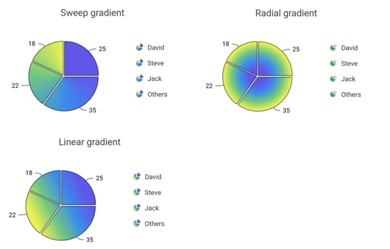
Note: For more information, refer to the gradient fill demo and documentation.
Mapping shaders for data points
You can also fill different shader for each individual data point in a Chart. The pointShaderMapper property allows you to map the shader field from the chart data source. You can map different gradient types and imageShader for individual data points using this mapper callback.
The following example shows how to map different image shaders to individual data points in the Flutter pie chart.
[Dart]
SfCircularChart(
  series: <PieSeries<_ChartShaderData, String>>[
    PieSeries<_ChartShaderData, String>(
      dataSource: <_ChartShaderData>[
        _ChartShaderData(
          'Apple',
          25,
          // actualImage is of type ui.Image and it is a physical image from assets folder
          ui.ImageShader(actualImage!, TileMode.repeated, TileMode.repeated, Matrix4.identity().scaled(0.5).storage),
        ),
        // ...
      ],
      pointShaderMapper: (_ChartShaderData data, _, Color color, Rect rect) => data.shader,
    ),
  ],
)

class _ChartShaderData {
  _ChartShaderData(this.x, this.y, this.text, this.shader);
  final String x;
  final num y;
  final Shader shader;
}
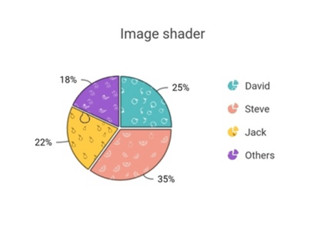
Note: For more information, refer to the image fill demo and Shader mapping for data points documentation.
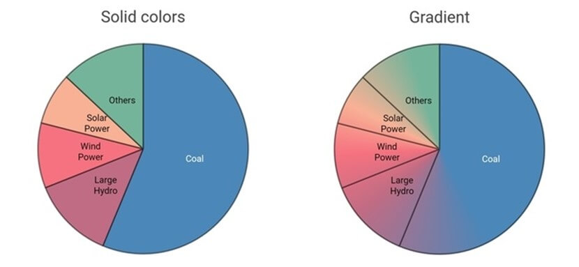
Point render mode
The data points in the Flutter pie and doughnut charts can be filled either with solid colors or with sweep gradients by setting the mode value for the pointRenderMode property.
- If PointRenderMode.segment is specified, the data points will be filled with solid colors from the palette or with the colors mentioned in the pointColorMapper property.
- If PointRenderMode.gradient is specified, then a sweep gradient will be formed with solid colors, and it will fill the data points.
[Dart]
SfCircularChart(
  series: <CircularSeries<_SalesData, String>>[
    PieSeries<_SalesData, String>(
      dataSource: chartData,
      xValueMapper: (_SalesData sales, _) => sales.x,
      yValueMapper: (_SalesData sales, _) => sales.y,
      pointRenderMode: PointRenderMode.gradient,
    )
  ]
)
Note: For more information, refer to the pointer render mode demo and documentation.
Other noteworthy updates
Additional enhancement
The Flutter Charts now provide support to change the trackball or crosshair position even after a touch interaction leaves the chart area.
Flutter 2.0
- The Flutter charts package is now Flutter 2.0 compatible and supports null-safety.
- All the widgets in Flutter Charts packages are compatible with Windows, macOS, and Linux .
Breaking changes
- The onAxisLabelRender callback has been deprecated; instead, you can use the axisLabelFormatter callback to customize the axis labels.
- Hereafter initialize the chart behaviors in the initState method instead of the build method.
- Now, the trackball tooltip will display the marker by default.
Conclusion
I hope you now have a clear idea about the new, useful features available in the Syncfusion Flutter Charts widget for the 2021 Volume 1 release. For more details about the bug fixes and other enhancements, check out our release notes and What’s New pages.
Browse thorugh our documentation to learn more about our Flutter widgets. You can also see Syncfusion’s Flutter app with many examples in this GitHub repository. Don’t miss our demo app for the web, or in Google Play, App Store, Microsoft Store and in Snapcraft.
If you aren’t a customer yet, you can try our 30-day free trial to check out these features.
Also, if you wish to send us feedback or would like to submit any questions, please feel free to post them in the comments section of this blog post. You can also contact us through our support forum, feedback portal, or Direct-Trac support system. We are always happy to assist you!


 No spam, just valuable updates.