Overview
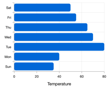
The Flutter Bar Chart and Graph is used to compare the frequency, count, total, or average of data in different categories. They are ideal for showing variations in the value of an item over time.
Key features

Overlapping bars
Compare two different types of relational values using the Flutter Bar Chart that overlap one another.

Gradient
Apply gradient colors to differentiate data series, improving the readability and appearance of the Flutter chart.
Corner radius
Modernize the UI by applying rounded corners to the Flutter Bar Chart.

Multiple axes
Use multiple axes to plot different data sets that significantly vary from one another.
Code example
Easily get started with the Flutter Bar Chart using a few simple lines of DART code example as demonstrated below,
import 'package:flutter/material.dart';
import 'package:syncfusion_flutter_charts/charts.dart';

void main() {
  return runApp(_ChartApp());
}

class _ChartApp extends StatelessWidget {
  @override
  Widget build(BuildContext context) {
    return MaterialApp(
      theme: ThemeData(primarySwatch: Colors.blue),
      home: _MyHomePage(),
    );
  }
}

class _MyHomePage extends StatefulWidget {
  // ignore: prefer_const_constructors_in_immutables
  _MyHomePage({Key? key}) : super(key: key);

  @override
  _MyHomePageState createState() => _MyHomePageState();
}

class _MyHomePageState extends State<_MyHomePage> {
  late List<_ChartData> data;
  late TooltipBehavior _tooltip;

  @override
  void initState() {
    data = [
      _ChartData('CHN', 12),
      _ChartData('GER', 15),
      _ChartData('RUS', 30),
      _ChartData('BRZ', 6.4),
      _ChartData('IND', 14)
    ];
    _tooltip = TooltipBehavior(enable: true);
    super.initState();
  }

  @override
  Widget build(BuildContext context) {
    return Scaffold(
        appBar: AppBar(
          title: const Text('Syncfusion Flutter chart'),
        ),
        body: SfCartesianChart(
            primaryXAxis: CategoryAxis(),
            primaryYAxis: NumericAxis(minimum: 0, maximum: 40, interval: 10),
            tooltipBehavior: _tooltip,
            series: <CartesianSeries<_ChartData, String>>[
              BarSeries<_ChartData, String>(
                  dataSource: data,
                  xValueMapper: (_ChartData data, _) => data.x,
                  yValueMapper: (_ChartData data, _) => data.y,
                  name: 'Gold',
                  color: Color.fromRGBO(8, 142, 255, 1))
            ]));
  }
}

class _ChartData {
  _ChartData(this.x, this.y);

  final String x;
  final double y;
}