
 Buvana Sathasivam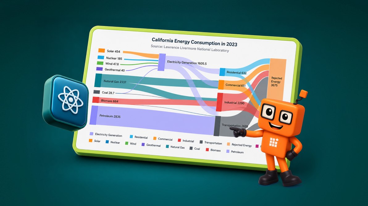
TL;DR: Complex data flows are often difficult to understand when hidden in spreadsheets or traditional charts. See how a React Sankey Diagram transforms California’s energy data into an interactive visualization, helping you uncover flow patterns, energy losses, and key insights with validation, tooltips, responsive layouts, and export support.
Imagine you’re reviewing an energy report and trying to answer a simple question:
Where does the energy actually go?
You may have the numbers, but tables and traditional charts often make it difficult to follow how energy moves through the system. A bar chart can compare values, but it can’t easily show how those values split, combine, or eventually reach their destination.
This is exactly the type of problem that a Sankey Diagram solves.
A Sankey Diagram visualizes movement between connected stages. The width of each connection represents the quantity being transferred, allowing viewers to immediately identify major contributors, distribution patterns, and losses throughout a process.
In this tutorial, we’ll use a simplified California energy dataset to build a React Sankey Diagram with Syncfusion. While the data is intentionally simplified, the implementation approach is the same one you can use in production dashboards, reporting systems, analytics portals, or operational monitoring applications.
By the end, you’ll have a reusable React component that makes complex flow-based data significantly easier to understand.
What you’ll build
We’ll create an interactive Sankey Diagram that shows:
- Energy originating from sources such as Solar, Wind, Nuclear, Geothermal, Biomass, Coal, Petroleum, and Natural Gas.
- Energy flowing into Electricity Generation.
- Distribution across Residential, Commercial, Industrial, and Transportation sectors.
- Final allocation into Energy Services and Rejected Energy.
- Source-colored links for easier visual tracking.
- Hover tooltips and visible node labels.
- A responsive layout that adapts to different screen sizes.
- Built-in printing and PNG export options.
- Data validation that detects:
- Duplicate node IDs,
- Broken source or destination references, and
- Invalid flow values.
The final result isn’t just a demo visualization; it’s a foundation you can extend for reporting, operations monitoring, and analytics applications.
When a Sankey Diagram makes sense
A Sankey Diagram works best when the primary goal is understanding how something moves through a process.
Instead of focusing on comparisons or trends, it helps answer questions such as:
- Where do the largest inputs come from?
- How is a resource distributed?
- Where do losses or bottlenecks occur?
- Which paths carry the most volume?
For scenarios involving movement, allocation, or transformation of data, resources, or energy, a Sankey Diagram often communicates relationships more effectively than traditional charts.
Tip: If you’re comparing categories, use a bar chart. If you’re showing changes over time, use a line chart. Sankey Diagrams are most useful when the flow itself is the story.
Why use Syncfusion for a React Sankey Diagram?
You can build a Sankey Diagram from scratch using D3 or SVG, which gives you complete control over the visualization. However, that flexibility comes with the responsibility of maintaining the rendering logic, interactions, and responsive behavior yourself.
Syncfusion React Sankey Diagram offers a component-based alternative that helps you go from structured data to a production-ready visualization much faster. It includes built-in support for labels, legends, tooltips, responsiveness, printing, and exporting, reducing the amount of code you need to build and maintain.
Choose Syncfusion when:
- You want to quickly transform data into a reusable dashboard component.
- Your application already uses Syncfusion React components and benefits from a consistent look and feel across the UI.
- You prefer a ready-made solution that includes common visualization features out of the box.
A custom D3 or SVG implementation may be a better fit only when your application requires a highly specialized layout or unique interactions that are not available through the component API.
Prerequisites
Before you begin, make sure you have Node.js installed, an existing React project, and a basic understanding of React and TypeScript.
Visualizing California’s energy flow pattern using a React Sankey Diagram
Now that the project setup is ready, let’s start building the diagram itself.
We’ll use a simplified California energy dataset to keep the example focused on the implementation rather than the data. Along the way, we’ll define the data structure, add a validation layer to catch common mistakes, and then render the complete Sankey Diagram with labels, tooltips, legends, printing, and export capabilities.
Step 1: Install the Syncfusion package
To get started, install the Syncfusion React Charts package:
npm install @syncfusion/ej2-react-charts --saveThis package includes the React Sankey Diagram component along with supporting services for features such as tooltips, legends, and exporting.
Step 2: Understand the Sankey data model
Before moving into the chart configuration, it’s helpful to understand how Sankey data is organized.
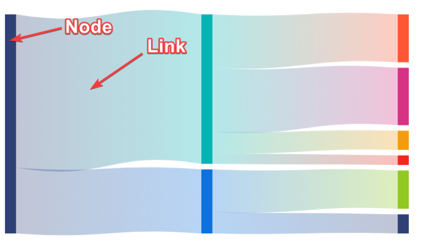
Every Sankey Diagram is built from two core pieces:
- Nodes represent the entities in your system.
- Links represent the amount moving between those entities.
In our example, energy sources such as Solar and Natural Gas are nodes. The energy flowing between those sources and other stages in the system is represented by links.
Once you understand these two building blocks, creating and troubleshooting Sankey Diagrams becomes much easier.
Each node must have a unique id (string). You can also use offset (number) to adjust its vertical position and color (string) to customize its appearance.
Each link connects two nodes and requires a sourceId (string), targetId (string), and value (number). The source and target IDs must match existing node IDs, while the value determines the thickness of the link.
Refer to the following image for a better understanding.
Important: Every sourceId and targetId must match a node id exactly. The strings are case-sensitive, so “Natural Gas” and “natural gas” are treated as two different node references.
Step 3: Prepare the California energy-flow dataset
For this tutorial, we’ll use a simplified version of a California energy-flow model.
The dataset is intentionally structured to mirror how energy moves through a real system. Energy starts at primary sources such as Solar, Wind, Petroleum, and Natural Gas. Some of that energy passes through Electricity Generation before reaching end-use sectors such as Residential, Commercial, Industrial, and Transportation. Finally, the flow is divided into useful output and energy losses.
This structure provides sufficient complexity to demonstrate how Sankey Diagrams handle branching paths, aggregation points, and losses without introducing unnecessary noise in the example.
Dataset note: The values used here have been simplified for demonstration purposes. Lawrence Livermore National Laboratory (LLNL) publishes detailed state-level energy-flow charts. If you’re building a production solution, replace these values with official data and reference the appropriate chart year.
Node data
type EnergyNode = {
  id: string;
  offset?: number;
  color?: string;
};

type EnergyLink = {
  sourceId: string;
  targetId: string;
  value: number;
};

const nodes: EnergyNode[] = [
  { id: 'Solar', offset: 20, color: '#FDB462' },
  { id: 'Nuclear', offset: 40, color: '#80B1D3' },
  { id: 'Wind', offset: 50, color: '#BEBADA' },
  { id: 'Geothermal', offset: 60, color: '#8DD3C7' },
  { id: 'Natural Gas', offset: 80, color: '#FB8072' },
  { id: 'Coal', offset: 100, color: '#8C8C8C' },
  { id: 'Biomass', offset: 110, color: '#B3DE69' },
  { id: 'Petroleum', offset: -10, color: '#BC80BD' },
  { id: 'Electricity Generation', offset: -120, color: '#FFD92F' },
  { id: 'Residential', offset: 38, color: '#A6CEE3' },
  { id: 'Commercial', offset: 36, color: '#1F78B4' },
  { id: 'Industrial', offset: 34, color: '#33A02C' },
  { id: 'Transportation', offset: 32, color: '#E31A1C' },
  { id: 'Rejected Energy', offset: -40, color: '#BDBDBD' },
  { id: 'Energy Services', color: '#4DAF4A' }
];
Link data
const links: EnergyLink[] = [
  { sourceId: 'Solar', targetId: 'Electricity Generation', value: 454 },
  { sourceId: 'Nuclear', targetId: 'Electricity Generation', value: 185 },
  { sourceId: 'Wind', targetId: 'Electricity Generation', value: 47.8 },
  { sourceId: 'Geothermal', targetId: 'Electricity Generation', value: 40 },
  { sourceId: 'Natural Gas', targetId: 'Electricity Generation', value: 800 },
  { sourceId: 'Coal', targetId: 'Electricity Generation', value: 28.7 },
  { sourceId: 'Biomass', targetId: 'Electricity Generation', value: 50 },
  { sourceId: 'Electricity Generation', targetId: 'Residential', value: 182 },
  { sourceId: 'Electricity Generation', targetId: 'Commercial', value: 351 },
  { sourceId: 'Electricity Generation', targetId: 'Industrial', value: 641 },
  { sourceId: 'Electricity Generation', targetId: 'Transportation', value: 20 },
  { sourceId: 'Electricity Generation', targetId: 'Rejected Energy', value: 411.5 },
  { sourceId: 'Natural Gas', targetId: 'Residential', value: 400 },
  { sourceId: 'Natural Gas', targetId: 'Commercial', value: 300 },
  { sourceId: 'Natural Gas', targetId: 'Industrial', value: 786 },
  { sourceId: 'Natural Gas', targetId: 'Transportation', value: 51 },
  { sourceId: 'Biomass', targetId: 'Industrial', value: 563 },
  { sourceId: 'Biomass', targetId: 'Transportation', value: 71 },
  { sourceId: 'Petroleum', targetId: 'Residential', value: 50 },
  { sourceId: 'Petroleum', targetId: 'Industrial', value: 300 },
  { sourceId: 'Petroleum', targetId: 'Transportation', value: 2486 },
  { sourceId: 'Residential', targetId: 'Rejected Energy', value: 432 },
  { sourceId: 'Residential', targetId: 'Energy Services', value: 200 },
  { sourceId: 'Commercial', targetId: 'Rejected Energy', value: 351 },
  { sourceId: 'Commercial', targetId: 'Energy Services', value: 300 },
  { sourceId: 'Industrial', targetId: 'Rejected Energy', value: 1535 },
  { sourceId: 'Industrial', targetId: 'Energy Services', value: 755 },
  { sourceId: 'Transportation', targetId: 'Rejected Energy', value: 1991 },
  { sourceId: 'Transportation', targetId: 'Energy Services', value: 637 }
];
Step 4: Validate the data before rendering
If you’ve ever spent time debugging a chart that refuses to render, you already know that data issues are often the culprit.
A single typo in a node ID, a missing reference, or an invalid value can silently break the visualization. These problems are easy to introduce, especially when chart data comes from APIs, spreadsheets, or transformed datasets.
To avoid that frustration, let’s add a small validation step before rendering. The following helper function checks for:
- Duplicate node IDs,
- Invalid source or target references,
- Missing, zero, or negative values.
Refer to the following code example.
function validateSankeyData(nodes: EnergyNode[], links: EnergyLink[]) {
  const nodeIds = new Set(nodes.map((node) => node.id));

  const duplicateIds = nodes
    .map((node) => node.id)
    .filter((id, index, array) => array.indexOf(id) !== index);

  if (duplicateIds.length > 0) {
    return `Duplicate node IDs found: ${duplicateIds.join(', ')}`;
  }

  const invalidLink = links.find(
    (link) =>
        !nodeIds.has(link.sourceId) ||
        !nodeIds.has(link.targetId) ||
        typeof link.value !== 'number' ||
        link.value <= 0
  );

  return invalidLink ? `Invalid Sankey link found: ${JSON.stringify(invalidLink)}` : null;
}
However, it does not replace full data-quality checks, such as:
- Balance validation,
- Circular-flow detection, or
- Source-data auditing.
But it does catch the kinds of mistakes that commonly lead to broken visualizations and unnecessary debugging sessions.
Step 5: Render the React Sankey Diagram
With the dataset prepared and validated, we can finally render the diagram.
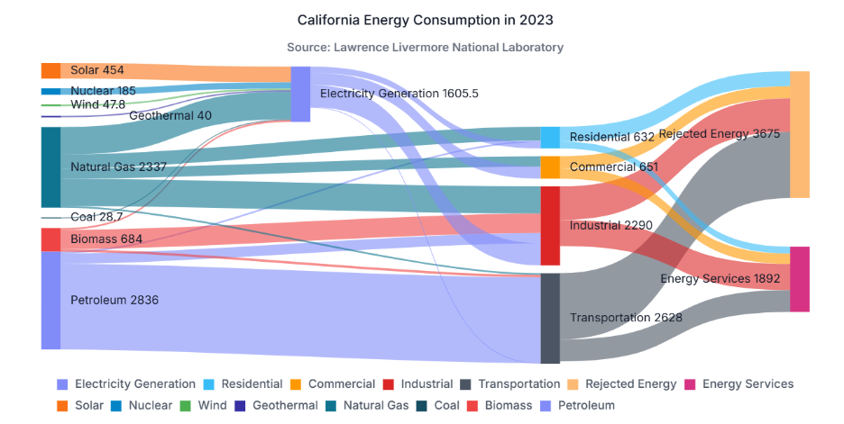
The component below brings everything together. It validates the dataset, renders the Sankey Diagram, enables tooltips and legends, and adds export and print actions, allowing the chart to be used in both interactive dashboards and reporting scenarios.
import React, { useRef } from 'react';
import {
    SankeyComponent,
    SankeyNodesCollectionDirective,
    SankeyNodeDirective,
    SankeyLinksCollectionDirective,
    SankeyLinkDirective,
    Inject,
    SankeyTooltip,
    SankeyLegend,
    SankeyExport
} from '@syncfusion/ej2-react-charts';

// Include the EnergyNode, EnergyLink, validateSankeyData, nodes, and links
// declarations from the earlier sections in the same file, or import them
// from a separate data module.

export default function CaliforniaEnergySankey() {
    const sankeyRef = useRef<SankeyComponent | null>(null);
    const validationError = validateSankeyData(nodes, links);

    const exportAsPng = () => {
        sankeyRef.current?.export?.('PNG', 'california-energy-sankey');
    };

    const printChart = () => {
        sankeyRef.current?.print?.();
    };

    if (validationError) {
        return <div role="alert">{validationError}</div>;
    }

    return (
        <section
            role="region"
            aria-label="California energy flow Sankey chart"
            aria-describedby="california-energy-sankey-description">
            <p id="california-energy-sankey-description">
                This Sankey chart shows energy moving from primary sources through
                electricity generation and end-use sectors into energy services and
                rejected energy. The values are simplified for this tutorial.
            </p>

            <div style={{ marginBottom: '12px' }}>
                <button type="button" onClick={exportAsPng}>
                    Export as PNG
                </button>
                <button
                    type="button"
                    onClick={printChart}
                    style={{ marginLeft: '8px' }}
                >
                    Print
                </button>
            </div>

            <SankeyComponent
                ref={sankeyRef}
                id="california-energy-sankey"
                width="100%"
                height="560px"
                title="California Energy Flow Example"
                subTitle="Tutorial dataset adapted from LLNL energy-flow concepts"
                linkStyle={{
                    opacity: 0.65,
                    curvature: 0.55,
                    colorType: 'Source'
                }}
                labelSettings={{ visible: true, fontSize: 12 }}
                tooltip={{ enable: true }}
                legendSettings={{
                    visible: true,
                    position: 'Bottom',
                    itemPadding: 8
                }}
            >
                <Inject
                    services={[
                        SankeyTooltip,
                        SankeyLegend,
                        SankeyExport
                    ]}/>

                <SankeyNodesCollectionDirective>
                    {nodes.map((node) => (
                        <SankeyNodeDirective
                            key={node.id}
                            id={node.id}
                            offset={node.offset}
                            color={node.color}/>
                    ))}
                </SankeyNodesCollectionDirective>

                <SankeyLinksCollectionDirective>
                    {links.map((link, index) => (
                        <SankeyLinkDirective
                            key={`${link.sourceId}-${link.targetId}-${index}`}
                            sourceId={link.sourceId}
                            targetId={link.targetId}
                            value={link.value}/>
                    ))}
                </SankeyLinksCollectionDirective>
            </SankeyComponent>
        </section>
    );
}
Refer to the following image.
Step 6: Customize the Sankey Diagram for better readability
At this point, the chart is functional, but a few small adjustments can make it much easier to read, especially as the dataset grows.
For production use, consider the following improvements:
- Reduce node overlaps by using the offset property to adjust the vertical position of closely placed nodes.
{ id: 'Residential', offset: 38 }
{ id: 'Commercial', offset: 36 }
{ id: 'Industrial', offset: 34 }
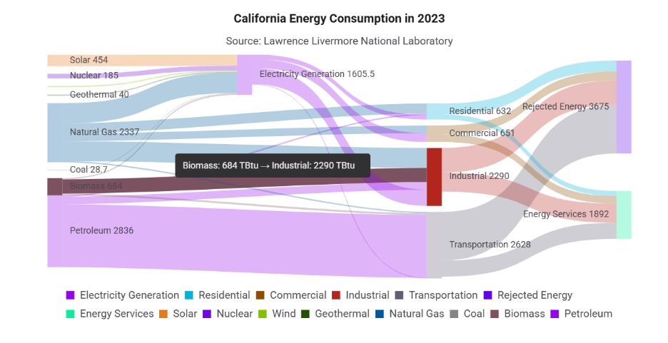
- Apply source-based link colors by setting colorType to Source. This helps users follow flows more easily. The opacity and curvature properties control link transparency and shape.
linkStyle={{ opacity: 0.65, curvature: 0.55, colorType: 'Source' }}
- Keep labels visible so values and flow paths remain easy to understand. Enable tooltips to display additional flow details during interactions and add a legend below the diagram to help users identify categories and node colors.
labelSettings={{ visible: true, fontSize: 12 }}
tooltip={{ enable: true }}
legendSettings={{ visible: true, position: 'Bottom', itemPadding: 8 }}
See the following image for more information.
In addition to improving readability, you can make the chart easier to share and analyze by enabling printing and export capabilities. Use the Sankey component reference to export the diagram as a PNG image or open the browser’s print interface. Ensure that SankeyExport is injected into the component.
<div style={{ width: '100%', height: '560px' }}>
  <CaliforniaEnergySankey />
</div>

const exportAsPng = () => {
  sankeyRef.current?.export?.('PNG', 'california-energy-sankey');
};

const printChart = () => {
  sankeyRef.current?.print?.();
};
Note: JPEG, SVG, and PDF export formats may also be available. Verify support in the specific Syncfusion package version used by your application before enabling it in production.
Step 7: Load data from JSON or an API
The sample data in this tutorial is hardcoded for simplicity, but most production applications load chart data from a service or API.
A good practice is to keep the visualization component separate from the data retrieval logic. Fetch the data, validate it, and render the chart only after it’s ready.
type EnergyFlowResponse = {
  nodes: EnergyNode[];
  links: EnergyLink[];
};

async function loadEnergyFlowData(): Promise<EnergyFlowResponse> {
  const response = await fetch('/data/california-energy-flow.json');

  if (!response.ok) {
    throw new Error('Unable to load energy-flow data.');
  }

  return response.json();
}
If you’re working with remote data, consider adding:
- A loading state while data is being fetched.
- An error state when requests fail.
- Validation before rendering.
- Memoization for larger datasets to avoid unnecessary recalculation during re-renders.
These small additions can make a noticeable difference in performance and maintainability as the application evolves.
Common issues and fixes
Most Sankey chart issues are typically related to data quality, component configuration, or sizing.
- Missing links or tooltips: Verify that node references match exactly and that all required services are injected.
- Overlapping or clipped content: Increase the chart or container height, and adjust node offsets, label size, padding, or overflow styles.
- Inconsistent totals: Validate input and output values at each stage of the flow to ensure data accuracy.
- Blank chart in hidden tabs: Refresh the chart after the tab becomes visible.
- Print or export not working: Confirm that the component reference is available before calling print or export methods.
Once your chart is working as expected, it’s important to ensure that it’s accessible to all users.
Accessibility considerations
- Keep labels visible whenever possible to help users understand the flow of data.
- Avoid relying solely on color to communicate meaning, as some users may have difficulty distinguishing colors.
- Provide a tabular view of the data alongside the chart to improve accessibility and make the information easier to consume.
Other use cases
Beyond energy data, Sankey Diagrams are useful whenever you need to explain how something moves through a system.
For example:
- Tracking users through a signup funnel.
- Visualizing API request routing across microservices.
- Understanding cloud cost allocation across teams.
- Mapping warehouse inventory movement.
- Showing how support tickets flow between departments.
- Analyzing ETL pipelines and data movement.
A common real-world example is cloud cost reporting. Teams often know their total spending but not how it is distributed across services, environments, and business units. A Sankey Diagram makes those relationships obvious within seconds.
Frequently Asked Questions
How do I debug missing links in a React Sankey Diagram?
Ensure that every sourceId and targetId matches a valid node id. Because node references are case-sensitive, even minor spelling differences can prevent links from rendering.
How do I export a React Sankey Diagram?
Create a component ref and call the export() method. Also, ensure that the SankeyExport service is injected into the React Sankey Diagram.
Can I use API data in a React Sankey Diagram?
Yes. Load the API data, map it to nodes and links, validate it, and then render the React Sankey Diagram after the data is ready.
Is the California energy-flow data used in this React Sankey Diagram official?
No. This React Sankey Diagram uses a simplified sample dataset. For production use, replace it with official data and cite the original source and publication year.

Turning complex data flows into visualizations people can actually understand
Building a Sankey Diagram isn’t just about creating a more attractive chart. It’s about helping users understand how resources, transactions, requests, or energy move through a system.
In this example, we used California energy data to visualize how energy is generated, distributed, and ultimately consumed or lost. The same implementation pattern works for business analytics, cloud-cost reporting, API traffic analysis, logistics tracking, and many other scenarios where understanding movement is more important than comparing static values.
If you’re already using Syncfusion in your React applications, the Sankey Diagram component offers a practical way to add interactive flow visualizations without having to maintain custom rendering logic. You can explore additional capabilities in the latest version of Essential Studio® through the License and Downloads page or try the components with a 30-day free trial.
For any questions or assistance, feel free to reach out to us through our support forum, support portal, or feedback portal. We’re always here to help. Happy coding!



 No spam, just valuable updates.