Try Our Live Demo
Personalize every editing experience
Tailor the editor to match your application, workflows, and brand without building a custom editing experience from scratch.
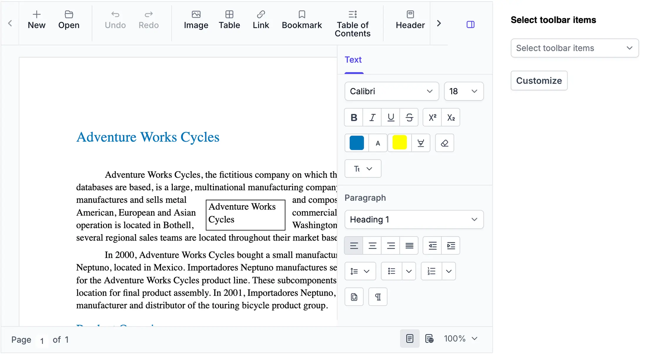
Personalized ribbon interface
Show, hide, enable, or disable commands as needed. Customize ribbon tabs, groups, and items to keep users focused on the tools that matter most.
Custom context actions
Add custom commands to the context menu and control when they appear. Give users quick access to application-specific actions without leaving the document.
Match your brand
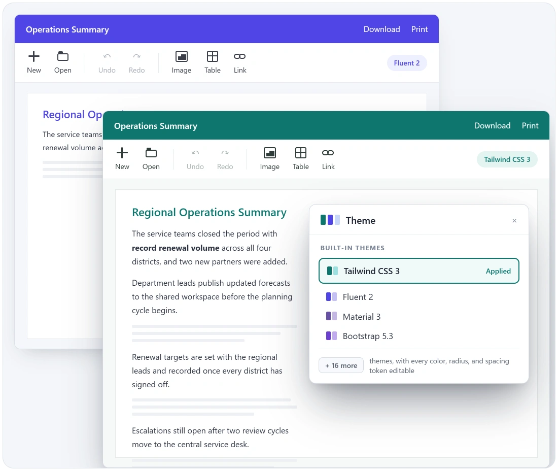
Choose from built-in themes and customize styles to create a document editing experience that aligns with your application’s design.
Customize ribbon tabs with the DOCX Editor SDK
The DOCX Editor SDK provides complete control over the ribbon interface. Hide unused tabs, reorder groups to match common workflows, and add custom buttons that trigger application-specific logic, all without modifying internal editor code.
- Show, hide, or reorder built-in ribbon tabs (Home, Insert, Layout, etc.) using dedicated tab control options
- Add, remove, enable, or disable groups and individual items within any ribbon tab at initialization or runtime
- Replace or extend the File menu — add backstage panels, remove unused items, or wire up fully custom file operations
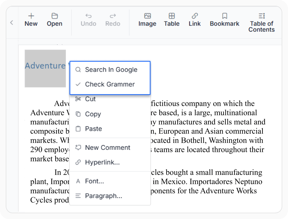
Add custom actions to the context menu
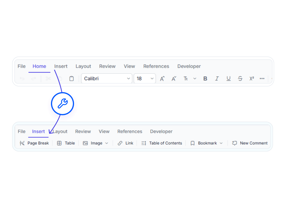
The DOCX Editor SDK supports fully customizable context menus. Add application-specific items with icons, build nested sub-menus, and control visibility based on the current selection — surfacing relevant workflows exactly where users are editing.
- Add custom menu items with icons and handle selection events to trigger application-specific logic
- Conditionally show or hide custom items before the menu opens — e.g. only show “Search in Google” when text is selected
- Build nested sub-menus (e.g. Insert Form Field → Text Form / Checkbox / Dropdown) for richer contextual action hierarchies
DOCX Editor theme customization and styling
The DOCX Editor SDK features a powerful and flexible theming system with over 20 ready-made themes, including Fluent 2, Material 3, Tailwind CSS 3, and Bootstrap 5.3. Customize every design token to achieve seamless brand consistency and create a fully tailored document editing experience.
- 20+ built-in themes available as npm packages or CDN references, allowing theme switching with a single stylesheet reference.
- Fine-tune every color, radius, and spacing token visually in Theme Studio, then download a production-ready CSS bundle
- Override design tokens directly in a stylesheet for deep brand customization without forking the theme
PLATFORM SUPPORT
UI customization across supported platforms
Ribbon customization, context menu customization, and theme styling are available across supported platforms. Support for specific customization capabilities varies by platform.
| Capability | JS, React, Angular, Vue | Blazor | ASP.NET Core & MVC | WPF | UWP |
|---|---|---|---|---|---|
| Ribbon customization | |||||
| Context menu customization | |||||
| Theme customization and styling |
Frequently Asked Questions
Is it possible to hide all default ribbon tabs and build a completely custom toolbar?
Yes. Built-in tabs can be hidden individually, and fully custom tabs with custom groups and items can be inserted in any order. Built-in and custom tabs can be mixed freely.
Is it possible to show different context menu items depending on what is selected?
Yes. A pre-render event fires before the context menu opens, allowing the current selection to be inspected and specific menu items to be shown or hidden dynamically.
Are themes available as npm packages for tree-shaking and build optimization?
Yes. Every theme is published as a separate npm package, allowing the full theme or just component-level CSS for a specific control to be imported — reducing bundle size significantly.
Is it possible to add icons to custom context menu items?
Yes. Custom context menu items support icons alongside label text. Icons can be configured when defining the custom menu item, matching the visual style of the built-in menu entries.
How can a custom server call be triggered from a ribbon button or context menu item?
Both ribbon button click handlers and context menu selection events receive action payloads, allowing any JavaScript or TypeScript function to be invoked — including server-side calls to a backend.
Is Theme Studio required to customize colors, or can CSS variables be used directly?
Both approaches work. For broad brand-level changes such as primary and surface colors, overriding CSS custom properties in a stylesheet is the fastest path. Theme Studio is better suited for granular, visual control over multiple component-level tokens.
Does the DOCX Editor SDK support runtime ribbon customization?
Yes. All ribbon customization methods are available as instance methods that can be called at any point during the application lifecycle, enabling dynamic, role-based UI changes at runtime.
Can the DOCX Editor SDK provide document editing without built-in toolbar and ribbon?
Yes. The DOCX Editor SDK supports an editor-only mode that removes built-in toolbar, ribbons, and panes, making it easy to embed document editing into existing application interfaces.
Resources
Learn more about our DOCX Editor SDK
Explore demos, KB articles, and documentation to get the most out of the DOCX Editor SDK.
Explore guides, APIs, and quick-start tips
See live use cases in action
Ask, share, and connect with peers
Find solutions and best practices fast
Get expert help when needed
Feature requests and bug reports
Track issues and suggest improvements
Awards
Greatness—it’s one thing to say you have it, but it means more when others recognize it. Syncfusion® is proud to hold the following industry awards.