Try Our Live Demo
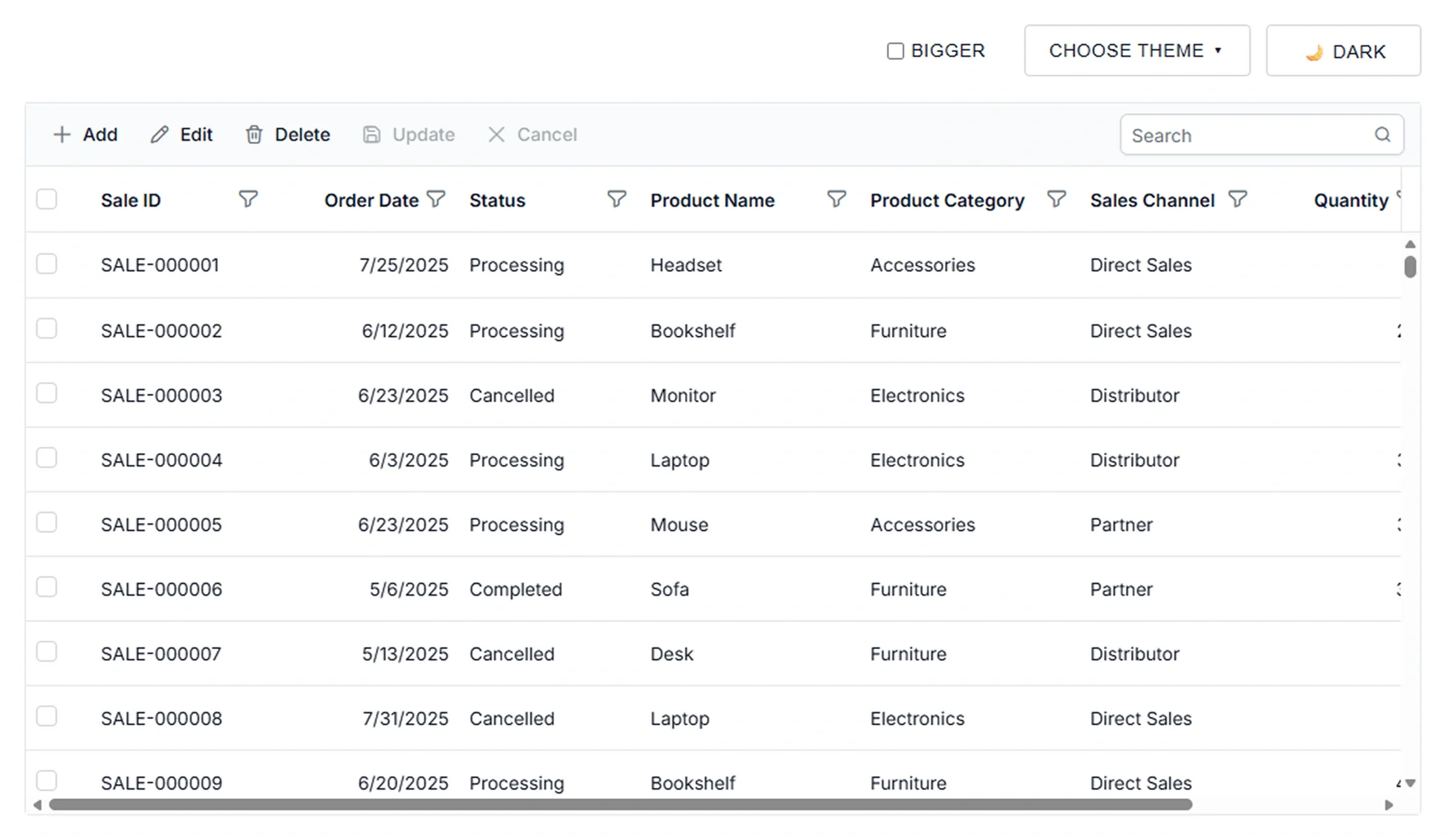
Data Grid Theme Studio configuration and styling
Theme Studio simplifies Data Grid theme customization through configurable primary and secondary colors, borders, and visual styles. Create tailored themes that deliver a consistent user experience across applications.
Custom theme downloads
Export customized themes for reuse across applications, ensuring consistent styling and streamlined theme deployment.
Predefined theme editing
Modify existing themes and adapt visual styles to align with application design requirements.
Consistent theme management
Manage theme settings centrally to maintain a cohesive appearance across Data Grid elements, states, and views.
Color system controls
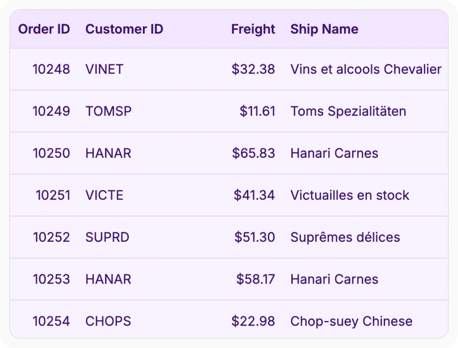
Theme Studio enables customization of theme colors used throughout Data Grid interfaces. Modify visual elements to align component appearance with branding and design standards. Use this feature when applications require organization-specific color palettes.
- Support primary theme colors for the overall appearance of Data Grid components.
- Enable accent color schemes for highlights, selections, and interactive states.
- Provide component color palettes for cohesive visual presentation.
- Apply consistent color settings across grid elements.
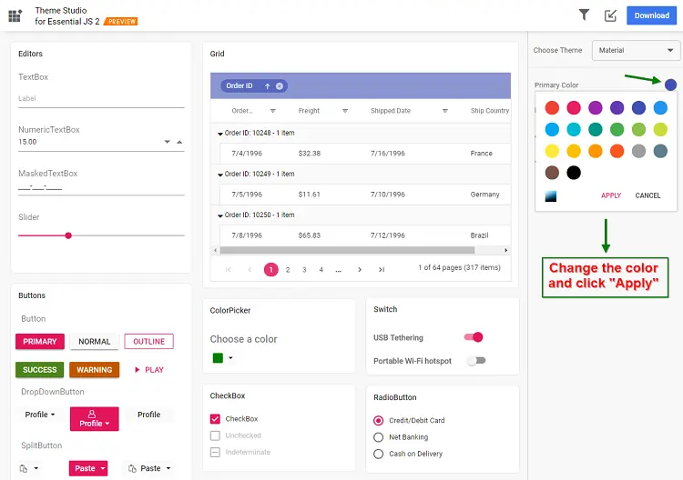
Customize predefined themes
Customize the appearance of predefined themes instead of creating designs from scratch. Use Theme Studio when existing visual styles require adaptation for application branding guidelines.
- Support custom visual styles for application branding.
- Preserve familiar design patterns with targeted visual refinements.
- Maintain consistency across updates using established theme foundations.
- Provide distinctive visual appearance without redesigning every element.
Theme variables
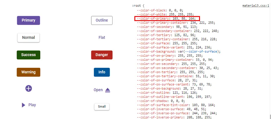
Customize reusable theme variables that control the appearance of Data Grid components. Use theme variables to standardize visual styles and maintain consistent branding across customized themes.
- Support updates to multiple visual elements through one theme variable.
- Create scalable theme configurations for ongoing maintenance.
- Reuse common styling values across theme variations.
- Simplify visual updates without adjusting individual components.
PLATFORM SUPPORT
Supported integration platforms
Theme Studio is supported for the web frameworks listed below. Desktop and cross-platform controls are marked as unsupported for the Theme Studio tool.
| Capability | JS, React, Angular, Vue | Blazor | ASP.NET Core & MVC | WPF & WinForms | .NET MAUI | Flutter | UWP | WinUI |
|---|---|---|---|---|---|---|---|---|
| Theme Studio Tool |
Frequently Asked Questions
Can Theme Studio customize existing themes in Data Grid?
Yes. Theme Studio supports customizing predefined Data Grid themes through colors, styles, and appearance settings.
How does Theme Studio maintain consistent styling in Data Grid?
Theme Studio applies shared theme values across Data Grid elements, helping standardize colors, design properties, and visual appearance throughout applications.
What theme settings can be customized in Data Grid Theme Studio?
Theme Studio supports customization of theme colors, visual styles, and reusable theme variables used throughout Data Grid interfaces.
Can Data Grid support consistent light and dark variants across platforms?
Yes. Theme Studio supports light and dark themes, allowing the Data Grid to maintain a consistent contrast and accessibility approach across web and desktop applications.
Resources
Learn more about Data Grid Theme Studio
Explore demos, KB articles, and documentation to get the most out of the Data Grid.
Explore guides, APIs, and quick-start tips
See live use cases in action
Ask, share, and connect with peers
Find solutions and best practices fast
Get expert help when needed
Feature requests and bug reports
Track issues and suggest improvements
Awards
Greatness—it’s one thing to say you have it, but it means more when others recognize it. Syncfusion® is proud to hold the following industry awards.