Try Our Live Demo
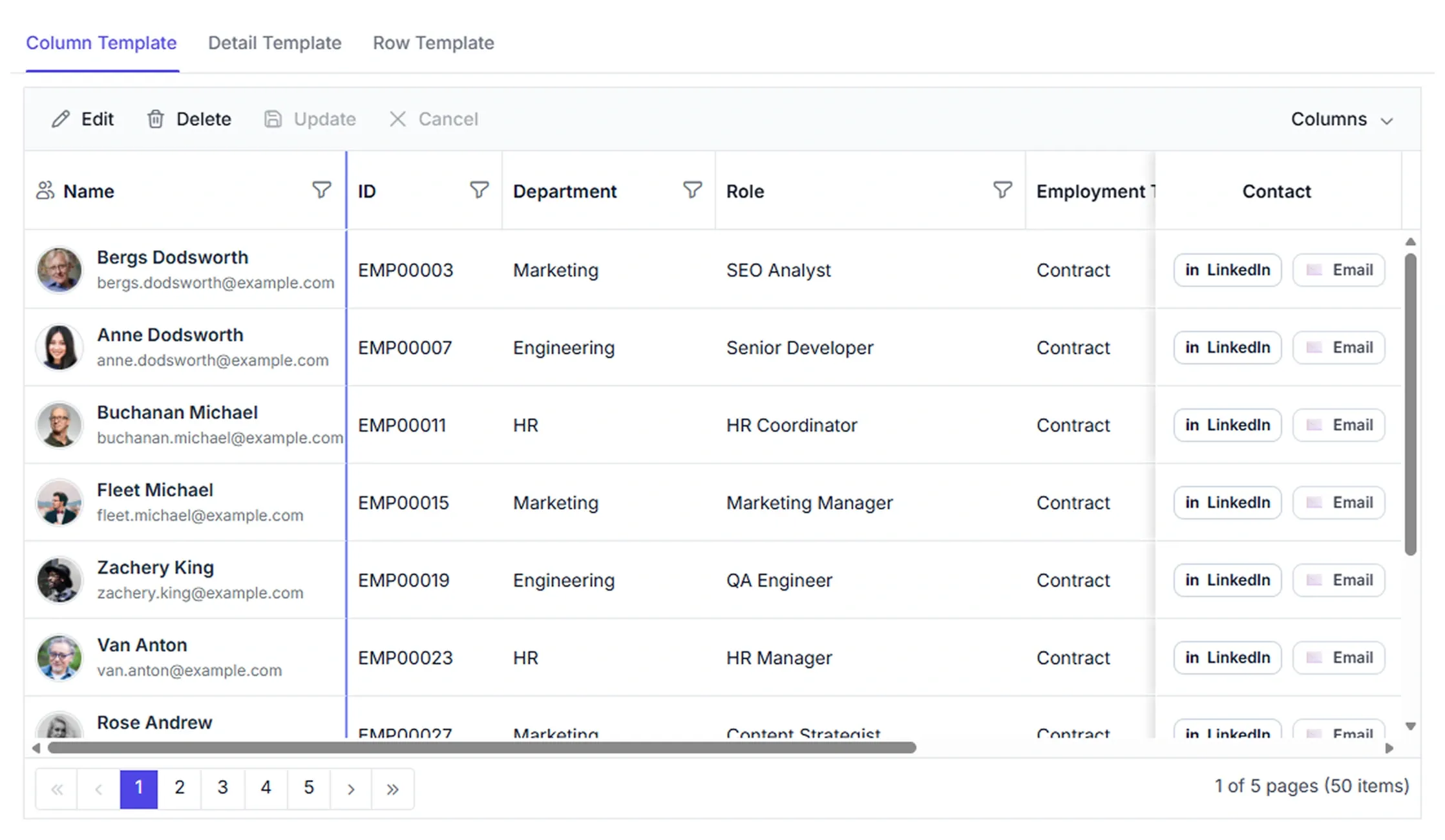
Data Grid templates for tailored layouts
Design tailored Data Grid experiences with templates that define data presentation. Personalize individual elements, highlight important information, and create layouts that improve readability and user interaction.
Flexible row layouts
Design custom row layouts that display multiple fields in a structured format.
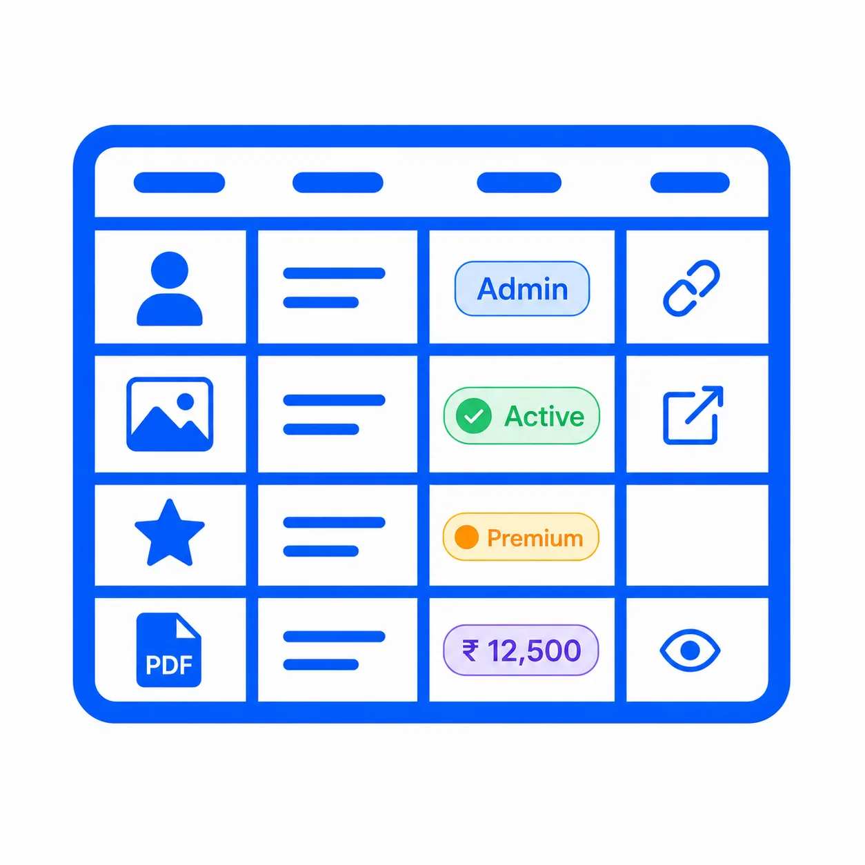
Custom content rendering
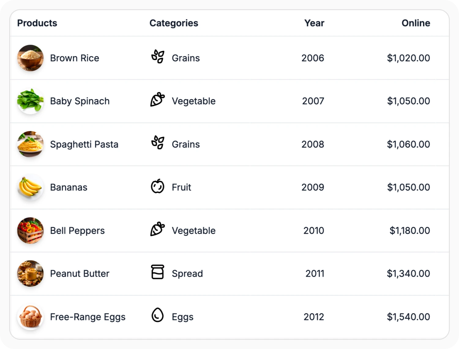
Customize individual column content with images, icons, badges, links, and formatted values.
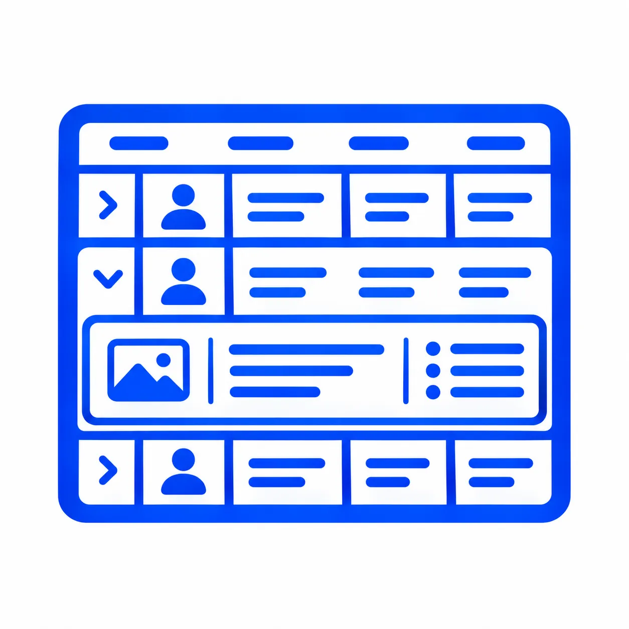
Expandable detail views
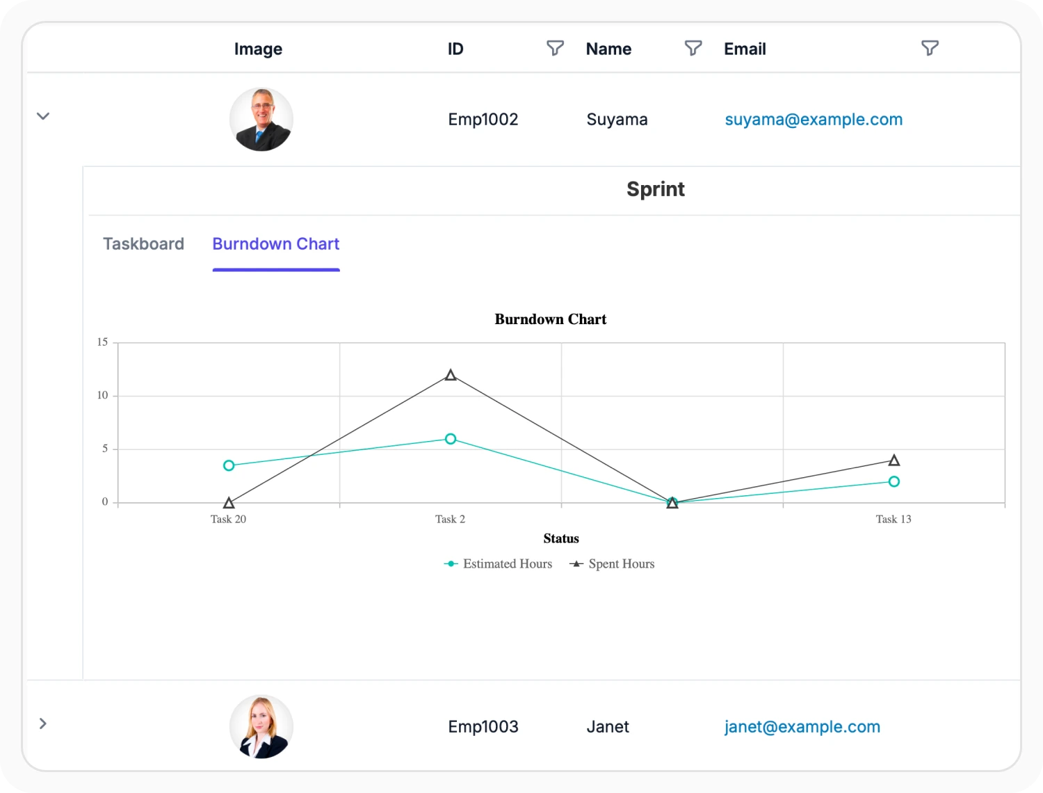
Display additional information through expandable template sections within grid rows.
Rich cell templates
Display images, icons, badges, custom components, and other custom content in Data Grid columns. Use this feature to enrich cell presentation with visual elements, interactive components, and formatted content beyond plain text.
- Support related information within a single cell for compact views.
- Enable visual styling to emphasize critical information.
- Provide contextual elements for interpreting data.
- Create tailored layouts for specific workflows and branding.
Expand rows with detail templates
Detail row templates display additional information beneath an expanded parent row. Use this feature when records contain more information than can be shown in the main grid view, allowing related details to be accessed without navigating to a separate page.
- Enable quick access to additional record information.
- Provide contextual information beneath expanded records.
- Organize complex data with structured detail layouts.
- Keep primary grid views focused on key information.
Custom row templates
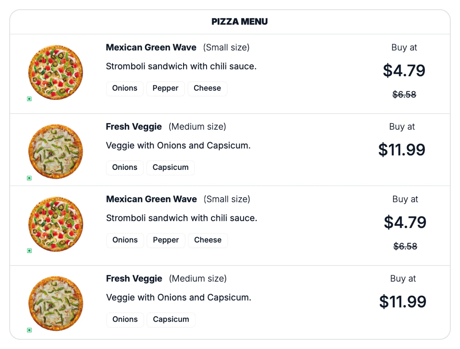
Row templates replace standard rows with custom layouts for presenting record information. Use this feature when records need to display images, additional content, or custom components beyond the default row layout.
- Display multiple data fields within a unified layout.
- Combine images, text, and custom content in rows.
- Present records with personalized visual structures.
- Organize information beyond standard row formats.
PLATFORM SUPPORT
Supported integration platforms
Template customization capabilities are available across web, desktop, and cross-platform frameworks. Support varies by platform for cell, row, detail, and header templates.
| Capability | JS, React, Angular, Vue | Blazor | ASP.NET Core & MVC | .NET MAUI | Flutter | UWP | WinUI |
|---|---|---|---|---|---|---|---|
| Column templates | |||||||
| Row templates | |||||||
| Detail templates | |||||||
| Header templates |
Frequently Asked Questions
How are column templates used to customize cell content in the Data Grid?
Column templates render custom content, such as images, icons, badges, or formatted values, in place of the default text-based columns.
Can templates customize headers in the Data Grid?
Yes. Header templates support customized header content, including icons, formatted text, and additional visual elements.
When should detail row templates be used in the Data Grid?
Detail row templates are useful when a record has more information than fits in the main grid view, so extra details can be shown in an expandable section without leaving the page.
When should row templates be used in the Data Grid?
Row templates are useful when records require personalized layouts that present multiple fields within a single visual structure.
Resources
Learn more about Data Grid template customization
Explore demos, KB articles, and documentation to get the most out of the Data Grid.
Explore guides, APIs, and quick-start tips
See live use cases in action
Ask, share, and connect with peers
Find solutions and best practices fast
Get expert help when needed
Feature requests and bug reports
Track issues and suggest improvements
Awards
Greatness—it’s one thing to say you have it, but it means more when others recognize it. Syncfusion® is proud to hold the following industry awards.