Try Our Live Demo
Choose the right stripline approach
Striplines help teams emphasize important regions, thresholds, and reference points directly within chart visualizations. Use horizontal striplines to highlight value-based ranges and vertical striplines to mark categories, time periods, events, or milestones.
Horizontal Striplines
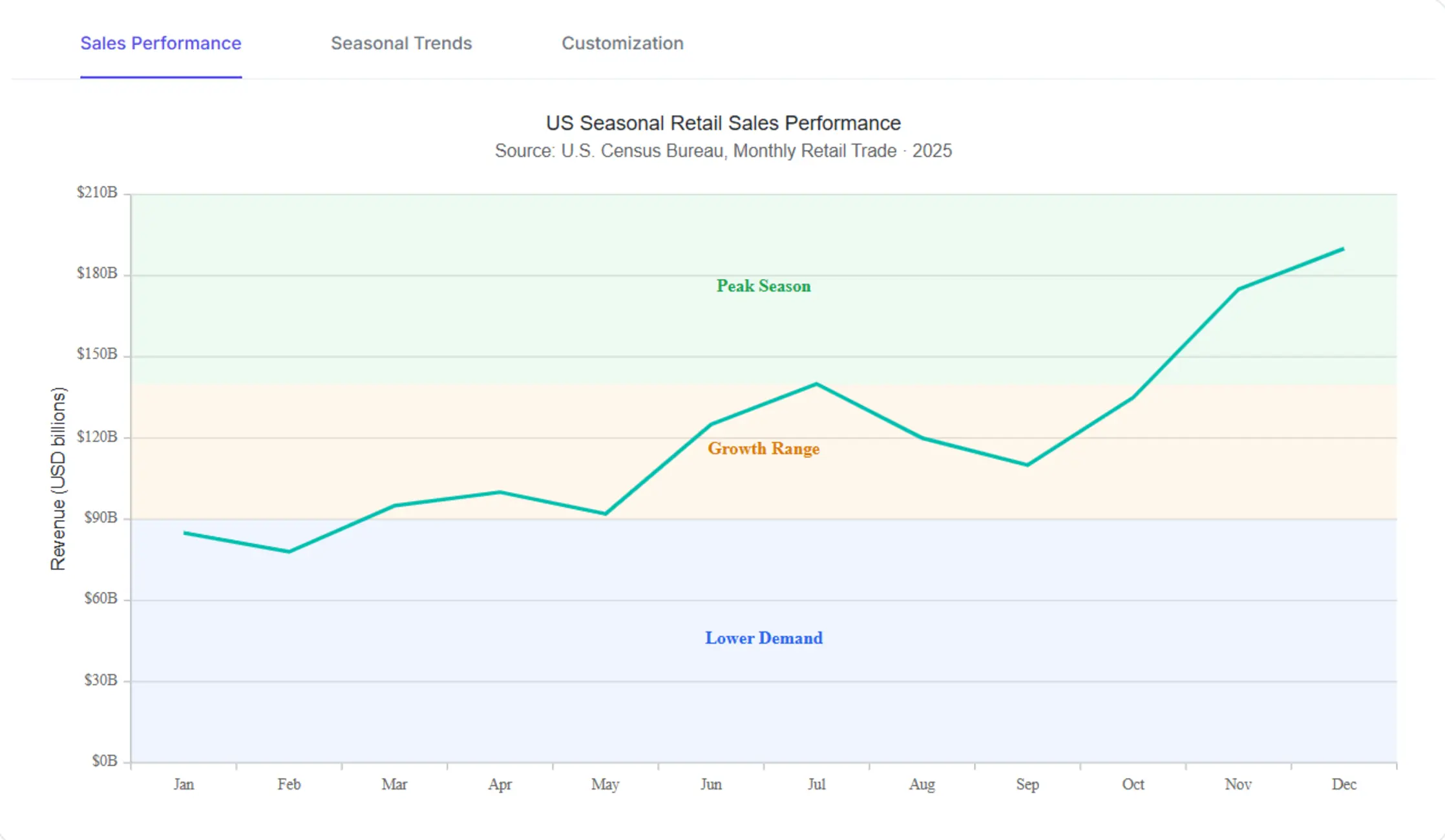
Highlight thresholds, operating ranges, target bands, and service-level limits across the value axis.
Vertical Striplines
Mark significant dates, milestones, maintenance windows, and release events along the horizontal axis.
Custom Striplines
Match application-specific thresholds and visual preferences with custom stripline styling.
Horizontal Striplines
Render horizontal bands at specified y-axis positions to highlight target bands, threshold ranges, and reference intervals that span the full chart width.
- Highlight KPI targets and warning thresholds.
- Mark acceptable operating ranges and performance bands.
- Improve visibility of critical chart values.
- Configure the band start and end values per stripline.
Vertical Striplines
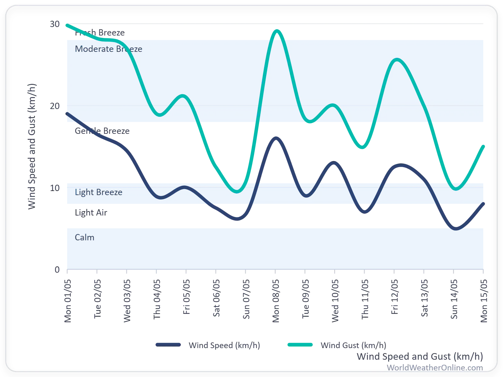
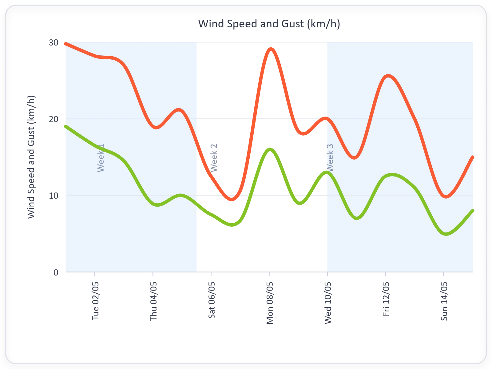
Mark categories, time intervals, and reference boundaries with Vertical Striplines. Vertical Striplines draw bands at specified x-axis positions to highlight events, releases, and boundaries along the horizontal axis.
- Mark events, releases, audits, or maintenance periods.
- Highlight critical dates within time-series datasets.
- Provide contextual information for trend analysis.
- Configure band start and end values for each vertical stripline.
Custom Striplines
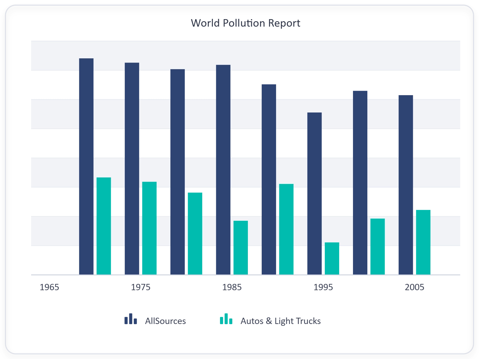
Customize the appearance of striplines to match application-specific thresholds and visual preferences, so the highlighted ranges communicate the intended meaning in context.
- Configure stripline styling and positioning.
- Align thresholds with business requirements.
- Emphasize critical ranges through visual customization.
- Configure border styles, opacity, and labels for each stripline.
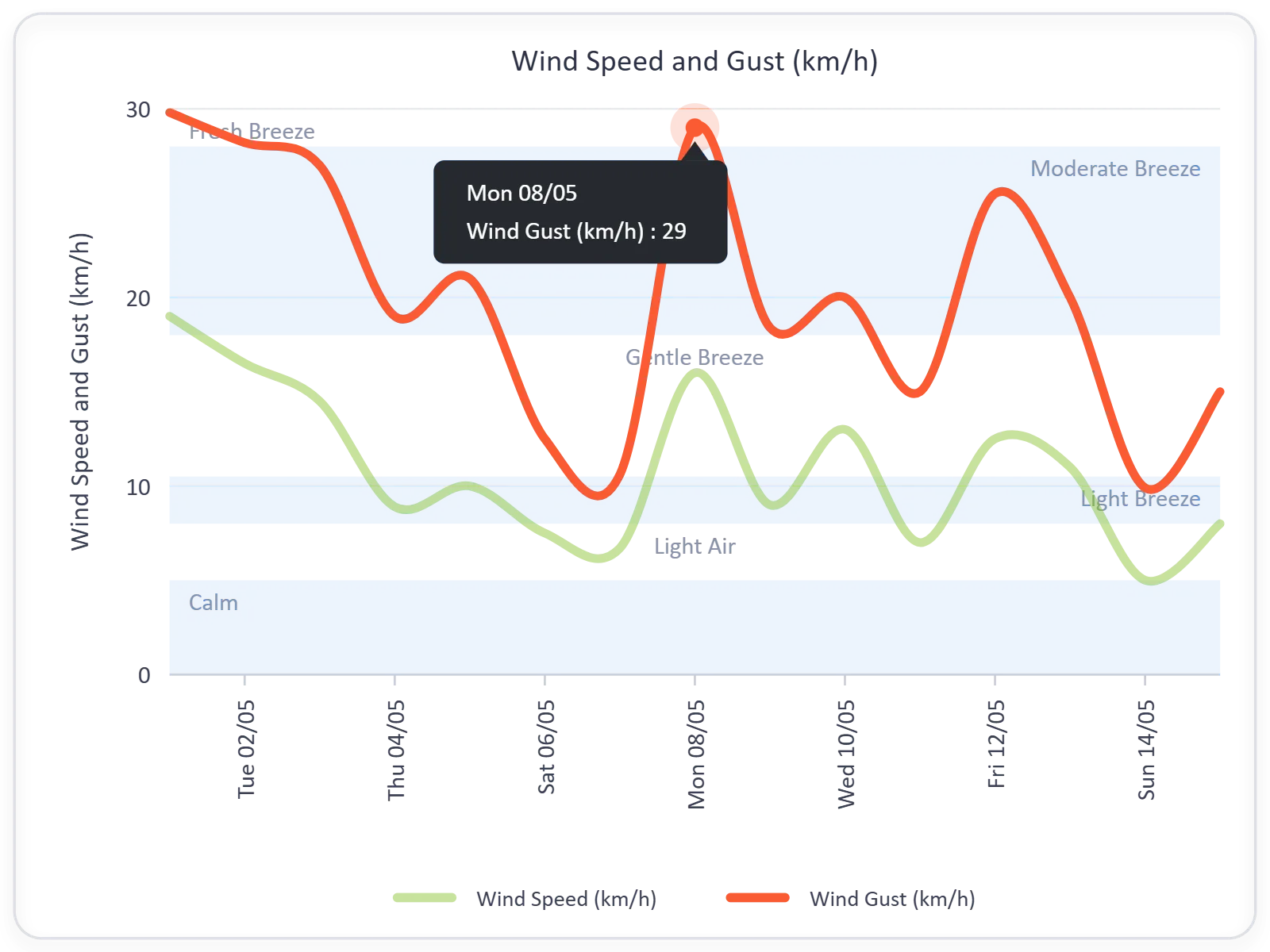
Stripline Labels
Add descriptive labels directly to stripline regions to communicate the meaning of highlighted thresholds, target ranges, compliance boundaries, or reference zones.
- Add labels to highlighted chart regions.
- Explain thresholds and reference markers.
- Improve chart readability and interpretation.
- Use label templates to format text consistently across striplines.
GUIDED STRIPLINE WORKFLOW
Add contextual chart markers in four steps
Developers can define chart thresholds or reference regions, configure stripline placement, customize appearance, and add labels to provide contextual information alongside chart data.
01
Identify key reference points
Determine the thresholds, milestones, target ranges, or boundaries that should be highlighted.
02
Configure stripline positions
Define stripline start and end values along the appropriate chart axis.
03
Customize appearance
Adjust colors, opacity, borders, and placement to fit application requirements.
04
Add labels and annotations
Display meaningful labels that describe the highlighted range, threshold, or event.
PLATFORM SUPPORT
Render striplines across platforms
Stripline capabilities are available across web, desktop, and cross-platform frameworks, with consistent support for horizontal, vertical, and custom stripline capabilities.
| Capability | JS, React, Angular, Vue | Blazor | ASP.NET Core & MVC | WPF & WinForms | .NET MAUI | Flutter |
|---|---|---|---|---|---|---|
| Horizontal Striplines | ||||||
| Vertical Striplines | ||||||
| Custom Striplines | ||||||
| Stripline Labels | ||||||
| Stripline range-based highlighting | ||||||
| Stripline text labels |
Frequently Asked Questions
What are striplines in Syncfusion Charts?
Striplines are horizontal or vertical highlight regions that appear across a chart to emphasize thresholds, target ranges, operating limits, events, or other reference points.
When should vertical striplines be used?
Vertical striplines are useful for marking significant dates, milestones, maintenance periods, releases, audits, or category boundaries that provide context for chart data.
Can stripline appearance be customized?
Yes. Stripline styling can be customized, including range configuration, color, positioning, borders, opacity, and other visual properties.
When should horizontal striplines be used?
Horizontal striplines are commonly used to highlight KPI targets, acceptable operating ranges, warning zones, quality thresholds, and service-level objectives along the value axis.
What types of applications commonly use striplines?
Striplines are frequently used in business intelligence dashboards, financial reporting systems, operational monitoring applications, manufacturing analytics, healthcare reporting, and performance management solutions.
Can multiple striplines be displayed on the same chart?
Yes. Charts can display multiple striplines simultaneously to highlight several thresholds, target bands, events, or reference regions.
Resources
Learn more about our Striplines
Explore demos, KB articles, and documentation to get the most out of Horizontal Striplines, Vertical Striplines, and stripline customization samples.
Explore guides, APIs, and quick-start tips
See live use cases in action
Ask, share, and connect with peers
Find solutions and best practices fast
Get expert help when you need it
Feature requests and bug reports
Track issues and suggest improvements
Awards
Greatness—it’s one thing to say you have it, but it means more when others recognize it. Syncfusion® is proud to hold the following industry awards.