Try Our Live Demo
Visualize high-volume data with confidence
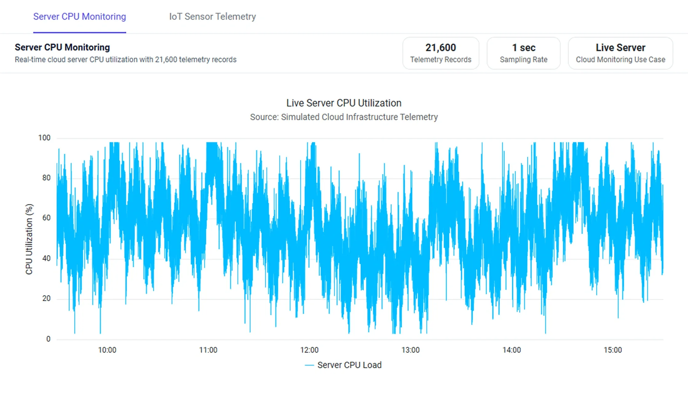
Render large time-series and telemetry datasets while keeping charts responsive. Use interactive features and a DateTime axis to track performance, compare metrics, and investigate continuously updating data.
Monitor high-volume CPU utilization metrics
Track CPU utilization, performance spikes, and trends across extended time periods.
Monitor multiple industrial sensor streams
Compare multiple sensor streams in a single chart to identify patterns and operational anomalies.
Inspect dense data interactively
Inspect exact values and compare related data points in dense visualizations with tooltips and crosshairs.
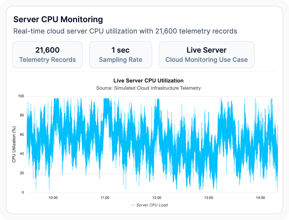
High-Volume CPU Metrics
Visualize large volumes of CPU utilization data while maintaining clarity and readability. Use them when performance must be tracked at scale, since interactive features surface usage patterns, spikes, and trends across extended time periods.
- Render dense line and area charts with thousands of data points per series.
- Identify usage patterns, spikes, and sustained performance trends over time.
- Track system performance and resource consumption across long time windows.
- Maintain chart responsiveness across long time windows.
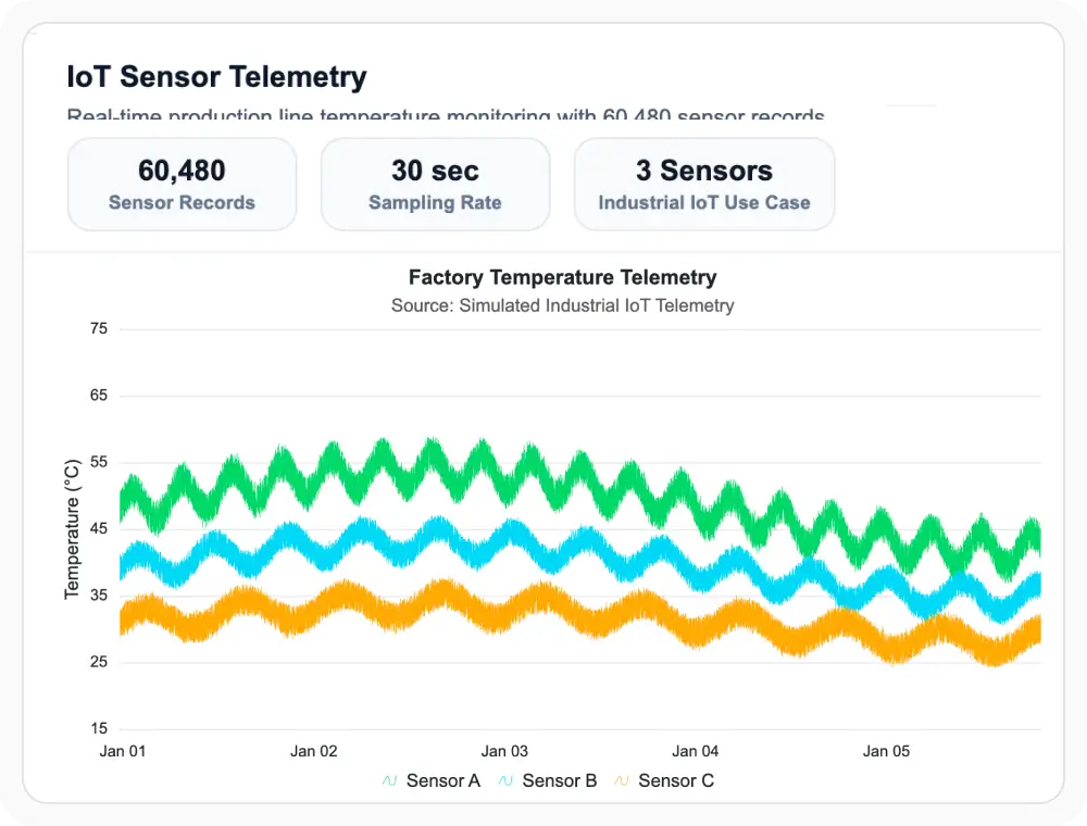
Industrial Sensor Streams
Visualize and monitor multiple sensor data streams within a single chart. Use them when connected equipment or industrial processes must be monitored, since interactive features surface patterns, trends, and operational anomalies.
- Plot multiple telemetry streams within a single chart for direct comparison.
- Use legends and series visibility to focus on individual sensors.
- Investigate anomalies across connected equipment, industrial processes, or IoT deployments.
- Display hundreds of telemetry streams without performance loss.
Inspect dense data interactively
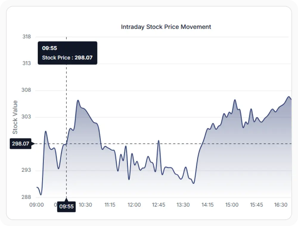
Use tooltips and crosshairs to inspect exact values within large datasets without losing context. Use them when detailed inspection is required, since interactive features support exploration, comparison, and precise data point analysis.
- Hover over data points to see exact values via tooltips.
- Align values across series with crosshairs for precise timestamp inspection.
- Zoom and pan across dense visualizations without losing context.
- Support tooltip templates for custom value formatting.
GUIDED LARGE DATA ANALYSIS
Turn large datasets into actionable insights
Teams can connect high-volume data, visualize related metrics, explore trends interactively, and investigate anomalies without sacrificing responsiveness.
01
Connect large datasets
Load time-series, telemetry, monitoring, or operational data from business systems and services.
02
Visualize related metrics
Display multiple series together for comparison and trend analysis.
03
Explore interactively
Use tooltips, crosshairs, zooming, and panning to inspect specific values and time periods.
04
Identify trends and anomalies
Analyze patterns, investigate exceptions, and support operational or business decisions.
PLATFORM SUPPORT
Visualize large datasets across platforms
Core large data visualization features are available across web, desktop, and cross-platform frameworks. Availability varies by feature for high-density rendering, real-time updates, DateTime axis support, and interactive crosshairs.
| Capability | JS, React, Angular, Vue | Blazor | ASP.NET Core & MVC | WPF & WinForms | .NET MAUI | Flutter |
|---|---|---|---|---|---|---|
| High-volume time-series rendering | ||||||
| Multiple series in a single chart | ||||||
| DateTime axis with adaptive intervals | ||||||
| Tooltips and crosshairs | ||||||
| Zoom and pan | ||||||
| Real-time data updates |
Frequently Asked Questions
Can Syncfusion Charts handle large datasets efficiently?
Yes. Syncfusion Charts supports visualizing large datasets while preserving interactive capabilities such as zooming, panning, tooltips, and crosshairs.
Can multiple telemetry series be displayed together?
Yes. Multiple series can be displayed together within a single chart to easily compare related metrics and identify patterns across data sources.
Can charts for large datasets update in real time?
Yes. Charts fully support real-time updates, supporting live monitoring, streaming data, and dynamic dashboard applications.
What interactions help analyze large datasets?
Tooltips, crosshairs, zooming, panning, and legends all help users explore and analyze large datasets more effectively without losing important context or detail.
Is the DateTime axis recommended for large time-series data?
Yes. DateTime axes help users analyze and navigate large time-series datasets more effectively by automatically adjusting intervals, labels, and tick formatting.
Which chart type works best for large time-series visualization?
Line charts are most commonly used because they clearly show trends and patterns across large datasets over extended periods of time.
Resources
Learn more about Syncfusion Charts large data visualization
Explore demos, KB articles, and documentation to get the most out of large data visualization features.
Explore guides, APIs, and quick-start tips
See live use cases in action
Ask, share, and connect with peers
Find solutions and best practices fast
Get expert help when you need it
Feature requests and bug reports
Track issues and suggest improvements
Awards
Greatness—it’s one thing to say you have it, but it means more when others recognize it. Syncfusion® is proud to hold the following industry awards.