Try Our Live Demo
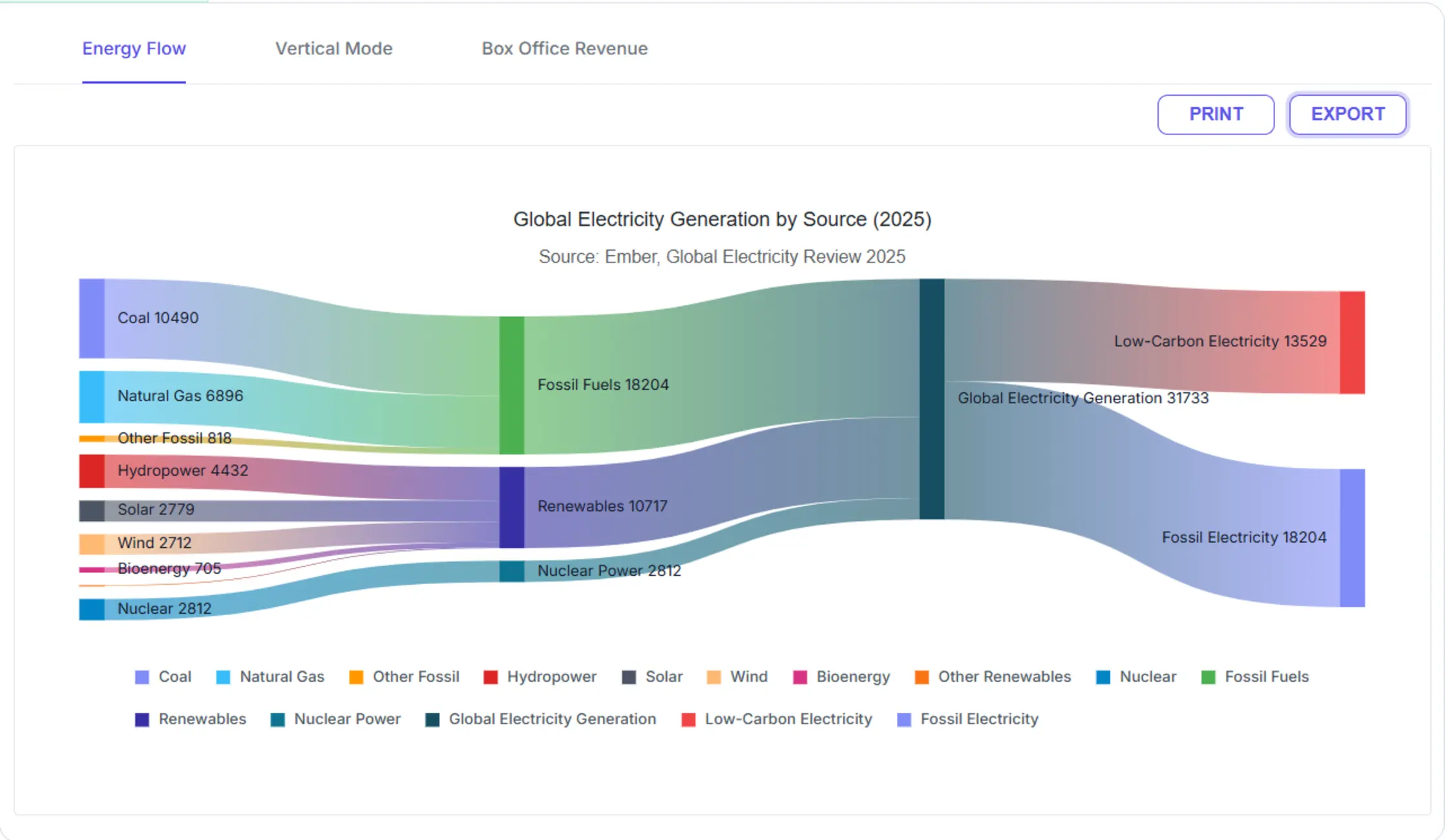
Analyze movement and relationships within complex systems
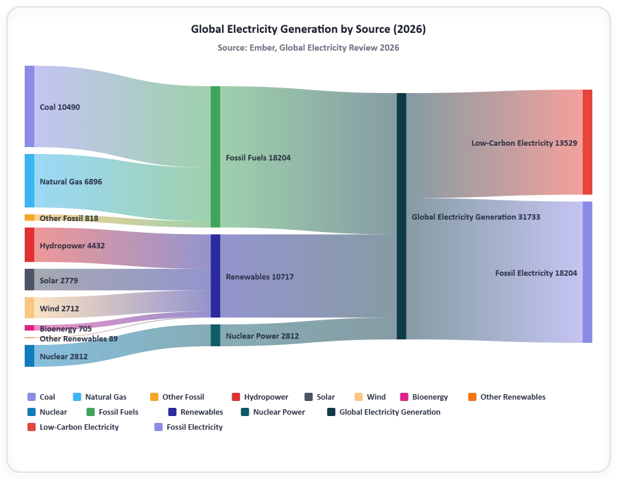
Sankey Diagrams help users understand how values move between entities, stages, and processes. Flow widths represent quantity, making it easy to identify the most significant pathways within the system.
Visualize flow relationships
Represent movement between connected entities using nodes and links. Understand where values originate, how they flow, and where they ultimately end up.
Track proportional transfers
Display flow magnitudes using proportional link widths, helping users quickly identify dominant pathways and high-value transfers.
Analyze complex processes
Visualize resource allocation, energy distribution, conversion funnels, customer journeys, and operational workflows in a single diagram.
Visualize Flow Relationships
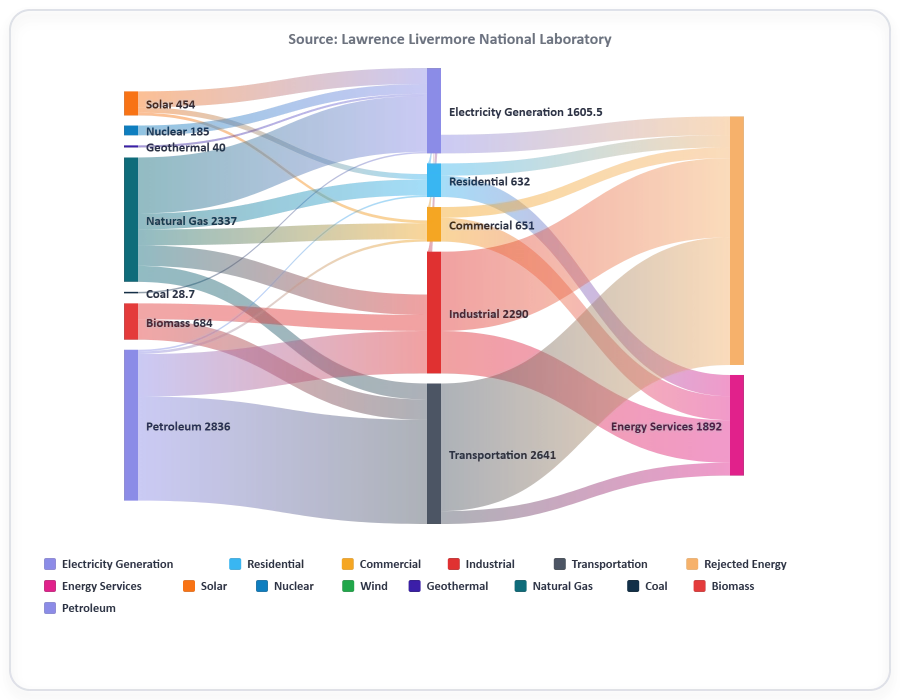
Represent movement between entities using connected nodes and links. Use it when the path of resources, data, customers, or energy through a system must be understood, since nodes and links visualize stages clearly.
- Connect source, intermediate, and destination nodes.
- Reveal the path values take through a system.
- Visualize relationships across multiple stages.
Represent Quantities with Proportional Widths
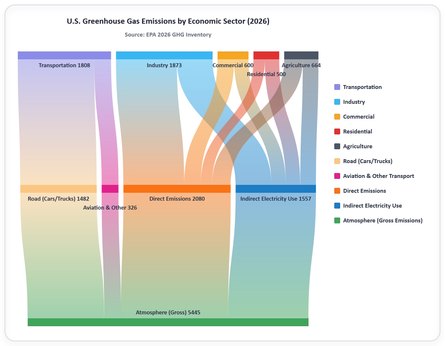
Display flow magnitude using link widths that scale according to value. Use it when dominant pathways or high-value transfers must be visible, since link widths surface important trends at a glance.
- Scale flow widths according to quantity.
- Highlight dominant transfers and pathways.
- Improve visual comparison between flows.
Display Labels and Detailed Information
Show node labels and flow information directly within the diagram. Use it when detailed context is required, since tooltips and labels support relationship and quantity exploration.
- Display node names and flow values.
- Reveal detailed information through tooltips.
- Improve readability and user understanding.
GUIDED SANKEY DIAGRAM WORKFLOW
Build a Sankey Diagram in four steps
Developers can define nodes and links, bind the data, choose an orientation, and render the Sankey Diagram to display quantities transferred between source entities and target destinations.
01
Define nodes and flow relationships
Identify source entities, intermediate stages, and destination nodes along with the connections between them.
02
Bind flow data
Associate values with each source-to-target relationship to determine flow magnitudes.
03
Customize visual appearance
Configure layout, styling, labels, colors, and interactive behaviors to match application requirements.
04
Analyze and share insights
Render the Sankey Diagram, review flow patterns, and export or print results for communication and reporting.
PLATFORM SUPPORT
Render Sankey Diagram across platforms
Core Sankey Diagram features are currently available for the JavaScript-based Charts (JS, React, Angular, Vue, ASP.NET Core & MVC) and Blazor. Sankey Diagram has not yet shipped for WPF, WinForms, .NET MAUI, or Flutter.
| Capability | JS, React, Angular, Vue | Blazor | ASP.NET Core & MVC | WPF & WinForms | .NET MAUI | Flutter |
|---|---|---|---|---|---|---|
| Default Sankey Diagram | ||||||
| Vertical orientation | ||||||
| Node and link data binding | ||||||
| Proportional flow widths | ||||||
| Direct print | ||||||
| Export |
Frequently Asked Questions
What is Sankey Diagram in Syncfusion Charts?
The Sankey Diagram in Syncfusion Charts is a flow visualization component that displays quantities in proportion to one another, focusing on movement or transfer between process stages.
What types of applications commonly use Sankey Diagrams?
Teams commonly use Sankey Diagrams in dashboards, analytical applications, operational tools, and reports to visualize energy distribution, resource allocation, process flows, and transfers between entities.
Is the Sankey Diagram available across multiple platforms?
Sankey Diagram is currently available for the JavaScript-based Charts (JS, React, Angular, Vue, ASP.NET Core & MVC) and Blazor. It is not yet available for WPF, WinForms, .NET MAUI, or Flutter. Refer to the platform support table for details, and check Syncfusion’s release notes for updates on additional platform support.
When should Sankey Diagram be used?
Use Sankey Diagram to visualize complex systems, energy flows, and any process with transfers between stages where proportional flow widths help identify the largest and smallest pathways.
Can a Sankey Diagram be rendered in a vertical orientation?
Yes. A Sankey Diagram supports a vertical orientation so flows stack vertically between nodes arranged from top to bottom.
Can a Sankey Diagram be printed or exported?
Yes. A Sankey Diagram can be printed directly or exported as a file for use in presentations, documents, and reports.
Resources
Learn more about our Sankey Diagram
Explore demos, KB articles, and documentation to get the most out of flow visualization with Sankey Diagram.
Explore guides, APIs, and quick-start tips
See live use cases in action
Ask, share, and connect with peers
Find solutions and best practices fast
Get expert help when you need it
Feature requests and bug reports
Track issues and suggest improvements
Awards
Greatness—it’s one thing to say you have it, but it means more when others recognize it. Syncfusion® is proud to hold the following industry awards.