
The Flutter Charts widget is a well-crafted control for visualizing data in the form of charts and graphs. It contains a rich gallery of 30+ chart types, ranging from line to financial, that cater to all charting scenarios.
In this blog post, I’ll quickly introduce the new features and breaking changes included in the Flutter Charts widget for the 2021 Volume 3 release.
Let’s see them!
New features and improvements
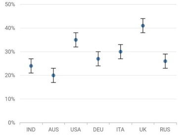
New error bar chart type
Error bars are graphical representations of variations in data. We can use them on graphs to indicate the error or uncertainty in a reported measurement. To render an error bar chart, create an instance of ErrorBarSeries, and add it to the series collection property of the SfCartesianChart.
The following code example shows how to render the error bar chart.
[Dart]
@override
Widget build(BuildContext context) {
     List chartData = [
      ChartData('IND', 29),
      ChartData('AUS', 18),
      ChartData('USA', 35),
      ChartData('DEU', 24),
      ChartData('ITA', 30),
      ChartData('UK', 41),
      ChartData('RUS', 26)
    ];

    return Scaffold(
        body: SfCartesianChart(
          primaryXAxis: CategoryAxis(),
          series: <ChartSeries<ChartData, String>>[
            ScatterSeries<ChartData, String>(
              dataSource: chartData,
              xValueMapper: (ChartData data, _) => data.x,
              yValueMapper: (ChartData data, _) => data.y,
            ),
            ErrorBarSeries<ChartData, String>(
              dataSource: chartData,
              xValueMapper: (ChartData data, _) => data.x,
              yValueMapper: (ChartData data, _) => data.y,
            ),
          ],
        )
    );
}
The following screenshot shows the rendered chart.
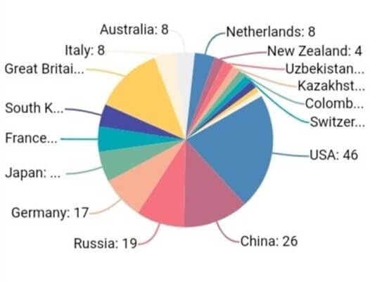
Smart data labels
This feature allows you to arrange the data labels smartly and avoid overlapping when the data point values fall close together in the Flutter pie and doughnut charts.
We have to set the enum value LabelIntersectAction.shift to the labelIntersectAction property in the DataLabelSettings class to smartly arrange the data labels when they intersect with one another.
The following code illustrates the API for placing the data labels smartly.
[Dart]
SfCircularChart(
  series: PieSeries<ChartData, String>>[
    PieSeries<ChartData, String>(
      dataSource: chartData,
      xValueMapper: (ChartData data, _) => data.x,
      yValueMapper: (ChartData data, _) => data.y,
      dataLabelSettings: DataLabelSettings(
        isVisible: true,
        labelIntersectAction: LabelIntersectAction.shift,
        connectorLineSettings: ConnectorLineSettings(
          type: ConnectorType.curve,
          length: '20%'
        )
      )
    )
  ]
)
The following screenshot shows the rendered chart.
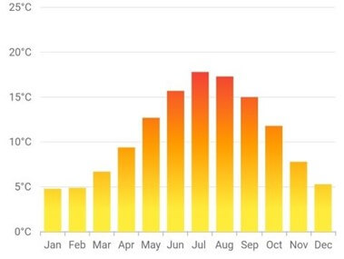
Shader fill support
This feature allows you to apply a comman shader for the Cartesian chart data points by considering the data points as a single segment. The onCreateShader callback is used to fill the data points with the gradient and ImageShader.
The following code snippet shows how to fill the shader (linear gradient) in a column chart.
[Dart]
/// Import dart ui package.
import 'dart:ui' as ui;

SfCartesianChart(
  primaryXAxis: CategoryAxis(),
  primaryYAxis: NumericAxis(),
  series: <CartesianSeries<ChartData, String>>[
    ColumnSeries<ChartData, String>(
      dataSource: [
        _ChartData('Jan', 4.3),
        _ChartData('Feb', 5.2),
        _ChartData('Mar', 6.7),
        _ChartData('Apr', 9.4),
        _ChartData('May', 12.7),
        _ChartData('Jun', 15.7),
        _ChartData('Jul', 17.8),
        _ChartData('Aug', 17),
        _ChartData('Sep', 15),
        _ChartData('Oct', 11.8),
        _ChartData('Nov', 7.8),
        _ChartData('Dec', 5.3)
      ],
      onCreateShader: (ShaderDetails details) {
        return ui.Gradient.linear(
          details.rect.topCenter,
          details.rect.bottomCenter,
          const [Colors.red, Colors.orange, Colors.yellow],
          [0.3, 0.6, 0.9]
        );
      },
      xValueMapper: (ChartData data, _) => data.x,
      yValueMapper: (ChartData data, _) => data.y
    )
  ]
)
The following screenshot shows the column chart with a gradient shader applied.
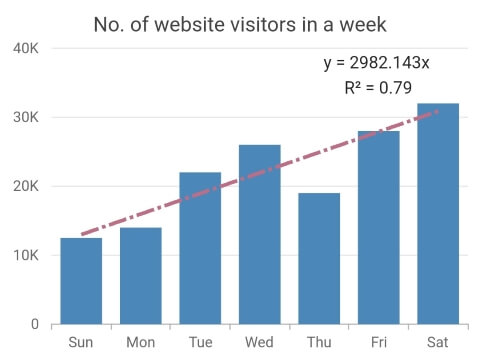
Slope and intercept values of trendlines
The Flutter Charts internally calculate the slope and intercept values of trendlines in the source and now we can fetch them in the application level for further use.
Refer to the following code example.
[Dart]
SfCartesianChart(
  primaryXAxis: CategoryAxis(),
  series: <ColumnSeries<ChartData, String>>[
    ColumnSeries<ChartData, String>(
      dataSource: chartData,
      xValueMapper: (ChartData data, _) => data.text,
      yValueMapper: (ChartData data, _) => data.yValue,
      trendlines: [
        Trendline(
          type: TrendlineType.linear,
          width: 3,
          color: const Color.fromRGBO(192, 108, 132, 1),
          dashArray: [15, 3, 3, 3],
          onRenderDetailsUpdate: (TrendlineRenderParams args) {
            print(‘'y = ${double.parse((args.slope[0]).toStringAsFixed(3))}x +
              ${double.parse(args.intercept.toStringAsFixed(3))}'’);
            print(‘R² =  ${double.parse((args.rSquaredValue)!.toStringAsFixed(4)).toString()}’);
          }
        )
      ]
    )
  ]
)
The following screenshot shows the intercept and slope values for a column chart.
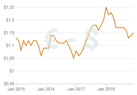
Placing annotations with a percentage value
We can place annotations on the Flutter Charts by specifying the logical pixel or data point value. In addition, we can now place annotations by specifying a percentage value too. The Charts widget considers its full width and height as 100%.
For example, if 50% is specified to the x-axis value for an annotation, then the annotation will be placed at 50% of the chart’s width.
The following code illustrates how to place an annotation by specifying percentage values.
[Dart]
SfCartesianChart(
  annotations: [
    CartesianChartAnnotation(
      widget: Container(
        child: const Text(r'€ - $ '),
      ),
      coordinateUnit: CoordinateUnit.percentage,
      region: AnnotationRegion.plotArea,
      x: '50%',
      y: '50%'
    )
  ]
)
Refer to the following screenshot to see this code rendered.
Delay support for animating elements
Use the animationDelay property to specify the delay duration for the series animation. This property accepts millisecond values as input. This feature is applicable for chart series, trendlines, and technical indicators.
The following code shows how to set an animation delay duration to a chart series.
[Dart]
SfCartesianChart(
  series: <ChartSeries<ChartData, String>>[
    ColumnSeries<ChartData, String>(
      animationDuration: 2000,
      dataSource: chartData,
      xValueMapper: (ChartData sales, _) => sales.x,
      yValueMapper: (ChartData sales, _) => sales.yValue1
    ),
    LineSeries<ChartData, String>(
      animationDuration: 4500,
      animationDelay: 2000,
      dataSource: chartData,
      xValueMapper: (ChartData sales, _) => sales.x,
      yValueMapper: (ChartData sales, _) => sales.yValue2
    )
  ]
)
Refer to the following GIF image to see the animation delay in action.
Get data points details by passing logical pixel values
In various scenarios, a user may need data point details for the equivalent logical pixel values in a chart.
For example, while tapping on a slice in a pie chart, the user can get the tapped position’s logical pixel value. Now, by passing the logical pixel value to the pixelToPoint method, the user can fetch the data point details in the Flutter circular, pyramid, and funnel charts. This feature is already available in our Flutter Cartesian Charts widget.
The following code explains how to pass logical pixel values as input to a chart and fetch data point details.
[Dart]
//Initialize the series controller.
ChartSeriesController? seriesController;

@override
Widget build(BuildContext context) {
  return Container(
    child: SfCartesianChart(
      series: <CartesianSeries<ChartSampleData, num>>[
        LineSeries<ChartSampleData, num>(
          onRendererCreated: (ChartSeriesController controller) {
            seriesController = controller;
          },
        )
      ],
      onChartTouchInteractionUp: (ChartTouchInteractionArgs args) {
        final Offset value = Offset(args.position.dx, args.position.dy);
        CartesianChartPoint<dynamic> chartpoint = seriesController!.pixelToPoint(value);
        print('X point: ${chartpoint.x}' + 'Y point: ${chartpoint.y}');
      }
    )
  );
}
Breaking changes
The 2021 Volume 3 release brings these breaking changes to the Flutter Charts widget:
- The onTrendlineRender callback has been deprecated; instead, use the onRenderDetailsUpdate callback in the Trendline class to get the trendline details.
- The enableSmartLabels callback has been deprecated; instead, use the LabelIntersectAction.shift callback in the DataLabelSettings class for pie and doughnut series to position the data labels smartly when they intersect one another.
- The deprecated ChartTextStyle class has been removed; instead, use the TextStyle class.
- Previously, in mobile devices, when the height is greater than the width, and the value of the legend’s position is set to LegendPosition.auto, the legend is positioned at the bottom. Hereafter, the legend will be positioned at the top. We modified this based on the Material design guidelines.
Conclusion
Thanks for reading! I hope you now have a clear idea about the new features in the Syncfusion Flutter Charts widget for the 2021 Volume 3 release. For more details about the bug fixes and other enhancements, check out our release notes and What’s New pages. Try out these new vivid features and enhance the readability of your data!
Also, browse through our documentation to learn more about our Flutter widgets. You can also see Syncfusion’s Flutter app with many examples in our GitHub repository. Don’t miss our demo app in Google Play, the App Store, the Windows Store, the App Center, Snapcraft, and on our website.
If you aren’t yet a Syncfusion customer, you can try our 30-day free trial to check out these features.
You can also contact us through our support forum, feedback portal, or Direct-Trac support system. We are always happy to assist you!


 No spam, just valuable updates.