
 Jayavigneshwaran G
Looking at raw data and trying draw conclusions from it is very tedious. Visual representations such as charts and graphs overcome this problem. These visual representations, when powered by interactive features, are a piece of cake to understand. In this blog, I am going to walk you through the rich and highly interactive features of Syncfusion Flutter Charts, namely:
These features help users understand data in various ways. Users can experiment with their data’s presentation to answer questions about it with the best visuals. Let’s check out these rich interactive capabilities.
Tooltip
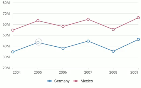
The tooltip is one of the Syncfusion Flutter Charts control’s most valuable features. On interacting with data points in a series, the specific data point values will be displayed in a pop-up called a tooltip. We can easily customize the tooltips to define additional chart point information, change their appearance, place images or custom widgets in them, and more. So, there’s almost no limit to the possibilities. Here are some of the key features of the tooltip:
- It can be enabled for all series in a chart.
- It can be activated on tap, double-tap, or long press.
- It can be positioned to always display at the top of the data point or at the pointer position.
- Its content can be formatted.
- Any widget can be used as a tooltip using Builder.
- It can be shown or hidden dynamically using public methods.
- Its appearance can be completely customized.
Refer to the following links for more details:
Refer to the following code example to enable tooltips in your Flutter chart.
[Dart]
class _MyHomePageState extends State<MyHomePage> {
  TooltipBehavior tooltip;

  @override
  void initState() {
    tooltip = TooltipBehavior(enable: true);
    super.initState();
  }

  @override
  Widget build(BuildContext context) {
    return Scaffold(
      body: SfCartesianChart(
        series: <LineSeries<ChartData, num>>[
          LineSeries<ChartData, num>(
            enableTooltip: true,
            dataSource: chartData,
            xValueMapper: (ChartData sales, _) => sales.x,
            yValueMapper: (ChartData sales, _) => sales.y
          )
        ],
        tooltipBehavior: tooltip
      )
    );
  }
}
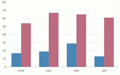
Selection
A user can interact with and highlight a data point in Flutter Charts using the selection feature. Performing selection brings the center of focus to that data point over other points. Some of the key features of selection include:
- A data point or group of data points can be selected.
- Selection can be activated on tap, double-tap, or long press.
- Selection modes can be point, series, or cluster.
- The appearance of both selected and not-selected data points can be customized.
- Data points can be selected even while rendering the chart initially.
- Data points can be selected or cleared dynamically using public methods.
- The selected data point details can be fetched for future use.
Refer to the following links for more details:
Refer to the following code example to enable selection in your Flutter Charts.
[Dart]
SfCartesianChart(
  series: <ColumnSeries<ChartData, String>>[
    ColumnSeries<ChartData, String>(
      selectionSettings: SelectionSettings(
        enable: true,
        unselectedOpacity: 0.5
      ),
      dataSource: chartData,
      xValueMapper: (ChartData sales, _) => sales.x,
      yValueMapper: (ChartData sales, _) => sales.y
    )
  ]
);
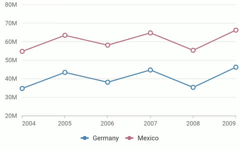
Trackball
In Flutter Charts, the trackball feature is similar to a tooltip, but the difference is that the trackball will appear as a label connected by a vertical or horizontal line to a data point. This feature can be used as an alternative to the data label feature in case you are unable to show data labels for all data points. This feature is particularly helpful in scenarios with space constraints. The following are some of the key features of the trackball:
- It can be displayed for both vertical and horizontal series.
- It can be activated on tap, double-tap, or long press.
- Trackball tooltips can be displayed in three modes: grouped for all series, individual tooltips for all series, or tooltip only for closest point.
- Track marker support is also available.
- The appearance of the track line, track marker, and tooltip can be completely customized.
- Trackball can be shown or hidden dynamically using public methods.
- Trackball hide duration can be customized, or it can be made to always be displayed.
Refer to the following links for more details:
Refer to the following code example to enable the trackball feature in your Flutter charts.
[Dart]
class _MyHomePageState extends State<MyHomePage> {
  TrackballBehavior trackball;

  @override
  void initState() {
    trackball = TrackballBehavior(
      enable: true,
      lineType: TrackballLineType.vertical,
      activationMode: ActivationMode.singleTap,
      tooltipAlignment: ChartAlignment.center,
      tooltipDisplayMode: TrackballDisplayMode.nearestPoint,
      tooltipSettings: InteractiveTooltip(format: 'point.x: point.y'),
      shouldAlwaysShow: false,
      hideDelay: 2000
    )
    super.initState();
  }

  @override
  Widget build(BuildContext context) {
    return Scaffold(
      body: SfCartesianChart(
        series: <LineSeries<ChartData, num>>[
          LineSeries<ChartData, num>(
            dataSource: chartData,
            xValueMapper: (ChartData sales, _) => sales.x,
            yValueMapper: (ChartData sales, _) => sales.y
          )
        ],
        trackballBehavior: trackball
      )
    );
  }
}
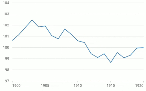
Crosshair
In Flutter Charts, a crosshair is used to display the value of any position in the chart area regardless of the data point. Even if a data point is not present at a location in the chart, the crosshair will display the value of that location. Some of the key features of the crosshair include:
- Crosshair lines can be displayed vertically, horizontally, or both together.
- Crosshair can be activated on tap, double-tap, or long press.
- Tooltips are displayed at the axis to show the current value.
- The appearance of crosshair lines and axis tooltips can be completely customized.
- Crosshair can be shown or hidden dynamically using public methods.
- Crosshair hide duration can be customized and made to always be displayed.
Refer to the following links for more details:
Refer to the following code example to enable the crosshair feature in your Flutter Charts.
[Dart]
class _MyHomePageState extends State<MyHomePage> {
  CrosshairBehavior crosshair;

  @override
  void initState() {
    crosshair = CrosshairBehavior(
      enable: true,
      activationMode: ActivationMode.singleTap,
      hideDelay: 2000,
      shouldAlwaysShow: false,
      lineType: CrosshairLineType.both,
      lineWidth: 1
    )
    super.initState();
  }

  @override
  Widget build(BuildContext context) {
    return Scaffold(
      body: SfCartesianChart(
        primaryXAxis: DateTimeAxis(
          interactiveTooltip: InteractiveTooltip(
            enable: true
          )
        ),
        crosshairBehavior: crosshair
      )
    );
  }
}
Zooming and panning
When plotting a Flutter chart with a large amount of data, zooming and panning can be used to provide better data readability. Zooming is performed by pinching or selecting a region, and panning is done by dragging your finger across the touchscreen. Here are a few helpful aspects of zooming and panning:
- You can ably zoom for the x axis, y axis, or both axes together.
- You can perform zooming and panning dynamically using public methods.
- On zooming, intervals are autocalculated, and axis label formats are updated.
- Maximum zoom level can be specified.
- Axis range can be autocalculated based on the visible data points.
- Axis elements support animation.
- View a particular piece of data in a chart using the visible minimum and visible maximum options.
Refer to the following links for more details:
- Zooming and panning UG
- Zooming and panning feature samples
Refer to the following code example to enable zooming and panning in your Flutter charts.
[Dart]
class _MyHomePageState extends State<MyHomePage> {
  ZoomPanBehavior zoomPan;

  @override
  void initState() {
    zoomPan = ZoomPanBehavior(
      enablePinching: true,
      enableSelectionZooming: true,
      enableMouseWheelZooming: true,
      enablePanning: true,
      zoomMode: ZoomMode.xy
    )
    super.initState();
  }

  @override
  Widget build(BuildContext context) {
    return Scaffold(
      body: SfCartesianChart(
        series: <LineSeries<ChartData, num>>[
          LineSeries<ChartData, num>(
            dataSource: chartData,
            xValueMapper: (ChartData sales, _) => sales.x,
            yValueMapper: (ChartData sales, _) => sales.y
          )
        ],
        zoomPanBehavior: zoomPan
      )
    );
  }
}
Conclusion
Data visualization and analysis is now an essential component of business processes. All big and small companies need clear, efficient, and interactive ways to communicate information properly. We ensure that our Flutter Charts component contributes to your business process with the user-oriented, interactive features that we built into it. You can find more information about these interactive features here.
Play with our Charts control for Flutter with the samples available at this GitHub location. Also, explore our samples available on Google Play and the App Store. Learn about the controls’ advanced features through our documentation.
If you have any questions or need any clarifications, please let us know in the comments section below. You can also contact us through our support forums, Direct-Trac, or feedback portal. We are always happy to assist you!


 No spam, just valuable updates.