
 Jay Natarajan
Fan chart series draws a line for the given actual y-values and draws colored bands over certain ranges to illustrate the uncertainty in the projections. You can find more details from this wiki link – https://en.wikipedia.org/wiki/Fan_chart_(time_series). By using Syncfusion’s multiple range area chart type, you can plot a Fan Chart series.
Below table shows data collection for a Fan chart:
DateTime(X-value) | Actual Value | Projected | Var1 | Var2 | Var3 | Var4 | Projected |
July 2011 | 24 | – | – | – | – | – | – |
Oct 2011 | 32 | – | – | – | – | – | – |
Jan 2012 | 16 | – | – | – | – | – | – |
Apr 2012 | 45 | – | – | – | – | – | – |
July 2012 | 30 | – | – | – | – | – | – |
Oct 2012 | – | 5 | 10 | 20 | 50 | 60 | 65 |
Jan 2013 | – | 10 | 15 | 30 | 60 | 70 | 75 |
Apr 2013 | – | 20 | 25 | 50 | 70 | 80 | 85 |
July 2013 | – | 25 | 30 | 60 | 80 | 90 | 95 |
Actual values are available till July 2012 and after that the collection has projected values from Min to Max with four variant values. To render this data as a Fan chart series, we will copy the actual values to projected values till July 2012. Then use three range charts having the Min & Max, Var1 & Var4, Var3 & Var2 as DataSources. Below find the XAML for WPF implementation:
<!--RangeArea series1-->
<syncfusion:chartseries type="RangeArea" datasource="{Binding}" bindingpathx="Date" bindingpathsy="ProjectedMin, ProjectedMax" isindexed="False" showemptypoints="False">
    <syncfusion:chartseries.interior>
        <solidcolorbrush color="Red" opacity="0.2"></solidcolorbrush>
    </syncfusion:chartseries.interior>
    <syncfusion:chartseries.stroke>
        <solidcolorbrush color="Red" opacity="0.2"></solidcolorbrush>
    </syncfusion:chartseries.stroke>
</syncfusion:chartseries>
<!--RangeArea series2-->
<syncfusion:chartseries type="RangeArea" datasource="{Binding}" bindingpathx="Date" bindingpathsy="Var1, Var4" isindexed="False" showemptypoints="False">
    <syncfusion:chartseries.interior>
        <solidcolorbrush color="Red" opacity="0.4"></solidcolorbrush>
    </syncfusion:chartseries.interior>
    <syncfusion:chartseries.stroke>
        <solidcolorbrush color="Red" opacity="0.4"></solidcolorbrush>
    </syncfusion:chartseries.stroke>
</syncfusion:chartseries>

<!--RangeArea series3-->
<syncfusion:chartseries type="RangeArea" datasource="{Binding}" bindingpathx="Date" bindingpathsy="Var2,Var3" isindexed="False" showemptypoints="False">
    <syncfusion:chartseries.interior>
        <solidcolorbrush color="Red" opacity="0.6"></solidcolorbrush>
    </syncfusion:chartseries.interior>
    <syncfusion:chartseries.stroke>
        <solidcolorbrush color="Red" opacity="0.6"></solidcolorbrush>
    </syncfusion:chartseries.stroke>
</syncfusion:chartseries>
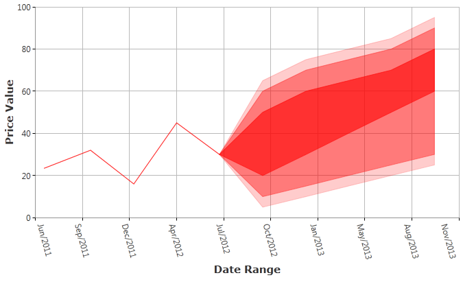
WPF sample – FanChart_WPF.zip
The same approach can be used to render Fan Chart series for ASP.NET, ASP.NET MVC and Windows Forms platforms. Below find samples:
ASP.NET, ASP.NET MVC and Windows Forms samples – FanChartSamples.zip



 No spam, just valuable updates.