
 Sivakumar R
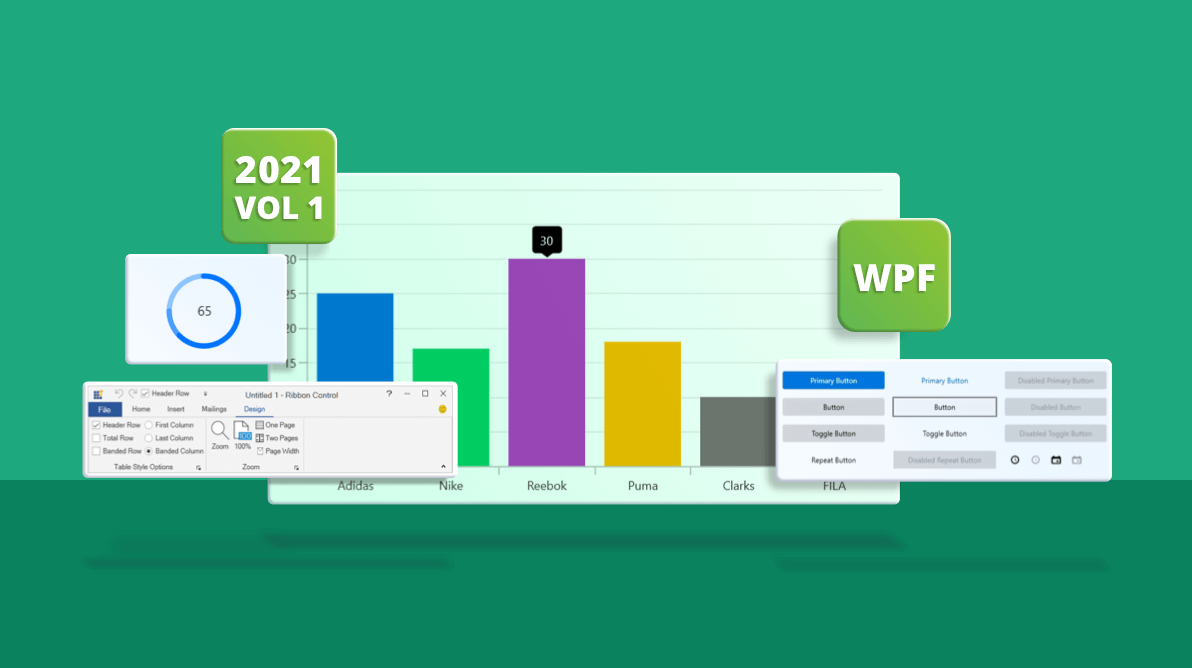
In the Essential Studio® 2021 Volume 1 release, Syncfusion has exciting new controls and updates in almost all its supported platforms. In this blog, we are going to look at the updates to the WPF controls in this 2021 Volume 1 release.
.NET 5.0 toolbox support
Previously in .NET 5.0 projects, Syncfusion WPF controls would be listed in the Visual Studio toolbox only when their corresponding NuGet packages were installed in the project. Now, the WPF UI controls are added to the toolbox via an installer.
Preview to production-ready controls
The following WPF controls have been developed to meet industry standards and are now marked as production-ready in the 2021 Volume 1 release:
Fluent light and dark themes
With this release, new Fluent light and dark themes are provided for both native framework and Syncfusion controls. The Fluent themes include design improvements like reveal highlight, reveal focus (high visibility keyboard visual feedback), and the option to enable touch design. You can customize Fluent themes using WPF Theme Studio or WPF Skin Manager just as you would other themes.
For more details, refer to our Fluent theme documentation.
High visibility keyboard visual feedback (reveal focus)
Reveal focus, or high visibility keyboard visual feedback, is an effect that shows a border on focusable elements when the user moves keyboard focus to that element. Now, you can enable or disable reveal focus for both framework and Syncfusion WPF controls using the WPF Skin Manager. The reveal focus is enabled by default in the Fluent theme, and you can enable it for other themes by setting the FocusVisualKind property of the theme.
For more information, refer to our WPF reveal focus documentation.
Windows 10-like compact scroll viewer
In Windows 10, the scroll bar in the scroll viewer is visualized using a panning indicator and traditional scroll bar, based on user interaction. Now, the Skin Manager has a ScrollBarMode property to enable a Windows 10-like compact scroll bar in all themes. By default, the compact scroll viewer is enabled in the Fluent themes, and you can enable this design in the other themes by using the ScrollBarMode property.
Size mode: touch UI for themes
With this 2021 Volume 1 release, all 13 themes in WPF Theme Studio support size mode. Using this, you can enable touch mode alignment by setting the SizeMode property of the Skin Manager.
For more information, refer to our WPF touch UI documentation.
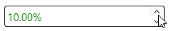
Spin button support in all numeric input controls
Our WPF Integer TextBox, Double TextBox, Percent TextBox, and Currency TextBox controls provide a built-in spin button which can be enabled by setting the ShowSpinButton property. Now, you can use the spin button to increase and decrease numeric values in the editor.
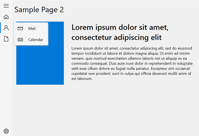
Navigation Drawer
Sidebar menu
Now, subitems of navigation items are displayed in a sidebar pop-up menu in compact display mode.
Keyboard navigation
Our WPF Navigation Drawer now provides complete keyboard support to navigate between menu items using the Tab and arrow keys. This feature is also applicable in the sidebar menu.
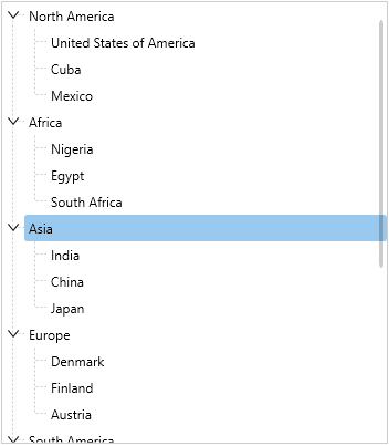
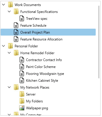
TreeView
MVVM support to map node expand states
Our WPF TreeView now provides support to save and retrieve node expansion states of a property in the underlying mode object. Even dynamic changes can be tracked.
Cancel editing
With this release, end users can cancel editing by pressing the Esc key, which reverses the edited value and returns it to its original value by using IEditableObject implementation in the model class.
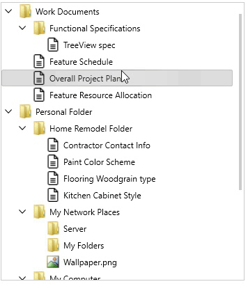
Editing on tap
Users can now edit nodes by tapping or double-tapping them based on the EditTrigger setting.
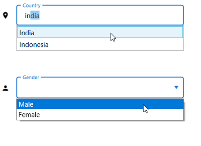
Text Input Layout
Support for combo box and autocomplete input controls
With this 2021 Volume 1 release, the Text Input Layout control allows loading WPF framework and Syncfusion combo box and autocomplete input controls, such as ComboBoxAdv, and SfTextBoxExt, in it.
For more information, refer to our supported input views documentation.
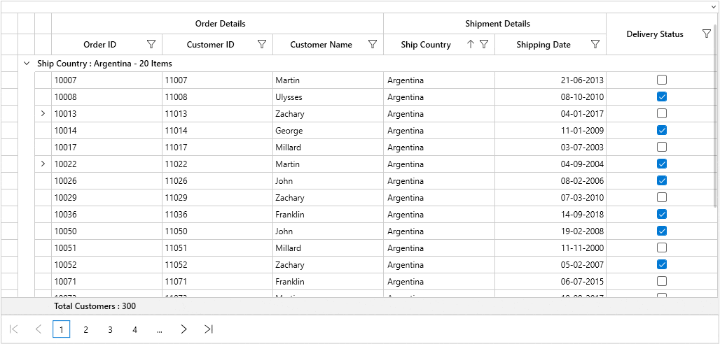
Property Grid
UI virtualization
The WPF Property Grid control now loads data faster using built-in UI virtualization. You can enable or disable this feature using the IsVirtualizing property.
Diagram
Diagram ribbon enhancement
The ribbon of our WPF Diagram control now includes commands to apply different appearances to diagrams with themes and variants from the Design tab. A theme in the Diagram control is a set of colors and effects that can be applied to a drawing with a single click.
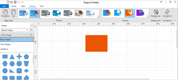
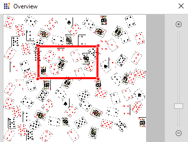
Diagram overview with zoom options
Now, the Overview control of the Diagram provides built-in zoom-in and zoom-out options.
PDF Viewer
File link annotations
Now, WPF PDF Viewer supports file link annotations in PDF documents and allows file navigation through an event.
Ink eraser tool
Users can now erase unwanted parts of freehand drawings (ink annotations) using an ink eraser tool in the toolbar.
Ribbon
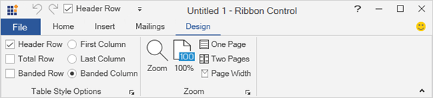
Custom items in QAT
Now you can add any kind of custom control, such as a combo box, text box, radio button, or check box, in the QAT of the Ribbon.
Chart
Improved tooltip UI
The default appearance of the tooltip, including its arrowhead and animation, have been improved.
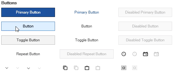
Miscellaneous
Other new features and enhancements to our WPF suite include:
- Radial Gauge control allows setting the duration for pointer animations.
- RichTextBox preserves the text box shape with top and bottom wrapping styles while viewing a Word document.
- Circular Progress Bar can display a secondary progress bar when a primary task depends on a secondary task. This will allow users to visualize the progress of both primary and secondary tasks simultaneously.
Circular Progress Bar with Primary and Secondary Progress Bars - Image Editor allows cropping an image in circular or elliptical shapes.
- Tab allows rearranging tabs when several tab items are present.
- Spreadsheet supports all themes in the Theme Studio.
- Spreadsheet ribbon displays information about each command using a tooltip.
- Smith Chart provides APIs to access the values of the chart’s center, radius, and area boundary.
- TreeMap supports customizing the duration of tooltip animations.
Visual Studio extensions
The Syncfusion WPF Extensions for Visual Studio provide an item template via an easy-to-use wizard to add the Chromeless Window and Ribbon Window controls to WPF applications. The Syncfusion WPF windows provide an option to quickly customize the window title bar. They also come with various built-in themes to provide an appealing user interface.
Conclusion
In this blog post, we have seen the major highlights in the Syncfusion WPF controls available in our 2021 Volume 1 release. We hope you’ll check out our release notes and What’s New pages to see the updates in other controls.
You can get your hands on demos in the Microsoft Store and the App Center.
Try these new features and share your feedback in the comments of this blog. You can also reach us through our support forums, Direct-Trac, or feedback portal.


 No spam, just valuable updates.