

A firm’s growth begins with listening to customer feedback. That’s why we at Syncfusion continuously review the constructive questions and comments we receive from our customers, which subsequently lead to various feature requests. From these requests, we handpicked the most widely asked-for features and made them available in Essential Studio® 2020 Volume 1, our latest release. In this blog post, I’ll quickly review the new chart types for the Flutter Chart widget, along with other new features.
New chart types
We extended the Syncfusion Flutter Charts widget to support three more financial chart types:
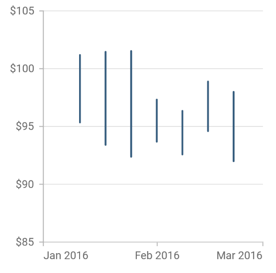
High-Low charts
High-low (HiLo) charts illustrate stock price movements by showing high and low values. The following code illustrates how to render a HiLo chart.
[Dart]
  SfCartesianChart(
    series: <ChartSeries<_ChartSampleData, DateTime>>[
      HiloSeries<_ChartSampleData, DateTime>(
        dataSource: chartData,
        xValueMapper: (_ChartSampleData sales, _) => sales.x,
        lowValueMapper: (_ChartSampleData sales, _) => sales.low,
        highValueMapper: (_ChartSampleData sales, _) => sales.high
      ),
      // Add more series.
    ]
  )
- Online sample: https://github.com/syncfusion/flutter-examples/blob/master/lib/samples/chart/cartesian_charts/chart_types/financial_charts/hilo_chart.dart
- Documentation: https://help.syncfusion.com/flutter/cartesian-charts/chart-types/hilo-chart
- API reference: https://pub.dev/documentation/syncfusion_flutter_charts/latest/charts/HiloSeries-class.html
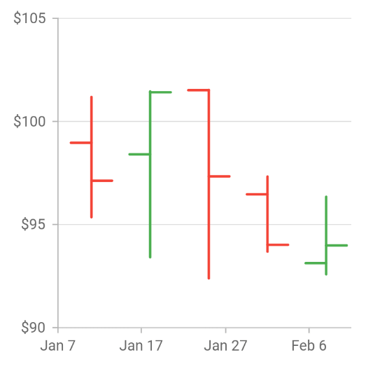
Open-high-low-close (OHLC) charts
Open-high-low-close (OHLC) charts represent the low, high, open, and closing values of a stock over time. The following code illustrates how to render an OHLC chart.
[Dart]
  SfCartesianChart(
    series: <ChartSeries<_ChartSampleData, DateTime>>[
      HiloOpenCloseSeries<_ChartSampleData, DateTime>(
        dataSource: chartData,
        xValueMapper: (_ChartSampleData sales, _) => sales.x,
        lowValueMapper: (_ChartSampleData sales, _) => sales.low,
        highValueMapper: (_ChartSampleData sales, _) => sales.high,
        openValueMapper: (ChartSampleData sales, _) => sales.open,
        closeValueMapper: (ChartSampleData sales, _) => sales.close
      ),
      // Add more series.
    ]
  )
- Sample: https://github.com/syncfusion/flutter-examples/blob/master/lib/samples/chart/cartesian_charts/chart_types/financial_charts/hilo_open_close_chart.dart
- Documentation: https://help.syncfusion.com/flutter/cartesian-charts/chart-types/ohlc-chart
- API reference: https://pub.dev/documentation/syncfusion_flutter_charts/latest/charts/HiloOpenCloseSeries-class.html
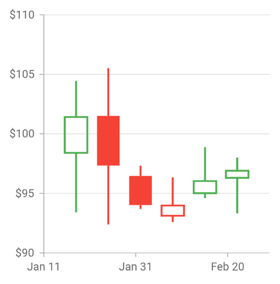
Candle charts
Candle charts are similar to OHLC charts in that they too are used to represent the open, high, low, and close price of a stock, but they visualize the data in a different way. The following code illustrates how to render a candle chart.
[Dart]
SfCartesianChart(
    series: <ChartSeries<_ChartSampleData, DateTime>>[
      CandleSeries<_ChartSampleData, DateTime>(
        dataSource: chartData,
        xValueMapper: (_ChartSampleData sales, _) => sales.x,
        lowValueMapper: (_ChartSampleData sales, _) => sales.low,
        highValueMapper: (_ChartSampleData sales, _) => sales.high,
        openValueMapper: (ChartSampleData sales, _) => sales.open,
        closeValueMapper: (ChartSampleData sales, _) => sales.close
      ),
      // Add more series.
    ]
  )
- Sample: https://github.com/syncfusion/flutter-examples/blob/master/lib/samples/chart/cartesian_charts/chart_types/financial_charts/candle_chart.dart
- Documentation: https://help.syncfusion.com/flutter/cartesian-charts/chart-types/candle-chart
- API reference: https://pub.dev/documentation/syncfusion_flutter_charts/latest/charts/CandleSeries-class.html
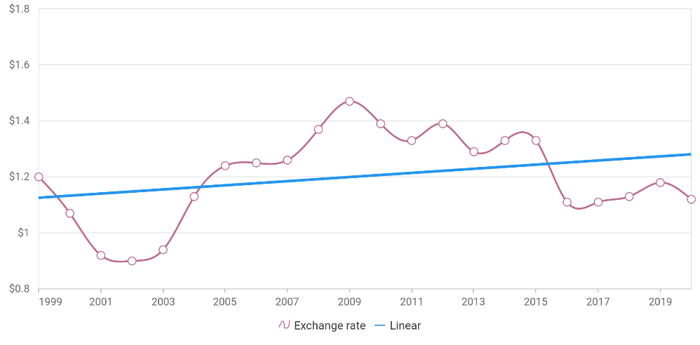
Trendlines
Trendlines are used to show the direction and speed of a value’s rise or fall. The following six types of trendlines can be rendered in Cartesian charts:
- Linear
- Exponential
- Logarithmic
- Polynomial
- Power
- Moving average
Trendlines support appearance customization, animation, tooltips, markers, as well as forward and backward forecasts. The following code illustrates how to render trendlines.
[Dart]
SfCartesianChart(
    series: <ChartSeries<_ChartSampleData, String>>[
    ColumnSeries<_ChartSampleData, String>(
        dataSource: chartData,
        xValueMapper: (_ChartSampleData data, _) => data.x,
        yValueMapper: (_ChartSampleData data, _) => data.y,
        trendlines: <Trendline>[
          Trendline(
              type: TrendlineType.linear
          )
        ]
      )
    ]
  )
- Sample: https://github.com/syncfusion/flutter-examples/tree/master/lib/samples/chart/cartesian_charts/trendline
- Documentation: https://help.syncfusion.com/flutter/cartesian-charts/trendline
- API reference: https://pub.dev/documentation/syncfusion_flutter_charts/latest/charts/Trendline-class.html
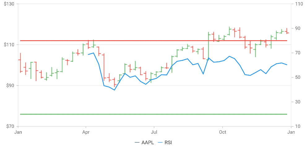
Technical indicators
Technical indicators—such as historic price, volume, interest, etc.—are used to forecast financial market direction. The Flutter Chart widget supports the following 10 types of technical indicators:
- Accumulation distribution indicator (AD)
- Average true range indicator (ATR)
- Bollinger band indicator
- Exponential moving average indicator (EMA)
- Moving average convergence/divergence indicator (MACD)
- Momentum indicator
- Relative strength index indicator (RSI)
- Simple moving average indicator (SMA)
- Stochastic indicator
- Triangular moving average indicator (TMA)
The following code illustrates how to render technical indicators.
[Dart]
SfCartesianChart(
    indicators: <TechnicalIndicators<_ChartSampleData, dynamic>>[
      RsiIndicator<_ChartSampleData, dynamic>(
        seriesName: 'AAPL'
      )
    ],
    series: <ChartSeries<_ChartSampleData, dynamic>>[
      HiloOpenCloseSeries<_ChartSampleData, dynamic>(
        dataSource: chartData,
        name: 'AAPL'
      )
    ]
  )
- Sample: https://github.com/syncfusion/flutter-examples/tree/master/lib/samples/chart/cartesian_charts/technical_indicators
- Documentation: https://help.syncfusion.com/flutter/cartesian-charts/technical-indicators
- API reference: https://pub.dev/documentation/syncfusion_flutter_charts/latest/charts/TechnicalIndicators-class.html
Conclusion
I hope you are excited to use these new features in your Flutter applications. For existing customers, the new version is available for download from the license and downloads page, or you can get the packages directly from pub.dev. If you are not yet a customer, you can try our 30-day free trial to check out these new features. Be sure to try our samples from the GitHub location, web sample browser, Play store, or App Store.
Also, if you wish to send us feedback or would like to submit any questions, please feel free to post them in the comments section of this blog post. You can also contact us through our support forum, feedback portal, or Direct-Trac support system.


Related Blogs
Here other blog posts related to Flutter updates in Volume 1:
 No spam, just valuable updates.