
 Selva Ganapathy Kathiresan
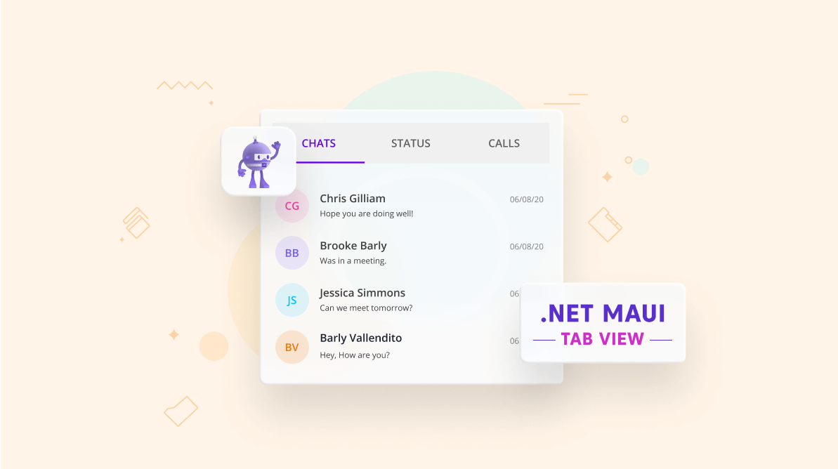
The .NET Multi-platform App UI (MAUI) is an evolution of Xamarin.Forms. It mainly focuses on single project development for different platforms such as Android, iOS, macOS, and Windows.
Syncfusion has shipped a set of cool .NET MAUI tools that includes Charts, Radial Gauge, and Tab View controls in the 2021 Volume 3 release. These controls are really fast, feature-rich, and flexible to use in your .NET MAUI applications.
In this blog, we will introduce the .NET MAUI Tabbed View control along with code examples.
.NET MAUI Tabbed View (Preview)
The advanced .NET MAUI Tabbed View is a simple and intuitive interface for tab navigation. You can use it in both mobile and desktop applications, wherever you want your users to explore and switch between different tabs.
Tab View overview
- Optimizes screen space usage when an application requires complex and huge layouts.
- Contains a set of tab items that present different content in the same space.
- Shows only one tab item at a time to be accessed by the user. The user taps another tab to make its content visible on the screen.
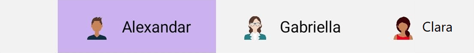
Tab width mode
The .NET MAUI Tabbed View provides two width options: default and size to content. These options determine how to calculate the width of the tabs on the tab bar when it is populated.
Default
In the default option, the width of all the tabs is equally divided based on the width of the tab bar. This enables a fixed tab bar that does not allow tab scrolling regardless of the number of tabs.
<syncfusion:SfTabView TabWidthMode="Default" />

Size to content
You can use this option when you need to set the width of a tab so that it fits the text or image that it contains. This option enables tab scrolling when the arrangement of the tabs and their width exceeds the tab bar’s width.
<syncfusion:SfTabView TabWidthMode="SizeToContent" />
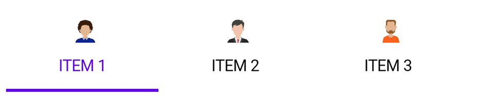
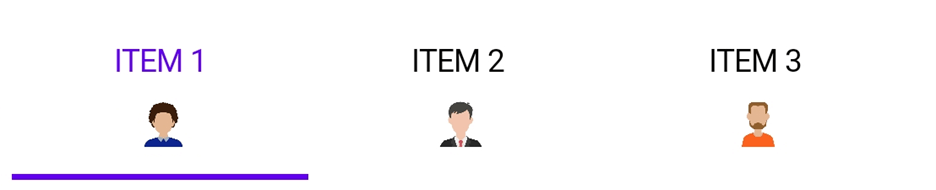
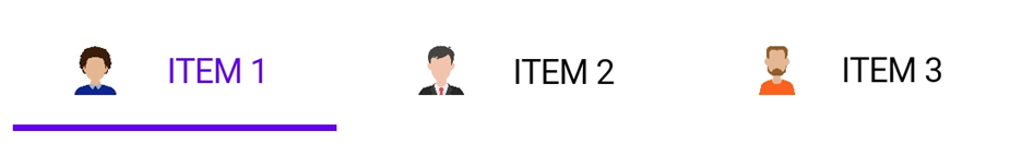
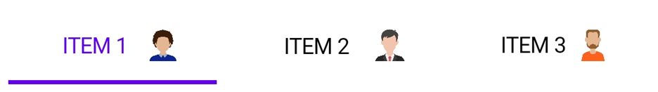
Tab image position
The .NET MAUI Tabbed View provides four options that determine how an image in a tab aligns relative to the tab’s text. The available options are top, bottom, left, and right.
Top
The top option places the image above the text.
<syncfusion:SfTabItem ImagePosition="Top"/>
Bottom
The bottom option places the image below the text.
<syncfusion:SfTabItem ImagePosition="Bottom"/>
Left
The left option places the image before the text.
<syncfusion:SfTabItem ImagePosition="Left"/>
Right
The right option places the image after the text.
<syncfusion:SfTabItem ImagePosition="Right"/>
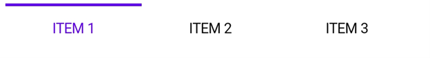
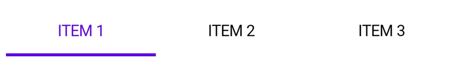
Selection indicator placement
The .NET MAUI Tabbed View provides three options that determine how the selection indicator aligns relative to the tab header item content. The available options are top, bottom, and fill.
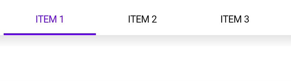
Top
The selection indicator is places at the top of the selected tab.
<syncfusion:SfTabView IndicatorPlacement="Top" />
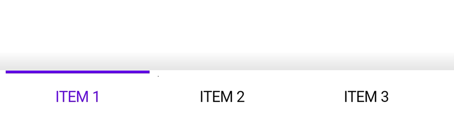
Bottom
The selection indicator is placed at the bottom of the selected tab.
<syncfusion:SfTabView IndicatorPlacement="Bottom" />
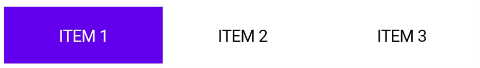
Fill
The selection indicator fills the selected tab.
<syncfusion:SfTabView IndicatorPlacement="Fill" />
Tab bar placement
The .NET MAUI Tabbed View provides two options that determine how the tab bar aligns relative to the tab content. The available options are top and bottom.
Top
The tab bar will be placed above the content region of the Tab View control.
<syncfusion:SfTabView TabBarPlacement="Top" />
Bottom
The tab bar will be placed below the content region of the Tab View control.
<syncfusion:SfTabView TabBarPlacement="Bottom" />
Nested tabs
This support allows users to have a nested tab view. You can also configure a tab view within another tab view through its Items property.
<syncfusion:SfTabView>
<syncfusion:SfTabItem Header="Item 1">
<syncfusion:SfTabView>
<syncfusion:SfTabItem Header="Item 1 SubItem 1"/>
<syncfusion:SfTabItem Header="Item 1 SubItem 2"/>
</syncfusion:SfTabView>
</syncfusion:SfTabItem>
<syncfusion:SfTabItem Header="Item 2">
<syncfusion:SfTabView>
<syncfusion:SfTabItem Header="Item 2 SubItem 1"/>
<syncfusion:SfTabItem Header="Item 2 SubItem 2"/>
</syncfusion:SfTabView>
</syncfusion:SfTabItem>
</syncfusion:SfTabView>
Ripple animation
The built-in ripple animation matches the Material theme. This animation also provides a better taping experience to the user.
Color and font customization
You can easily customize all fonts and theirs colors with simple APIs.

Visual state manager
Use the visual state manager to make changes to the .NET MAUI Tabbed View item properties based on the visual states set in the code. The applicable visual states are selected, normal, enable and disable.
<Style TargetType="TabView:SfTabItem">
<Setter Property="VisualStateManager.VisualStateGroups">
<VisualStateGroupList>
<VisualStateGroup>
<VisualState x:Name="Selected" >
<VisualState.Setters>
<Setter Property="TextColor" Value="Red" />
<Setter Property="ImagePosition" Value="Top" />
<Setter Property="FontSize" Value="16" />
<Setter Property="FontAttributes" Value="Bold" />
</VisualState.Setters>
</VisualState>
<VisualState x:Name="Normal">
<VisualState.Setters>
<Setter Property="TextColor" Value="Black" />
<Setter Property="ImagePosition" Value="Left" />
<Setter Property="FontSize" Value="12" />
<Setter Property="FontAttributes" Value="Italic" />
</VisualState.Setters>
</VisualState>
</VisualStateGroup>
</VisualStateGroupList>
</Setter>
</Style>
Conclusion
Thanks for reading! In this blog post, we have gone through the features of .NET MAUI Tabbed View control rolled out in the 2021 Volume 3 release. Also, we are planning to provide several more features like an action button, overflow button, swipe navigation, and more. You can download the assemblies from NuGet to evaluate this new control. Check out our Release Notes and What’s New pages for more details.
We are also planning to deliver more .NET MAUI controls to replace our existing Syncfusion Xamarin.Forms controls. You can expect them in our upcoming releases!
Do you need any other features from this .NET MAUI Tabbed View? Please comment below or mention them in our support forum, Direct-Trac, or feedback portal. We are always happy to assist you!


 No spam, just valuable updates.
Comments (2)
Looks beautiful. I would also need badges on a tab in my application. It would be very useful if you can implement it here.
Hi JAN POLENKO,
Thank you for your interest in Syncfusion products. We already consider the badge on tab header feature, you can expect this feature in our Vol 4 2021 release