
 Satheeskumar S
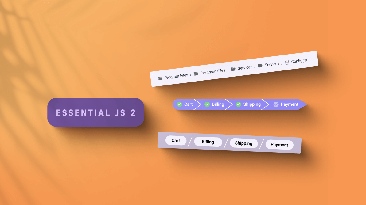
We are happy to introduce the new JavaScript Breadcrumb control in the Essential JS 2 suite.
The Breadcrumb component is a graphical user interface that serves as a navigation header for your web application or site. It helps to identify or highlight the current location within the hierarchical structure of a website.
The Essential JS 2 suite has a huge set of controls, and all these controls possess common web standards and functionalities such as web accessibility, right-to-left rendering, keyboard interaction, modular architecture, and responsiveness, with touch-friendly and lightweight UIs. Now, the Breadcrumb is included in this suite with all these JS 2 features as well as control-specific features.
This blog will provide a walk-through on the new Breadcrumb control, its UI designs, its features, and the platforms it supports.
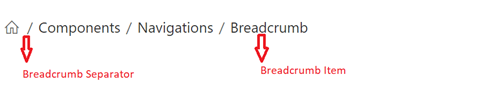
Breadcrumb UI design
We have designed the Breadcrumb control to be flexible, responsive, and completely customizable. The following are the two elements of a Breadcrumb control:
- Breadcrumb item: The navigation item of the link.
- Breadcrumb separator: The separator between breadcrumb items.
Use cases
We can use the Breadcrumb control as a navigation header for web applications or websites. Also, we can use it as a secondary navigation tool to identify the current location without navigation.
The following are some real-world scenarios the Breadcrumb control will best fit:
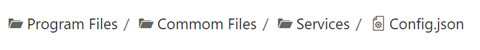
- E-commerce sites: The hierarchical categories of a product can be displayed with its parent category in navigation links.
- Search engines: Showcase the current location with the parent root in the search results.
- Support tickets: Display the current support ticket with its platforms and parent navigation.
Existing features
The following is the list of key features available in the Breadcrumb control:
- BindToLocation or URL binding.
- Items with icons.
- UI customization with custom items and separator templates.
- Breadcrumb with overflow.
- Keyboard accessibility and responsiveness.
BindToLocation or URL binding
The BindToLocation feature of the Breadcrumb control generates items automatically using the current location in a web application when both items and URL properties are not specified.
Alternatively, when an absolute or a relative URL is specified, the items are generated based on the provided URL.
Note: Refer to the Breadcrumb binding example for more details.
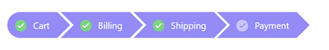
Items with icons
The JavaScript Breadcrumb control comes with built-in icon support for the visual representation of the items. By default, the Breadcrumb aligns the icons on the left side of the text, but if required, we can place them on the right side.
UI customization with custom item and separator templates
We can create custom user experiences using the templates. Also, we can customize both breadcrumb items and separators using the template support. Using this, you can completely modify the appearance of the Breadcrumb with HTML elements and other components.
Note: Refer to the Breadcrumb template and customization sample for more details.
Breadcrumb with overflow
You can limit the number of items displayed in a breadcrumb control. The following are the overflow modes available:
- Default: Shows the maximum number of items possible in the container space and hides the remaining items. Clicking on a previous item will show the hidden items.
- Collapsed: Shows the first and last breadcrumb items and hides the remaining items with a collapsed icon. When we click the collapsed icon, all items become visible and navigable.
Note: Refer to the Breadcrumb overflow sample for more details.
Keyboard accessibility
All our Essential JS 2 suite controls follow keyboard interaction and web accessibility standards. So, users can easily interact with the Breadcrumb control using their keyboard. Use the following keyboard shortcuts to handle the Breadcrumb control:
- Tab: To navigate to the next item.
- Shift + Tab: To navigate to the previous item.
- Enter: To perform click action on an item.
Responsive and touch-friendly
By default, the Breadcrumb control is both responsive and touch-friendly. It will adapt to all mobile devices based on the screen size. The Breadcrumb control UI automatically changes to overflow mode, when we change the screen size. This enables the control to render adaptively based on the device, providing optimal user experience on phones, tablets, and desktops applications.
Upcoming features
The Breadcrumb control is now available in preview mode, and we plan to enhance the overflow support with the following modes in future releases:
- Menu: Shows the number of breadcrumb items that can be accommodated within the container space and creates a submenu with the remaining items.
- Wrap: Wraps the items on multiple lines when the Breadcrumb’s width exceeds the container space.
- Scroll: Shows an HTML scroll bar when the Breadcrumb’s width exceeds the container space.
- None: Shows all the items on a single line.
How to use it
We can implement the Breadcrumb control on all major platforms as a navigation tool. It has a huge set of resources for developers, including source code on GitHub, live demos in our sample browser, and customization features in the documentation.
Supported platforms
The following platforms support Breadcrumb.
Conclusion
We hope you enjoyed this quick introduction to the design and available features of Essential JS 2’s new Breadcrumb control. If you would like to give it a try, please download our latest version of Essential Studio, 2021 Volume 3, and provide your valuable feedback.
If you have any questions, please let us know in the comments section below. You can also contact us through our support forums, Direct-Trac, or feedback portal. We are always happy to assist you!
 No spam, just valuable updates.