
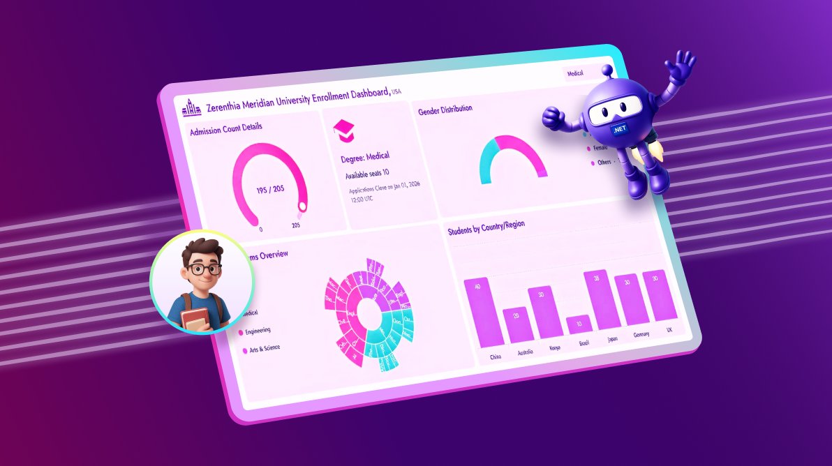
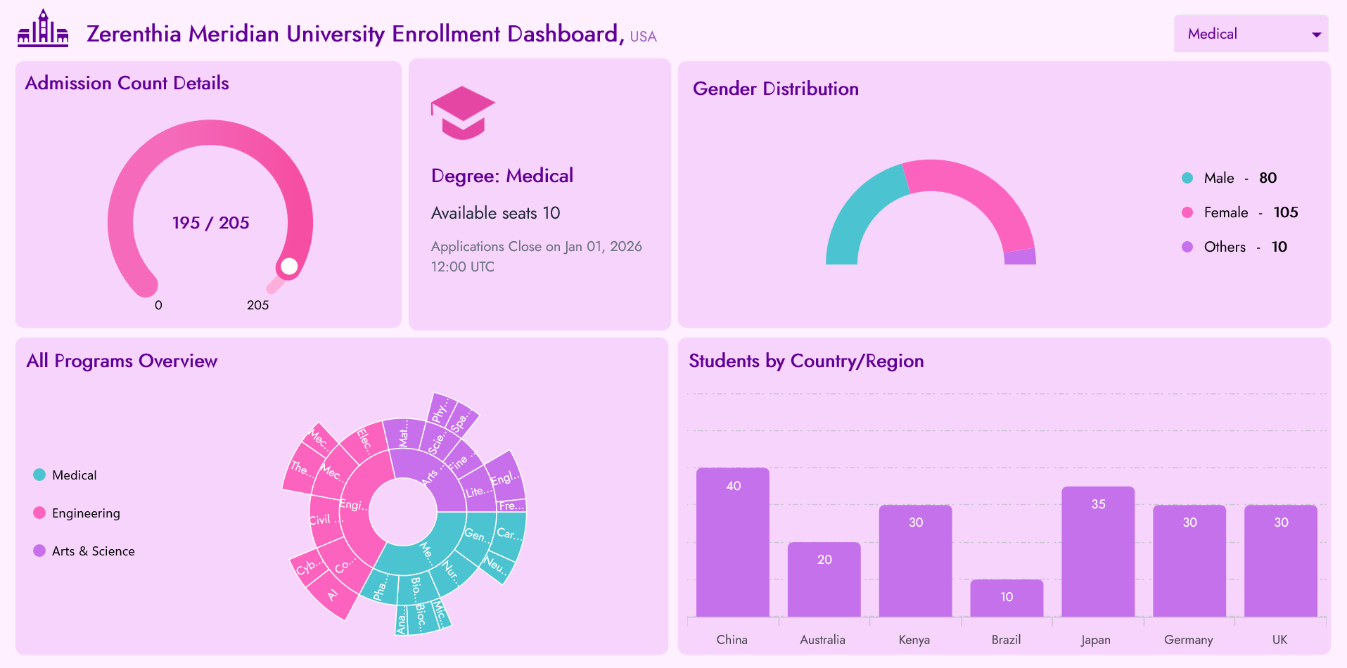
TL;DR: Learn how to build a modern, responsive Student Enrollment Dashboard using .NET MAUI with Syncfusion Charts, Gauges, and Inputs. Visualize KPIs like admission count, gender distribution, program breakdown, and regional student mix with interactive charts.
Welcome to our Chart of the Week series!
Universities deal with thousands of rows of enrollment data, but spreadsheets rarely tell the full story. That’s where dashboards shine, turning raw numbers into actionable insights.
In this guide, we’ll build a Student Enrollment Dashboard in .NET MAUI using Syncfusion® .NET MAUI Charts. The goal? Transform admissions data into a responsive, visually engaging experience that works across devices.
Why this Dashboard matters
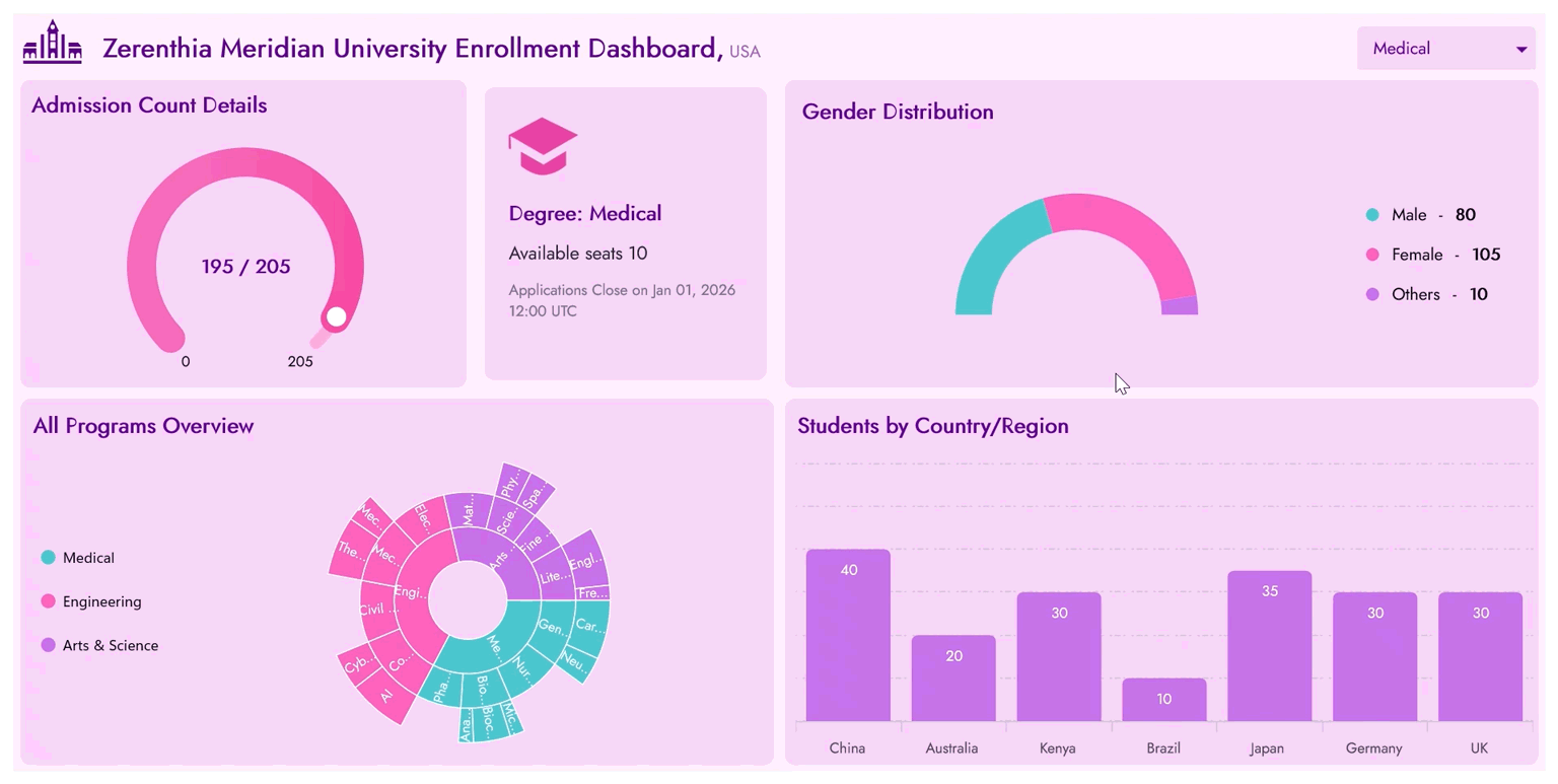
Every tile in the dashboard offers a unique perspective on enrollment health, filled seats, gender diversity, program breakdowns, and international reach. Admissions teams can track progress, identify trends, and make data-driven decisions instantly. It includes:
- Degree filter for dynamic segmentation.
- Admission KPI gauge showing filled vs. total seats.
- Notice banner for seat availability and deadlines.
- Gender distribution Doughnut chart.
- A Sunburst chart for program breakdown (Degree → Course → Program Type).
- A Column chart for student count by country/region.
- Responsive layout optimized for desktops and mobile.
The core goals are:
- Monitor enrollment targets.
- Visualize gender and regional diversity.
- Highlight program popularity and capacity.
- Enable data-driven decisions for outreach and scheduling.
Step 1: Create the Model and ViewModel
Begin by defining the classes that structure your data and manage business logic. These models form the backbone of the dashboard, ensuring that well-organized data drives each visualization.
Refer to the code example below.
public class DegreeModel
{
    // Represents a single academic degree (e.g., Medical, Engineering, Arts & Science).
    // Used to drive the degree filter, admission KPI gauge, notice banner, gender chart, and region chart.
}

public class CountryStat
{
    // Holds information about student counts by country or region.
    // Drives the Students by Country/Region column chart visualization.
}

public class ProgramType
{
    // Represents a specific program type under a course.
    // Used in the Sunburst chart to show distribution of students by program type.
}

public class CourseModel
{
    // Represents a course under a degree (e.g., AI, Civil, Neuro).
    // Drives the middle ring of the Sunburst chart and aggregates program type data.
}

public class GenderStat
{
    // Holds gender distribution data (e.g., Male, Female, Other).
    // Drives the Gender Distribution doughnut chart visualization.
}

public class SunburstNode
{
    // Represents hierarchical data for the Sunburst chart:
    // Degree → Course → ProgramType with associated student count.
}
Next, create the EnrollmentViewModel, which binds these models to the UI.
public partial class EnrollmentViewModel
{
    // Selected degree drives all dashboard tiles
    public DegreeModel? SelectedDegree {get; set;}
    // KPI Gauge bindings
    public int GaugeTotal  {get; set;}
    public double GaugeShapePointer  {get; set;}
    public string AdmittedSeatsByDegree  {get; set;}
    public int RemainingVacancies  {get; set;}

    // Notice banner deadline
    public string ApplicationCloseText {get; set;}

    // Collections bound to UI
    public ObservableCollection<DegreeModel> Degrees { get; }
    public IList<SunburstNode> SunburstData { get; }
    public List<Brush> CustomBrushes { get; set; }
    public IList<GenderStat> GenderStats => SelectedDegree?.Gender ?? new List<GenderStat>();
    public IList<CountryStat> CountryStats => SelectedDegree?.Countries ?? new List<CountryStat>();

    // Constructor initializes static data and palettes
    public EnrollmentViewModel()
    {
        Degrees = new ObservableCollection<DegreeModel>(CreateStaticDegrees());
        SelectedDegree = Degrees.First(d => d.Name == "Medical");
        SunburstData = BuildSunburst(Degrees);
    }

    private IEnumerable<DegreeModel> CreateStaticDegrees()
    {
        // Generates the static dataset of degree, course, gender, and country stats for the dashboard.
    }

    private IList<SunburstNode> BuildSunburst(IEnumerable<DegreeModel> degrees)
    {
        // Builds hierarchical nodes (Degree → Course → ProgramType) for the Sunburst chart visualization.
    }
}
Note: You can view the complete code implementation in the Model and EnrollmentViewModel classes.
Step 2: Configure the layout
Once the data structure is ready, the next step is to design the dashboard layout. A clean and responsive layout ensures that insights are easy to interpret.
We’ll use a MainGrid divided into three rows:
- Header row: Branded title and degree filter.
- Middle row: KPI gauge, notice banner, and gender chart.
- Bottom row: Sunburst chart and regional column chart.
Here’s how you can do it in XAML code:
<!--MainGrid-->
<Grid x:Name="MainGrid" RowDefinitions="{OnPlatform Default='0.6*,4.2*,5*',  Android='2*,440,5*', iOS='2*,440,5*'}" >

    <Grid Grid.Row="1" ColumnDefinitions="{OnPlatform Default='*,auto', Android='*',iOS='*'}" RowDefinitions="{OnPlatform Default='*',Android='*,*',iOS='*,*'}">

        <!--Title-->
        <Grid ColumnDefinitions="Auto,*" >
            …
        </Grid>

        <!--ComboBox-->
        <Border Grid.Row="1" Grid.Column="1">
            …
        </Border>
    </Grid>

    <!--AdmissionData, NoticeData, GenderData-->
    <Grid Grid.Row="1" ColumnDefinitions="{OnPlatform Default='*',WinUI='*,*',MacCatalyst='*,*'}" >

        <Grid Grid.Column="0" RowDefinitions="{OnPlatform Default='*', Android='*,*',iOS='*,*'}" ColumnDefinitions="{OnPlatform Default='*', WinUI='6*,4*', MacCatalyst='6*,4*'}">
            …
        </Grid>
    </Grid>

    <!--OverallData, RegionData-->
    <Grid Grid.Row="2" ColumnDefinitions="{OnPlatform Default='*',WinUI='*,*',MacCatalyst='*,*'}" RowDefinitions="{OnPlatform Default='*', Android='*,*',iOS='*,*'}">
        …
    </Grid>
</Grid>
Step 3: Degree filter with branded header
After setting up the layout, focus on the header section. This area establishes the dashboard’s identity and provides an interactive degree filter.
Using SfComboBox, users can quickly switch between programs such as Medical, Engineering, and Arts. Each selection triggers dynamic updates across all charts, ensuring real-time insights.
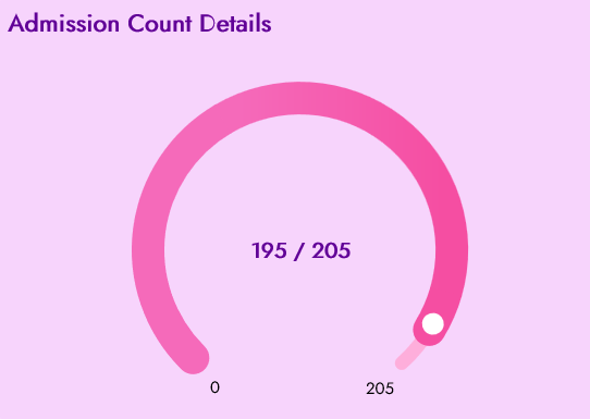
Step 4: Admission KPI Gauge
Now that users can filter by degree, it’s time to visualize seat occupancy. The KPI gauge answers the critical question: How many seats are filled?
Powered by SfRadialGauge, this component delivers an intuitive radial chart with smooth animations and bold annotations. As the needle moves, users instantly see progress toward enrollment goals.
Key features:
- Animated transitions when switching degrees.
- Clean axis styling for clarity.
- Central annotations showing admitted seats vs. total capacity.
Here’s the complete XAML code block.
<Border>
    <Grid RowDefinitions="Auto,*">
        <Label  Text="Admission Count Details"/>

        <sfGauge:SfRadialGauge   Grid.Row="1">
            <sfGauge:SfRadialGauge.Axes>
                <sfGauge:RadialAxis Minimum="0" Maximum="{Binding SelectedDegree.TotalSeats}"/>
                    <sfGauge:RadialAxis.AxisLineStyle>
                        <sfGauge:RadialLineStyle CornerStyle="BothCurve"/>
                    </sfGauge:RadialAxis.AxisLineStyle>
                    …
                    <sfGauge:RadialAxis.Annotations>
                        <sfGauge:GaugeAnnotation>
                            <sfGauge:GaugeAnnotation.Content>
                                ...
                            </sfGauge:GaugeAnnotation.Content>
                        </sfGauge:GaugeAnnotation>
                    </sfGauge:RadialAxis.Annotations>
                    <sfGauge:RadialAxis.Pointers>
                        …
                    </sfGauge:RadialAxis.Pointers>
                </sfGauge:RadialAxis>
            </sfGauge:SfRadialGauge.Axes>
        </sfGauge:SfRadialGauge>
    </Grid>
</Border>
Here’s what the Radial Gauge looks like:
Step 5: Display context with a Notice banner
Numbers alone don’t tell the full story. To provide context, add a notice banner that highlights seat availability and application deadlines. This card-style component keeps admissions teams informed and focused on key dates.
<Border x:Name="Banner" >
    <Grid VerticalOptions="{OnPlatform Default=Fill, MacCatalyst=Center}" RowDefinitions="auto,*" RowSpacing="{OnPlatform Default=14, MacCatalyst=18}" Padding="{OnPlatform Default=20, MacCatalyst=20 0 20 20}">

        <Image Source="graduate.png" HorizontalOptions="Start" VerticalOptions="Start" WidthRequest="60" HeightRequest="60"/>

        <VerticalStackLayout Grid.Row="1" Spacing="{OnPlatform Default=10, MacCatalyst=14}">

            <Label Text="{Binding SelectedDegree.Name, StringFormat='Degree: {0}'}" FontAttributes="Bold" FontSize="18" TextColor="#610097"/>

            <Label Text="{Binding RemainingVacancies, StringFormat='Available seats {0}'}" FontSize="16" TextColor="#1F2937"/>

            <Label Text="{Binding ApplicationCloseText}" FontSize="13" TextColor="#6B7280" LineBreakMode="WordWrap"/>
        </VerticalStackLayout>
    </Grid>
</Border>
Here’s the expected output:

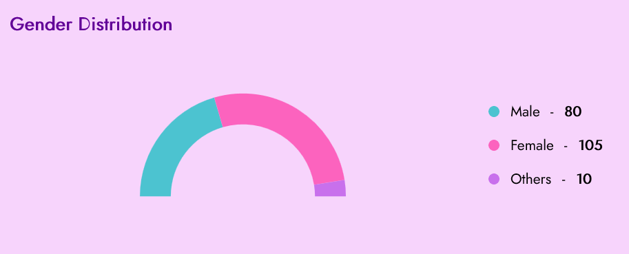
Step 6: Visualize Gender distribution with a Doughnut Chart
Now, showcase diversity using a gender distribution chart. Built with SfCircularChart and DoughnutSeries, this visualization updates dynamically based on the selected degree.
This chart highlights,
- Half‑doughnut layout for clarity.
- Each slice represents a category such as Female, Male, or Other.
- Custom legend to display color, category, and count.
- Responsive legend placement for desktop and mobile.
Here’s a code snippet to achieve this.
<Border>
    <Grid>
        <sfCharts:SfCircularChart>
            <sfCharts:DoughnutSeries  ItemsSource="{Binding GenderStats}" StartAngle=" EndAngle="360" XBindingPath="Category" YBindingPath="Count"/>
        </sfCharts:SfCircularChart>
    </Grid>
</Border>
After running the code, you’ll see this.
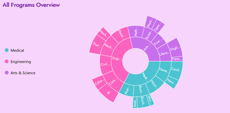
Step 7: Sunburst Chart for program distribution
After showcasing gender diversity, the next step is to explore the overall enrollment structure. To achieve this, we’ll use a Sunburst Chart, which provides an interactive and visually appealing way to represent hierarchical data.
This chart illustrates enrollment across various degrees, courses, and program types, enabling teams to quickly identify trends and popular programs. Think of it as a hierarchical tree reimagined as concentric rings:
- The innermost ring represents degrees.
- The middle ring expands into courses.
- The outer ring displays program types.
With labels and interactive tooltips, users can drill down into the data to uncover which programs attract the most students and pinpoint areas with the strongest enrollment. This visualization makes complex relationships easy to interpret at a glance.
Below is the code you need to implement this feature.
<Border>
    <sfSunburst:SfSunburstChart ItemsSource="{Binding SunburstData}" ValueMemberPath="StudentCount" >

        <sfSunburst:SfSunburstChart.Levels>
            <sfSunburst:SunburstHierarchicalLevel GroupMemberPath="DegreeName"/>
            <sfSunburst:SunburstHierarchicalLevel GroupMemberPath="CourseName"/>
            <sfSunburst:SunburstHierarchicalLevel GroupMemberPath="ProgramType"/>
        </sfSunburst:SfSunburstChart.Levels>

    </sfSunburst:SfSunburstChart>
</Border>
The following image shows the Sunburst Chart.
Step 8: Visualize Students by Country/Region with a Column Chart
Finally, let’s highlight geographic diversity in enrollment. The Students by Country/Region tile provides a clear view of how student numbers vary across different countries. Each column represents a country, and its height reflects the number of students enrolled, making comparisons quick and intuitive.
This visualization is implemented using SfCartesianChart with a ColumnSeries, which binds directly to country-level statistics. As users switch between degrees, the chart updates dynamically to reflect the latest data. Rounded corners and smooth animated transitions give the chart a modern, polished look that feels approachable and professional.
Below is the code snippet you’ll need to create this feature:
<Border>
    <sfCharts:SfCartesianChart>
        <sfCharts:SfCartesianChart.XAxes>
            <sfCharts:CategoryAxis>
            </sfCharts:CategoryAxis>
        </sfCharts:SfCartesianChart.XAxes>

        <sfCharts:SfCartesianChart.YAxes>
            <sfCharts:NumericalAxis>
            </sfCharts:NumericalAxis>
        </sfCharts:SfCartesianChart.YAxes>

        <sfCharts:ColumnSeries  ItemsSource="{Binding CountryStats}" XBindingPath="Country" YBindingPath="Count"/>
    </sfCharts:SfCartesianChart>
</Border>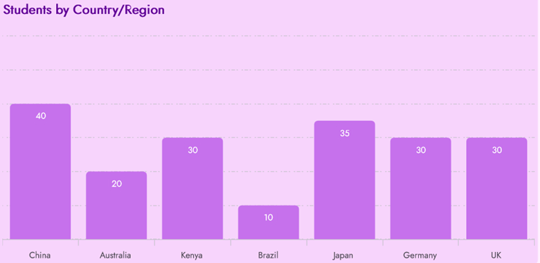
Implement these steps, and you’ll have a fully functional Student Enrollment Dashboard in .NET MAUI, as shown below.
GitHub reference
For more details, refer to the .NET MAUI Student Enrollment dashboards sample on GitHub.

Conclusion
Thank you for reading! In this guide, we explored how to create a Student Enrollment Dashboard using .NET MAUI Charts.
If you’re a Syncfusion user, you can download the setup from the license and downloads page. Otherwise, you can download a free 30-day trial.
You can also contact us through our support forum, support portal, or feedback portal for queries. We are always happy to assist you!


 No spam, just valuable updates.