
 Naveenkumar Sanjeevirayan
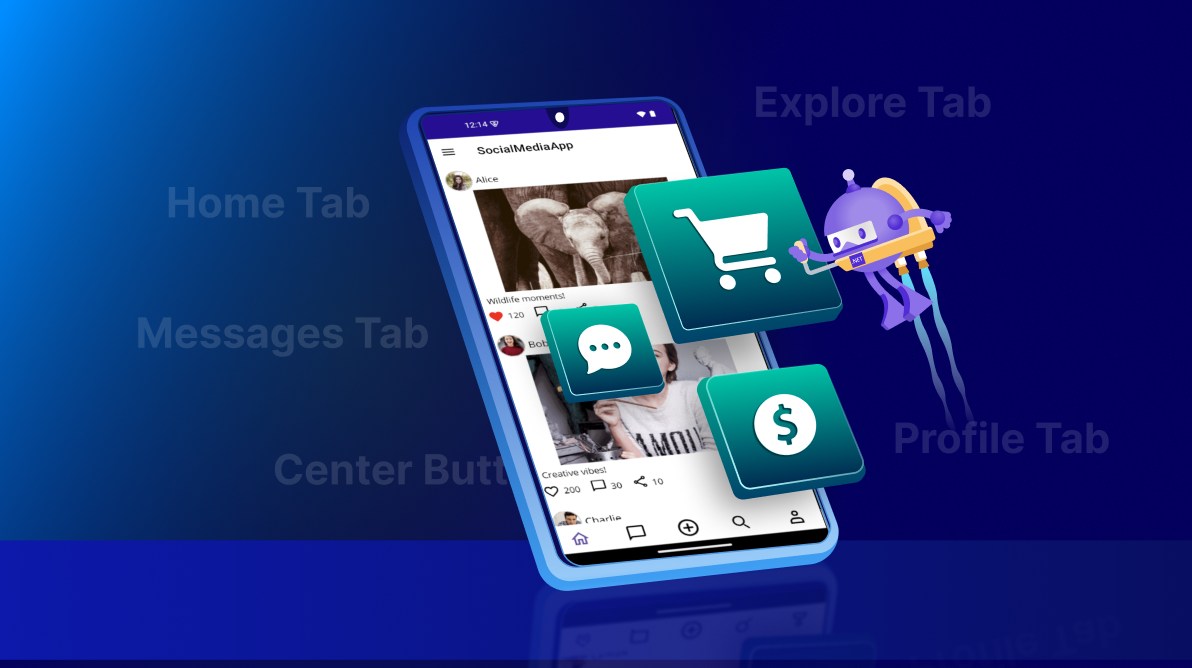
TL;DR: Building a .NET MAUI social media app? Use Tab View for intuitive navigation and add a center button for quick post creation. Implement dynamic feeds, messages, and profile pages with a responsive UI.
Want to build a modern, mobile-friendly social media app? In this tutorial, we’ll show you how to build a feature-rich application using .NET MAUI Tab View and ListView controls. You’ll learn how to design intuitive navigation, implement a center button for quick actions, and create interactive feeds, all with Syncfusion’s .NET MAUI controls.
Why a center button?
The center button enhances usability by providing quick access to key actions, such as creating a new post. This design pattern is widely adopted across various app types for its convenience. Common use cases include:
- Social Media: Upload photos, share videos, or start a live stream.
- Messaging: Initiate a new conversation instantly.
- E-Commerce: Quickly add products or create listings.
- Finance: Log transactions or add budget entries with ease.
Key features
To make your .NET MAUI social media app engaging and easy to navigate, we’ll include the following core features:
- Home Tab: A personalized feed displaying posts tailored to the user.
- Messages Tab: Recent conversations with integrated search functionality.
- Explore Tab: A grid layout showcasing trending content for discovery.
- Profile Tab: User details along with their posts and activity.
- Center Button: A quick-access shortcut for creating new posts.
Step-by-step implementation
Step 1: Install Syncfusion .NET MAUI Tab View
Begin by adding the Tab View control to your project using the official documentation. This control enables a tabbed interface with customizable tabs and an optional center button for quick actions, ensuring smooth navigation throughout your app.
Step 2: Define data models and ViewModel
Next, set up your data structure for efficient management. Create model classes such as a Post Model to represent social media posts with user details, images, and engagement metrics, and a Message Model to handle chat data, including sender information and unread message counts. Then, implement a ViewModel, SocialMediaViewModel, that maintains collections of posts and messages. This ViewModel acts as the data context for your views and supports real-time UI updates using INotifyPropertyChanged.
Note: For complete implementation details, refer to the GitHub repository.
Step 3: Design tab layout
Now, create tabs for Home, Messages, Explore, and Profile to structure your app’s navigation. Use font icons for a lightweight and visually appealing interface.
To highlight the active tab, apply VisualStateManager styling in SfTabItem. This approach allows you to define distinct visual states for selected and unselected tabs:
- Default tabs display black text for the normal state.
- Selected tabs use a highlight color (#6750a4) for better visibility.
Define this style once in ContentPage.Resources so it automatically applies to all tab items, ensuring consistency across the app. Additionally, bind each tab icon’s color to the tab’s TextColor so the icon dynamically reflects the selection state.
<tabView:SfTabView>
<!--Home Tab-->
<tabView:SfTabItem x:Name="homeTab" ImageSize="30">
<tabView:SfTabItem.ImageSource>
<FontImageSource Glyph="" FontFamily="MauiSampleFontIcon"
Color="{Binding Source={x:Reference homeTab},Path=TextColor}" />
</tabView:SfTabItem.ImageSource>
</tabView:SfTabItem>
<!-- Repeat same structure for other tabs -->
</tabView:SfTabView>
Step 4: Enable center button
Enhance usability by adding a center button to your Tab View for quick post creation. This interactive element is positioned at the center of the tab bar and can be fully customized using CenterButtonSettings.
With these settings, you can configure:
ImageSourceandImageSizefor the button icon.- DisplayMode for positioning.
- Optional custom content, such as glyphs or icons.
In this example, a font icon Glyph="" from a custom font family is used to represent the center button, ensuring a clean and lightweight design.
<tabView:SfTabView IsCenterButtonEnabled="True" >
<!--Center Button-->
<tabView:SfTabView.CenterButtonSettings>
<tabView:CenterButtonSettings DisplayMode="Image" ImageSize="35">
<tabView:CenterButtonSettings.ImageSource>
<FontImageSource Glyph="" Color="Black" FontFamily="MauiSampleFontIcon" Size="20"/>
</tabView:CenterButtonSettings.ImageSource>
</tabView:CenterButtonSettings>
</tabView:SfTabView.CenterButtonSettings>
</tabView:SfTabView>Step 5: Bind data with ViewModel
Next, to keep your UI responsive and fully data-driven, implement a ViewModel that uses INotifyPropertyChanged for real-time updates.
Start by creating a SocialMediaViewModel that manages collections such as Posts, Messages, ExplorePosts, and UserPosts. After that, bind this ViewModel to your ContentPage so all tabs share the same data context:
XML
<ContentPage.BindingContext>
    <local:SocialMediaViewModel />
</ContentPage.BindingContext>
This ensures smooth data flow across tabs and supports dynamic updates without manual refresh.
Step 6: Display dynamic content
Let’s bring your tabs to life by displaying dynamic content tailored to each section of your .NET MAUI social media app. The key to efficient rendering is Syncfusion’s ListView, a high-performance and highly customizable list control for .NET MAUI. Before proceeding, make sure you have installed and configured ListView by following the official documentation.
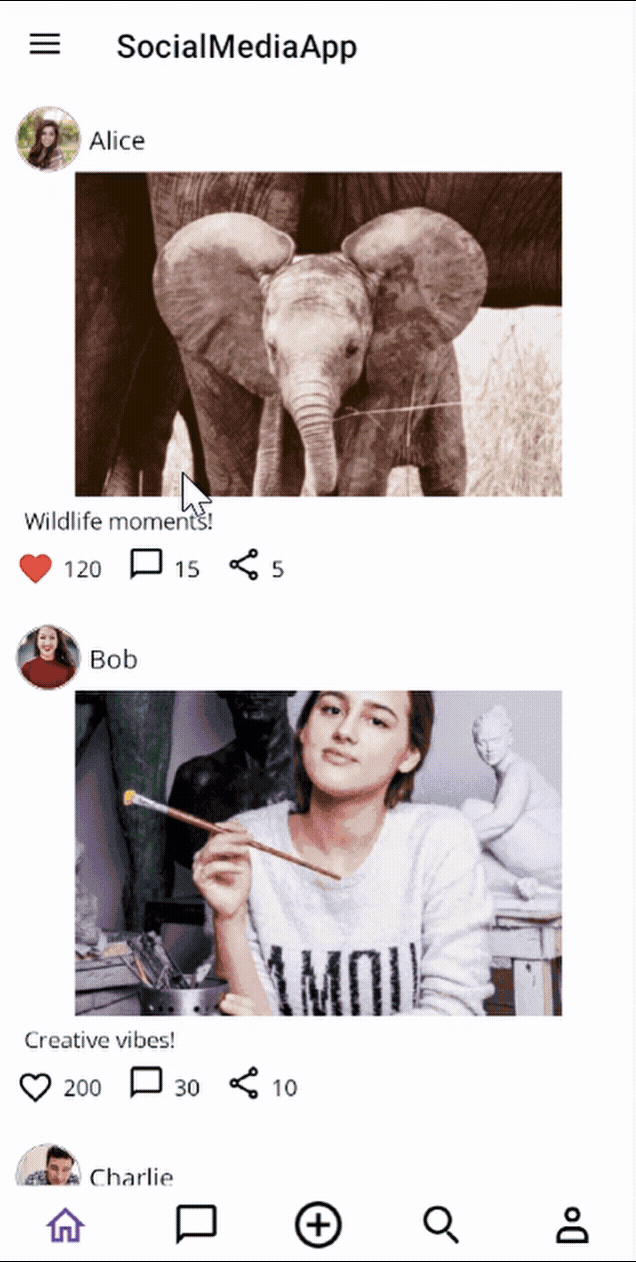
Home tab
Start with the Home tab, which displays a vertically scrolling feed of posts including user details, images, and captions. Use ListView for virtualization and templating to maintain smooth performance even with large datasets.
<tabView:SfTabView EnableSwiping="True" IsCenterButtonEnabled="True" IndicatorStrokeThickness="0" TabBarPlacement="Bottom" >

    <!—Center button settings-->

    <!--Home Tab-->
    <tabView:SfTabItem x:Name="homeTab" ImageSize="30">
. . .
        <listView:SfListView ItemsSource="{Binding Posts}" SelectionMode="None"
                                 AutoFitMode="Height" >
        <listView:SfListView.ItemTemplate>
            <DataTemplate>
                <VerticalStackLayout Padding="10">
                    <HorizontalStackLayout>
                        <Image Source="{Binding ProfileImage}" WidthRequest="40" HeightRequest="40" Aspect="AspectFill"/>
                        <Label Text="{Binding UserName}" FontSize="16" VerticalOptions="Center" Padding="5"/>
                    </HorizontalStackLayout>
                    <Image Source="{Binding PostImage}" WidthRequest="300" HeightRequest="200" Aspect="AspectFill"/>
                    <Label Text="{Binding Caption}" FontSize="14" Padding="5"/>
                </VerticalStackLayout>
            </DataTemplate>
        </listView:SfListView.ItemTemplate>
    </listView:SfListView>
</tabView:SfTabItem>
</tabView:SfTabView>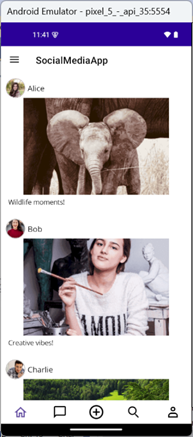
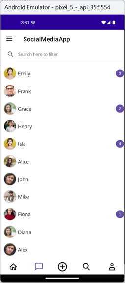
Messages tab
Next, display recent conversations and unread notifications. Add a SearchBar for filtering chats by sender name and use SfBadgeView to show unread counts. Filtering can be implemented using Syncfusion’s ListView and a simple text-change event that updates the data source.
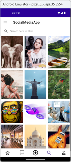
Explore tab
Showcase trending content in a Pinterest-style grid using ListView with GridLayout. Include a SearchBar for filtering posts by username or image name.
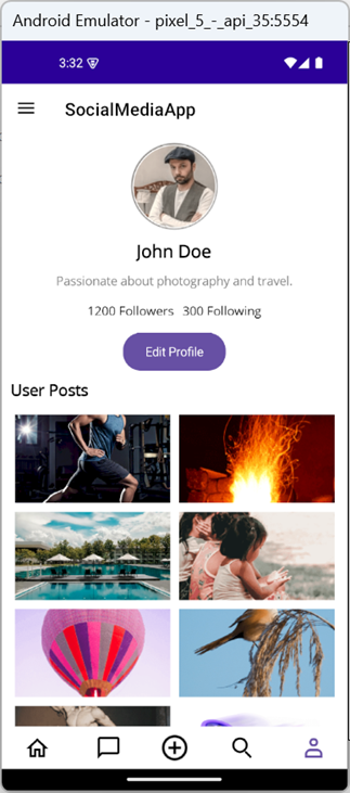
Profile tab
Finally, create a responsive profile view with user details and posts in a two-column grid layout. Include an Edit Profile button for image updates. Use a ScrollView with VerticalStackLayout for responsiveness. Profile data is managed via a UserProfile model and bound through SocialMediaViewModel.
<!--Profile Tab-->
<tabView:SfTabItem x:Name="profileTab" ImageSize="30">
    <ScrollView>
        <VerticalStackLayout Padding="10" Spacing="10">
            <Border HeightRequest="100" WidthRequest="100">
                <Border.StrokeShape>
                    <RoundRectangle CornerRadius="50" />
                </Border.StrokeShape>
                <Image x:Name="profileImage" Source="{Binding Profile.ProfileImage}" Aspect="AspectFill" HorizontalOptions="Center"/>
            </Border>
            <Label Text="{Binding Profile.Name}" FontSize="20" FontAttributes="Bold" HorizontalOptions="Center"/>
            <Label Text="{Binding Profile.Bio}" FontSize="14" HorizontalOptions="Center" TextColor="Gray"/>
            <HorizontalStackLayout HorizontalOptions="Center">
                <Label Text="{Binding Profile.Followers, StringFormat='{0} Followers'}" FontSize="14" Padding="5"/>
                <Label Text="{Binding Profile.Following, StringFormat='{0} Following'}" FontSize="14" Padding="5"/>
            </HorizontalStackLayout>
            <buttons:SfButton Text="Edit Profile" Clicked="OnEditProfileClicked" BackgroundColor="Blue" TextColor="White" HorizontalOptions="Center"/>
            <Label Text="User Posts" FontSize="18" FontAttributes="Bold"/>

            <!--User post with ListView-->

        </VerticalStackLayout>
    </ScrollView>
</tabView:SfTabItem>
Edit profile logic
private async void OnEditProfileClicked(object sender, EventArgs e)
{
    // Create and navigate to the image selection page
    var imageSelectionPage = new ProfileImageSelectionPage(OnImageSelected);
    await Navigation.PushAsync(imageSelectionPage);
}

// Callback method to receive selected image
private void OnImageSelected(string selectedImage)
{
    if (!string.IsNullOrEmpty(selectedImage))
    {
        profileImage.Source = selectedImage;
    }
}
Note: You can find the full implementation of these tabs in the GitHub repository.
Step 7: Enhancing user experience
To make your app more engaging, start by adding interactive post actions, such as Likes, Comments, and Shares, in the Home tab. Implement these using font icons and converters for dynamic behavior:
- LikesToIconConverter switches between filled and outline icons.
- LikesToColorConverter changes the icon color based on the like status.
<ContentPage.Resources>
    <ResourceDictionary>
        <local:LikesToIconConverter x:Key="likesToIconConverter"/>
        <local:LikesToColorConverter x:Key="likesToColorConverter"/>
    </ResourceDictionary>
</ContentPage.Resources>

<!--Home Tab-->
<tabView:SfTabItem x:Name="homeTab" ImageSize="30">
    . . .
    <listView:SfListView ItemsSource="{Binding Posts}" SelectionMode="None"
                                 AutoFitMode="Height">
        <listView:SfListView.ItemTemplate>
            <DataTemplate>
                <VerticalStackLayout Padding="10">
                    <HorizontalStackLayout>
                        <Image Source="{Binding ProfileImage}" WidthRequest="40" HeightRequest="40" Aspect="AspectFill"/>
                        <Label Text="{Binding UserName}" FontSize="16" VerticalOptions="Center" Padding="5"/>
                    </HorizontalStackLayout>
                    <Image Source="{Binding PostImage}" WidthRequest="300" HeightRequest="200" Aspect="AspectFill"/>
                    <Label Text="{Binding Caption}" FontSize="14" Padding="5"/>

                    <!-- Post Interactions -->
                    <HorizontalStackLayout Spacing="10">
                        <!-- Like Button -->
                        <HorizontalStackLayout>
                            <Label Text="{Binding IsLiked, Converter={StaticResource likesToIconConverter}}"
                                TextColor="{Binding IsLiked, Converter={StaticResource likesToColorConverter}}"
                                FontFamily="MauiSampleFontIcon" FontSize="24" VerticalOptions="Center">
                                <Label.GestureRecognizers>
                                    <TapGestureRecognizer Tapped="OnLikeTapped"/>
                                </Label.GestureRecognizers>
                            </Label>
                            <Label Text="{Binding Likes, Mode=TwoWay}" VerticalOptions="Center" FontSize="14" Padding="5"/>
                        </HorizontalStackLayout>

                        <!-- Repeat same structure for other interaction buttons – Comments and Shares -->

                    </HorizontalStackLayout>
                </VerticalStackLayout>
            </DataTemplate>
        </listView:SfListView.ItemTemplate>
    </listView:SfListView>
</tabView:SfTabItem>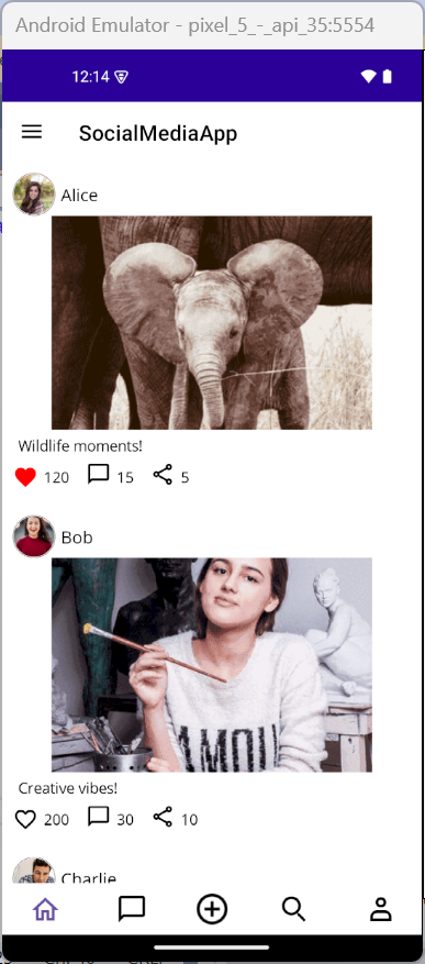
Step 8: Creating a new post
The center button in the tab view acts as a shortcut for users to create a new post. When tapped, it navigates to a dedicated post creation page where users can write a caption and upload an image. Add the CenterButtonTapped event to your Tab View:
<tabView:SfTabView CenterButtonTapped="OnCenterbuttonTapped">
    <!-- Tab items go here -->
</tabView:SfTabView>
Handle the tap event and navigate to the post creation page:
private async void OnCenterbuttonTapped(object sender, EventArgs e)
{
    if (BindingContext is SocialMediaViewModel socialMediaViewModel)
    {
        Navigation.PushAsync(new CreatePostPage(socialMediaViewModel));
    }
}
The CreatePostPage provides users with a simple and intuitive interface for sharing new content. It includes:
- A caption editor for writing thoughts or descriptions.
- An image upload button that opens a selection page.
- A preview of the selected image.
- A publish button to post the content.
Once the user selects an image and writes a caption, the post is added to both the general feed and the user’s profile. This page enhances user engagement by making content creation quick and accessible.
Upload image
The ImageSelectionPage allows users to select an image from a predefined gallery. This page is used when creating or editing a post or profile. It displays images in a grid layout using Syncfusion’s SfListView, and once an image is selected, it’s passed back to the calling page via a callback.
This modular design keeps the image selection process simple and reusable across different parts of the app.
GitHub references
For complete implementation details, check out the full guide on Designing a User-Friendly Social Media App using .NET MAUI TabView in our GitHub repository.

Conclusion
Thanks for reading! In this blog, we explored how to build a feature-rich social media application using Syncfusion’s .NET MAUI Tab View and ListView controls. By leveraging a Tab View with a Center Button, we created a seamless navigation experience that allows users to switch between app sections and quickly access core actions, like creating a new post.
From designing interactive feeds and searchable message lists to building a customizable profile page and post creation flow, this tutorial demonstrates how .NET MAUI can be used to craft modern, mobile-friendly social apps. Give them a try and leave your feedback in the comments section below!
If you’re a Syncfusion user, you can download the setup from the license and downloads page. Otherwise, you can download a free 30-day trial.
You can also contact us through our support forum, support portal, or feedback portal for queries. We are always happy to assist you!


 No spam, just valuable updates.