
 Naveenkumar Sanjeevirayan
TL;DR: Want to build a sleek photo gallery in your .NET MAUI app? Learn how to combine Syncfusion’s Tab View and ListView controls to create a visually appealing, organized gallery. Follow step-by-step instructions to display, group, and navigate photos and albums with dynamic data binding, interactive layouts, and custom styles. Perfect for showcasing images with smooth performance and intuitive UI.
In today’s mobile-first world, users expect visually rich apps. Especially when it comes to photos. Whether it’s travel memories or event captures, organizing images in a sleek and interactive gallery enhances user experience.
In this tutorial, you’ll learn how to build a stunning photo gallery app using .NET MAUI and Syncfusion’s Tab View and ListView controls. We’ll guide you through step-by-step implementation with dynamic data, grouped layouts, and custom styles, optimized for performance across Android, iOS, and Windows.
Why use Syncfusion .NET MAUI Tab View?
The .NET MAUI Tab View provides:
- Navigation: An intuitive way to organize and navigate through different parts of your app.
- Customization: Enables unique and attractive UI through customizable headers and content areas.
- Swiping: Seamless swipe functionality to switch between tabs.
Why use Syncfusion .NET MAUI ListView?
The .NET MAUI List View is excellent for building a photo gallery because:
- Item templates: It supports rich UI through item templating.
- Layouts: Supports both linear and grid layouts, ideal for a gallery.
- Grouping: Offers customizable group headers with sticky views.
Steps to create your stunning photo gallery
Follow these steps to create your stunning photo gallery:
1. Create a simple .NET MAUI Tab View
Start by creating a MAUI application. Refer to the documentation for detailed instructions on setup. Include the following basic Tab View:
<tabView:SfTabView />
2. Add multiple tabs with headers
Add tabs with different headers to categorize your images:
<tabView:SfTabView x:Name="tabView" TabBarPlacement="Bottom">
    <tabView:SfTabView.Items>
        <tabView:SfTabItem Header="Photos"    ImageSource="photos.png" />
        <tabView:SfTabItem Header="Albums"    ImageSource="albums.png" />
        <tabView:SfTabItem Header="Favorites" ImageSource="favorites.png" />
    </tabView:SfTabView.Items>
</tabView:SfTabView>
3 Add ListView as content for each tab
You can refer to the documentation to create the Maui ListView. Include a List View for displaying photos within each tab. Here’s how you can set it up:
<tabView:SfTabItem Header="Photos" ImageSource="photos.png">
    <tabView:SfTabItem.Content>
        <listView:SfListView>
            <listView:SfListView.ItemTemplate>
                <DataTemplate>
                    <!-- Bind your ImageData here -->
                </DataTemplate>
            </listView:SfListView.ItemTemplate>
        </listView:SfListView>
    </tabView:SfTabItem.Content>
</tabView:SfTabItem>
4. Populate items in the ListView
1. Define model classes
Create model classes to hold image data, such as ImageInfo and AlbumInfo. Define properties related to each photo:
ImageInfo.cs
public class ImageInfo : INotifyPropertyChanged
{
    private string   imageName;
    private string   image;
    private string   size;
    private DateTime dateTime;
    private bool     isFavorite;

    // Properties with Change Notification
    public string ImageName
    {
        get => imageName;
        set
        {
            imageName = value;
            OnPropertyChanged();
        }
    }

    // Similar properties for other fields...

    public event PropertyChangedEventHandler PropertyChanged;

    protected void OnPropertyChanged([CallerMemberName] string propertyName = null)
    {
        PropertyChanged?.Invoke(this, new PropertyChangedEventArgs(propertyName));
    }
}
AlbumInfo.cs
public class AlbumInfo
{
    public string AlbumName { get; set; }
    public string CoverImage { get; set; }
    public double Count { get; set; }
    public ObservableCollection<ImageInfo> Photos { get; set; }
}
2. Create a ViewModel to manage your data
Use a GalleryViewModel class to generate and manage collections of images and albums.
GalleryViewModel.cs
public class GalleryViewModel
{
    public ObservableCollection<ImageInfo> Photos      { get; set; }
    public ObservableCollection<ImageInfo> Countries   { get; set; }
    public ObservableCollection<ImageInfo> Birds       { get; set; }
    public ObservableCollection<ImageInfo> Electronics { get; set; }
    public ObservableCollection<ImageInfo> Foods       { get; set; }
    public ObservableCollection<ImageInfo> Recents     { get; set; }
    public ObservableCollection<ImageInfo> Favorites   { get; set; }
    public ObservableCollection<AlbumInfo> Albums      { get; set; }

    public GalleryViewModel()
    {
        GeneratePhotos();
        GenerateAlbums();
    }

    // Method to generate a collection of images
    private void GeneratePhotos()
    {
        DateTime dateTime = DateTime.Now.Date;
        Photos = new ObservableCollection<ImageInfo>
        {
            new ImageInfo { ImageName = "place_1", Image = "place_1.jpg", Size = "2MB", DateTime = dateTime.AddHours(15) },
            new ImageInfo { ImageName = "bird01",   Image = "bird01.png",   Size = "2MB", DateTime = dateTime.AddDays(-1).AddHours(8) },
            new ImageInfo { ImageName = "India",    Image = "india.jpg",    Size = "2MB", DateTime = dateTime.AddDays(-27).AddHours(10), IsFavorite = true },
            // Additional images...
        };

        // Consolidate images into a single 'Recents' collection
        Recents = new ObservableCollection<ImageInfo>();
        foreach (var category in new[] { Photos, Countries, Birds, Foods, Electronics })
        {
            Recents = new ObservableCollection<ImageInfo>(Recents.Concat(category));
        }

        // Sort recent images by date
        var sortedRecentList = Recents.OrderByDescending(item => item.DateTime).ToList();
        Recents.Clear();
        foreach (var item in sortedRecentList)
        {
            Recents.Add(item);
        }

        // Initialize favorites
        Favorites = new ObservableCollection<ImageInfo>();
        foreach (var photo in Recents)
        {
            if (photo.IsFavorite)
            {
                Favorites.Add(photo);
            }
        }
    }

    // Method to generate albums
    private void GenerateAlbums()
    {
        Albums = new ObservableCollection<AlbumInfo>
        {
            new AlbumInfo { AlbumName = "Recents",     CoverImage = "place_1.jpg",       Count = 58, Photos = Recents     },
            new AlbumInfo { AlbumName = "Countries",   CoverImage = "argentina.jpg",     Count = 13, Photos = Countries   },
            new AlbumInfo { AlbumName = "Electronics", CoverImage = "blindinglights.png", Count = 8,  Photos = Electronics },
            new AlbumInfo { AlbumName = "Birds",       CoverImage = "bird01.png",        Count = 10, Photos = Birds       },
            new AlbumInfo { AlbumName = "Foods",       CoverImage = "bread.png",         Count = 15, Photos = Foods       },
        };
    }
}
5. Bind the image collection to the ListView
In your MainPage.xaml, define the layout and bind your image data to display within the ListView:
<tabView:SfTabView x:Name="tabView" TabBarPlacement="Bottom">

    <!-- Photos Tab -->
    <tabView:SfTabItem Header="Photos" ImageSource="photos.png">
        <listView:SfListView
            x:Name="listViewPhotos"
            ItemsSource="{Binding Photos}"
            SelectionMode="None"
            ItemSize="90"
            ItemSpacing="5">

            <listView:SfListView.ItemsLayout>
                <listView:GridLayout SpanCount="4" />
            </listView:SfListView.ItemsLayout>

            <listView:SfListView.ItemTemplate>
                <DataTemplate>
                    <Image
                        Source="{Binding Image}"
                        Aspect="AspectFill"
                        HeightRequest="88"
                        WidthRequest="88" />
                </DataTemplate>
            </listView:SfListView.ItemTemplate>

        </listView:SfListView>
    </tabView:SfTabItem>

    <!-- Albums Tab -->
    <tabView:SfTabItem Header="Albums" ImageSource="albums.png">
        <listView:SfListView
            ItemsSource="{Binding Albums}"
            ItemSize="230"
            SelectionMode="None">

            <listView:SfListView.ItemsLayout>
                <listView:GridLayout SpanCount="2" />
            </listView:SfListView.ItemsLayout>

            <listView:SfListView.ItemTemplate>
                <DataTemplate>
                    <Grid RowDefinitions="*,20,20">
                        <Image
                            Source="{Binding CoverImage}"
                            Aspect="Fill"
                            HeightRequest="180"
                            WidthRequest="180" />

                        <Label
                            Text="{Binding AlbumName}"
                            FontSize="15"
                            Margin="10,0,0,0"
                            Grid.Row="1" />

                        <Label
                            Text="{Binding Count, StringFormat='{0} items'}"
                            Margin="10,0,0,0"
                            FontSize="12"
                            Grid.Row="2" />
                    </Grid>
                </DataTemplate>
            </listView:SfListView.ItemTemplate>

        </listView:SfListView>
    </tabView:SfTabItem>

    <!-- Favorites Tab -->
    <tabView:SfTabItem Header="Favorites" ImageSource="favorites.png">
        <listView:SfListView
            ItemsSource="{Binding Favorites, Mode=TwoWay}"
            ItemSize="300"
            ItemSpacing="10"
            SelectionMode="None"
            AutoFitMode="Height">

            <listView:SfListView.ItemsLayout>
                <listView:GridLayout SpanCount="2" />
            </listView:SfListView.ItemsLayout>

            <listView:SfListView.ItemTemplate>
                <DataTemplate>
                    <Grid RowDefinitions="30,*">
                        <Label
                            Text="{Binding DateTime, StringFormat='{0:ddd, dd MMM, yyyy}'}"
                            FontAttributes="Bold"
                            FontSize="15" />

                        <Image
                            Source="{Binding Image}"
                            Aspect="AspectFill"
                            Grid.Row="1" />
                    </Grid>
                </DataTemplate>
            </listView:SfListView.ItemTemplate>

        </listView:SfListView>
    </tabView:SfTabItem>

</tabView:SfTabView>
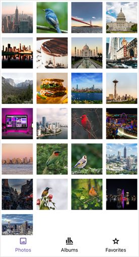
Photos |
Albums |
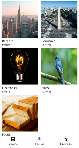
6. Create pages to display images
Step 1: Create a page to display an individual image
You need a simple content page to show a single image when a user selects it from your photo gallery.
ImagePage.Xaml
<ContentPage
    xmlns="http://schemas.microsoft.com/dotnet/2021/maui"
    xmlns:x="http://schemas.microsoft.com/winfx/2009/xaml"
    x:Class="PhotoGallery.ImagePage"
    Title="Image Details">

    <Grid RowDefinitions="*,60">
        <Image
            Source="{Binding Image}"
            Aspect="AspectFit" />
    </Grid>

</ContentPage>
Step 2: Create a page to display images from an album
To show a collection of images within an album, create another content page. This will use a List to display all images associated with a selected album.
AlbumCollectionPage.Xaml
<ContentPage
    xmlns="http://schemas.microsoft.com/dotnet/2021/maui"
    xmlns:x="http://schemas.microsoft.com/winfx/2009/xaml"
    xmlns:listView="clr-namespace:Syncfusion.Maui.ListView;assembly=Syncfusion.Maui.ListView"
    x:Class="PhotoGallery.AlbumCollectionPage"
    Title="{Binding AlbumName}">

    <Grid>

        <listView:SfListView
            x:Name="listView"
            ItemsSource="{Binding Photos}"
            SelectionMode="None"
            ItemSize="90"
            ItemSpacing="5">

            <listView:SfListView.ItemsLayout>
                <listView:GridLayout SpanCount="4" />
            </listView:SfListView.ItemsLayout>

            <listView:SfListView.ItemTemplate>
                <DataTemplate>
                    <Image
                        Source="{Binding Image}"
                        Aspect="AspectFill"
                        HeightRequest="88"
                        WidthRequest="88" />
                </DataTemplate>
            </listView:SfListView.ItemTemplate>

        </listView:SfListView>

    </Grid>

</ContentPage>
7. Implementing navigation with tapped events
Step 1: Define the ItemTapped event in XAML
In your XAML file, define the ItemTapped event in ListView for navigation. This allows users to navigate to a detailed view of the photo when they tap on an image in the list.
MainPage.Xaml
<tabView:SfTabView x:Name="tabView" TabBarPlacement="Bottom">

    <tabView:SfTabItem
        x:Name="photosTab"
        Header="Photos"
        ImageSource="photos.png"
        ImageTextSpacing="5">

        <!-- ListView for displaying photos -->
        <listView:SfListView
            x:Name="listViewPhotos"
            ItemsSource="{Binding Photos}"
            SelectionMode="None"
            ItemSize="90"
            ItemSpacing="5"
            ItemTapped="OnPhotosItemTapped">

            <!-- ItemTemplate and other configurations -->

        </listView:SfListView>

    </tabView:SfTabItem>

    ...

</tabView:SfTabView>
Step 2: Implement navigation in the code-behind
In your code-behind file, implement the logic to navigate to the image details page when an item is tapped.
MainPage.Xaml.cs
private void OnPhotosItemTapped(object sender, Syncfusion.Maui.ListView.ItemTappedEventArgs e)
{
     // Create an instance of ImagePage
     ImagePage imagePage = new ImagePage(this.BindingContext as GalleryViewModel, e.DataItem as ImageInfo);
     imagePage.BindingContext = e.DataItem as ImageInfo; // Pass the selected image to the new page

     // Navigate to the ImagePage
     Navigation.PushAsync(imagePage);
}
8. Customizing the Tab View for selection
Step 1: Create a style for TabViewItem
Define styles to customize the text color of TabViewItem based on the selection state using visual states.
MainPage.Xaml
<ContentPage.Resources>
        <Style TargetType="tabView:SfTabItem">
            <Setter Property="VisualStateManager.VisualStateGroups">
                <VisualStateGroupList>
                    <VisualStateGroup>

                        <VisualState x:Name="Normal">
                            <VisualState.Setters>
                                <Setter Property="TextColor" Value="#000000" />
                            </VisualState.Setters>
                        </VisualState>

                        <VisualState x:Name="Selected">
                            <VisualState.Setters>
                                <Setter Property="TextColor" Value="#6750A4" />
                            </VisualState.Setters>
                        </VisualState>

                    </VisualStateGroup>
                </VisualStateGroupList>
            </Setter>
        </Style>
    </ContentPage.Resources>
Step 2: Customize the tab header
Customize the tab header’s appearance and behavior by setting properties such as IndicatorStrokeThickness, TabBarHeight, and using FontImageSource for icons.
MainPage.Xaml
<tabView:SfTabView
x:Name="tabView"
TabBarPlacement="Bottom"
EnableSwiping="True"
IndicatorStrokeThickness="0"
TabBarHeight="55">
<tabView:SfTabItem
Header="Photos"
x:Name="photosTab"
ImageTextSpacing="5">
<tabView:SfTabItem.ImageSource>
<FontImageSource
Glyph=""
Color="{Binding Source={x:Reference photosTab}, Path=TextColor}"
FontFamily="PhotoGallery"/>
</tabView:SfTabItem.ImageSource>
</tabView:SfTabItem>
<tabView:SfTabItem
Header="Albums"
x:Name="albumsTab"
ImageTextSpacing="5">
<!-- Similar setup for other tabs -->
</tabView:SfTabItem>
</tabView:SfTabView>
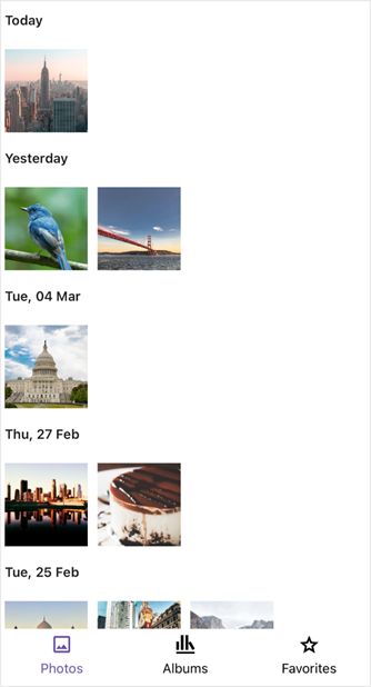
9. Group the ListView images
Group images in your ListView based on a property, such as DateTime, by using GroupDescriptor.
MainPage.Xaml:
public MainPage()
{
    InitializeComponent();

    listViewPhotos.DataSource.GroupDescriptors.Add(new GroupDescriptor()
    {
        PropertyName = "DateTime",
        KeySelector = (object obj1) =>
        {
            var item = obj1 as ImageInfo;
            if (item != null)
            {
                if (item.DateTime.Date == DateTime.Now.Date)
                {
                    return "Today";
                }
                else if (item.DateTime.Date == DateTime.Now.Date.AddDays(-1))
                {
                    return "Yesterday";
                }
                else if (item.DateTime.Year == DateTime.Now.Year)
                {
                    return item.DateTime.ToString("ddd, dd MMM", CultureInfo.InvariantCulture);
                }
                else
                {
                    return item.DateTime.ToString("ddd, dd MMM, yyyy", CultureInfo.InvariantCulture);
                }
            }
            else
            {
                return "";
            }
        }
    });
}
10. Customize the image display page
Step 1: Create a converter for favorite icon
Implement a converter to change the display of favorite icons based on whether an image is marked as a favorite.
FavoriteToIconConverter
public class FavoriteToIconConverter : IValueConverter
{
public object Convert(object value, Type targetType, object parameter, CultureInfo culture)
{
if (value is bool isFavorite)
{
// Assume '' is the outline and '' is the filled icon.
return isFavorite ? "\uE707" : "\uE706";
}
return "\uE706"; // Default to outline
}
public object ConvertBack(object value, Type targetType, object parameter, CultureInfo culture)
{
throw new NotImplementedException();
}
}
Step 2: Handle property changes for adding to favorites
Update property change events in your ViewModel to handle the dynamic addition and removal of images from the favorites collection.
GalleryViewModel.cs
private void GeneratePhotos()
{
    ...
    foreach (var category in new[] { Photos, Countries, Birds, Foods, Electronics })
    {
        foreach (var photo in category)
        {
            photo.PropertyChanged += ImageInfo_PropertyChanged;
        }

        // Add to Recents
        Recents = new ObservableCollection<ImageInfo>(Recents.Concat(category));
    }
    ...
}

private void ImageInfo_PropertyChanged(object sender, PropertyChangedEventArgs e)
{
    if (sender is ImageInfo imageInfo && e.PropertyName == nameof(ImageInfo.IsFavorite))
    {
        if (imageInfo.IsFavorite && !Favorites.Contains(imageInfo))
        {
            Favorites.Add(imageInfo);
        }
        else if (!imageInfo.IsFavorite && Favorites.Contains(imageInfo))
        {
            Favorites.Remove(imageInfo);
        }
    }
}
Step 3: Implement UI actions in the image display page
Use the converter in your XAML to update the UI and define actions for user interactions like tapping icons.
ImagePage.Xaml
<ContentPage.Resources>
<local:FavoriteToIconConverter x:Key="FavoriteToIconConverter"/>
</ContentPage.Resources>
<Grid RowDefinitions="*,60">
<Image Source="{Binding Image}" Aspect="AspectFit"/>
<HorizontalStackLayout VerticalOptions="End" Spacing="20" HorizontalOptions="Center">
<!-- Favorite Button -->
<Border StrokeThickness="0" HeightRequest="60" WidthRequest="60">
<Border.StrokeShape>
<RoundRectangle CornerRadius="30"/>
</Border.StrokeShape>
<effects:SfEffectsView TouchDownEffects="Highlight">
<effects:SfEffectsView.GestureRecognizers>
<TapGestureRecognizer Tapped="OnFavoriteTapped"/>
</effects:SfEffectsView.GestureRecognizers>
<VerticalStackLayout HorizontalOptions="Center" VerticalOptions="Center">
<Label Text="{Binding IsFavorite, Converter={StaticResource FavoriteToIconConverter}}"
FontFamily="sPhotoGallery"
FontSize="24"
HorizontalOptions="Center"/>
<Label Text="Favorite" />
</VerticalStackLayout>
</effects:SfEffectsView>
</Border>
<!-- Delete Button -->
<Border StrokeThickness="0" HeightRequest="60" WidthRequest="60">
<Border.StrokeShape>
<RoundRectangle CornerRadius="30"/>
</Border.StrokeShape>
<effects:SfEffectsView TouchDownEffects="Highlight">
<effects:SfEffectsView.GestureRecognizers>
<TapGestureRecognizer Tapped="OnDeleteTapped"/>
</effects:SfEffectsView.GestureRecognizers>
<VerticalStackLayout HorizontalOptions="Center" VerticalOptions="Center">
<Label Text=""
FontFamily="PhotoGallery"
FontSize="24"
HorizontalOptions="Center"/>
<Label Text="Delete" />
</VerticalStackLayout>
</effects:SfEffectsView>
</Border>
...
</HorizontalStackLayout>
</Grid>
ImagePage.Xaml.cs
private void OnFavoriteTapped(object sender, TappedEventArgs e)
{
    if (BindingContext is ImageInfo imageInfo)
    {
        imageInfo.IsFavorite = !imageInfo.IsFavorite;
    }
}

private async void OnDeleteTapped(object sender, TappedEventArgs e)
{
    if (BindingContext is ImageInfo imageInfo)
    {
        // Confirm the deletion action
        bool isConfirmed = await DisplayAlert("Delete Image", "Are you sure you want to delete this image?", "Yes", "No");
        if (isConfirmed)
        {
            if (_viewModel.Recents.Contains(imageInfo))
                _viewModel.Recents.Remove(imageInfo);

            // Remove from Photos collection
            if (_viewModel.Photos.Contains(imageInfo))
                _viewModel.Photos.Remove(imageInfo);
            else if (_viewModel.Countries.Contains(imageInfo))
                _viewModel.Countries.Remove(imageInfo);
            else if (_viewModel.Foods.Contains(imageInfo))
                _viewModel.Foods.Remove(imageInfo);
            else if (_viewModel.Electronics.Contains(imageInfo))
                _viewModel.Electronics.Remove(imageInfo);
            else if (_viewModel.Birds.Contains(imageInfo))
                _viewModel.Birds.Remove(imageInfo);

            // Remove from Favorites if it's there
            if (imageInfo.IsFavorite)
            {
                _viewModel.Favorites.Remove(imageInfo);
            }

            // Navigate back to the main page or previous navigation stack
            await Navigation.PopAsync();
        }
    }
}

UI Actions
GitHub references
For more details, refer to the GitHub demo

Conclusion
Thanks for reading! With Syncfusion’s Tab View and ListView controls, building a responsive, interactive photo gallery in .NET MAUI becomes effortless. You’ve now seen how to group photos, display albums, and bind dynamic image data using modern UI components.
This approach not only improves user experience but also ensures your app is scalable and visually appealing across devices
Download Essential Studio for .NET MAUI to start evaluating the latest features immediately.
If you have any questions, you can also contact us through our support forum, support portal, or feedback portal. We are always happy to help you!


 No spam, just valuable updates.