

This is the second blog in our series on design tips for better Charts. If you missed the first one, you can check it out at this link: 7 Tips to Improve Your Chart’s Readability.
In this blog, we will walk you through some useful tips and tricks to make your charts more understandable. In the upcoming blog, which is going to be the last blog in this series, we’ll provide tips to make your charts more aesthetically appealing. You can expect this blog to be available on July 16.
I have used the Syncfusion Flutter Charts widget to illustrate the tips in this post, but they are not limited to Flutter charts and are applicable to charts in any other platform as well.
Tip #1: Choose an apt chart type for your story
There are n number of chart types available to visualize data nowadays, like line, column, pie, scatter, and so on. You should carefully choose the appropriate chart type for your data story. Choosing the right chart type depends on the type of data and the message you wish to convey to users. So, before starting the design, it is important to have a clear understanding of the data you are working with.
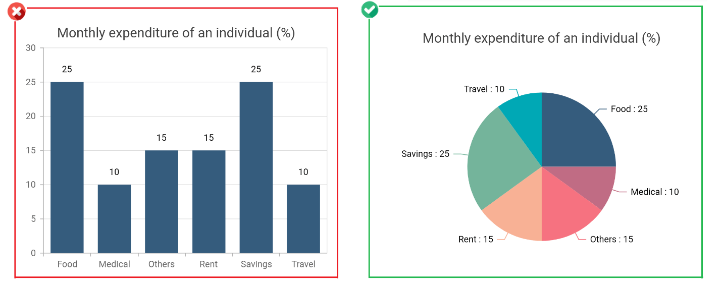
For example, consider a scenario where you need to display a person’s monthly expenses by category, whose sum is 100%. For this, you should use a pie chart rather than a column chart because it provides a quick idea of how the data is distributed.
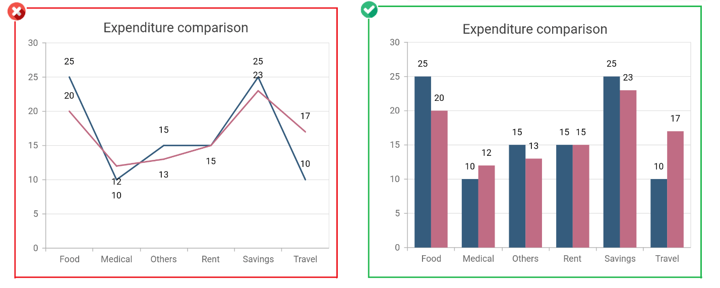
If you have two sets of data to be visualized and compared, it is better to use a column chart over a line chart. Column charts are always better for categorization and comparison.
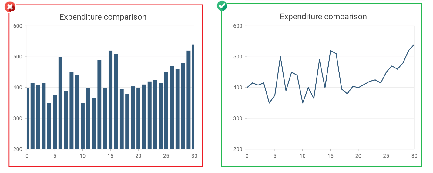
If you have a large data set and need to visualize its trend, use the line chart. It can visualize large amounts of data in a meaningful way by conveying a trend to the user.
Refer to the following code example to change the series type in the Syncfusion Flutter Charts widget.
[Dart]
SfCartesianChart(
   series: <<ChartSeries<<ChartData, double>>>>[
      // Renders column series
      ColumnSeries<<ChartData, double>>(
         //...
      ),
      // Renders line series
      LineSeries<<ChartData, double>>(
         //...
      )
   ],
   //...
)
Tip #2: Keep the design simple
Always keep the chart design simple by choosing a plain way to convey your information. Special effects added to the design to make it trendy and exciting may create confusion in conveying the content to the user. For example, 3D charts may be difficult to interpret over 2D charts because the depth effect in the 3D drawings distorts the data.
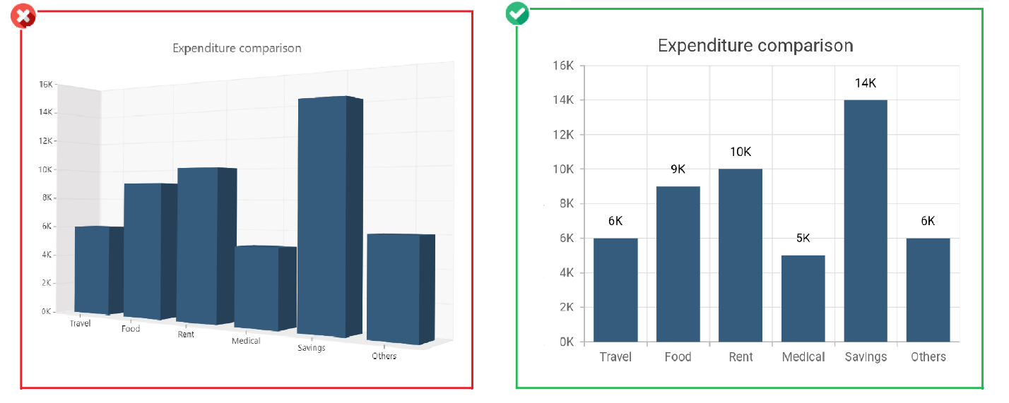 In the above 3D chart, the elevation and depth effects make the Savings value appear to be more than 14k. In the 2D chart of the same data, you can see the Savings value is exactly 14k.
Tip #3: Use animations, but don’t overdo it
In the process of making a chart trendy and attractive, we may overuse effects and animations, resulting in poor presentation. Charts can have animations, but they should be very simple and smooth. For example, it is better to use a fade in/fade out effect instead of a bounce in/bounce out effect.
Use the same animation for all the elements in a chart. For example, choosing the fade in effect for a series and a bounce in effect for another series in the same graph may confuse the user.
In addition, any animation should not last for more than two seconds. More time spent on an animation imposes an unnecessary wait on the user to see the data, which may be annoying.
The animation duration can be controlled by specifying millisecond values to the animationDuration property in the series. Refer to the following code example.
[Dart]
SfCartesianChart(
   series: <<ChartSeries<<ChartData, double>>>>[
      ColumnSeries<<ChartData, double>>(
         // Value in milliseconds
         animationDuration: 2000
       ),
       LineSeries<<ChartData, double>>(
          animationDuration: 2000
       )
   ],
   //...
)
Tip #4: Order data logically
It is quite difficult to understand unordered data. Ordered data delivers clarity to the user. Data points can be ordered alphabetically or based on their value, either in ascending or descending order. The sorting mode can be decided based on your data.
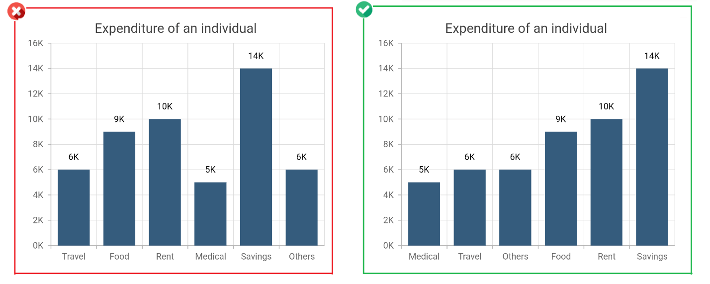
In the above example, the data is sorted in ascending order, based on the y values of the data points. This can be changed by setting values to the sortingOrder and sortFieldValueMapper properties in the series. Refer to the following code example.
[Dart]
SfCartesianChart(
  series: <<ChartSeries<<ChartData, double>>>>[
    ColumnSeries<<ChartData, double>>(
      sortingOrder: SortingOrder.ascending,
      sortFieldValueMapper: (ChartData sales, _) =>> sales.y
    )
  ],
  //...
)
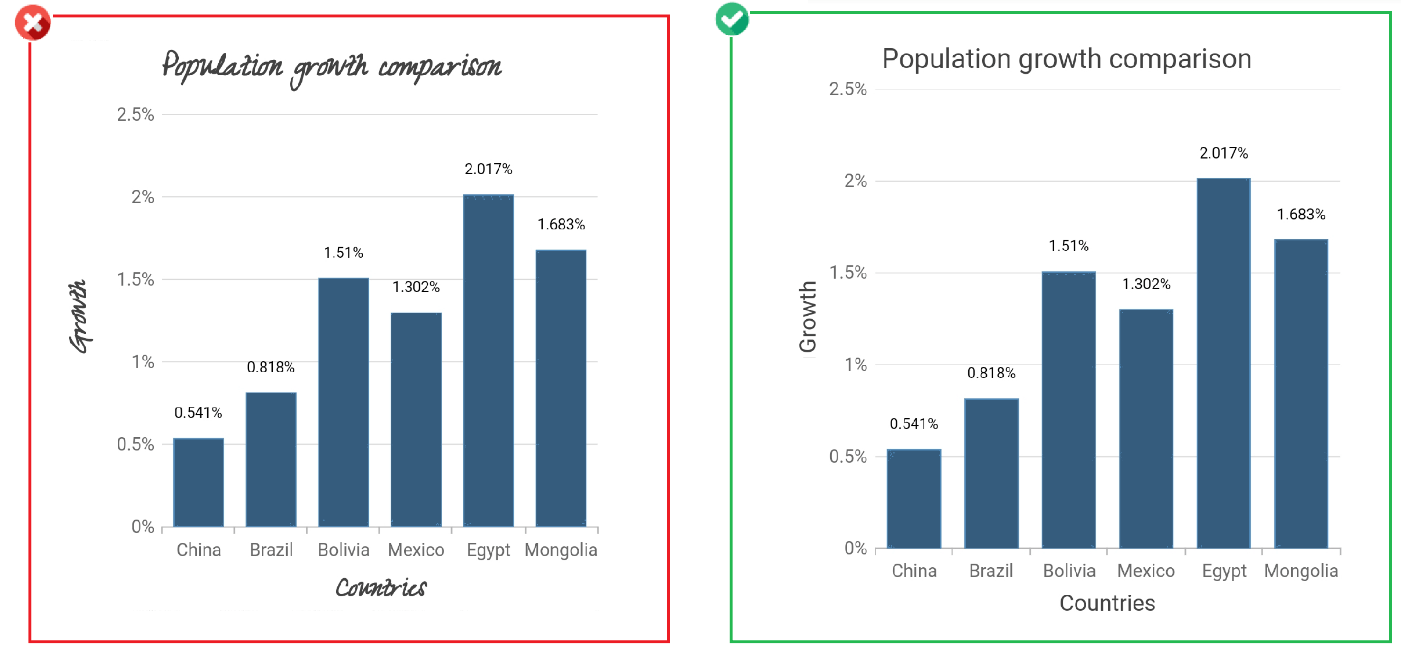
Tip #5: Add meaningful titles
Header text in the chart explains the content and outline of the story to the user immediately. Also, you should add axis titles and formats to the labels wherever applicable. If the data and other elements like data labels and legends themselves sufficiently convey the message, then the header can be ignored.
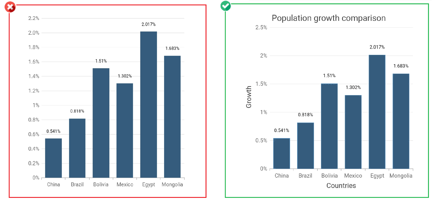
Chart title and axis titles can be added to the chart by setting values to the title property in the chart and in the primaryXAxis and primaryYAxis classes. Refer to the following code example.
[Dart]
SfCartesianChart(
   title: ChartTitle(
      text: 'Population growth comparision'
   ),
   primaryXAxis: NumericAxis(
      title: AxisTitle(
         text: 'Countries'
      )
   ),
   primaryYAxis: NumericAxis(
      title: AxisTitle(
         text: 'Growth (%)'
      )
   )
)
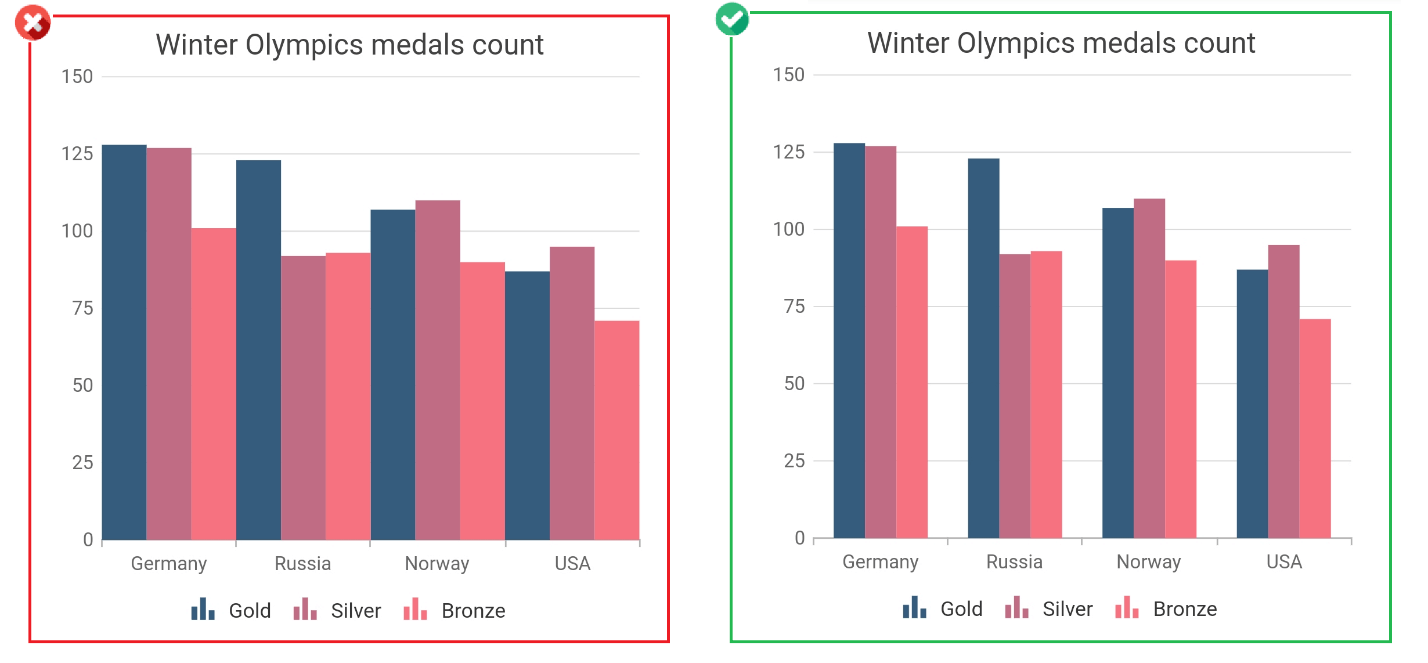
Tip #6: Enable legend and data labels
A legend can be enabled in the chart to display additional information about the data. Series names are displayed in the legend. Legends are more helpful when there is more than one series in the chart. By also enabling data labels, users can more easily understand exact data point values.
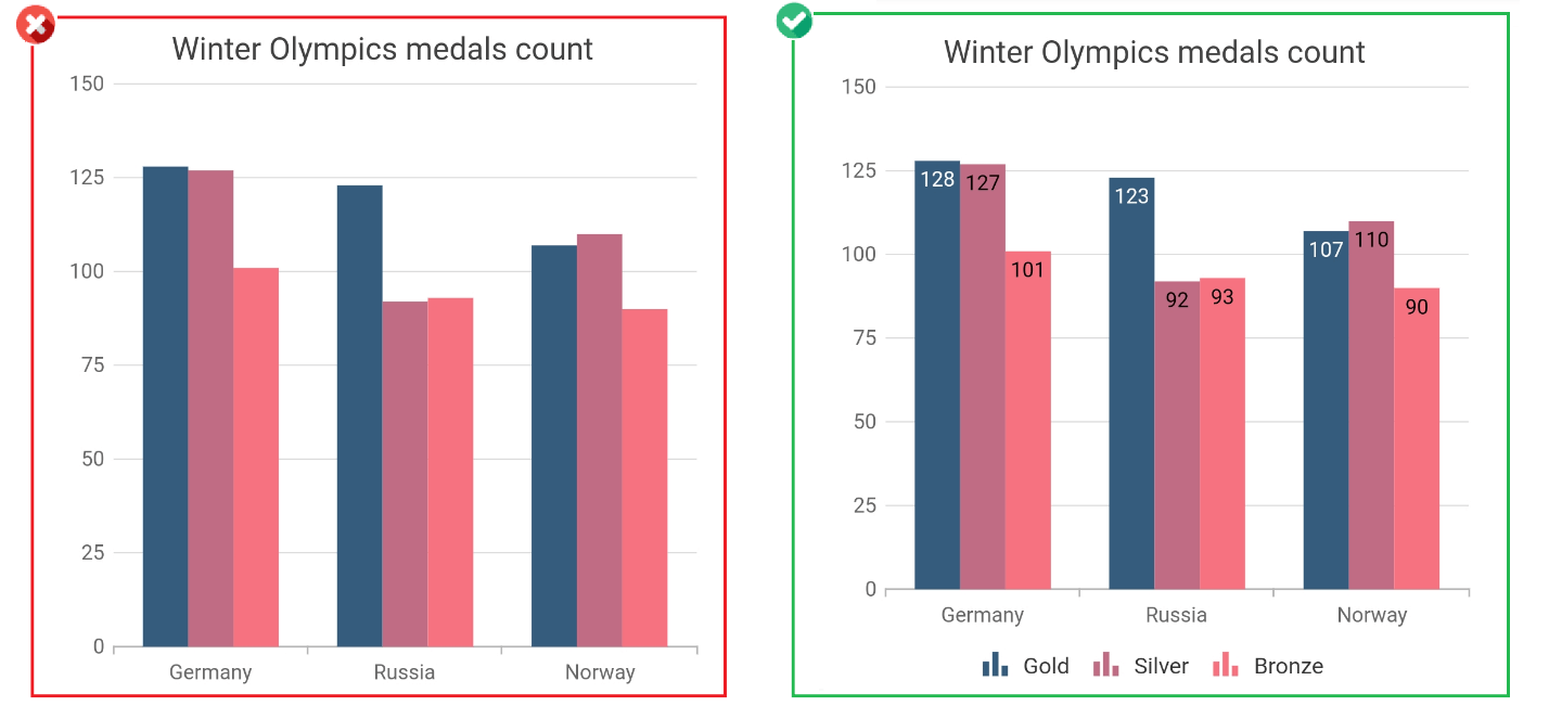
The legend and data labels can be enabled by setting the isVisible property in the legend and isVisible property in dataLabelSettings to true. Refer to the following code example.
[Dart]
SfCartesianChart(
  legend: Legend(isVisible: true),
  series: <<ChartSeries<<ChartData, double>>>>[
    ColumnSeries<<ChartData, double>>(
      dataLabelSettings: DataLabelSettings(
        isVisible: true
      )
    )
  ]
  //...
)
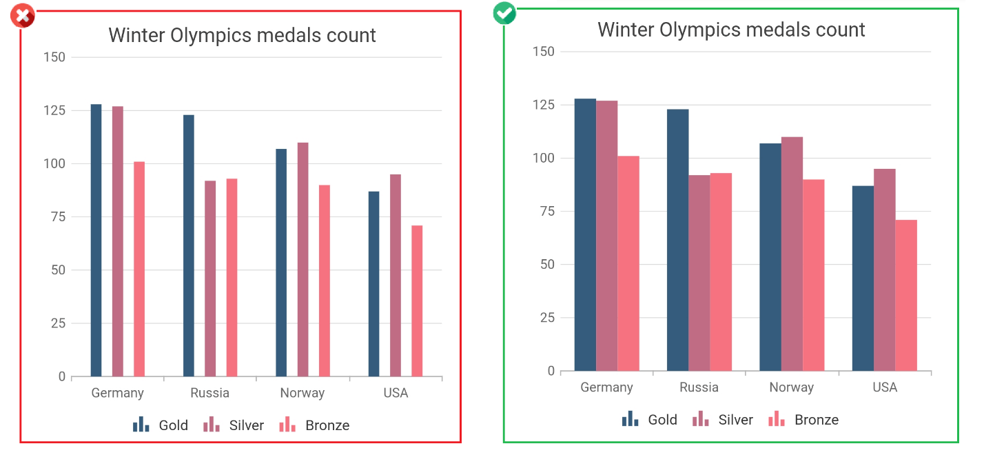
Tip #7: Choose a simple text style
When adding text in a chart, be sure that you choose a simple and easily readable font family. In the following example, the chart on the right is easier to read compared to the left one.
Tip #8: Provide space at necessary places
Always add necessary spaces between elements in a chart. Otherwise, it will look messy and could be difficult to understand. For example, in the below image, the chart on the right is more easily understandable than the left one.
The space between columns can be controlled by setting values to the spacing and width properties in the series. Refer to the following code example.
[Dart]
SfCartesianChart(
  series: <<ChartSeries<<ChartData, double>>>>[
    ColumnSeries<<ChartData, double>>(
       width: 0.7,
       spacing: 0
    )
  ],
  //...
)
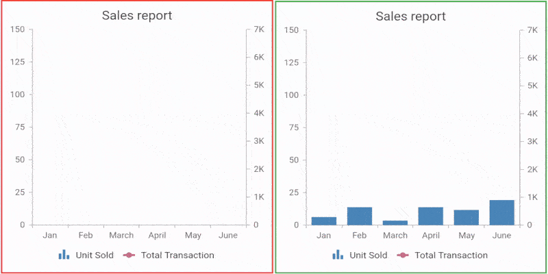
Tip #9: Avoid unnecessary spaces
Always remember that a space should be added only when necessary. Excess space can make the chart appear unorganized and ruin the design.
Tip #10: Convey contextual clues with shapes
Using meaningful symbols or images in a chart will also contribute to its comprehension. For example, in the following image, the chart on the right is easier to understand at a glance and more aesthetically appealing compared to the one on the left.
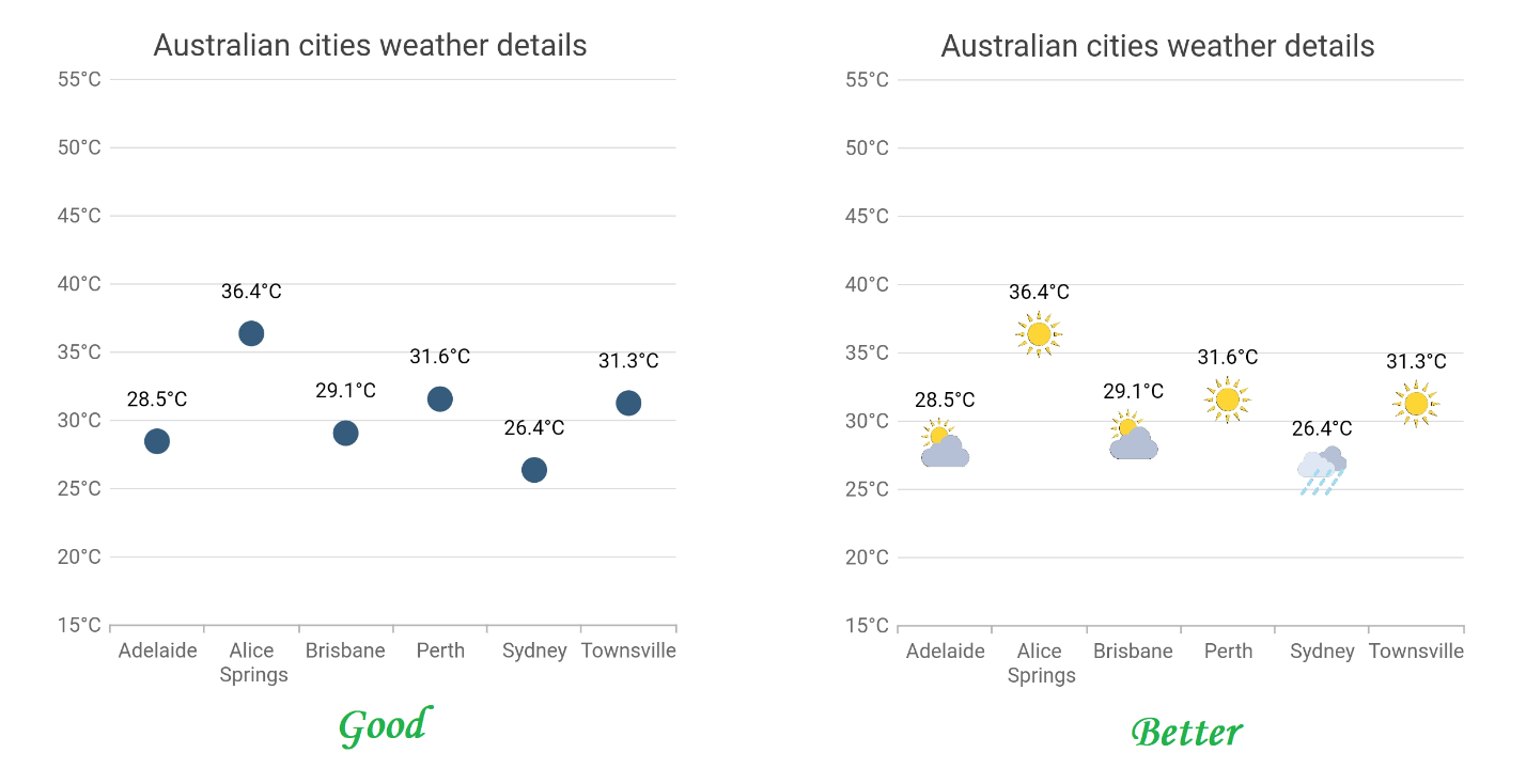
Refer to the following code example to specify images in the scatter series.
[Dart]
SfCartesianChart(
  series: <<ChartSeries<<ChartData, double>>>>[
    ScatterSeries<<ChartData, double>>(
      markerSettings: MarkerSettings(
        isVisible: true,
        shape: DataMarkerType.image,
        image: const AssetImage('images/truck.png')
      )
    )
  ]
  //...
)
Tip #11: Maintain proper axis ranges
An improper axis range may present a misleading message to the user. It is best to always start an axis at 0. For example, consider the left chart in the following image. It portrays the value of HP as much less than Lenovo. In actuality, both vendors had very high shipments, and the difference between them is not very much. The y axis value not starting at 0 distorts these facts. The chart on the right provides a better illustration of the data.

Tip: #12 Use a single color for the same type of data
Always use the same color for all the data points in a series. Applying different colors to the data points without a specific reason will confuse the user. At the same time, provide a different color for all the data points in another series.
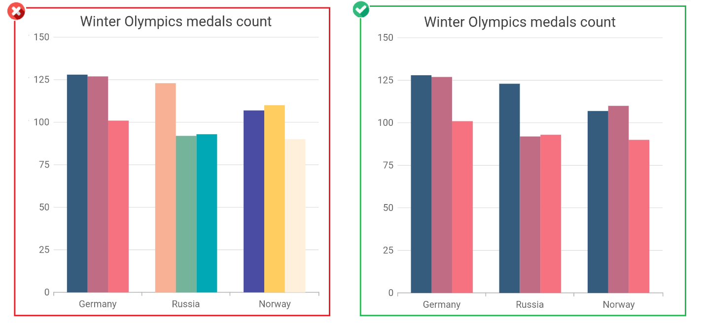
Colors specified in the palette property will be applied to all the data points in the series. Refer to the below code example.
[Dart]
SfCartesianChart(
  palette: <<Color>>[Colors.red, Colors.green]
  //...
)
Tip #13: Display additional information effectively
You should avoid displaying excessive information in a chart. On the other hand, you shouldn’t refrain from visualizing basic information too. To handle this scenario, annotations can be used in charts. Annotations are just elements like text or a graph that conveys additional information about the base chart. They can also be used to place watermark text in chart. You can also use trackball and tooltips to display additional information instead of annotations depending on your scenario.

In the above image, the pie chart on the right is an annotation. Refer to the following code example to configure this.
[Dart]
SfCartesianChart(
  annotations: <<CartesianChartAnnotation>>[
    CartesianChartAnnotation(
      widget: Container(
        child: SfCircularChart(
          //...
        )
      )
    )
  ]
)
Tip #14: Highlight the data you are talking about
When your story is about a particular data point in the chart, highlight that point with a special color and fade out other data points. This will direct the focus of the user to that particular data point. This can be done using the selection feature in charts.
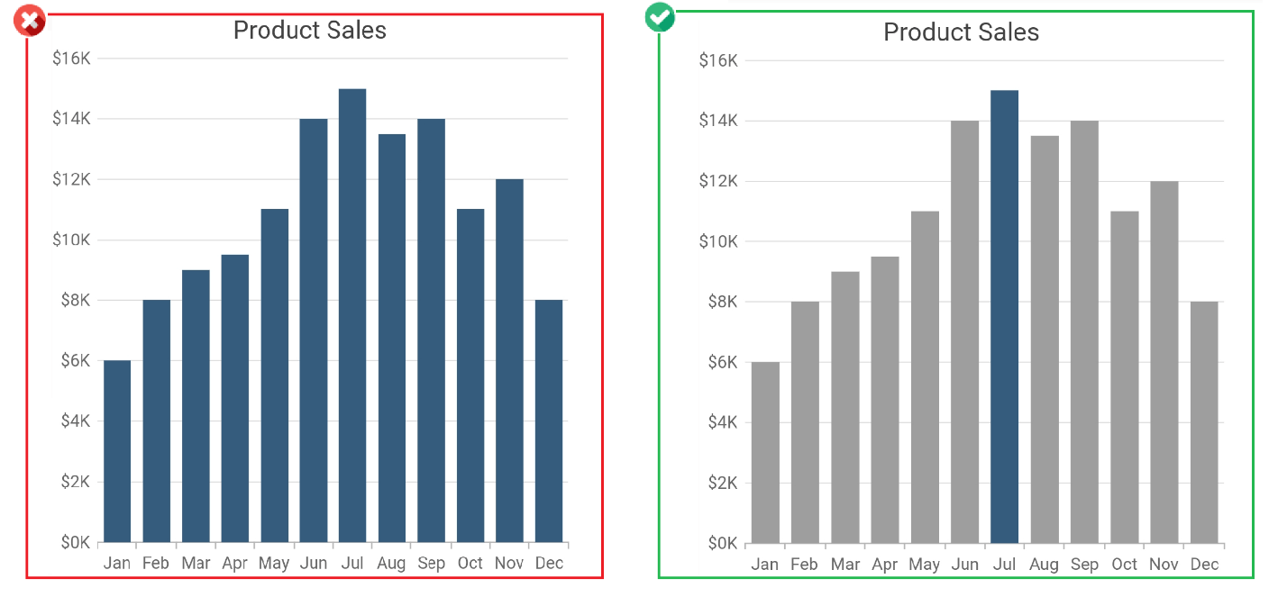
This can be achieved in Syncfusion Flutter charts by specifying an index value to the initialSelectedDataIndexes property and by using selectionSettings properties. Refer to the following code example.
[Dart]
SfCartesianChart(
  initialSelectedDataIndexes: <<int>>[6],
  series: <<ColumnSeries<<SalesData, num>>>>[
    ColumnSeries<<SalesData, num>>(
      selectionSettings: SelectionSettings(
        enable: true,
        unselectedColor: Colors.grey,
        selectedColor: Colors.blueGrey
      )
    )
  ]
)
Tip #15: Highlight an axis value or range
Just like data points, an axis range can be highlighted in the chart to help tell your story. This can be achieved using the plot band (strip line) feature in charts.
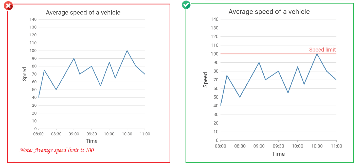
This feature can be used in Syncfusion Flutter charts by specifying values to the properties in plotBands. Refer to the following code example.
[Dart]
SfCartesianChart(
  primaryYAxis: NumericAxis(
    plotBands:<<PlotBand>>[
      plotBands(
        start: 80, end: 80, borderColor: Colors.red, text: 'Speed limit'
      )
    ]
  )
)
Conclusion
We hope that these tips will help you make your charts more understandable. Stay tuned for the final blog in this series. Also, check out our Charts component for other platforms besides Flutter, including:
If you wish to send us feedback or would like to submit any questions, please feel free to post them in the comments section of this blog post.


 No spam, just valuable updates.