
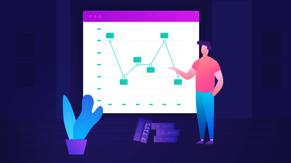
We are very excited to publish our first blog in a series called Design Tips. We are planning to publish blogs in this series every Thursday for three consecutive weeks. In this blog, we will walk you through some useful tips and tricks to improve the readability of charts. In the upcoming blogs in this series, we’ll provide tips to make your charts more understandable and aesthetically appealing.
Charts are one of the most important and widely used data visualization elements for representing data in graphical form.
While designing charts, many of us will make mistakes due to lack of awareness of chart design principles. This might lead to:
- Poor presentation.
- Miscommunication of the story.
- Difficulty in reading and understanding.
The following tips will help you improve the readability of your charts by eliminating common flaws in the design.
I have used the Syncfusion Flutter Charts widget for illustration. These tips are not limited to Flutter charts and are applicable to the charts in other platforms, as well.
#1 Keep the design simple by removing unnecessary styling
Always include only the necessary elements in the design. Don’t add more content and make it clumsy. Most of the time, the border, background, and grids will not convey any details about the data to the user. So, we can remove these and keep the design simple.
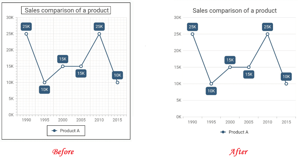 This can be achieved by setting values for the chart border, chart title border, plot area border, and major and minor grid lines in both the vertical and horizontal axis. Refer to the following code example.
[Dart]
SfCartesianChart(
   borderWidth: 0,
   plotAreaBorderWidth: 0,
   primaryXAxis: NumericAxis(
      majorGridLines: MajorGridLines(width: 0)
   ),
   title: ChartTitle(
      text: 'Sales comparision of a product',
      borderWidth: 0
   )
)
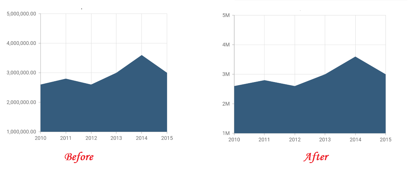
#2 Display units instead of numbers
There may be cases in which you have large numbers in data, and you need to visualize them in a chart. Instead of displaying the numbers in their entirety, display them with units. (For example, display 1,000,000,000 as 1B.)
 This can be achieved in Flutter charts by specifying values to the numberFormat property in primaryYAxis. For this, the intl package should be imported. Refer to the following code example.
[Dart]
import 'package:intl/intl.dart';

//...

SfCartesianChart(
   primaryYAxis: NumericAxis(
      numberFormat: NumberFormat.compact()
   ),
   //...
)
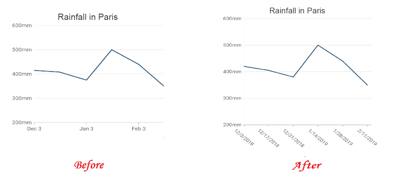
#3 Display proper axis scale
Axis scales convey the range of the data, starting, ending, and interval values, to the user. So, use proper interval values and change the label format based on your data. For example, if your data has values from various years, then displaying month and day values alone in the labels is not enough.
You can change the label format of the date-time axis using the dataFormat property in primaryXAxis. Refer to the following code example.
[Dart]
SfCartesianChart(
   primaryXAxis: DateTimeAxis(
      dateFormat: DateFormat.yMd()
   ),
   //...
)
#4 Reduce unnecessary precision
For some real-time data, we deal with very precise decimal values. Displaying long decimal values in the chart will occupy too much space and degrade readability. So, in such cases, you should display the rounded-off values. For example, if your value is 17.8965432219, it should be displayed as 17.9.
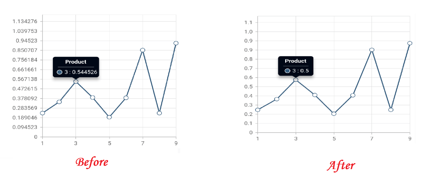
For this, specify values to the decimalPlaces property in the primaryYAxis and the tooltip. Refer to the following code example.
[Dart]
SfCartesianChart(
   primaryYAxis: NumericAxis(
      decimalPlaces: 1
   ),
   tooltipBehavior: TooltipBehavior(
      enable: true,
      decimalPlaces: 1
   )
   //...
)
#5 Display additional details in interaction
In the design, there may be some information that is essential and must be displayed. But showing all of it together will look messy in the design. At that time, you might prefer showing the additional details on demand, i.e. using the tooltip feature in Flutter Charts. It will display the details of the data points in a pop-up when the user interacts with them.
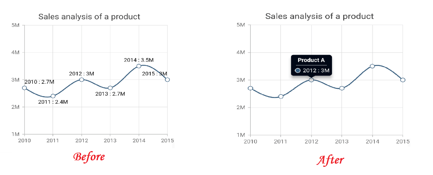 The tooltip can be enabled by setting the enable property to true in TooltipBehavior. Refer to the following code example.
[Dart]
SfCartesianChart(
   tooltipBehavior: TooltipBehavior(
      enable: true
   ),
   //...
)
#6 Avoid abbreviation
Abbreviations are fine to in a chart. But it is even better to display the actual text. This will help users have a better understanding of the data. Also, if a user is not familiar with the abbreviation, then the information will not be completely conveyed to them.
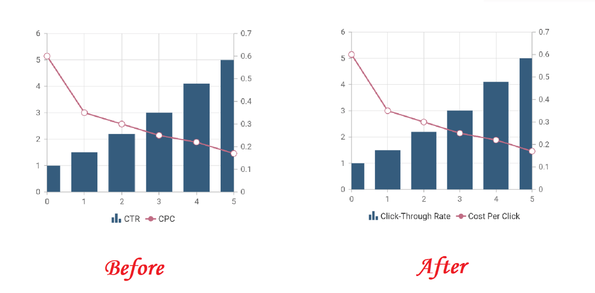 Refer to the code example of the chart on the right side in the following.
[Dart]
SfCartesianChart(
   series: <ChartSeries<ChartData, double>>[
      ColumnSeries<ChartData, double>(
         name: 'Click-Through Rate',
       ),
       LineSeries<ChartData, double>(
          name: 'Cost Per Click'
       )
   ],
   //...
)
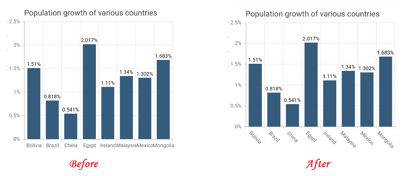
#7 Avoid text overlap
The axis labels’ text can overlap if there are a large number of labels, the labels are long, or the chart has a smaller width. In such cases, Flutter Charts will automatically hide the overlapping labels. If it’s a numeric or date-time axis, it is fine to hide the overlapping labels. But if it is a category axis and you hide the overlapping labels, then the user will not know the x value of that data point.
In that case, you can apply other overlap actions besides hide, like wrap, multiple rows, rotate 45, and rotate 90.
 This can be achieved by setting these values in the labelIntersectAction property in primaryXAxis. Refer to the following code example.
[Dart]
SfCartesianChart(
   primaryXAxis: CategoryAxis(
      labelIntersectAction: AxisLabelIntersectAction.rotate45
   ),
   //...
)
Conclusion
We hope that these tips will help you in improving your Flutter Charts’ readability. Stay tuned for upcoming blogs in this series. Also check out our Charts component for different platforms in the following list:
If you wish to send us feedback or would like to submit any questions, please feel free to post them in the comments section of this blog post. You can also contact us through our support forum, feedback portal, or Direct-Trac support system.


 No spam, just valuable updates.