Easy and intuitive way to create professional diagrams
- Create organizational chart, hierarchical tree, and mind map diagram in minutes using built-in automatic layout algorithm.
- Create real time cross platform applications like flowchart maker, BPMN editor, network diagram and floor plan.
- Experience seamless interaction, & editing capabilities.
Trusted by the world’s leading companies

Overview
The JSP diagram is a feature-rich control for visualizing, creating, and editing interactive diagrams. It supports creating flowchart, organizational charts, mind maps, and BPMN either through code or a visual interface.
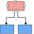
Nodes
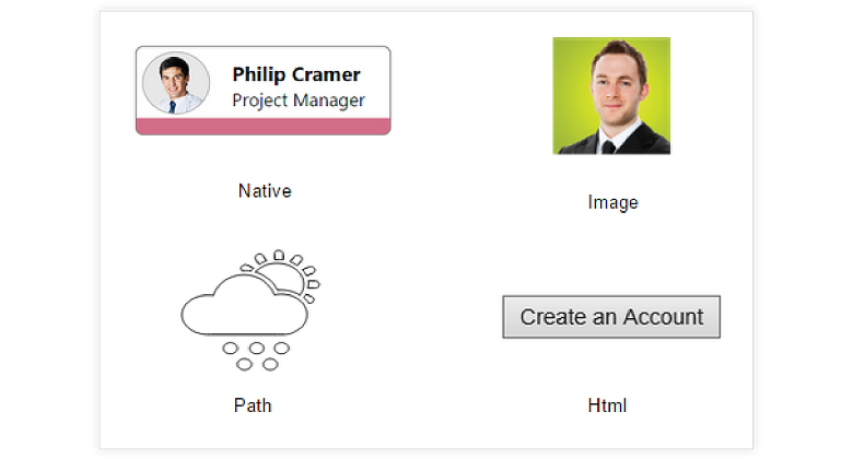
Nodes are used to host graphical objects (paths or controls) that can be arranged and manipulated on a diagram page.
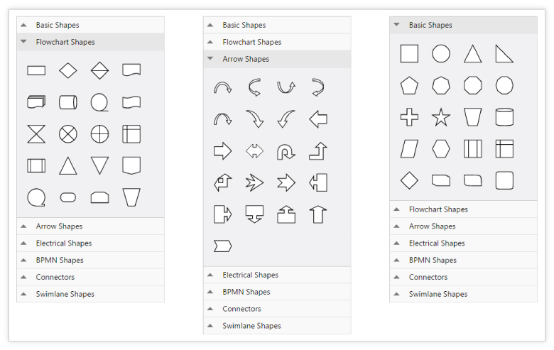
- Many predefined standard shapes have been included.
- Custom shapes can also be created and added easily.
- The appearance of a node can be fully customized.
- Node’s UI can also be templated and re-used across multiple nodes.
Connectors
The relationship between two nodes is represented using a connector. Multiple instances of nodes and connectors form a diagram. Some of the key features are listed below.
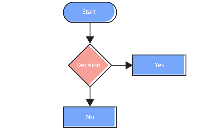
Types
Different types of segments are available to connect objects.
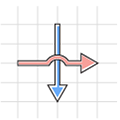
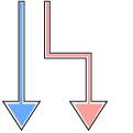
Bridging
Bridging is a visual indication of overlapping between two connectors.
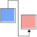
Routing
Orthogonal connectors take a smart path that avoids overlapping with the nodes to which it is connected.
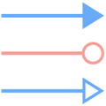
Decorator
Arrows or decorators at the edges of connectors are used to represent relationships between nodes.
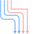
Rounded Corners
Corner radius can be specified for edges in connectors.
Ports
Ports are specific points in a node to which a connector can be connected.
Label
Labels are used to annotate nodes and connectors. Diagram also makes it easy to edit and align labels relative to the object to which it is mapped.
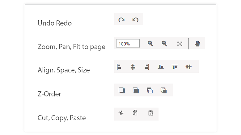
Interactive Feature
Interactive features are used to improve the run time editing experience of a diagram. You can easily edit a diagram with mouse, touch screen, or keyboard interfaces.
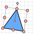
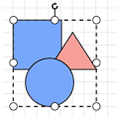
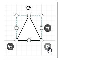
Select, Drag, Resize, Rotate
Objects can be selected and then dragged, resized, or rotated.
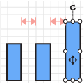
Snap
Objects can be aligned easily against gridlines or neighboring objects.
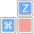
Keyboard Interactions
All common actions can also be performed through keyboard input.
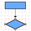
Connect
The connect tool can be used to create a connection between two nodes, ports, or points.
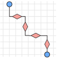
Edit Connector
A connector’s route can be manually edited by dragging thumbs that are visible after selection.
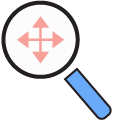
Zoom Pan
Large diagrams can be explored using the zoom and pan tool.
Group
Multiple nodes or connectors can be grouped together to form a single object called a group.

Drawing Tool
The drawing tool enables users to draw custom nodes and shapes by clicking and dragging on the diagram surface.
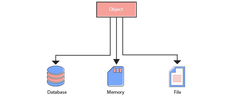
Data Binding
Seamlessly data bind to various client-side and remote data sources such as JSON, RESTful services, OData services, WCF services, and much more.
Commands
Diagram control has a predefined set of commands. Some of the standard commands are mapped to keyboard shortcuts. It is also possible to configure new commands and key combinations.
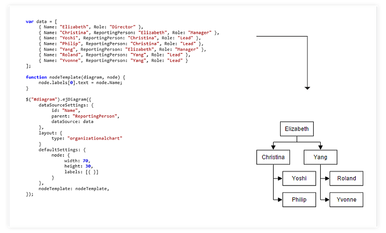
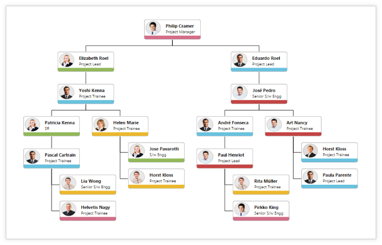
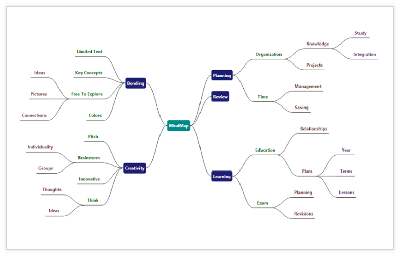
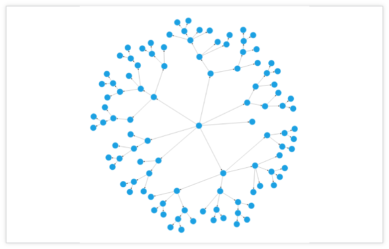
Automatic Layout
Automatic layout is used to arrange nodes automatically based on a predefined layout logic. There is built-in support for organization chart layout, hierarchical tree layout, and radial tree layout.
Overview
Overview control is used to improve the navigation experience when exploring large diagrams. It displays a small preview and allows operations such as zooming and panning within it.
Symbol Palette
The symbol palette is a gallery of reusable symbols/nodes that can be dragged and dropped onto the surface of the diagram.
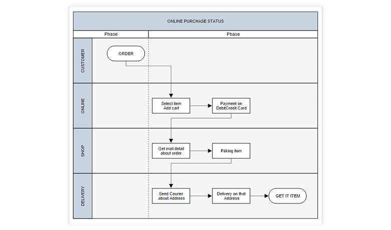
Swim Lane
A swim lane is a visual element used in process flow diagrams or flowcharts. Swim lanes may be arranged either horizontally or vertically. Swim lane has built-in lanes and phases where nodes can be added to it. It has rich interactive features and auto-alignment options, which makes editing easy.
Serialization
Diagram’s state can be persisted to JSOM format and then be loaded back using serialization.
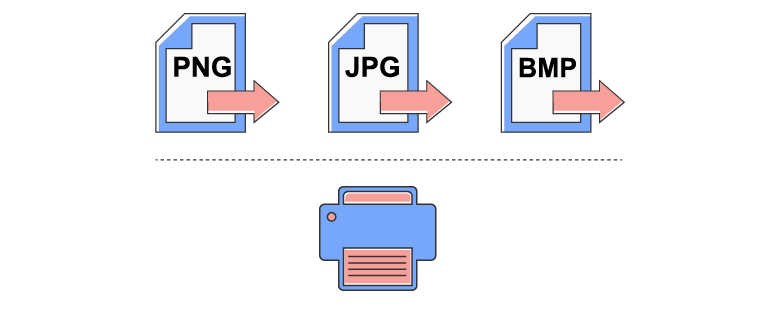
Exporting and Printing
Diagrams can be easily exported as image files (.png, .jpeg, .bmp, and .svg formats) and can also be printed as a document.
Miscellaneous
There are several other features available to enhance the diagramming experience.
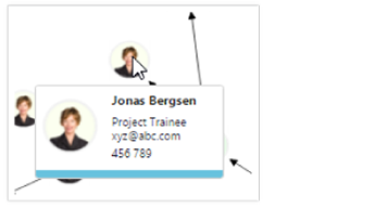
Tooltip
Additional information about a node can be viewed using tooltips.
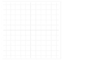
Gridlines
Gridlines provide guidance when trying to align objects.
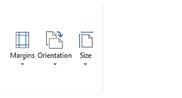
Page Layout
The drawing surface can be given a page-like appearance using page size, orientation, and margin.
User Handles
Frequently used commands can be easily mapped to the user handle.
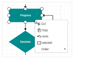
Context Menu
Frequently used commands can be easily mapped to the context menu.
Localization
All static text within the diagram can be localized to any desired language.

AngularJS and More
There is built-in integration with all the popular 3rd party frameworks like AngularJS, KnockoutJS, jQuery, TypeScript, and Bootstrap.
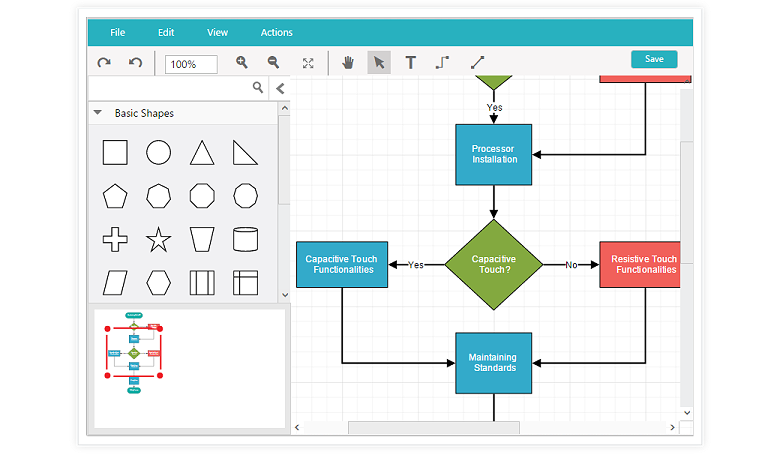
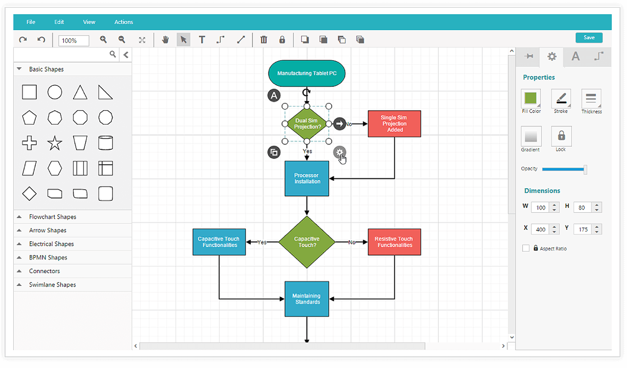
Diagram Builder
Diagram builder is a diagramming application created using the diagram control. It is used to create, edit, save, export, and print diagrams. It has a symbol palette, property editor, overview window, toolbox, and menu to provide a great editing experience.
60+ JSP CONTROLS
ALL CONTROLS
GRIDS
DATA VISUALIZATION
EDITORS
NAVIGATION
NOTIFICATION
BUSINESS INTELLIGENCE
REPORTING
Rated by users across the globe
Awards
Greatness—it’s one thing to say you have it, but it means more when others recognize it. Syncfusion® is proud to hold the following industry awards.

