
 Mohamed Samsudeen
The Syncfusion WinUI and WPF toolkits have been strengthened further in our recent 2021 Volume 3 release. In this blog, we will see the new controls and major features included in WinUI and WPF for this release.
WinUI
Production-ready controls
The following WinUI controls were developed to meet industry standards and are marked as production-ready:
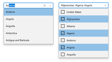
ComboBox (new)
The WinUI ComboBox control (dropdown list) is a text box component that allows users to type a value or choose an option from a list of predefined options. It has several out-of-the-box features, such as data binding, multiselection, filtering, UI customization, and custom templates.
Editable mode
Editable text box to type in and select items from the given data source.
Searching
On typing, the best-matched items will be highlighted for easier selection. In addition, filtering can be enabled if needed.
Filtering
The ComboBox filters items based on the entered text and auto-fills with the first suggestion.
Single and multiple selections
The ComboBox control allows single and multiple selections. The required selection can easily be specified using the SelectionMode property.
Watermark
Display placeholder text inside the control until the user inputs the text.
Appearance customization
Dropdown list items and the ComboBox area can be completely customized with an image or custom controls using templates.
Segmented Control (new)
The WinUI Segmented control provides a simple way to choose from a linear set of two or more segments, each of which functions as a mutually exclusive option.
Key features
- Customize the segmented background, text color, selection style, and more using the built-in features to fit your application’s theme.
- Populate the segment items from a collection of strings and business objects.
- Completely customize the segments with a custom UI.
Calendar
Change the first day of the week based on culture
Previously, the first day of the week was always set to Sunday, irrespective of the culture of the Calendar. Now, the first day of the week in a calendar will be automatically set based on the current culture.
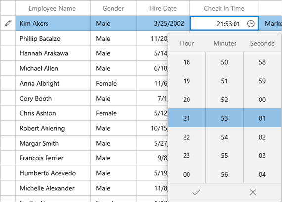
DataGrid
Time column
The new time column is integrated with the TimePicker control to easily select a time.
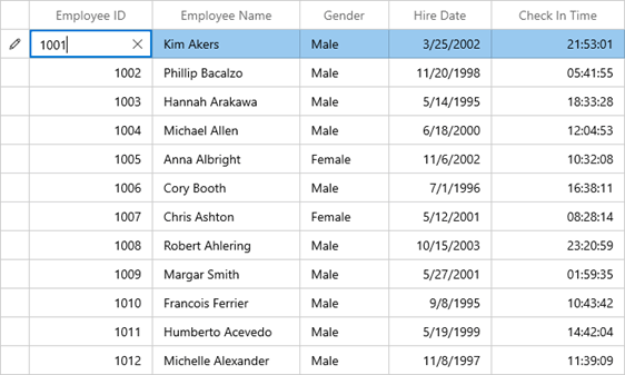
Numeric column
The new numeric column allows editing the values smartly using the built-in NumberBox control.
Input controls
Header and description
Now, the following input controls support headers and descriptions:
The header and description can either be strings or custom controls.
NumberBox
Culture
Modify the culture of an individual NumberBox. The text in the NumberBox will be updated based on the specified culture.
Restrict maximum number of decimal digits
NumberBox will not allow users to enter more decimal digits than the specified format.
Input scope
NumberBox will show a numeric keypad by default in tablet mode. It can also be changed to other types of keypads.
Hide text box
Hide the text box in the NumberBox control and attach the repeat button to another control.
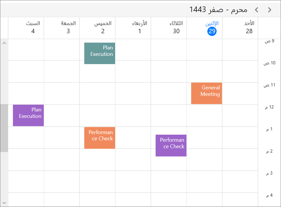
Scheduler
Calendar types
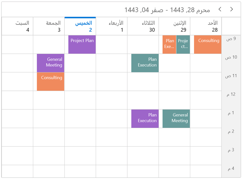
Now you can display different types of calendars such as Gregorian, Korean, Hebrew.
Allowed views
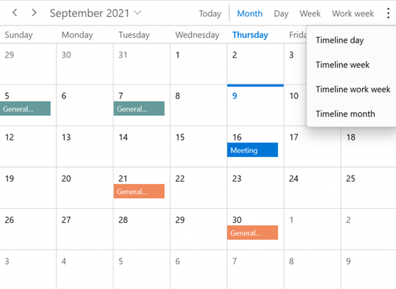
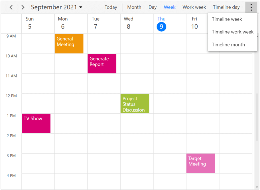
All the different scheduler view types can be listed in the scheduler header to quickly navigate among them. You can show only specific view types if needed.
Date navigation using the date picker
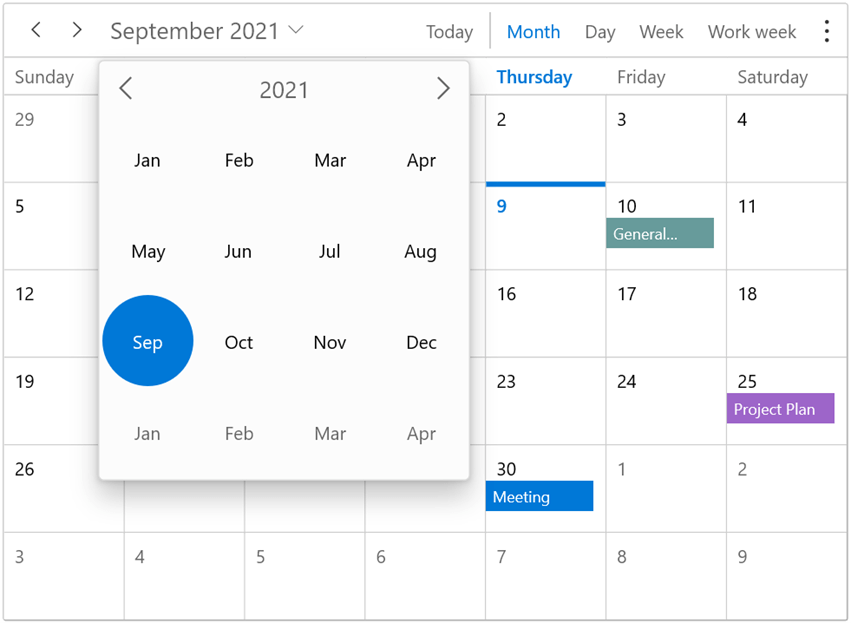
Navigate through different dates using a built-in date picker available in the scheduler header.
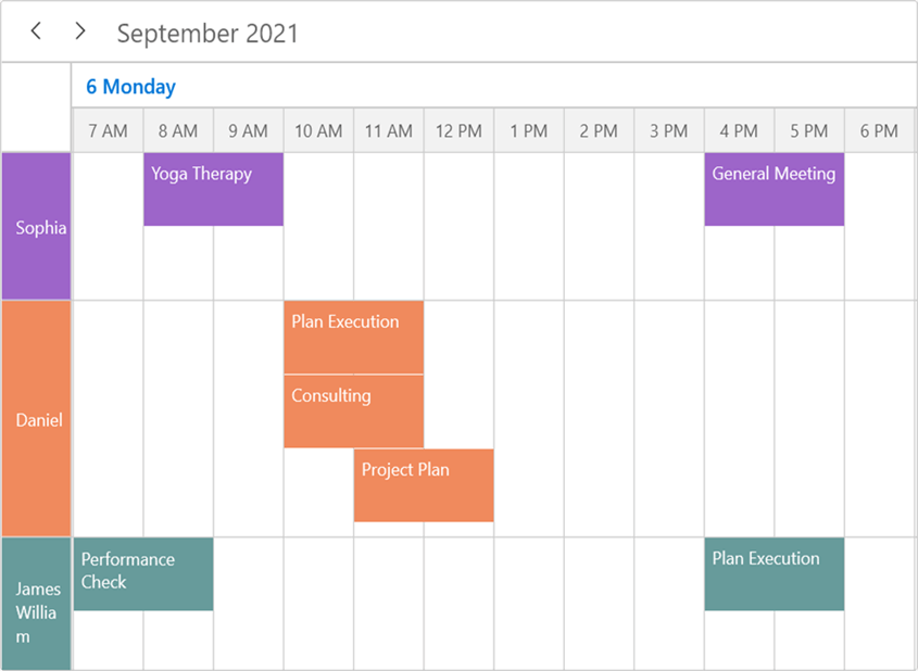
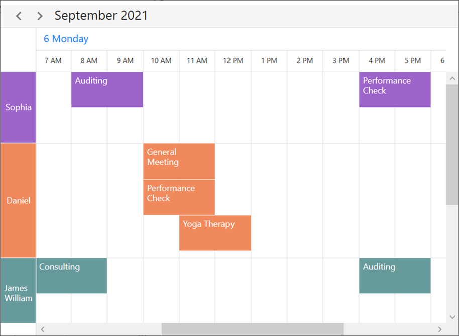
Resource view auto and minimum heights
Adjust the height of the resource view in timeline views based on the appointments. Set the minimum height for the resource view in timeline views.
TreeGrid
Date column
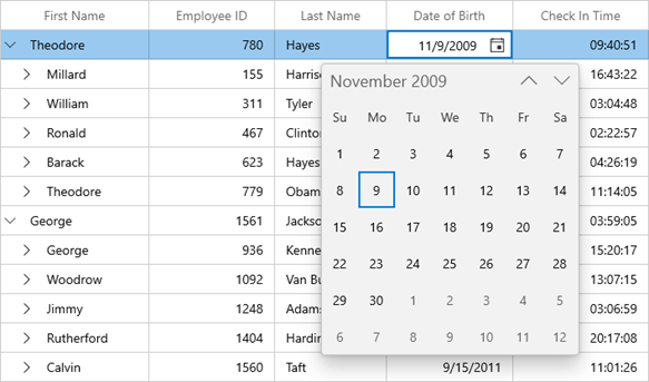
Show a date column and select a date easily using the CalendarDatePicker editor control.
Time column
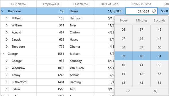
Show a time column and select a time easily using the TimePicker editor control.
Numeric column
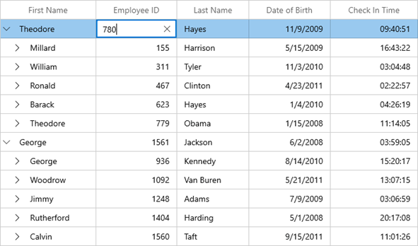
Show a numeric column and smartly edit the values using the NumberBox editor control.
WPF
There are some of the notable features included in WPF in the 2021 Volume 3 release.
Diagram
Restrict negative axis dragging
This feature restricts the users from dragging and dropping diagram elements to negative axis bounds.
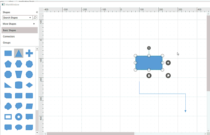
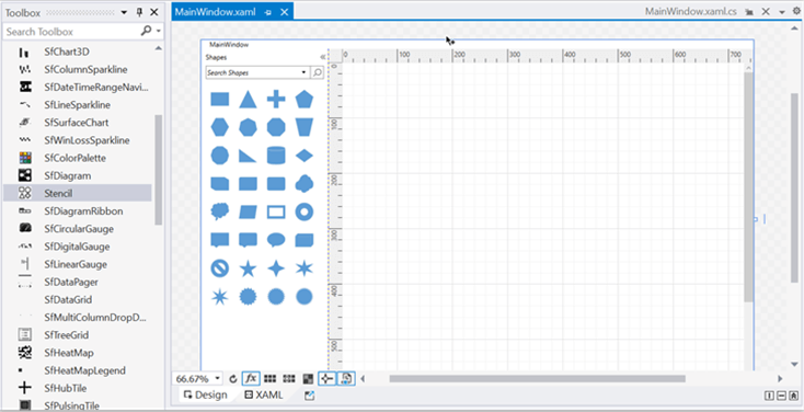
Toolbox support for stencil control
The stencil control is now available in the Visual Studio toolbox. Drag it easily into the designer to include it in the application.
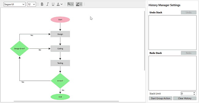
Undo and redo improvement
View, delete and limit the operations recorded in the undo and redo stack. You can also group diagram actions and store them as a single entry in the history manager.
PDF Viewer
Annotation locking
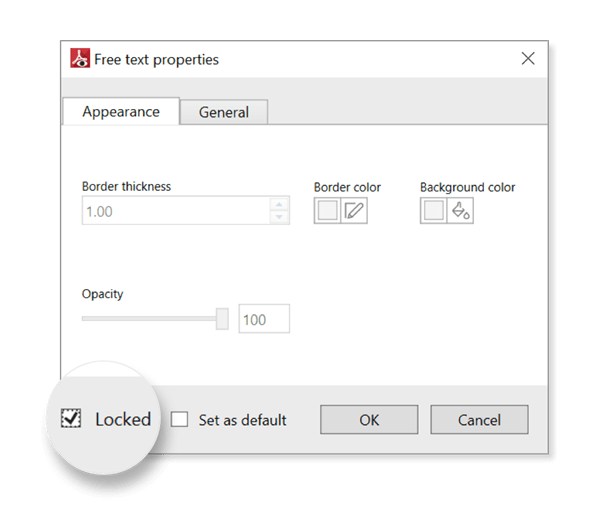
Users can now lock annotations in PDF files to prevent modifications.
Active viewport rendering
Render only the parts of a PDF file within the viewport region at higher zoom percentages, saving memory and improving performance.
Scheduler
Calendar types
Now you can have different calendar types such as Gregorian, Korean, Hebrew.
Allowed views
All the different scheduler view types can be listed in the scheduler header to quickly navigate among them. You can show only specific view types if needed.
Date navigation using the date picker
Navigate dates using a built-in date picker available in the scheduler header.

Resource view auto and minimum heights
Adjust the height of the resource view in timeline views based on the appointments. Set a minimum height for the resource view in timeline views.
Conclusion
Thanks for reading! In this blog, we have seen the new, user-friendly controls and notable feature enhancements rolled out in our Syncfusion desktop platforms in the 2021 Volume 3 release. You can check out all the available new features in our WinUI and WPF platforms in our Release Notes and on the What’s New page.
Nowadays, desktop applications are becoming more popular than ever. Try out these new, versatile controls and features and build innovative desktop applications!
Explore samples of the WinUI and WPF controls from the GitHub location. Additionally, you can download and check out our WinUI and WPF demo apps in the Microsoft Store.
You can also contact us through our support forums, Direct-Trac, or feedback portal. We are always happy to assist you!


Related blogs
- Syncfusion Essential Studio® 2021 Volume 3 Is Here!
- WinUI Scheduler: A Smart Tool to Handle Appointments in a Hospital
- Pick Colors Like a Boss Using Syncfusion Color Controls in WinUI
- Create, View, Edit, and Save Your Excel Files Using WPF Spreadsheet
- Create a Feature-Rich WPF Diagramming App in 2 Minutes
 No spam, just valuable updates.