
 Rajendran R
We are glad to introduce the control that was requested most in our feedback portal for Essential JS 2: the Kanban board, which is a preview and is available in our 2020 Volume 1 release.
The Kanban board is useful for designing applications containing task-scheduling boards used for product or software development, project management, personal task management, and much more. It organizes tasks with transparent workflows and can be integrated in any team environment. The control comes with all the features necessary to design a board.
This blog post showcases the following key features of the Kanban board in JavaScript:
- Data binding
- Customizable cards
- Column customization
- Swimlanes
- Performing CRUD in cards
- Work-in-progress validation
- Toggling columns
- Tooltips
- Templates
- Themes
To get started with the Kanban board, refer to our documentation.
Data binding
Create a data manager or JavaScript object array collection (JSON) to bind card data to the Kanban control. Now, you can bind data to cards from local and remote services through the data manager, which handles RESTful JSON data services.
Local data
Create a data structure, as shown in the following code example.
let kanbanData:Array<object> = [
    {
        Id: 'Demo meeting',
        Summary: 'Presentation about new features of the control',
        Status: 'Open'
    },
    {
        Id: 'Requirement',
        Summary: "Gather the requirements for adding a new feature",
        Status: 'InProgress'
    },
    {
        Id: 'Validation',
        Summary: 'Validate the customer-reported issue',
        Status: 'Close'
    }
];
The following code renders the Kanban control with the local data source found in the previous code example.
import { Kanban } from '@syncfusion/ej2-kanban';

let kanbanData:Array<object> = [
    {
        Id: 'Demo meeting',
        Summary: 'Presentation about new features of the control',
        Status: 'Open'
    },
    {
        Id: 'Requirement',
        Summary: "Gather the requirements for adding a new feature",
        Status: 'InProgress'
    },
    {
        Id: 'Validation',
        Summary: 'Validate the customer-reported issue',
        Status: 'Close'
    }
];
let kanbanObj: Kanban = new Kanban({
    dataSource: kanbanData,
    keyField: 'Status',
    columns: [
        { headerText: 'Backlog', keyField: 'Open' },
        { headerText: 'In Progress', keyField: 'InProgress' },
        { headerText: 'Done', keyField: 'Close' }
    ],
    cardSettings:{ contentField:"Summary", headerField:"Id" }
});
kanbanObj.appendTo('#Kanban');
Local data using the data manager
The data manager can also be used to bind local data to the Kanban control. Declare the data manager as shown in the following code example.
import { Kanban } from '@syncfusion/ej2-kanban';
import { DataManager, Query } from '@syncfusion/ej2-data';

let kanbanData:Array<object> = [
    {
        Id: 'Demo meeting',
        Summary: 'Presentation about new features of the control',
        Status: 'Open'
    },
    {
        Id: 'Requirement',
        Summary: "Gather the requirements for adding a new feature",
        Status: 'InProgress'
    },
    {
        Id: 'Validation',
        Summary: 'Validate the customer-reported issue',
        Status: 'Close'
    }
];
let result: Object[] = new DataManager(kanbanData).executeLocal(new Query());

let kanbanObj: Kanban = new Kanban({
    dataSource: result,
    keyField: 'Status',
    columns: [
        { headerText: 'Backlog', keyField: 'Open' },
        { headerText: 'In Progress', keyField: 'InProgress' },
        { headerText: 'Done', keyField: 'Close' }
    ],
    cardSettings:{ contentField:"Summary", headerField:"Id" }
});
kanbanObj.appendTo('#Kanban');
Remote data using data manager
To bind data to the Kanban control using remote data sources, map the service URL to the data manager. The data manager supports various adaptors to bind data from different remote services. They are:
- OData
- OData V4
- Web API
- URL Adaptor
- Custom Adaptor
The following code example shows binding remote data using the data manager.
import { Kanban } from '@syncfusion/ej2-kanban';
import { DataManager } from '@syncfusion/ej2-data';

let dataManger: DataManager = new DataManager({
    url: 'https://js.syncfusion.com/ejServices/wcf/Northwind.svc/Tasks',
    crossDomain: true
});

let kanbanObj: Kanban = new Kanban({
    dataSource: dataManger,
    keyField: 'Status',
    columns: [
        { headerText: 'To Do', keyField: 'Open' },
        { headerText: 'In Progress', keyField: 'InProgress' },
        { headerText: 'Testing', keyField: 'Testing' },
        { headerText: 'Done', keyField: 'Close' }
    ],
    cardSettings:{ contentField:"Summary", headerField:"Id" }
});
kanbanObj.appendTo('#Kanban');
Customizable cards
Cards play a major role in Kanban boards. Every card represents a task. Cards have header and content sections that are loaded from correspondingly mapped fields.
You can drag and drop a card to change its state. The card’s styles are derived from the Syncfusion CSS card control. Its layout can be customized using templates to help design it in line with the application.
The following code example shows the declaration of the card template.
<script id="cardTemplate" type="text/x-jsrender">
    <div class='e-card-content'>
        <table class="card-template-wrap">
            <tbody>
                <tr>
                   <td class="CardHeader">Type:</td>
                   <td>${Type}</td>
                </tr>
                <tr>
                    <td class="CardHeader">Priority:</td>
                    <td>${Priority}</td>
                </tr>
                <tr>
                    <td class="CardHeader">Summary:</td>
                    <td>${Summary}</td>
                </tr>
            </tbody>
        </table>
    </div>
</script>
The following code renders the Kanban control.
import { Kanban } from '@syncfusion/ej2-kanban';
import { DataManager, Query } from '@syncfusion/ej2-data';

let dataManger: DataManager = new DataManager({
    url: 'https://js.syncfusion.com/ejServices/wcf/Northwind.svc/Tasks',
    crossDomain: true
});

let kanbanObj: Kanban = new Kanban({
    dataSource: dataManger,
    keyField: 'Status',
    columns: [
        { headerText: 'To Do', keyField: 'Open' },
        { headerText: 'In Progress', keyField: 'InProgress' },
        { headerText: 'Testing', keyField: 'Testing' },
        { headerText: 'Done', keyField: 'Close' }
    ],
    cardSettings: {
        headerField: 'Id',
        template:"#cardTemplate"
    }
});
kanbanObj.appendTo('#Kanban');
Columns
The Kanban control organizes each stage in a process as a column (e.g., backlogs, in-progress tasks, completed tasks). You can add any number of columns you want. Cards flow between the stages until they are moved to the completed stage.
The columns contain the following configurations:
- Column header text and corresponding mapping key field.
- An option to allow columns to expand and collapse.
- An option to collapse columns upon initialization.
- The ability to show or hide a task count in a column.
- WIP limits: constraints to validate the minimum and maximum number of cards allowed.
The following code example shows the declaration of columns in the Kanban control.
let kanbanObj: Kanban = new Kanban({
    …
    columns: [
        { keyField: 'Open', headerText: 'To Do', template:"#headerTemplate", allowToggle:true, isExpanded: false, minCount: 1, maxCount: 5},
…
    ],
  …
});
Header template
You can customize the column header with your own UI using HTML and CSS. The following code example illustrates this.
let kanbanObj: Kanban = new Kanban({
    columns: [
        { template:"#headerTemplate", keyField: 'Open'},
        { template:"#headerTemplate", keyField: 'InProgress'},
        { template:"#headerTemplate", keyField: 'Testing'},
        { template:"#headerTemplate", keyField: 'Close' }
    ],
});

HTML
<script id="headerTemplate" type="text/x-jsrender">
    <div class="header-template-wrap">
        <div class="header-icon e-icons ${keyField}"></div>
        <div class="header-text">${headerText}</div>
    </div>
</script>
Stacked header
Stacked headers divide and organize subheadings in a table by logically grouping columns according to header. The following code example illustrates this.
let kanbanObj: Kanban = new Kanban({
…
    stackedHeaders:[
        { text: 'Open', keyFields: 'Open',  },
        { text: 'Doing', keyFields: 'InProgress, Review' },
        { text: 'Completed', keyFields: 'Close' }
    ],
…
});
Swimlane
Swimlane rows layout cards horizontally based on category and according to a specific key (e.g., engineer, priority, EPIC, etc.). The swimlane row displays the text of a corresponding key and the count of cards in the swimlane. To configure a swimlane, map the corresponding key and text fields in the swimlaneSettings property.
The header of the swimlane can be customized through a template. Users can drag and drop cards between swimlanes. If necessary, you can hide an empty swimlane row in the Kanban board. Cards in swimlane can be sorted in ascending or descending order.
The following code shows the declaration of the swimlane in the Kanban control.
let kanbanObj: Kanban = new Kanban({
    swimlaneSettings: {
        keyField: 'Assignee',
        textField:'Assignee',
        allowDragAndDrop: true,
        showEmptyRow: true,
        showItemCount: true,
        sortBy: 'Ascending',
        template: '#swimlaneTemplate'
    },
});
Customizing swimlane header
Each swimlane row header can be customized with an image and text, as shown in the following code.
let kanbanObj: Kanban = new Kanban({
        swimlaneSettings: {
            keyField: 'Assignee',
            template: '#swimlaneTemplate',
        }
    });
<script id="swimlaneTemplate" type="text/x-jsrender">
    <div class='swimlane-template e-swimlane-template-table'>
        <div class="e-swimlane-row-text"><img src="./src/kanban/images/${keyField}.png" alt=""/><span>${textField}</span></div>
    </div>
</script>
Performing CRUD in cards
The Kanban control has full-fledge support to manipulate cards (create, read, update, and delete) using a built-in dialog module, custom fields, or a dialog template
Built-in CRUD actions
The built-in dialog editing module helps create, edit, and delete a card based on mapped fields.
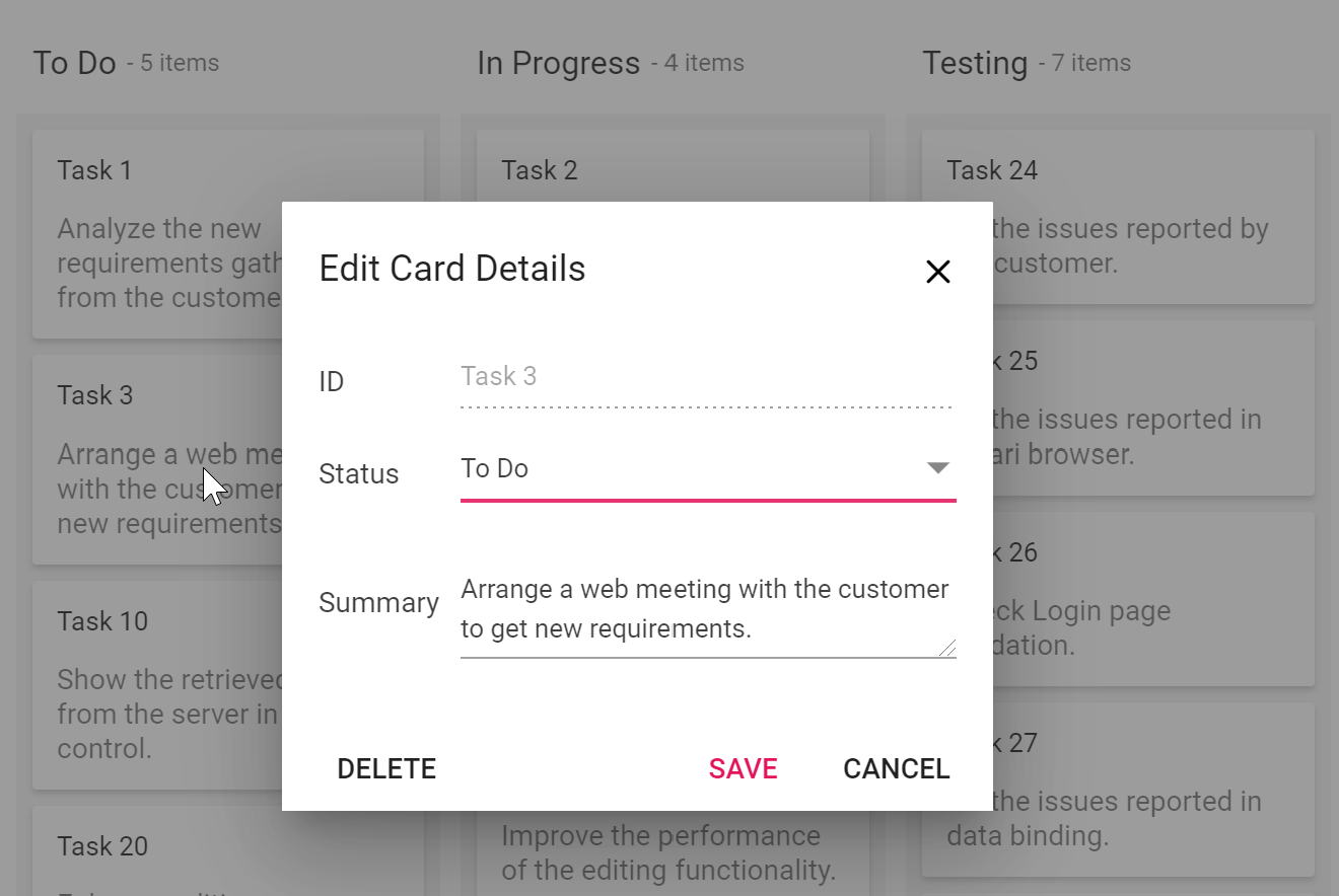
Custom fields
The Kanban control provides an option to add custom fields with built-in dialog fields. The following code example shows the dialog setting for the fields.
let kanbanObj: Kanban = new Kanban({
    dialogSettings: {
        fields: [
            { key: 'Id', type: 'Input' },
            { key: 'Status', type: 'DropDown' },
            { key: 'Estimate', type: 'Numeric' },
            { key: 'Summary', type: 'TextArea' }
        ]
    }
});
Editing template
The Kanban control offers template support, with which you can create a custom editing window. The following code example illustrates this.
Let kanbanObj: Kanban = new Kanban({
    dialogSettings: {
        template: '#dialogTemplate'
    },
});
Work-in-progress validation
Work-in-progress (WIP) validation limits the tasks allowed in each column in a Kanban board. For example, you can limit the “in-progress” column to only one task at a time. WIP validation provides the following benefits:
- Better focus and improved productivity.
- Less multitasking.
- Fewer bottlenecks.
- Easy measurement of team and individual capacity.
- No overloading teams with tasks.
If validation fails, the columns are indicated with a “validation failed” state. The following code example shows differentiation when minimum and maximum validation fails by applying two different variations of appearance.
let kanbanObj: Kanban = new Kanban({
    columns: [
        { headerText: 'To Do', keyField: 'Open', minCount: 1, maxCount: 5 },
        { headerText: 'In Progress', keyField: 'InProgress', minCount:1, maxCount:2 },
        { headerText: 'Testing', keyField: 'Testing' },
        { headerText: 'Done', keyField: 'Close' }
    ],
});
Toggle columns (expand and collapse)
Toggling columns helps when displaying a large number of columns on a board. Using this feature, you can collapse a few columns by clicking an icon that prevents the user from scrolling the board. Also, you can collapse a column when a page loads. The following code example illustrates this.
let kanbanObj: Kanban = new Kanban({
    columns: [
        { headerText: 'To Do', keyField: 'Open' },
        { headerText: 'In Progress', keyField: 'InProgress' },
        { headerText: 'Testing', keyField: 'Testing', allowToggle:true, isExpanded:false },
        { headerText: 'Done', keyField: 'Close' }
    ],
});
Tooltip
The Kanban control supports to two types of tooltips: a default tooltip, and a tooltip template.
Default tooltip
The card tooltip can be enabled by using the property enableTooltip. When enabling this property, card information is shown in the tooltip by default.
let kanbanObj: Kanban = new Kanban({
…
    enableTooltip:true,
…
});
Tooltip template
A tooltip can be customized using a template. The following code example illustrates this.
let kanbanObj: Kanban = new Kanban({
…
enableTooltip:true,
tooltipTemplate:"#tooltipTemplate",
…
});
Templates
Customize the default appearance of the UI elements of the Kanban control by using HTML and CSS. The appearance of the following UI elements can be customized:
Themes
The following SASS-based built-in themes are available for the Kanban control:
- Material
- Fabric
- Bootstrap 3 and 4
- High Contrast
Resources
You can check out the source of our JavaScript Kanban control on GitHub and NPM.
Conclusion
When creating our Kanban control for the 2020 Volume 1 release, we covered most of the common requirements and included a modular architecture. Currently, the control is available for JavaScript, Angular, React, Vue, ASP.NET MVC, ASP.NET Core, and Blazor.
We look forward to you trying out the Kanban control and providing your feedback. If you are new to Syncfusion, try our control’s features by downloading a free trial. You can also explore our online demo and our documentation.
If you have any questions or feedback, please let us know in the comments section. You can also contact us through our support forum or Direct-Trac.
 No spam, just valuable updates.