
As you know, we introduce new chart types in almost all our releases. The 2020 Volume 3 release was rolled out last week. If you haven’t checked it out yet, have a look here. We included the following two new chart types in the Flutter Charts widget in this release:
In this blog, I will walk you through how to create a waterfall chart and the features available in it. The box and whisker chart will be explained in an upcoming blog. In addition to these chart types, we have also implemented and included various new features in our Flutter Charts. You can find those details in this blog: What’s New in 2020 Vol 3: Flutter Charts.
Let’s explore the features of the waterfall chart!
Overview
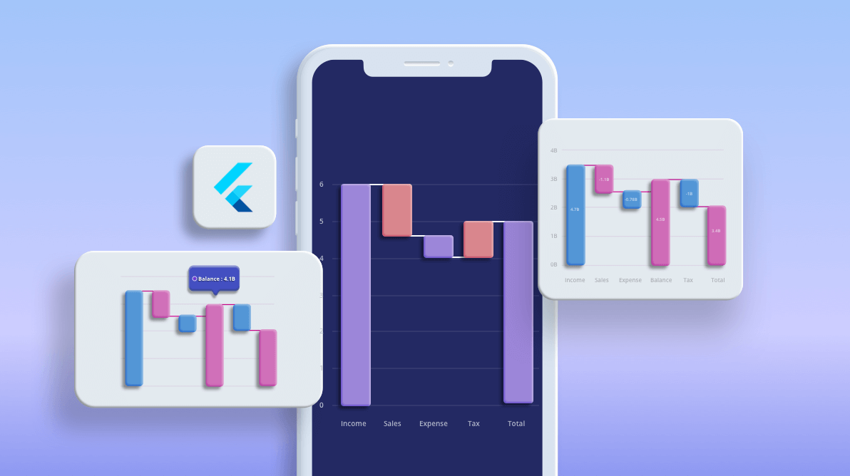
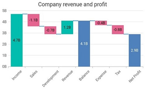
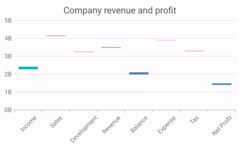
The new Flutter waterfall chart shows gradual changes in the quantitative value of an entity that is subject to changes by increments or decrements. Using the waterfall chart, you can quickly illustrate changes in revenues.
This will be helpful in understanding the details of the dynamic data quickly. The data point can be either a positive or negative value.
To render a waterfall chart, create an instance of the WaterfallSeries and add it to the series collection property of SfCartesianChart. The waterfall chart takes the following values as input.
| Value | Type | Description |
| X | Int/ Double/ String/ DateTime | X-axis value of the data point. |
| Y | Int/ Double | Y-axis value of the data point. |
| Intermediate sum | Boolean | Decides whether the data point should be an intermediate sum or not. |
| Total sum | Boolean | Decides whether the data point should be a total sum or not. |
For example, consider the following code snippet.
[Dart]
ChartData(4, 5),               // Considered a normal data point.
ChartData(4, 5, true),         // Considered an intermediate sum.
ChartData(4, null, true),      // Considered an intermediate sum.
ChartData(4, 5, false, true),  // Considered a total sum.
ChartData(4, 5, true, true),   // Considered a total sum.
ChartData(4, 5, false, false), // Considered a normal data point.
Intermediate sum and total sum
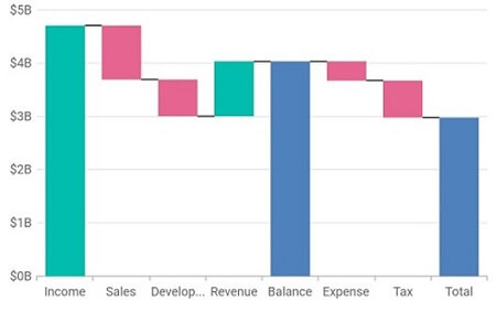
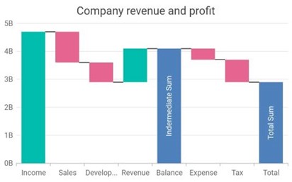
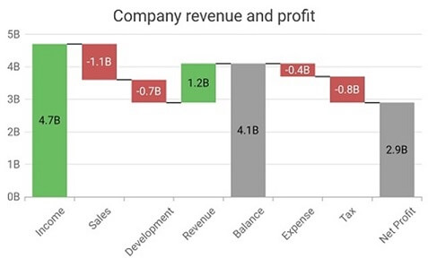
The important functionality of a waterfall chart is its ability to display both intermediate and total sums:
- Intermediate sum: Displays the total of the previous data points from its position in the chart.
- Total sum: Displays the total of all the data points in the chart.
For example, if an intermediate sum is specified at index 4, it will add the first, second, and third data points. If another intermediate sum is specified at index 7, it will add the fifth and sixth data points. Meanwhile, the total sum will add the first, second, third, fifth, and sixth data points.
The intermediateSumPredicate and totalSumPredicate are the APIs used to identify the data points that act as intermediate and total sums, respectively. Any number of data points in the series can be intermediate or total sums.
Note: If a data point is specified as an intermediate or total sum, its y value is not considered for calculation.
Refer to the code example.
[Dart]
SfCartesianChart(
  series: <ChartSeries<ChartData, double>>[
    WaterfallSeries<ChartData, double>(
      dataSource: <ChartData>[
        ChartData(2, 10),
        ChartData(3, -3),
        ChartData(4, 5, true),
        //...
        ChartData(13, -5, false, true)
      ],
      xValueMapper: (ChartData data, _) => data.x,
      yValueMapper: (ChartData data, _) => data.y,
      intermediateSumPredicate: (ChartData data, _) => data.isIntermediate,
      totalSumPredicate: (ChartData data, _) => data.isTotal
    )
  ]
)
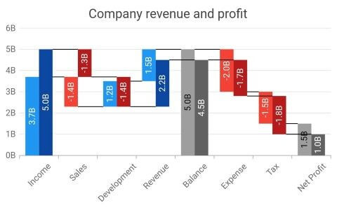
Special points color customization
For the special points, such as negative points, intermediate sums, and total sums, colors can be changed using the following built-in APIs in the waterfall chart:
- negativePointsColor: To change the color of the negative data points in the series.
- intermediateSumColor: To change the color of the intermediate sum points in the series.
- totalSumColor: To change the color of the total sum points in the series.
If no color is specified, then those points will be rendered with the default series color.
Refer to the code example.
[Dart]
SfCartesianChart(
  series: <ChartSeries<ChartData, double>>[
    WaterfallSeries<ChartData, double>(
      negativePointsColor: const Color.fromRGBO(229, 101, 144, 1),
      intermediateSumColor: const Color.fromRGBO(79, 129, 188, 1),
      totalSumColor: const Color.fromRGBO(79, 129, 188, 1)
    )
  ]
)
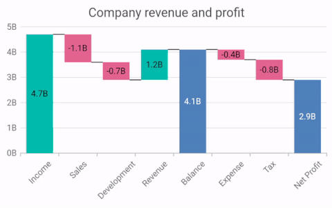
Connector lines
Connector lines can be enabled in order to connect the data points in a waterfall chart. For positive values, the connector line is drawn to the bottom and for negative values, intermediate sums, and total sums, the connector line is drawn to the top. Connector line color, width, and dash value can be customized.
Refer to the code example.
[Dart]
SfCartesianChart(
  series: <ChartSeries<ChartData, double>>[
    WaterfallSeries<ChartData, double>(
      connectorLineSettings: WaterfallConnectorLineSettings(
        width: 2.5,
        dashArray: <double>[3, 1]
      )
    )
  ]
)
Other supported features
As with other chart types, all major chart features are supported: data labels, animation, multiple series, side-by-side series placement, inversed axis, transposed axis, legend, tooltip, zooming and panning, etc.

Helpful links
For more details about the waterfall chart type, you can refer to the following links:
Conclusion
I hope you now understand the waterfall chart and its available functionalities in the Syncfusion Flutter Charts widget. This chart type clearly shows each and every change (increment and decrement) in the data with its versatile features. We can use this chart type to show a student’s marks each semester, the revenue of a firm, pandemic details, etc. You can download this chart in our 2020 Volume 3 release.
If you aren’t a customer yet, you can try our 30-day free trial to check out these features.
Also, if you wish to send us feedback or would like to submit any questions, please feel free to post them in the comments section of this blog post. You can also contact us through our support forum, feedback portal, or Direct-Trac support system. We are always happy to assist you!


 No spam, just valuable updates.