
 Manivannan Elangovan
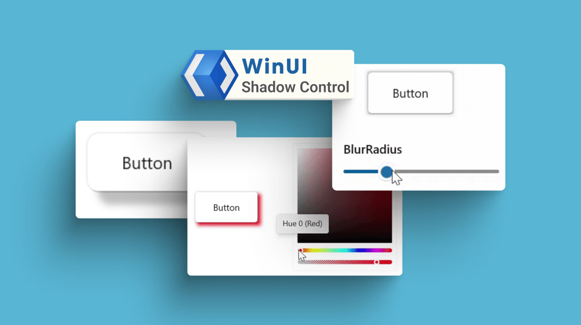
We at Syncfusion are glad to announce the availability of the new WinUI Shadow control in our 2022 Volume 2 release. It is a content control that can apply shadow effects to framework elements to give them an appearance of depth. It also allows users to easily differentiate the overlapping elements and enjoy a beautiful and appealing user interface.
The key features of the WinUI Shadow control are as follows:
Let’s see them in brief!
Color
The WinUI Shadow control allows users to customize its color.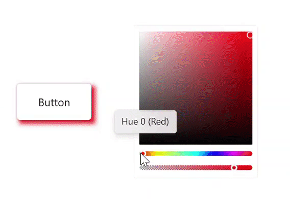
Offset
Change the position of the shadow relative to the position of the view.
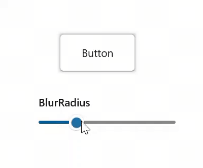
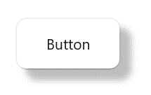
Blur radius
You can adjust the blur level of the shadow like in the following image.
Corner radius
Also, you can adjust the corner radius of the shadow based on the control’s corner radius.
Shadows in different framework elements
You can apply shadows to shapes, paths, images, and any type of framework elements.


Getting started with WinUI Shadow control
We have explored the features of the WinUI Shadow control. Now, let’s see how to add it to your app and use it in a button control.
Step 1: Create a WinUI app.
First, create a simple project using the instructions provided in the Create app with Windows App SDK documentation.
Step 2: Add the Syncfusion.Core.WinUI NuGet package.
Then, install the latest Syncfusion.Core.WinUI NuGet package in your app from NuGet Gallery or from the installed location, C:\Program Files (x86)\Syncfusion\Essential Studio\WinUI\xx.x.x.xx\NuGetPackages.
Note: xx.x.x.xx denotes the version of the installed Syncfusion WinUI Core package.
Step 3: Add the namespace.
Now, include the Syncfusion.UI.Xaml.Core namespace in your XAML file using the following code.
xmlns:syncfusion="using:Syncfusion.UI.Xaml.Core"
Step 4: Initialize the WinUI Shadow control.
Finally, initialize the WinUI Shadow control and add a button as content to it. Refer to the following code example.
<Page
x:Class="GettingStarted.MainPage"
xmlns="http://schemas.microsoft.com/winfx/2006/xaml/presentation"
xmlns:x="http://schemas.microsoft.com/winfx/2006/xaml"
xmlns:local="using:GettingStarted"
xmlns:d="http://schemas.microsoft.com/expression/blend/2008"
xmlns:mc="http://schemas.openxmlformats.org/markup-compatibility/2006"
xmlns:syncfusion="using:Syncfusion.UI.Xaml.Core"
mc:Ignorable="d"
Background="{ThemeResource ApplicationPageBackgroundThemeBrush}">
<Grid>
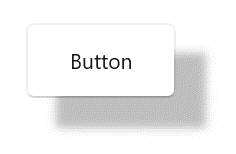
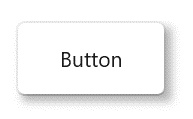
<syncfusion:SfShadow>
<Button Background="White" Height="50" Width="100" Content="Button"/>
</syncfusion:SfShadow>
</Grid>
</Page>Executing the above code will create a button with a shadow effect like the following image.
Note: For more details, refer to the Getting started with WinUI Shadow Control documentation
Conclusion
Thanks for reading! I hope you enjoyed learning about the new Syncfusion WinUI Shadow control and its features. This control is available in our 2022 Volume 2 release. Also, check out our Release Notes and What’s New pages to see all the available new updates in this release. Try them out and leave your feedback in the comments section below!
You can download and check out our demo app in the Microsoft Store.
For current customers, the new version is available for download from the License and Downloads page. If you are not yet a Syncfusion customer, you can try our 30-day free trial to check out our newest features.
You can also contact us through our support forums, support portal, or feedback portal. We are always happy to assist you!
 No spam, just valuable updates.