
 Jegan Raj M
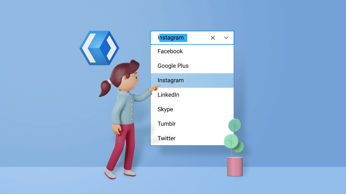
A combo box control is a dropdown control that allows you to type a value in a text box and choose from a list of predefined options.
We at Syncfusion have also developed a ComboBox control for the WinUI 3 platform for our 2021 Volume 3 release.
Following are the main features of the WinUI ComboBox in its initial release:
Let’s look at these features and learn how to integrate the new WinUI ComboBox control into your application.
Editing
The WinUI ComboBox supports both editable and non-editable text boxes for selecting an item from a data source.
In the editable mode, we can type and select the items from a collection. In this case, the typed item will get highlighted in a collection.
The non- editable mode prevents users from editing and instead allows them to select from the dropdown list.
Note: For more details, refer to the Editing in WinUI ComboBox documentation.
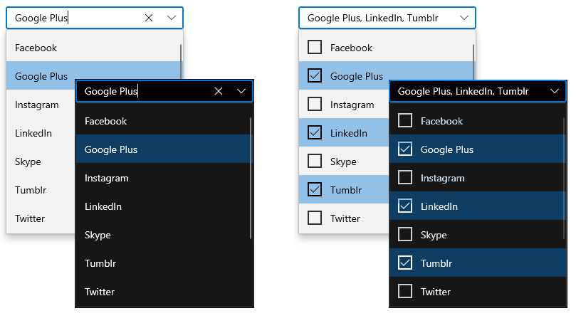
Multiselection
The ComboBox supports both single and multiple selection modes. The multiselection mode allows users to select multiple values from the dropdown list, whereas the single selection mode allows selecting only a single item. Multiple selection can be represented with checkboxes, like in the following screenshot.

Note: For more details, refer to the Multiple selections in WinUI ComboBox documentation.
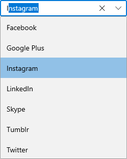
Searching
Search for and select a required item from the list. You can search with either the starting or contained letters.
Note: For more details, refer to the Searching in WinUI ComboBox documentation.
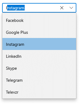
Filtering
The ComboBox has built-in support to filter data items depending on the text entered in the editing text box. You can filter data by entering the starting letter or a specific letter in the item.
Refer to the following GIF images.

Note: For more details, refer to the Filtering in WinUI ComboBox documentation.
Grouping
You can group a collection and display the header for each group. Also, you can customize the group header with images and templates like in the following screenshot.
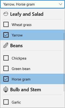
To display grouped collections, use the CollectionViewSource property. You can’t perform filtering while grouping a collection in the ComboBox control.
Note: For more details, refer to the Grouping in WinUI ComboBox documentation.
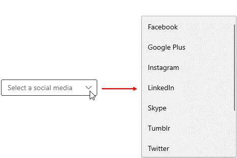
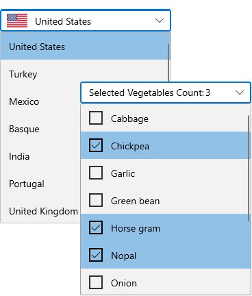
Selection box UI
You can easily customize the selection box appearance based on the selected item(s).
For example, you can display a country name with its flag or the selected iems count like in the following screenshot.
Note: Refer to the Selection box UI documentation for more details.
Item customization
You can easily customize the dropdown list items with images or any other custom control.

Note: To get detailed information, refer to the Customize ComboBoxItem documentation.
Theming
The ComboBox control is available in both light and dark themes.
Note: Refer to the Themes for Syncfusion WinUI Controls documentation.
Getting started with the WinUI ComboBox
We have explored the features of the WinUI ComboBox control. Now, let’s see how to add it to your application and use its basic features.
Step 1: Create a WinUI application.
First, create a simple project using the instructions provided in the Create app with Windows App SDK documentation.
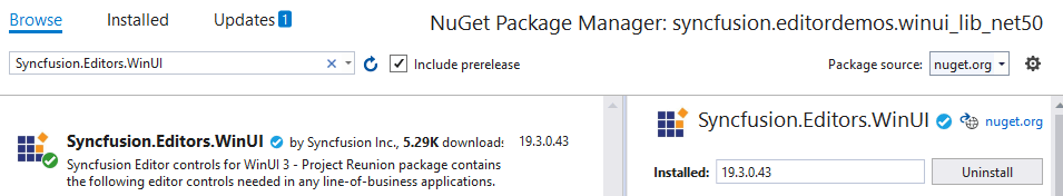
Step 2: Add the Syncfusion.Editor.WinUI NuGet package.
Then, install the latest Syncfusion.Editor.WinUI NuGet package in the application from nuget.org or from the installed location, C:\Program Files (x86)\Syncfusion\Essential Studio®\WinUI\xx.x.x.xx\NuGetPackages.
Note: xx.x.x.xx denotes the version of the Syncfusion WinUI Editor package.
Refer to the following screenshot.
 Step 3: Add the namespace.
Now, include the editors namespace in your XAML file with the following code.
xmlns:editors="using:Syncfusion.UI.Xaml.Editors"
Step 4: Initialize the ComboBox.
Initialize the ComboBox control and add the items like in the following code example.
<editors:SfComboBox x:Name="sfComboBox"
                    Width="250"
 	<editors:SfComboBoxItem Content="Badminton"/>
       <editors:SfComboBoxItem Content="Cricket"/>
       <editors:SfComboBoxItem Content="Football"/>
       <editors:SfComboBoxItem Content="Golf"/>
       <editors:SfComboBoxItem Content="Hockey"/>
</editors:SfComboBox>
This code will create the ComboBox with its items like the following GIF image.

GitHub reference
Get the demo project for the WinUI ComboBox control on GitHub.
Conclusion
I hope you enjoyed learning about the new Syncfusion WinUI ComboBox control and its features. This control is available in our 2021 Volume 3 release. Also, check out our Release Notes and What’s New pages to see all the available new updates in this release. Try them out and leave your feedback in the comments section below!
You can download and check out our demo app in the Microsoft Store.
For current customers, the new version is available for download from the License and Downloads page. If you are not yet a Syncfusion customer, you can try our 30-day free trial to check out our newest features.
You can also contact us through our support forums, Direct-Trac, or feedback portal. We are always happy to assist you!
 No spam, just valuable updates.
Comments (4)
Nice! I like the Grouping and Selection features.
Hi Mark, Thanks for your feedback.
How to set SelectedItems using code behind. I tried using SelectedItems.Add() but the view doesn’t update because the items in the dropdown are not checked.
@12_0217 Hoà ng Lê You can set the selectedItems in code behind as shown in below code snippet,
comboBox.SelectedItems.Add(socialMediasList[0]);
comboBox.SelectedItems.Add(socialMediasList[2]);
comboBox.SelectedItems.Add(socialMediasList[3]);
comboBox.SelectedItems.Add(socialMediasList[5]);
And also refer this documentation: https://help.syncfusion.com/winui/combobox/selection?cs-save-lang=1&cs-lang=csharp#programmatic-selection-1