
 Neelakandan Kannan
We are thrilled to announce the availability of the new .NET MAUI DataGrid control in our Syncfusion Essential Studio® 2022 Volume 2 release. We have provided the DataGrid support for the following platforms,
- Android
- iOS
- WinUI
- Mac Catalyst
Key features
The .NET MAUI DataGrid control supports the following features in this 2022 Volume 2 release,
- Data binding
- Different column types
- Sorting
- Filtering
- Column sizing
- Auto row height
- Selection
- Styling
Data binding
Users can bind any IEnumerable-type data sources like lists and ObservableCollection. Data table binding is also supported.
Column types
You can show different data types in different types of columns. The following column types are supported:
- Numeric
- Text
- Date
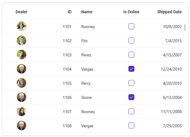
- Checkbox
- Image
- Template (To load controls in a column through the template support.)
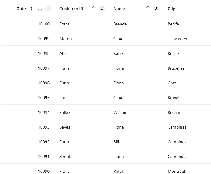
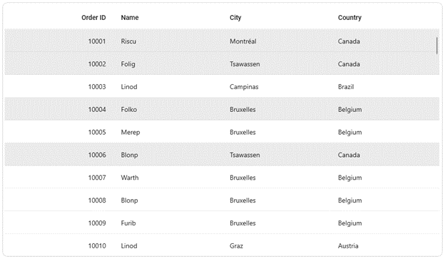
Sorting
Users can interactively sort one or more columns in ascending or descending order. The .NET MAUI DataGrid also supports tri-state sorting i.e., ascending, descending, and unsorted order. You can show numbers next to the sort icon to indicate the order in which the sorting was performed for multiple columns.
Refer to the following image.
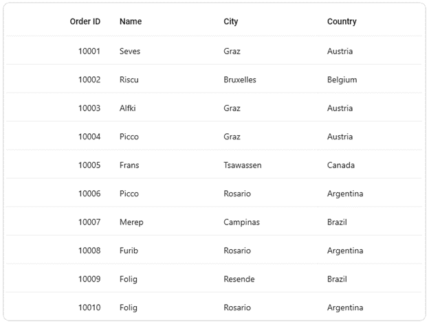
Filtering
Users can perform filtering actions programmatically by providing the appropriate conditions to filter the required rows.
public bool FilterRecords(object record)
{
   string filterText = "ALFKI";
   var item = record as OrderInfo;
   if (item != null)
   {
     if (item.Customer.Equals(filterText))
     return true;
   }
   return false;
}

private void Button_Clicked(object sender, EventArgs e)
{
   dataGrid.View.Filter = FilterRecords;
   dataGrid.View.RefreshFilter();
}
Column sizing
You can set the required column width for each column. Also, you can set the minimum or maximum widths for the columns.
The .NET MAUI DataGrid supports different column width modes such as auto-sizing the columns based on the cell content and filling all the columns within viewport.
Auto row height
The DataGrid control allows users to set separate heights for the header row and data rows. You can set the height for any specific data row. For better readability of the content, you can auto-fit the height for rows.
Selection
Select one or more rows in DataGrid control. The following selection modes are supported:
- Single – Only one row can be selected.
- Single deselect – Only one row can be selected and it can be deselected when we select it again.
- Multiple – More than one row can be selected.
The keyboard navigation helps users to easily navigate between cells and rows without needing a mouse. This support is available only for the Windows platform.
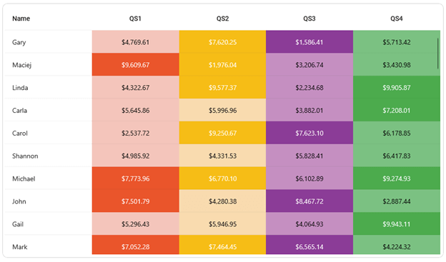
Styling
Also, you can customize the appearance of each element in the .NET MAUI DataGrid control. You can easily set the style conditionally for the grid elements, too.
The following styles are supported for cell customization:
- Font and its attributes
- Text color
- Background
Conclusion
Thanks for reading! We have provided the basic features for the .NET MAUI DataGrid in this 2022 Volume 2 release. We will add more features like in our Xamarin DataGrid in near future. Please take the time to get started with .NET MAUI DataGrid and leave your feedback in the comments section given below!
Refer to our Release Notes and What’s New pages to check out all the new updates in the 2022 Volume 2 release.
You can also reach us through our support forums, support portal, or feedback portal.


 No spam, just valuable updates.
Comments (1)
Thanks for sharing. I read many of your blog posts, cool, your blog is very good.