
 Maithiliy K
We are happy to introduce the new Syncfusion Blazor Pager component in our 2022 Volume 2 release. It is one of the most-awaited and upvoted components in our feedback portal.
Let’s explore the features of the new Blazor Pager component and its UI design with code examples.
Blazor Pager: Overview
The Blazor Pager component is a completely responsive and customizable control. It can easily split data sets into pages and enable us to view them through an intuitive UI.
You can configure the look and feel of the Pager using several built-in options. The component supports standard functionalities like accessibility, keyboard interactions, and events. It also comes with industry-standard themes such as Material, Fabric, and Bootstrap.
Ease of use
Every user prefers to render a component and enable their required functionalities with minimal configuration. We developed our Blazor Pager component to render and enable features with minimal property declaration and configuration.
From the API name itself, you can easily understand the usage of the property. For more details, check out the Getting Started with Blazor Pager documentation.
Key features
The key features of the new Blazor Pager component are as follows:
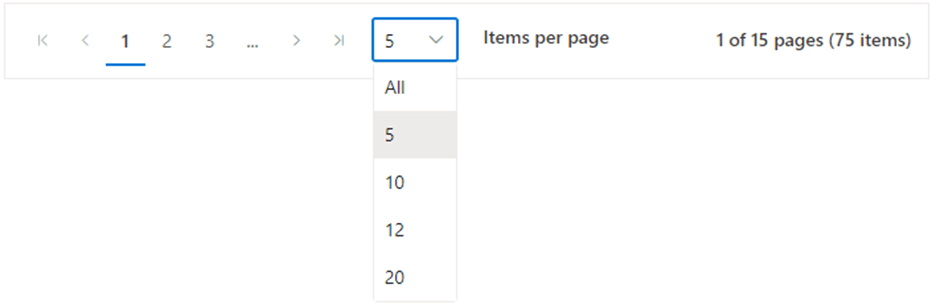
Dropdown to choose the page size
The Pager lets you show different page sizes as a list in the pager dropdown, which helps us dynamically change the page size. You can also change the page size of the Pager by setting the PageSizes property.
Refer to the following image.
Template
You can customize the appearance of the entire Pager UI with HTML elements or other components using the Template property.
Refer to the following GIF image.
Responsive layout
The Blazor Pager component acts intelligently and changes its UI responsively based on the pager dimensions. Its optimized design provides the best UI interaction on different devices.
While resizing the browser window, the elements in the Pager component will adjust automatically. The beauty is: there is no need for any specific property support to enable this feature in the Pager.
Refer to the following image.

Web standards
Web accessibility is a major and essential requirement for any application. An app should be readable and understandable even for users with disabilities. We have developed our Blazor Pager with complete web accessibility support to satisfy this essential need.
Accessibility is achieved in the Blazor Pager component through the WAI-ARIA standard and keyboard navigation:
- WAI-ARIA: The Pager component’s UI includes high-contrast visual elements that help users with low vision enjoy the best viewing experience. The Pager component’s features are easily accessed through assistive technologies such as screen readers.
The following ARIA attributes are used in the Blazor Pager component:- pager (role)
- link (role)
- aria-label (attribute)
- aria-selected (attribute)
- Keyboard navigation: Ensures that every cell is keyboard-accessible. You can even perform the major functions like navigation using keyboard commands alone; no mouse interaction is required. This helps in creating highly accessible apps using this component.
The Blazor Pager component supports the following keyboard shortcuts:Interaction Keys Description Page down/Right arrow Navigates to the next page. Page up/Left arrow Navigates to the previous page. Enter/Space Select the page currently in focus. Tab Focus on the next pager item. Shift + Tab Focus on the previous pager item. Home Navigates to the first page. End Navigates to the last page. Alt + Page up Navigates to the previous pager. Alt + Page down Navigates to the next pager.
Globalization
This feature allows the Blazor Pager component to function globally, thus meeting the diverse needs of different regions.
RTL rendering displays the text and layout from the right-to-left direction. This improves the user experience and accessibility for RTL languages like Hebrew, Arabic, and Persian.
You can localize all the strings used in the Pager component’s UI. The localization (l10n) library is used to localize the UI strings.
Themes
Themes provide an elegant look and feel to an app. The Blazor Pager component supports several built-in SASS-based themes: Fluent, Tailwind CSS, Bootstrap 5, Bootstrap 4, Bootstrap, Material, Fabric, and high contrast. You can also easily customize the themes by overriding the existing SASS styling.
Integrating the Pager and ListView components
We can integrate the Blazor Pager component with all data-binding components, such as DataGrid, Card, and ListView.
Let’s see how to integrate the Blazor Pager component with the ListView component.
You can split the ListView component’s data set into sectioned pages and view them page by page. Navigation can be done with the built-in numeric elements and buttons available.
- First, render the Blazor ListView component. Refer to this documentation for more details regarding how to define this component.
<SfListView  DataSource="@ListData" TValue="DataModel"  HeaderTitle="Contacts" Height="355px" ShowHeader="true">
   <ListViewFieldSettings TValue="DataModel" Id="Id" Text="Name"></ListViewFieldSettings>
</SfListView>

@code {

   // Initialize the list.
   List<DataModel> ListData = new List<DataModel>();
   protected override void OnInitialized()
   {
     base.OnInitialized();
     ListData.Add(new DataModel { Name = "Nancy, Berlin, France" });
     ListData.Add(new DataModel { Name = "Andrew, Madrid, Germany"});
     ListData.Add(new DataModel { Name = "Janet, London, Brazil"});
     ListData.Add(new DataModel { Name = "Margaret, Marseille, Belgium"});
     ListData.Add(new DataModel { Name = "Steven, Cholchester, Switzerland"});
     ListData.Add(new DataModel { Name = "Laura , Tsawassen, Venezuela");
     ListData.Add(new DataModel { Name = "Robert, Tacoma, Austria"});
     ListData.Add(new DataModel { Name = "Michael, Redmond, Mexico"});
     ListData.Add(new DataModel { Name = "Albert, Kirkland, USA"});
     ListData.Add(new DataModel { Name = "Nolan, London, Sweden" });
     ListData.Add(new DataModel { Name = "Jennifer, Berlin, Finland");
     ListData.Add(new DataModel { Name = "Carter, Madrid, Italy"});
     ListData.Add(new DataModel { Name = "Allison, Marseille, Spain"});
     ListData.Add(new DataModel { Name = "John, Tsawassen, UK"});
     ListData.Add(new DataModel { Name = "Susan, Redmond, Ireland" });
     ListData.Add(new DataModel { Name = "Lydia, Cholchester, Portugal" });
     ListData.Add(new DataModel { Name = "Kelsey, London, Canada"});
     ListData.Add(new DataModel { Name = "Jessica, Kirkland, Denmark"});
     ListData.Add(new DataModel { Name = "Robert, Berlin, Austria"});
     ListData.Add(new DataModel { Name = "Shelley, Tacoma, Poland"});
     ListData.Add(new DataModel { Name = "Vanjack, Tsawassen, Norway"});
     ListData.Add(new DataModel { Name = "shelley, Cholchester, Argentina"});
     ListData.Add(new DataModel { Name = "Lydia, Kirkland, Finland"});
     ListData.Add(new DataModel { Name = "Jessica, Madrid, Sweden"});
     ListData.Add(new DataModel { Name = "Nolan, London, UK"});
     ListData.Add(new DataModel { Name = "Jennifer, Redmond, Italy"});
   }
   public class DataModel
   {
     public string Name { get; set; }
     public string Id { get; set; }
   }
}
From the previous code, you can see that the entire data source is bound to the ListView component. In the following steps, we will learn how to limit the rendering of data in the ListView using the Pager component.
- Now, render the Blazor Pager component. Refer to this documentation for more details regarding how to define this component.
<SfPager PageSize=5 NumericItemsCount=2 TotalItemsCount=25 >
</SfPager>
- Then, limit the rendering of data during the initial rendering time of the ListView component based on the PageSize defined in the Pager component. Refer to the following code example.
<div class="control-container"> @{ // Process and bind current page data to the ListView component instead of binding the entire data. var listData = ListData.Skip(Skip).Take(Take).ToList(); <SfListView DataSource="@listData" TValue="DataModel" HeaderTitle="Contacts" Height="355px" ShowHeader="true"> <ListViewFieldSettings TValue="DataModel" Id="Id" Text="Name"></ListViewFieldSettings> </SfListView> } <div class="pager-container"> <SfPager PageSize=5 NumericItemsCount=2 TotalItemsCount=25> </SfPager> </div> </div> @code { public int SkipValue ; public int TakeValue = 5; // It refers the PageSize value of Pager component // Initialized the list. List<DataModel> ListData = new List<DataModel>(); protected override void OnInitialized() { base.OnInitialized(); ListData.Add(new DataModel { Name = "Nancy, Berlin, France" }); ListData.Add(new DataModel { Name = "Andrew, Madrid, Germany"}); ListData.Add(new DataModel { Name = "Janet, London, Brazil"}); ListData.Add(new DataModel { Name = "Margaret, Marseille, Belgium"}); ListData.Add(new DataModel { Name = "Steven, Cholchester, Switzerland"}); ListData.Add(new DataModel { Name = "Laura , Tsawassen, Venezuela"); ListData.Add(new DataModel { Name = "Robert, Tacoma, Austria"}); ListData.Add(new DataModel { Name = "Michael, Redmond, Mexico"}); ListData.Add(new DataModel { Name = "Albert, Kirkland, USA"}); ListData.Add(new DataModel { Name = "Nolan, London, Sweden" }); ListData.Add(new DataModel { Name = "Jennifer, Berlin, Finland"); ListData.Add(new DataModel { Name = "Carter, Madrid, Italy"}); ListData.Add(new DataModel { Name = "Allison, Marseille, Spain"}); ListData.Add(new DataModel { Name = "John, Tsawassen, UK"}); ListData.Add(new DataModel { Name = "Susan, Redmond, Ireland" }); ListData.Add(new DataModel { Name = "Lydia, Cholchester, Portugal" }); ListData.Add(new DataModel { Name = "Kelsey, London, Canada"}); ListData.Add(new DataModel { Name = "Jessica, Kirkland, Denmark"}); ListData.Add(new DataModel { Name = "Robert, Berlin, Austria"}); ListData.Add(new DataModel { Name = "Shelley, Tacoma, Poland"}); ListData.Add(new DataModel { Name = "Vanjack, Tsawassen, Norway"}); ListData.Add(new DataModel { Name = "shelley, Cholchester, Argentina"}); ListData.Add(new DataModel { Name = "Lydia, Kirkland, Finland"}); ListData.Add(new DataModel { Name = "Jessica, Madrid, Sweden"}); ListData.Add(new DataModel { Name = "Nolan, London, UK"}); ListData.Add(new DataModel { Name = "Jennifer, Redmond, Italy"}); } public class DataModel { public string Name { get; set; } public string Id { get; set; } } } <style> .e-listview , .pager-container { max-width: 460px; } </style> - Now, we need to bind the data in the ListView component while navigating the pages in the Pager component. While navigating the numeric items in the Pager, the Click event will be triggered. In the Click event of the Pager, we will calculate the number of items to be displayed on each page of the ListView. Initially, the ListView items are displayed on each page based on the Pager’s PageSize property. Refer to the following code example.
<div class="control-container">
  @{
     var listData = ListData.Skip(Skip).Take(Take).ToList();

     <SfListView @ref="@List" DataSource="@listData" TValue="DataModel"  HeaderTitle="Contacts" Height="355px" ShowHeader="true">
       <ListViewFieldSettings TValue="DataModel" Id="Id" Text="Name"></ListViewFieldSettings>
     </SfListView>
  }
  <div class="pager-container">
    <SfPager @ref="@Pager" PageSize=5 NumericItemsCount=2 TotalItemsCount=25 Click="Click">
    </SfPager>
  </div>
</div>
@code {
  SfPager Pager;
  public SfListView<DataModel> List { get; set; }
  public int Skip ;
  public int Take = 5;

  // Initialized the list.
  List<DataModel> ListData = new List<DataModel>();
  protected override void OnInitialized()
  {
     base.OnInitialized();
     ListData.Add(new DataModel { Name = "Nancy, Berlin, France" });
     ListData.Add(new DataModel { Name = "Andrew, Madrid, Germany"});
     ListData.Add(new DataModel { Name = "Janet, London, Brazil"});
     ListData.Add(new DataModel { Name = "Margaret, Marseille, Belgium"});
     ListData.Add(new DataModel { Name = "Steven, Cholchester, Switzerland"});
     ListData.Add(new DataModel { Name = "Laura , Tsawassen, Venezuela");
     ListData.Add(new DataModel { Name = "Robert, Tacoma, Austria"});
     ListData.Add(new DataModel { Name = "Michael, Redmond, Mexico"});
     ListData.Add(new DataModel { Name = "Albert, Kirkland, USA"});
     ListData.Add(new DataModel { Name = "Nolan, London, Sweden" });
     ListData.Add(new DataModel { Name = "Jennifer, Berlin, Finland");
     ListData.Add(new DataModel { Name = "Carter, Madrid, Italy"});
     ListData.Add(new DataModel { Name = "Allison, Marseille, Spain"});
     ListData.Add(new DataModel { Name = "John, Tsawassen, UK"});
     ListData.Add(new DataModel { Name = "Susan, Redmond, Ireland" });
     ListData.Add(new DataModel { Name = "Lydia, Cholchester, Portugal" });
     ListData.Add(new DataModel { Name = "Kelsey, London, Canada"});
     ListData.Add(new DataModel { Name = "Jessica, Kirkland, Denmark"});
     ListData.Add(new DataModel { Name = "Robert, Berlin, Austria"});
     ListData.Add(new DataModel { Name = "Shelley, Tacoma, Poland"});
     ListData.Add(new DataModel { Name = "Vanjack, Tsawassen, Norway"});
     ListData.Add(new DataModel { Name = "shelley, Cholchester, Argentina"});
     ListData.Add(new DataModel { Name = "Lydia, Kirkland, Finland"});
     ListData.Add(new DataModel { Name = "Jessica, Madrid, Sweden"});
     ListData.Add(new DataModel { Name = "Nolan, London, UK"});
     ListData.Add(new DataModel { Name = "Jennifer, Redmond, Italy"});
  }

  // This Click handler is triggered while clicking on the Pager numeric item.
  public void Click(PageClickEventArgs args)
  {
    // From the Pager instance, you can access its properties value and the current action details from this PageClickEventArgs.
    // Based on this information, calculate the Skip and Take values of the current page and manipulate the data source to get the current page data.
       Skip = (args.CurrentPage * Pager.PageSize) - Pager.PageSize;
       Take = Pager.PageSize;
  }
  public class DataModel
  {
     public string Name { get; set; }
     public string Id { get; set; }
  }
}
<style>
  .e-listview , .pager-container {
      max-width: 460px;
   }
</style>
References
For more details, refer to our Getting Started with Blazor Pager Component documentation and demos.
Conclusion
Thanks for reading! We hope you enjoyed this quick introduction to the new Blazor Pager component, rolled out in the 2022 Volume 2 release. Try out this great control and provide your valuable feedback in the comments section. Check out our Release Notes and What’s New pages to see all the new updates in this release.
For current customers, the new Essential Studio® version is available for download from the License and Downloads page. If you are not yet a Syncfusion customer, you can try our 30-day free trial to check out our newest features.
You can also contact us through our support forums, support portal, or feedback portal. We are always happy to assist you!


 No spam, just valuable updates.