TL;DR: Explore how to customize the series in Syncfusion Flutter Charts. Learn to modify series colors, apply gradients, and use custom renderers. Discover detailed implementation steps and code examples. Enhance your data visualization with these powerful customization options.
Effective communication often hinges on the clarity of data presentation, and utilizing charts can significantly enhance the conveyance of information, making it both clear and compelling. Syncfusion Flutter Charts widget has extensive customization features, allowing you to fine-tune your charts to meet your unique requirements.
In this blog, we’ll explore the options available to customize the series’ appearance in the Syncfusion Flutter Charts.
Let’s get started!
Series customization options
Let’s see the built-in options to customize the visual representation of the series in the Flutter Charts widget:
- Color and border-color
- Point color mapper
- Gradient
- Border gradient
- Shader
- Customize segment method
- Custom series renderer
The following table displays the customization options supported by the Syncfusion Flutter Cartesian Charts series.
Cartesian series | Point color mapper | Gradient | Border gradient | Shader |
Area series | No | Yes | Yes | Yes |
Bar series | Yes | Yes | Yes | Yes |
Box and Whiskers series | Yes | Yes | Yes | Yes |
Bubble series | Yes | Yes | Yes | Yes |
Candle series | Yes | No | No | Yes |
Column series | Yes | Yes | Yes | Yes |
Error bar series | Yes | No | No | Yes |
Fastline series | No | Yes | No | Yes |
Hilo open close series | Yes | No | No | Yes |
Hilo series | Yes | No | No | Yes |
Histogram series | Yes | Yes | Yes | Yes |
Line series | Yes | No | No | Yes |
Range area series | No | Yes | Yes | Yes |
Range column series | Yes | Yes | Yes | Yes |
Scatter series | Yes | Yes | Yes | Yes |
Spline series | Yes | No | No | Yes |
Spline area series | No | Yes | Yes | Yes |
Spline range area series | No | Yes | Yes | Yes |
Stacked area series | No | Yes | Yes | Yes |
Stacked area 100% series | No | Yes | Yes | Yes |
Stacked bar series | Yes | Yes | Yes | Yes |
Stacked bar 100% series | Yes | Yes | Yes | Yes |
Stacked column series | Yes | Yes | Yes | Yes |
Stacked column 100% series | Yes | Yes | Yes | Yes |
Stacked line series | Yes | No | No | Yes |
Stacked line 100% series | Yes | No | No | Yes |
Step area series | No | Yes | Yes | Yes |
Step line series | Yes | No | No | Yes |
Waterfall series | Yes | Yes | Yes | Yes |
Refer to the following table to know the customization options supported by the other Flutter Charts series.
Other series | Point color mapper | Gradient | Border gradient | Point shader |
Doughnut series | Yes | No | No | Yes |
Funnel series | Yes | No | No | No |
Pie series | Yes | No | No | Yes |
Pyramid series | Yes | No | No | No |
Radial Bar series | Yes | No | No | Yes |
Let’s explore these customization options with code examples!
Color and border-color
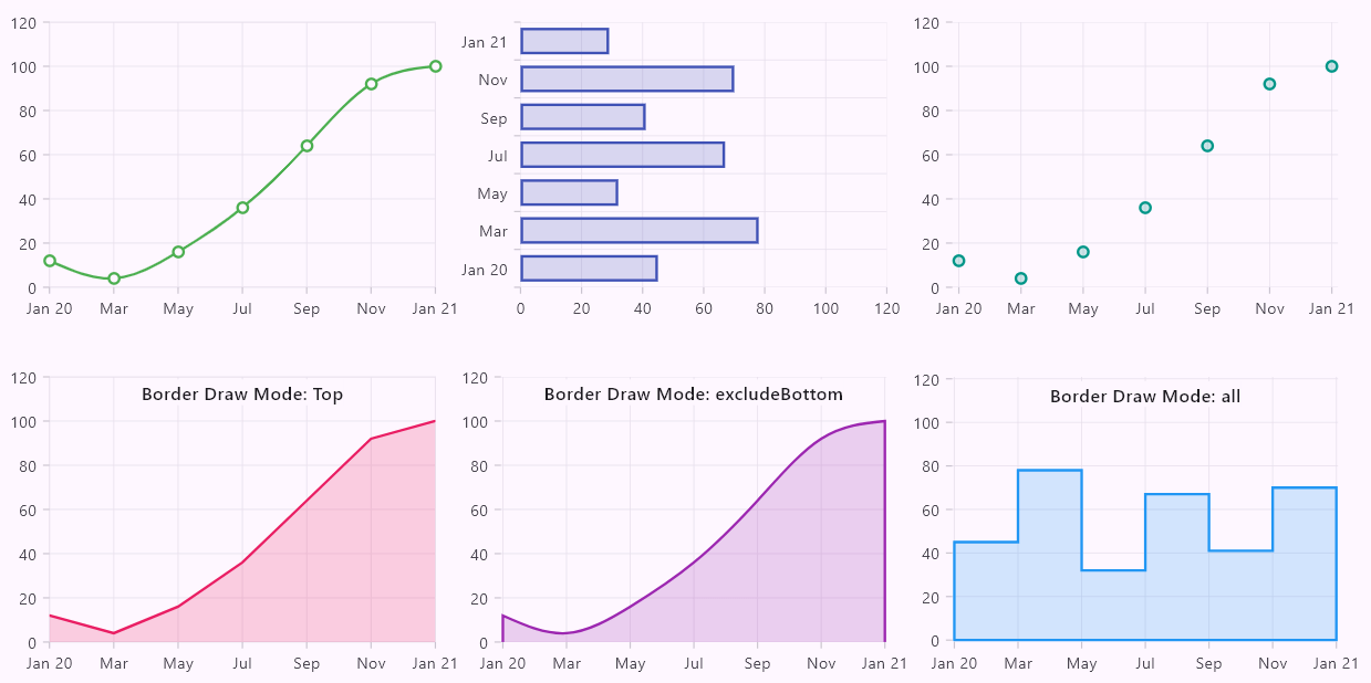
The color and border color properties accept a solid color and will be applied to the entire series. Since the fill color and border color properties are unavailable across all series types, these customization options are limited to specific series. For instance, the bar and area series’ allow customization of fill and border colors, whereas the line series supports color and width customizations.
Additionally, the area type series supports a border drawing mode option, specifying which sides of the border should be rendered. This can include all sides, only the top of the area series, or excluding the bottom portion.
Refer to the following code example.
SfCartesianChart(
  series: <CartesianSeries<ChartData, num>>[
    LineSeries(
      ...
      color: Colors.green,
      width: 2,
      ...
    ),
    BarSeries(
      ...
      color: Colors.indigo.withOpacity(0.2),
      borderColor: Colors.indigo,
      width: 2,
      ...
    ),
    AreSeries(
      ...
      color: Colors.purple.withOpacity(0.2),
      borderColor: Colors.purple,
      width: 2,
      borderDrawMode: BorderDrawMode.top,
      ...
    ),
    ...
  ],
)
Refer to the following image.
Point color mapper
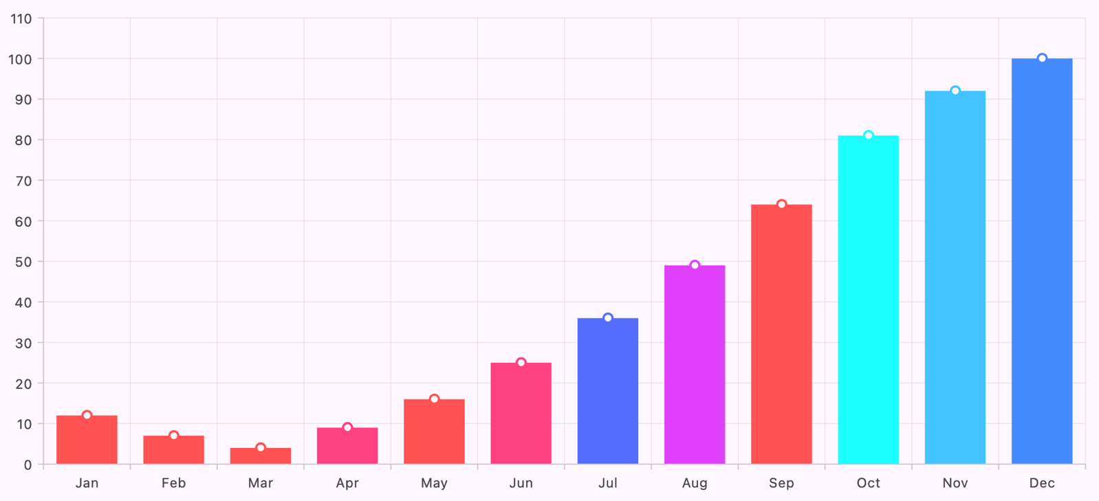
The point color mapper is supported in all Flutter Cartesian Chart series types except the area-type series. It allows us to customize the color of individual series segments. The pointColorMapper callback is called whenever there is a need for the segment color, such as adding or updating the segment, when the data source changes, and more.
In the following code example, the point color is returned from the Colors.accents list using the chart series data point index.
SfCartesianChart(
  series: <CartesianSeries<ChartData, num>>[
    ColumnSeries(
      ...
      pointColorMapper: (ChartData data, int index) {
        if (index == 0) {
          return Colors.accents[0];
        } else {
          return Colors.accents[Colors.accents.length % index];
        }
      },
    ),
  ],
)
Refer to the following image.
Gradient
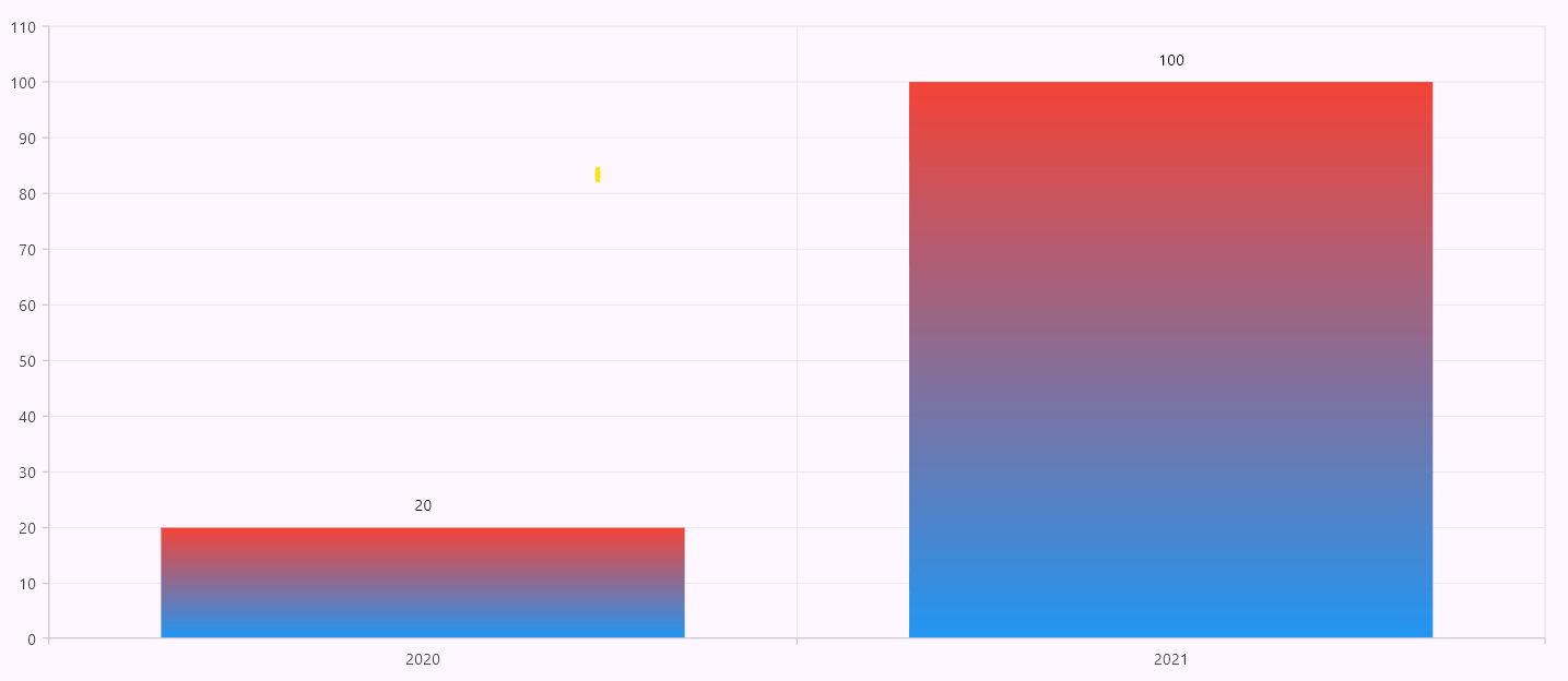
It is a type of LinearGradient specifically designed to be applied across individual segments within a given series.
For example, if we have a gradient transitioning from blue to red and a ColumnSeries with two data points of 20 and 100, the gradient will be applied uniformly to segments regardless of their values. Ideally, if we were to identify a y-axis midpoint value such as 50, we would expect to see a red tint from the midpoint to above, and the midpoint to below would only have a blue shade. However, the gradient will be applied entirely throughout the respected segment, so both the 20 and 50 data points will have red and blue shades.
In the following code example, a vertical gradient is used with red and blue colors.
ColumnSeries(
  ...
  gradient: LinearGradient(
    colors: <Color>[Colors.red, Colors.blue],
    begin: Alignment.topCenter,
    end: Alignment.bottomCenter,
    stops: const <double>[0, 1],
  ),
)
Refer to the following image.
Border gradient
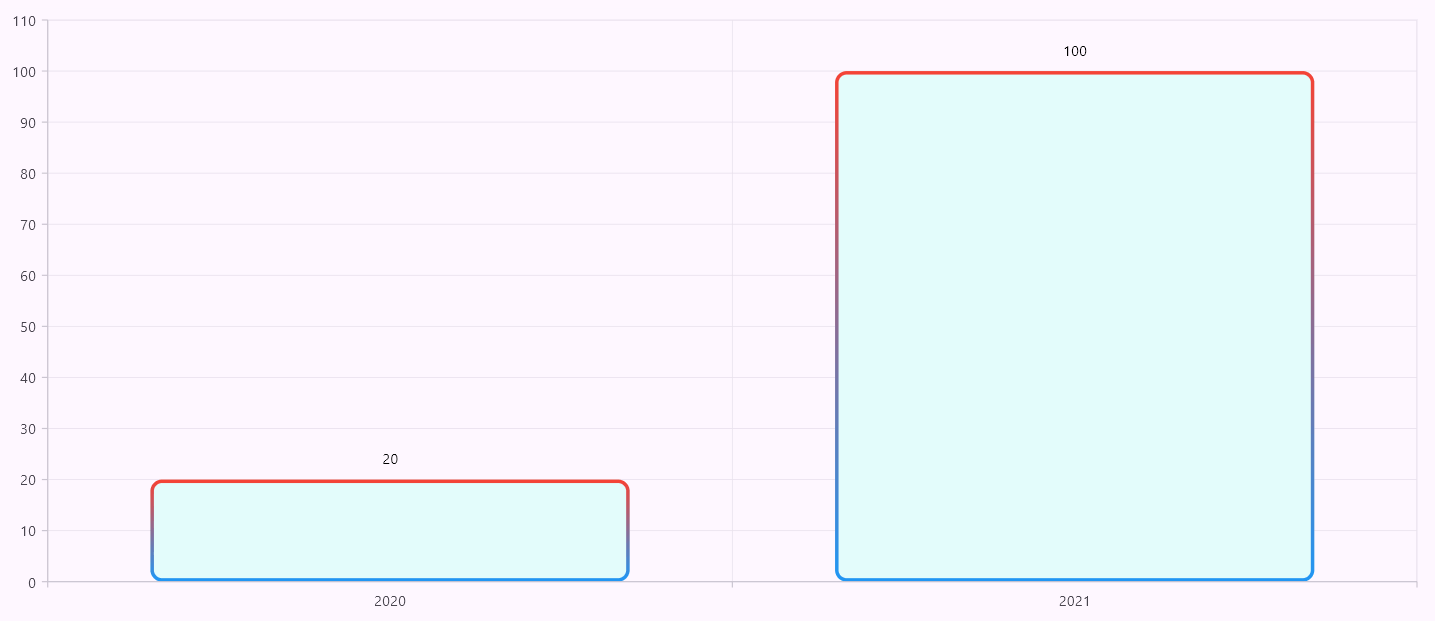
Like the chart series gradient, a border gradient is a type of LinearGradient specifically designed to be applied across individual segments’ borders within a given series. It acts the same as a series gradient, meaning the gradient will be applied uniformly to segments regardless of their values.
Refer to the following code example.
ColumnSeries(
  ...
  borderWidth: 2,
  borderRadius: BorderRadius.circular(10),
  borderGradient: LinearGradient(
    colors: <Color>[Colors.red, Colors.blue],
    begin: Alignment.topCenter,
    end: Alignment.bottomCenter,
    stops: const <double>[0, 1],
  ),
)
Refer to the following image.
Shader
The shader will be applied to the whole series, not specific segments. The onCreateShader is a callback that is called whenever there is a need for the segment or series color, such as adding or updating, when the data source changes, etc., similar to the pointColorMapper.
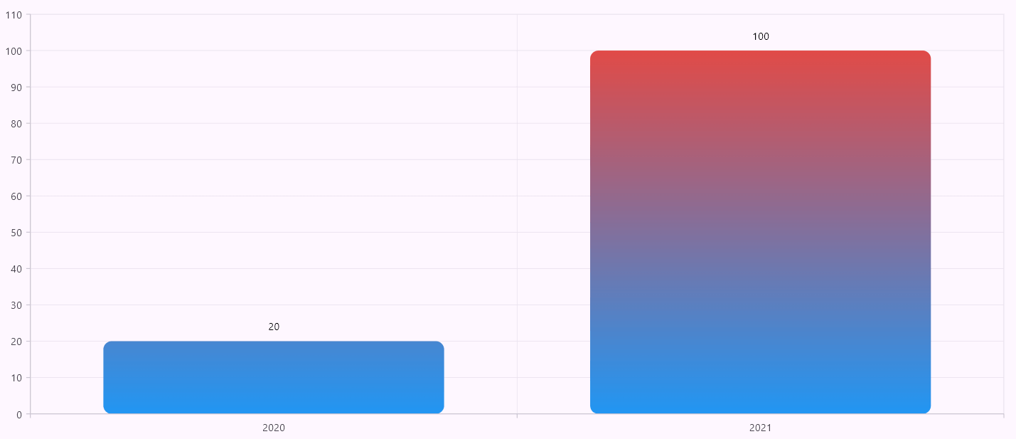
For example, if we have a vertical gradient transitioning from blue to red and a ColumnSeries with two data points of 20 and 100, the gradient will be applied uniformly to the entire series. Ideally, if we were to identify a y-axis midpoint value such as 50, the red tint would start from the midpoint and extend above, while only having a blue shade below the midpoint. So, the segment with a value of 20 would only have a blue tint, but the segment with a value of 100 should have a gradient from blue to red.
The shader callback brings the following parameters:
- rect – Holds the respected series render box bounds.
- renderType – Denotes whether this is called for series or legend.
Refer to the following code example.
ColumnSeries(
  ...
  borderRadius: BorderRadius.circular(10),
  onCreateShader: (ShaderDetails details) {
    return LinearGradient(
      colors: <Color>[Colors.red, Colors.blue],
      begin: Alignment.topCenter,
      end: Alignment.bottomCenter,
      stops: const <double>[0, 1],
    ).createShader(details.rect);
  },
)
Refer to the following image.
Range-based shader customization
Since the shader returned from onCreateShader will be applied consistently throughout the series, it is beneficial for anticipating color customization based on positive and negative values.
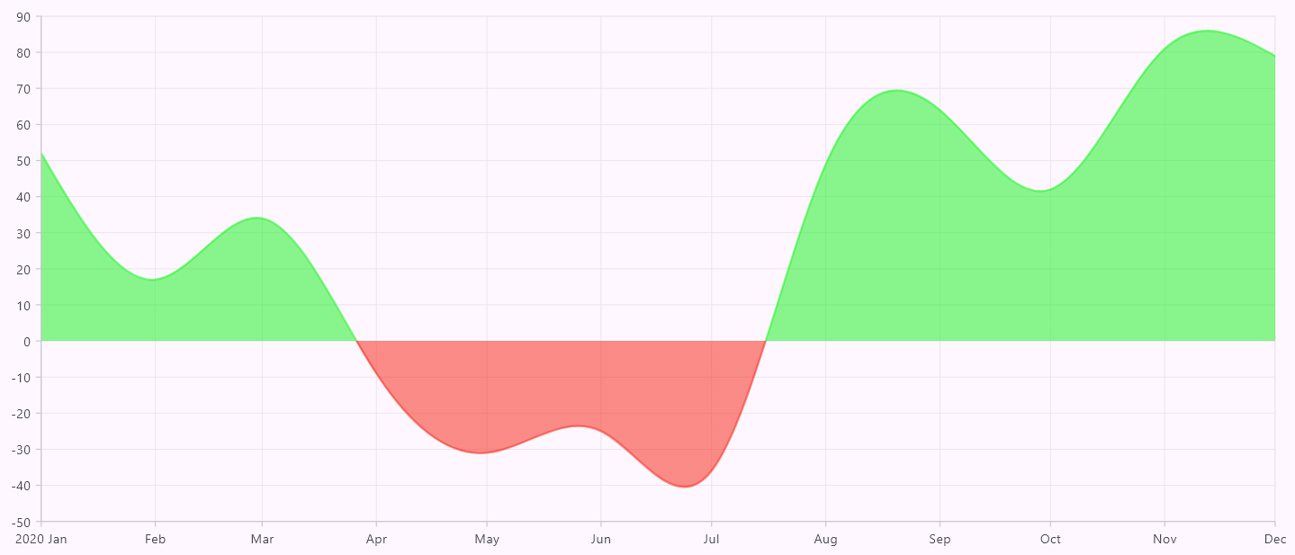
For example, the goal is to visually represent positive values with varying shades of green and negative values with different shades of red.
To accurately apply these color distinctions, it is essential to determine the exact position where the y-axis crosses zero, which serves as the demarcation line between positive and negative values.
Locating the zero position on the y-axis can be accomplished using a clever technique that utilizes the onActualRangeChanged callback function of the axis. This function is triggered when there is a change in the actual range being displayed on the chart. Within this callback, you can calculate the position of the zero value on the y-axis by conducting a simple mathematical operation.
Take the maximum visible value on the y-axis, referred to as visibleMax, and divide it by the total range of values currently visible on the chart. The result of this division will give you a ratio (a position factor) corresponding to the location of the zero value of the y-axis.
Use this position factor as a midpoint color stop for a LinearGradient to create variations in shades of green and red, as illustrated in the following code example.
To ensure the shader is effectively applied as a mask on the entire series rendering, make sure the series’ color and borderColor properties are set. This allows the shader to mask the color correctly. If the borderColor is not set, the shader will not be applied to the border.
double _originColorStopY = 0;

SfCartesianChart(
  primaryXAxis: const DateTimeAxis(),
  onActualRangeChanged: (ActualRangeChangedArgs args) {
    if (args.orientation == AxisOrientation.vertical) {
      final num range = args.visibleMax.abs() + args.visibleMin.abs();
      _originColorStopY = args.visibleMax / range;
    }
  },
  ...
)

SplineAreaSeries(
  ...
  color: Colors.green,
  borderColor: Colors.green,
  onCreateShader: (ShaderDetails details) {
    return ui.Gradient.linear(
      details.rect.topCenter,
      details.rect.bottomCenter,
      <Color>[
        Colors.green,
        Colors.green,
        Colors.red,
        Colors.red,
      ],
      <double>[0, _originColorStopY, _originColorStopY, 1],
    );
  },
)
In this example, we used four colors and their corresponding color stop points. The color stops [0, _originColorStopY, _originColorStopY, 1] will be divided into the following segments:
- From 0 to _originColorStopY, the colors are mapped as green to green. As a result, we do not observe any gradient transition; instead, we see a solid green color representing the positive value position.
- From _originColorStopY to _originColorStopY, this transition is not visible since the start and end stops are the same.
- From _originColorStopY to 1, the colors are mapped as red to red. This results in a solid red color transition, indicating the negative portion.
Note: To add opacity into the shader, it is essential to incorporate the corresponding opacity value into the series’ color property. By doing this, the shader will derive the opacity value from the color property and then apply it accordingly. This is the current behavior of the Flutter framework to add an opacity to the shader.
Refer to the following image.
Point shader
It is specific to CircularSeries and is used to apply individual gradients specific to a segment.
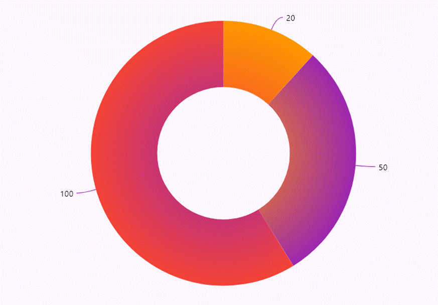
In the following code example, gradient colors are loaded from a data source and applied using RadialGradient to individual segments.
SfCircularChart(
  series: <CircularSeries<CircularChartData, String>>[
   DoughnutSeries(
     dataSource: <CircularChartData>[
        CircularChartData('2021', 20, Colors.red, Colors.orange),
        CircularChartData('2022', 50, Colors.orange, Colors.purple),
        CircularChartData('2023', 100, Colors.purple, Colors.red),
      ],
      ...
      pointShaderMapper: (dynamic data, int index, Color color, Rect rect) {
        return RadialGradient(
          colors: <Color>[data.start, data.end],
          stops: const <double>[0, 1],
        ).createShader(rect);
      },
      ...
    ),
  ],
)
Refer to the following image.
Customize chart series segment through method
The customizeSegment method is designed to tailor the visual aspects of a segment according to its index or specific conditions. This method can be overridden in the subclass of the series renderer. Within the customizeSegment, properties such as fillPaint and strokePaint are accessible, allowing for the segment’s color modifications.
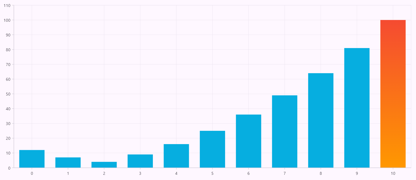
In the following code example, the shader is applied to the segment with the 10th index. We currently do not have direct properties to apply a gradient to individual segments, but this can be achieved using the customizeSegment method.
class _ColumnSeriesRenderer extends ColumnSeriesRenderer<ChartData, num> {
  @override
  void customizeSegment(ChartSegment segment) {
    super.customizeSegment(segment);
    if (segment.currentSegmentIndex == 10) {
      segment.fillPaint.shader = const LinearGradient(
        colors: <Color>[Colors.red, Colors.orange],
        begin: Alignment.topCenter,
        end: Alignment.bottomCenter,
        stops: <double>[0, 1],
      ).createShader(paintBounds);
    } else {
      segment.fillPaint.shader = null;
    }
  }
}
Refer to the following image.
Custom series renderer
This is the final and most important option available in the series, allowing us to render our own series. Creating our series renderer allows us to draw the required shapes on each segment.
To do this, create a custom renderer class by extending an existing series renderer and then sharing this custom renderer with the series through the onCreateRenderer callback. The following are the major key factors of the renderer:
- createSegment: To create segments based on data points.
- customizeSegment: To customize the segment appearance based on its index or specific case.
- onPaint: To paint series.
Then, create a custom segment class by extending an existing segment class, mapping it with the series renderer by overriding the createSegment method, and returning it.
Once the custom segment is mapped with the series, the base implementation passes the respective data point values into the segment and transforms them into pixel values. Therefore, in the next step, override the segment’s onPaint method to implement the desired drawing logic.
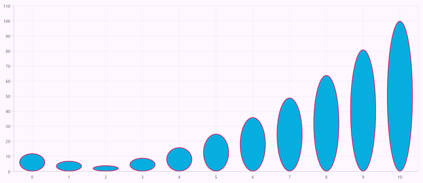
In the following code example, we have drawn an oval shape to replace a column segment.
ColumnSeries(
  ...
  borderColor: Colors.pink,
  onCreateRenderer: (ChartSeries<ChartData, num> series) {
    return _ColumnSeriesRenderer();
  },
)

class _ColumnSeriesRenderer extends ColumnSeriesRenderer<ChartData, num> {
  @override
  ColumnSegment<ChartData, num> createSegment() => _ColumnSegment();
}

class _ColumnSegment extends ColumnSegment<ChartData, num> {
  @override
  void onPaint(Canvas canvas) {
    if (segmentRect == null) {
      return;
    }
    final Rect fillRect = segmentRect!.outerRect;
    canvas.drawOval(fillRect, fillPaint);
    final Rect borderRect = fillRect.deflate(series.borderWidth / 2);
    canvas.drawOval(borderRect, strokePaint);
  }
}
Refer to the following image.
GitHub reference
For more details, refer to the Flutter Charts series customization GitHub demos.

Unlock the power of Syncfusion’s highly customizable Flutter widgets.
Conclusion
Thanks for reading! In this blog, we’ve explored the series customization options in the Syncfusion Flutter Charts widget. Use these features to visualize your data and get valuable insights. Give it a try, and leave your feedback in the comment section below.
If you need a new widget for the Flutter framework or new features in our existing widgets, you can contact us through our support forum, support portal, or feedback portal. As always, we are happy to assist you!
