

TL;DR: This blog highlights seven essential financial charts, such as pie, line, column, and radar charts, that simplify personal finance tracking and improve decision-making.
Welcome to our Chart of the Week blog series!
In this edition, we focus on financial charts that help users make sense of their personal finance data. In today’s digital-first world, financial apps have become essential tools for managing money. But raw numbers alone don’t tell the full story. That’s where data visualization comes in. By using the right charts, you can transform your personal finance data into clear, actionable insights. In this blog, we’ll explore seven essential financial charts that every financial app should include to help users track expenses, monitor savings, and understand their financial health at a glance.
Why financial charts are essential today
In an era of digital banking, automated payments, and diverse investment options, keeping track of your financial health has become increasingly complex. Yet, understanding your complete financial picture is more crucial than ever. The visual representation of financial data offers several compelling advantages:
- Improved decision making: Clear visualizations make it easier to identify areas for financial improvement and to make informed choices.
- Enhanced motivation: Seeing your progress visually creates stronger emotional connections to your financial goals.
- Simplified complex relationships: Visualizations help illustrate the interactions between income, expenses, investments, and debt, which can be difficult to understand in spreadsheets.
- Better financial habits: Regular visual check-ins with your financial data encourage consistent monitoring and better money management.
Whether you’re building a budgeting tool, investment dashboard, or a comprehensive financial app, choosing the right chart type can dramatically improve user engagement and decision-making.
Let’s explore the seven most powerful chart types that can revolutionize how you understand and manage your personal finances.
Why and how Syncfusion® Charts will help to develop charts for mobile and desktop platforms?
Syncfusion’s chart libraries provide a comprehensive solution for visualizing financial data across multiple platforms. With support for .NET MAUI, Flutter, Xamarin, WinUI, WPF, and WinForms, Syncfusion® Charts offer:
- Cross-platform compatibility: Build once and deploy across multiple platforms
- Rich feature set: Over 20+ chart types with customizable elements
- Interactive features: Zooming, panning, tooltips, and trackballs to explore data in depth
- Responsive design: Charts adapt to different screen sizes and orientations
- Consistent API: Similar API structure across platforms for easier development
Syncfusion® Charts are particularly valuable for financial applications because they support the specific chart types needed for financial analysis, provide data binding capabilities, and offer extensive customization options.
Pie Chart: Expense breakdown
A Pie Chart is perfect for visualizing how your expenses are distributed across different categories. It provides an immediate visual representation of which spending categories consume the largest portions of your budget.
Why use a Pie Chart for this purpose
- Shows the proportion of expenses in different categories immediately
- Helps identify areas where you might be overspending
- Easy to understand, even for those without financial expertise
- Allows quick comparison between expense categories
<chart:SfCircularChart >
    <chart:PieSeries ItemsSource="{Binding ExpenseData}"
                     XBindingPath="Category"
                     YBindingPath="Amount">
    </chart:PieSeries>
</chart:SfCircularChart>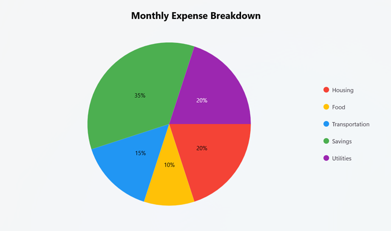
For information on other Syncfusion® products, refer to our documentation:
Line Chart: Monthly income trend
Line Charts are considered the gold standard for visualizing income trends in personal finance applications. Their unique ability to display continuous data progression through connected points provides an exceptional platform for analyzing financial metrics over time. When used for income tracking, line charts transform raw numbers into actionable insights through visualization, highlighting progression and enabling comparative analysis.
Why use a Line Chart for this purpose
- Visualizes income changes over time
- Highlights trends, patterns, and seasonal variations
- Allows comparison between different periods (months, years)
- Shows the rate of income growth or decline
<chart:SfCartesianChart >
    <chart:SfCartesianChart.XAxes>
        <chart:CategoryAxis EdgeLabelsDrawingMode="Fit"
                            ShowMajorGridLines="False">
        </chart:CategoryAxis>
    </chart:SfCartesianChart.XAxes>

    <chart:SfCartesianChart.YAxes>
        <chart:NumericalAxis EdgeLabelsDrawingMode="Fit"
                             ShowMajorGridLines="True">
        </chart:NumericalAxis>
    </chart:SfCartesianChart.YAxes>

    <chart:LineSeries ItemsSource="{Binding IncomeData}"
                      XBindingPath="Month"
                      YBindingPath="Income">
    </chart:LineSeries>
</chart:SfCartesianChart>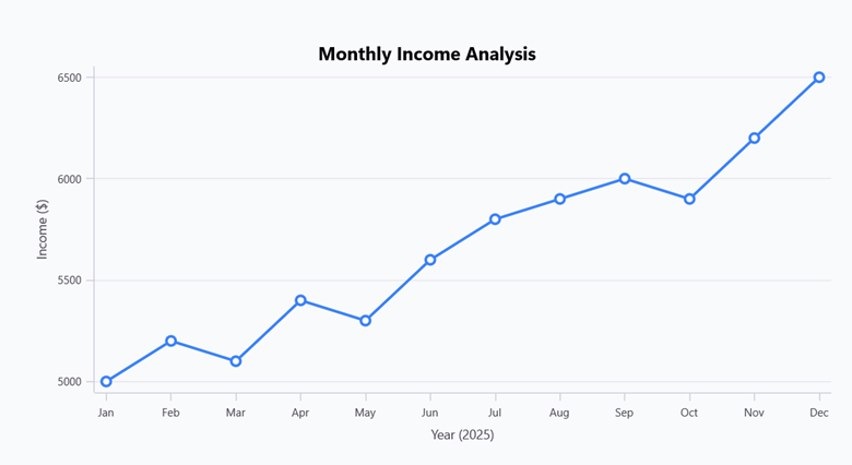
For information on other Syncfusion® products, refer to our documentation:
Column Chart: Savings comparison
Column Charts provide one of the most powerful and intuitive ways to compare discrete financial data points. For savings visualization, they create an immediate, impactful representation of how your savings efforts compare across different periods, accounts, or against your targets.
Why use a Column Chart for this purpose
- Provides a clear visual comparison of saving amounts
- Easily compare savings across different accounts or periods
- Can show progress toward savings goals
- Highlights differences in saving patterns
<chart:SfCartesianChart>
    <chart:SfCartesianChart.XAxes>
        <chart:CategoryAxis ShowMajorGridLines="False"
                            EdgeLabelsDrawingMode="Fit"
        </chart:CategoryAxis>
    </chart:SfCartesianChart.XAxes>

    <chart:SfCartesianChart.YAxes>
        <chart:NumericalAxis ShowMajorGridLines="True">
        </chart:NumericalAxis>
    </chart:SfCartesianChart.YAxes>

    <chart:ColumnSeries ItemsSource="{Binding SavingsData}"
                        XBindingPath="Year"
                        YBindingPath="Amount">
    </chart:ColumnSeries>
</chart:SfCartesianChart>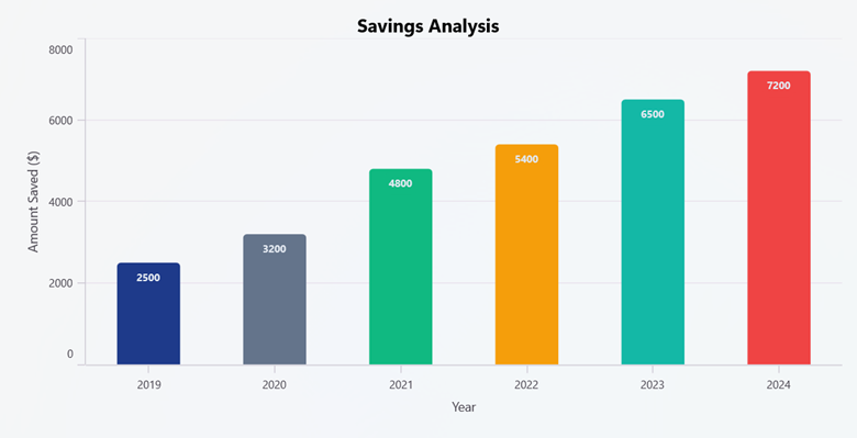
For information on other Syncfusion® products, refer to our documentation:
Stacked Column Chart: Budget vs actual
Stacked Column Charts provide a powerful, yet straightforward visualization approach specifically designed for comparing multiple financial categories side by side. In budget-to-actual analysis, this chart type effectively organizes financial data to display both individual category spending and total expenditure simultaneously, giving you a complete picture of your budget performance in a single view.
Why use a Stacked Column Chart for this purpose
- Displays budget vs. actual spending side by side
- Shows the relationship between planned and actual expenses
- Identifies categories where you’re over or under budget
- Provides a comprehensive view of financial discipline
<chart:SfCartesianChart >
    <chart:SfCartesianChart.XAxes>
        <chart:CategoryAxis ShowMajorGridLines="False">
        </chart:CategoryAxis>
    </chart:SfCartesianChart.XAxes>
    <chart:SfCartesianChart.YAxes>
        <chart:NumericalAxis ShowMajorGridLines="True">
        </chart:NumericalAxis>
    </chart:SfCartesianChart.YAxes>
    <chart:StackingColumnSeries ItemsSource="{Binding BudgetData}"
                                XBindingPath="Category"
                                YBindingPath="Planned">
    </chart:StackingColumnSeries>
    <chart:StackingColumnSeries ItemsSource="{Binding BudgetData}"
                                XBindingPath="Category"
                                YBindingPath="Actual">
    </chart:StackingColumnSeries>
</chart:SfCartesianChart>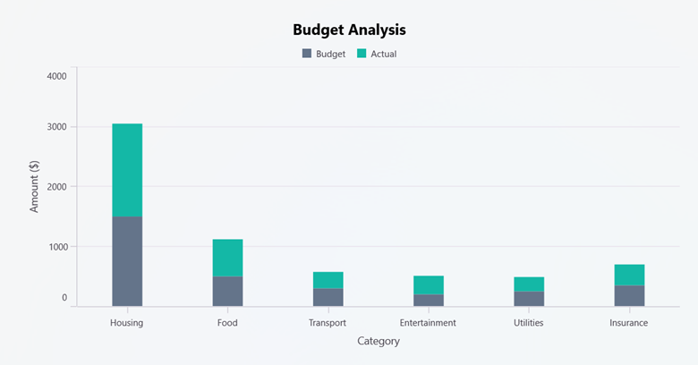
For information on other Syncfusion® products, refer to our documentation:
Doughnut Chart: Investment Portfolio
Doughnut Charts offer an intuitive and visually appealing approach to investment distribution visualization, enabling investors to quickly assess how their money is spread across different asset types while maximizing information density in a compact display format. Unlike conventional pie charts, the doughnut’s central void creates additional space for complementary data while maintaining the circular format that humans naturally interpret as representing proportional relationships.
Why use a Doughnut Chart for this purpose
- Shows proportional allocation of investments
- Helps assess portfolio diversification at a glance
- Provides a clear visual representation of asset distribution
- Center space can be used to display the total portfolio value
<chart:SfCircularChart >
    <chart:DoughnutSeries ItemsSource="{Binding InvestmentData}"
                          XBindingPath="Category"
                          YBindingPath="Percentage">
    </chart:DoughnutSeries>
</chart:SfCircularChart>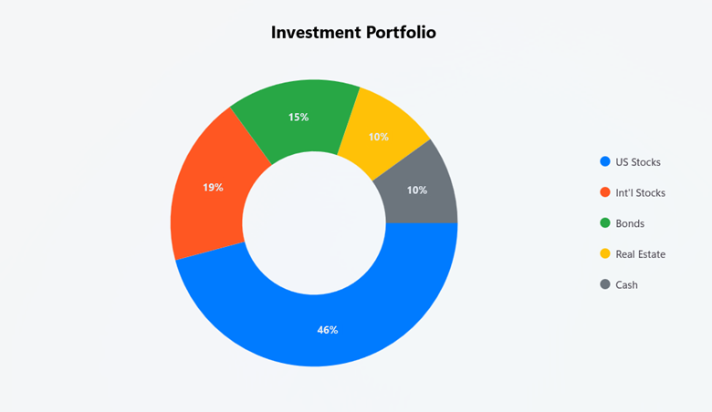
For information on other Syncfusion® products, refer to our documentation:
Area Chart: Net worth growth
Area Charts represent the ideal visualization method for tracking net worth progression over time, offering a unique combination of trend visibility and data accumulation representation. By filling the space between the data line and axis, area charts create a visual volume that intuitively communicates the concept of wealth building and financial growth in a way that makes sense to everyone, regardless of their level of financial expertise.
Why use an Area Chart for this purpose
- Visualizes net worth growth trajectory
- Highlights the accumulation of wealth over time
- Shows trends in net worth changes
- Can include separate areas for different asset components
<chart:SfCartesianChart >
    <chart:SfCartesianChart.XAxes>
        <chart:CategoryAxis EdgeLabelsDrawingMode="Fit"
                            ShowMajorGridLines="False">
        </chart:CategoryAxis>
    </chart:SfCartesianChart.XAxes>
    <chart:SfCartesianChart.YAxes>
        <chart:NumericalAxis EdgeLabelsDrawingMode="Fit"
                             ShowMajorGridLines="True">
        </chart:NumericalAxis>
    </chart:SfCartesianChart.YAxes>
    <chart:AreaSeries ItemsSource="{Binding NetWorthData}"
                      XBindingPath="Period"
                      YBindingPath="Assets">
    </chart:AreaSeries>
    <chart:AreaSeries ItemsSource="{Binding NetWorthData}"
                      XBindingPath="Period"
                      YBindingPath="Liabilities">
    </chart:AreaSeries>
</chart:SfCartesianChart>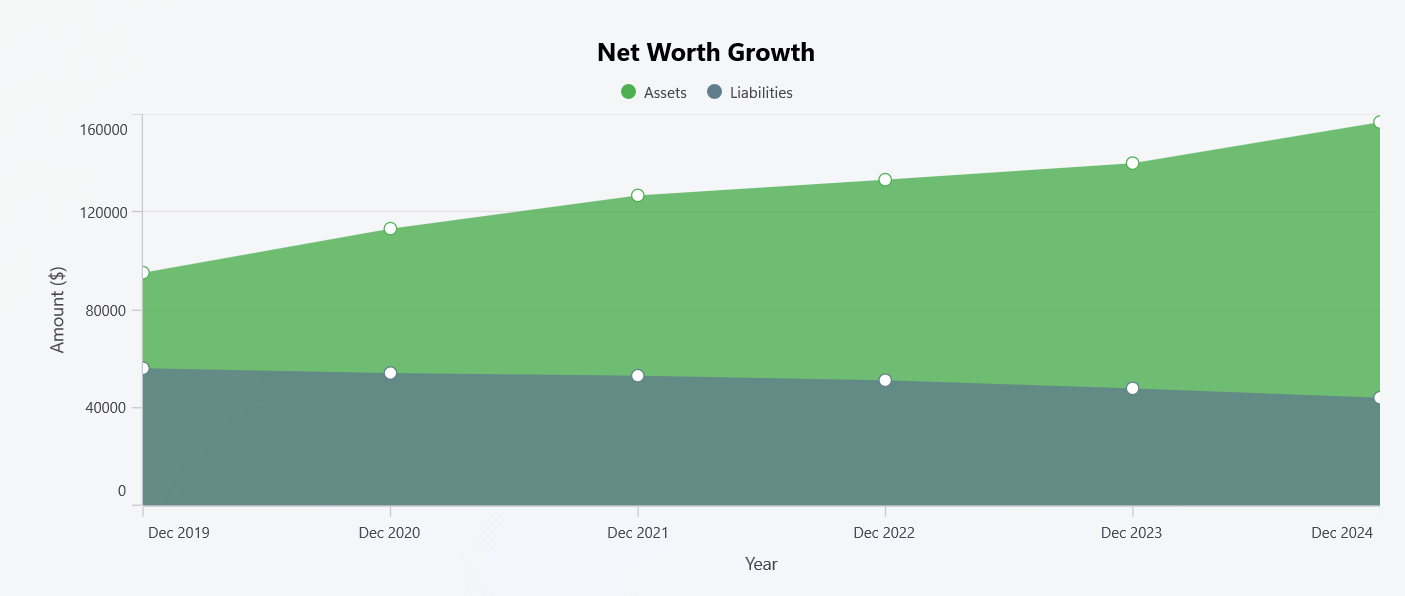
For information on other Syncfusion® products, refer to our documentation:
Polar Chart: Financial health score
You can use Polar Charts to provide an exceptional approach for a comprehensive financial health assessment. Polar charts simultaneously display multiple financial metrics in a single, easy-to-understand visualization. Unlike single-metric charts, polar charts create a multi-dimensional picture of your complete financial situation, allowing for balanced evaluation across all important financial health indicators.
Why use a Polar Chart for this purpose
- Shows performance across multiple financial metrics simultaneously
- Helps identify strengths and weaknesses in your financial position
- Provides a complete view of overall financial health at a glance
- Makes it easy to track improvements in multiple areas over time
- Shows whether your finances are balanced across important dimensions
- Highlights the gap between the current and ideal financial situation
- Helps prioritize areas that need the most attention
<chart:SfPolarChart>
    <chart:PolarAreaSeries ItemsSource="{Binding FinancialHealthData}"
                           XBindingPath="Category"
                           YBindingPath="Score">
    </chart:PolarAreaSeries>
</chart:SfPolarChart>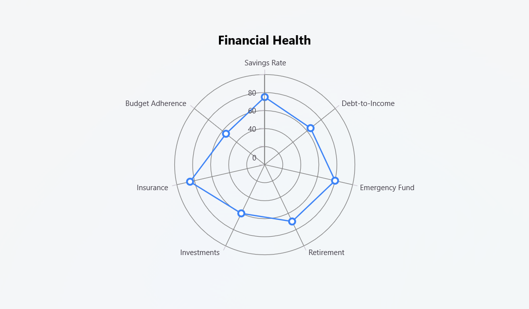
For information on other Syncfusion® products, refer to our documentation:
Why Syncfusion® Charts?
Syncfusion® Charts offer several advantages for visualizing financial data:
- Rich visualization options: With over 20+ chart types, you can find the perfect visualization for any financial data.
- Cross-platform compatibility: Build applications that work seamlessly across iOS, Android, macOS, Windows, and web platforms.
- Interactive features: Enhance user experience with zooming, panning, tooltips, and trackballs to explore financial data in depth.
- Customization: Extensive styling options to match your application’s theme and branding.
- Performance optimized: Efficiently renders large financial datasets without compromising on performance.
- Regular updates: Benefit from continuous improvements and new features with frequent updates.
- Comprehensive documentation: Detailed documentation and examples to help you get started quickly.
- Excellent support: Access to technical support to resolve any issues you might encounter.
Explore more
Interested in learning more about financial data visualization with Syncfusion®? Check out these resources:
- Financial dashboard examples
- Syncfusion® component demos
- Syncfusion® showcase apps
- Flutter chart library overview
- Syncfusion® blogs
Conclusion
Visualizing your financial data is a powerful way to gain insights, track progress, and make informed decisions about your personal finances. Using the right financial charts can transform how users manage and understand their money.
Whether you’re tracking expenses, monitoring income trends, comparing savings, or analyzing your investment portfolio, there’s a chart type that can help you better understand and manage your financial health. Explore how these interactive, cross-platform charts can elevate your personal finance strategy.
Existing customers can access the new version of Essential Studio® on the license and downloads page. If you aren’t a Syncfusion® customer, try our 30-day free trial to experience our fantastic features.
If you require assistance, don’t hesitate to contact us via our support forum, support portal, or feedback portal. We are always eager to help you!


 No spam, just valuable updates.