
 Prakash Perumal
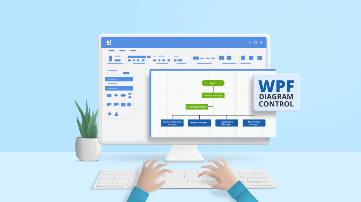
An organizational chart (org chart) is a diagram that graphically represents the size and structure of an organization and the relationships, roles, and responsibilities of individuals in the organization. In simple terms, it helps us to visualize the workflow within an organization.
The Syncfusion WPF Diagram control is a powerful, extensible, and feature-rich library for visualizing, creating and editing interactive diagrams. It supports creating flowcharts, organizational charts, mind maps, floor plans, UML diagrams, and BPMN charts either through code or a visual interface.
This blog is a quick guide to creating a hierarchical org chart using the Syncfusion WPF Diagram control.
Create a simple org chart
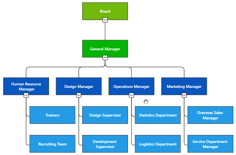
The most common type of organizational chart is a hierarchical org chart. The topmost block in the chart represents the most senior individual in an organization, and each successive block represents the next most senior people.
Let’s create a simple hierarchical org chart using the Syncfusion WPF Diagram control. We’ll use its built-in, high-performing layout algorithm to arrange the parent and child blocks.
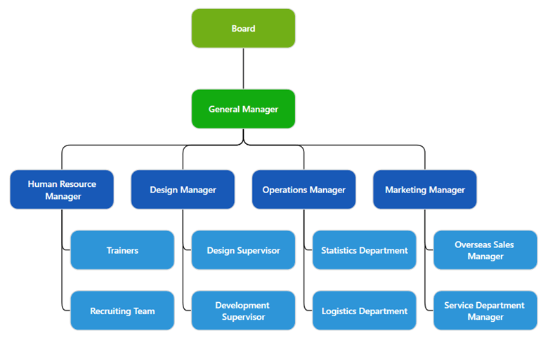
Each shape shown in the previous image is a node, and the lines are the connectors.
Step #1: Add the Syncfusion WPF Diagram control to your application.
First, create a new WPF app. Then, add the Syncfusion WPF Diagram control to your app by referring to our getting started documentation.
Step #2: Define the data source.
We need a data source or node collection to populate the organization chart on the diagram canvas.
Let’s create a model class to construct the data source. Then, we define the employee’s ID, designation, and supervisor in your organization in the model class. You can add a color property to improve the UI’s design. You can also specify custom properties if needed.
Refer to the following code example.
public class Employee
{
    public string EmployeeId { get; set; }
    public string ParentId { get; set; }
    public string Designation { get; set; }
    public string RatingColor { get; set; }
}
Now, create a data source for the organizational chart where each record in the data source will be created as a separate node.
private Employees GetDataSource()
{
    Employees employees = new Employees()
    {
        new Employee() { EmployeeId = "1", Designation = "Board", RatingColor = "#71AF17" },
        new Employee() { EmployeeId = "2", ParentId = "1", Designation = "General Manager", RatingColor = "#13ab11" },
        new Employee() { EmployeeId = "3", ParentId = "2", Designation = "Human Resource\n Manager", RatingColor = "#1859B7" },
        new Employee() { EmployeeId = "4", ParentId = "2", Designation = "Design Manager", RatingColor = "#1859B7" },
        new Employee() { EmployeeId = "5", ParentId = "2", Designation = "Operations Manager", RatingColor = "#1859B7" },
        new Employee() { EmployeeId = "6", ParentId = "2", Designation = "Marketing Manager", RatingColor = "#1859B7" },
        new Employee() { EmployeeId = "7", ParentId = "3", Designation = "Trainers", RatingColor = "#2E95D8" },
        new Employee() { EmployeeId = "8", ParentId = "3", Designation = "Recruiting Team", RatingColor = "#2E95D8" },
        new Employee() { EmployeeId = "9", ParentId = "4", Designation = "Design Supervisor", RatingColor = "#2E95D8" },
        new Employee() { EmployeeId = "10", ParentId = "4", Designation = "Development \nSupervisor", RatingColor = "#2E95D8" },
        new Employee() { EmployeeId = "11", ParentId = "5", Designation = "Statistics Department", RatingColor = "#2E95D8" },
        new Employee() { EmployeeId = "12", ParentId = "5", Designation = "Logistics Department", RatingColor = "#2E95D8" },
        new Employee() { EmployeeId = "13", ParentId = "6", Designation = "Overseas Sales \nManager", RatingColor = "#2E95D8" },
        new Employee() { EmployeeId = "14", ParentId = "6", Designation = "Service Department \nManager", RatingColor = "#2E95D8" },
    };

    return employees;
}
Step #3: Bind the data source to the layout.
Create an instance of the WPF Diagram control. Then, create an instance of the DataSourceSettings with the data mapping configuration and assign it to the DataSourceSettings property of the created diagram instance.
Refer to the following code example.
// Initialize DataSourceSettings for SfDiagram.
diagram.DataSourceSettings = new DataSourceSettings()
{
    Id = "EmployeeId",
    ParentId = "ParentId",
    DataSource = GetDataSource(),
};
Configure the LayoutManager with the organizational chart layout settings to arrange the employee records automatically.
// Initialize LayoutSettings for SfDiagram.
diagram.LayoutManager = new LayoutManager()
{
    Layout = new DirectedTreeLayout() { Type = LayoutType.Organization }
};
Step #4: Define the appearance of the shapes.
The ContentTemplate property of a node allows you to define the desired template for each block in the organizational chart.
Refer to the following code example.
<Window.Resources>
    <ResourceDictionary>
        <!--ViewTemplate of NodeContent-->
        <DataTemplate x:Key="ContentTemplateforNode">
            <Border Width="130" Height="50" BorderThickness="1" Background="{Binding Path=RatingColor}" CornerRadius="10" BorderBrush="LightGray">
                <TextBlock x:Name="Designation"
                           HorizontalAlignment="Center"
                           VerticalAlignment="Center"
                           FontFamily="Segoe UI"
                           FontSize="11"
                           FontWeight="SemiBold"
                           Foreground="White"
                           TextAlignment="Center"
                           Text="{Binding Path=Designation}" />
            </Border>
        </DataTemplate>

        <!--Style for Node-->
        <Style TargetType="Syncfusion:Node">
            <Setter Property="ContentTemplate" Value="{StaticResource ContentTemplateforNode}"/>
        </Style>
    </ResourceDictionary>
</Window.Resources>
Note: You can download the complete code example to create a hierarchical org chart using the WPF Diagram control.
Thus, we have created the hierarchical org chart using the WPF Diagram control. Let’s see how to customize it.
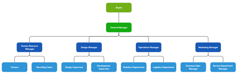
Changing the orientation and spacing
You can arrange the hierarchical org chart with different orientations: top-to-bottom, left-to-right, right-to-left, and bottom-to-top. You can also customize the spacing between each level both horizontally and vertically and define margins around the chart.
Refer to the following code example to set the orientation.
// Initialize LayoutSettings for SfDiagram.
LayoutManager = new LayoutManager()
{
    Layout = new DirectedTreeLayout()
    {
        Type = LayoutType.Organization,
        //set the layout orientation.
        Orientation = TreeOrientation.BottomToTop,
        // set the spacing between each level in the horizontal and vertical direction.
        HorizontalSpacing = 60,
        VerticalSpacing = 60
    }
};
Changing the alignment of leaf blocks
You can align the leaf-level (children) nodes of the organizational chart either horizontally or vertically. Nodes can be aligned to the left, right, or center horizontally and to the top, bottom, or middle vertically.
The diagram’s GetLayoutInfoCommand/GetLayoutInfo event will be invoked while positioning each node on the layout, and it takes the node and tree information as the arguments. Use this event to alter the leaf-level nodes’ alignment.
Refer to the following code example.
/// <summary>
/// Method to change the orientation and type of layout.
/// </summary>
/// <param name="obj">LayoutInfoArgs instance</param>
private void OnGetLayoutInfoCommand(object obj)
{
    var args = obj as LayoutInfoArgs;
    if (args != null)
    {
        // set the leaf-level node alignment
        args.Type = ChartType.Center;
        args.Orientation = Orientation.Horizontal;
    }
}
Adding an assistant
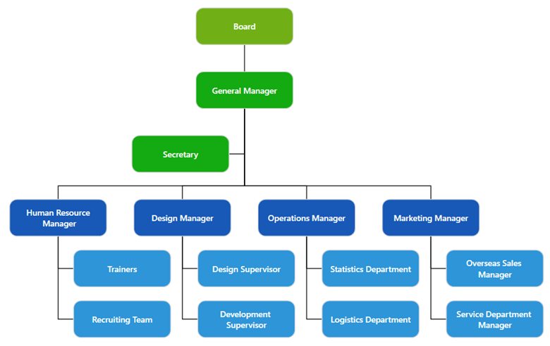
The WPF Diagram control supports defining assistants in an organizational chart. Assistants are the people who work exclusively for a single reporting person. They are defined in a dedicated part of the tree.
Refer to the following code example to specify a node as an assistant node. Here, the secretary is the assistant who reports only to the general manager.
/// <summary>
/// Custom organization chart diagram view model.
/// </summary>
public class OrganizationChart : DiagramViewModel
{

    public OrganizationChart()
    {
        // Initialize Diagram properties.
        Constraints = Constraints.Remove(GraphConstraints.PageEditing, GraphConstraints.PanRails);
        Menu = null;
        Tool = Tool.ZoomPan;
        DefaultConnectorType = ConnectorType.Orthogonal;

        // Initialize DataSourceSettings for SfDiagram.
        DataSourceSettings = new DataSourceSettings()
        {
            Id = "EmployeeId",
            ParentId = "ParentId",
            DataSource = GetDataSource(),
        };

        // Initialize LayoutSettings for SfDiagram.
        LayoutManager = new LayoutManager()
        {
            Layout = new DirectedTreeLayout() { Type = LayoutType.Organization, VerticalSpacing = 35, HorizontalSpacing = 35 }
        };

        // Initialize GetLayoutInfoCommand.
        GetLayoutInfoCommand = new DelegateCommand(OnGetLayoutInfoCommand);
    }

    /// <summary>
    /// Method to change the orientation and type of layout.
    /// </summary>
    /// <param name="obj">An instance of LayoutInfoArgs</param>
    private void OnGetLayoutInfoCommand(object obj)
    {
        var args = obj as LayoutInfoArgs;
        var layout = LayoutManager.Layout as DirectedTreeLayout;
        if (layout != null && layout.Type == LayoutType.Organization)
        {
            if (args.Item != null && (args.Item.Content as Employee).Designation == "General Manager")
            {
                args.Assistants.Add(args.Children[0]);
                args.Children.Remove(args.Children[0]);
            }
        }
    }


    /// <summary>
    /// Method to get the data for DataSource.
    /// </summary>
    private Employees GetDataSource()
    {
        Employees employees = new Employees()
        {
            new Employee() { EmployeeId = "1", Designation = "Board", RatingColor = "#71AF17" },
            new Employee() { EmployeeId = "2", ParentId = "1", Designation = "General Manager", RatingColor = "#13ab11" },
            new Employee() { EmployeeId = "2_1", ParentId = "2", Designation = "Secretary", RatingColor = "#13ab11" },
            new Employee() { EmployeeId = "3", ParentId = "2", Designation = "Human Resource\n Manager", RatingColor = "#1859B7" },
            new Employee() { EmployeeId = "4", ParentId = "2", Designation = "Design Manager", RatingColor = "#1859B7" },
            new Employee() { EmployeeId = "5", ParentId = "2", Designation = "Operations Manager", RatingColor = "#1859B7" },
            new Employee() { EmployeeId = "6", ParentId = "2", Designation = "Marketing Manager", RatingColor = "#1859B7" },
            new Employee() { EmployeeId = "7", ParentId = "3", Designation = "Trainers", RatingColor = "#2E95D8" },
            new Employee() { EmployeeId = "8", ParentId = "3", Designation = "Recruiting Team", RatingColor = "#2E95D8" },
            new Employee() { EmployeeId = "9", ParentId = "4", Designation = "Design Supervisor", RatingColor = "#2E95D8" },
            new Employee() { EmployeeId = "10", ParentId = "4", Designation = "Development \nSupervisor", RatingColor = "#2E95D8" },
            new Employee() { EmployeeId = "11", ParentId = "5", Designation = "Statistics Department", RatingColor = "#2E95D8" },
            new Employee() { EmployeeId = "12", ParentId = "5", Designation = "Logistics Department", RatingColor = "#2E95D8" },
            new Employee() { EmployeeId = "13", ParentId = "6", Designation = "Overseas Sales \nManager", RatingColor = "#2E95D8" },
            new Employee() { EmployeeId = "14", ParentId = "6", Designation = "Service Department \nManager", RatingColor = "#2E95D8" },
        };

        return employees;
    }
}
Note: Check out the example to create assistants in a hierarchical org chart.
Expand or collapse branches
Using the ExpandCollapse command, you can show or hide branches in the organizational chart to view only the relevant nodes in the diagram. The IsExpanded property of a node helps us to know whether the node’s children are collapsed or not.
Refer to the following code examples.
XAML
<Syncfusion:BoolToVisibilityConverter x:Key="BoolToVisibiltyConverter"/>

<!--ViewTemplate of NodeContent-->
<DataTemplate x:Key="ContentTemplateforNode">
    <Grid>
        <Grid.RowDefinitions>
            <RowDefinition Height="*"/>
            <RowDefinition Height="7"/>
        </Grid.RowDefinitions>
        <Border Grid.Row="0" Width="130" Height="50" BorderThickness="1" Background="{Binding Path=RatingColor}" BorderBrush="Black">
            <TextBlock x:Name="Designation"
                       HorizontalAlignment="Center"
                       VerticalAlignment="Center"
                       FontFamily="Segoe UI"
                       FontSize="11"
                       FontWeight="SemiBold"
                       Foreground="White"
                       Text="{Binding Path=Designation}"
                       TextAlignment="Center" />
        </Border>
        <Grid Grid.Row="1" Margin="0,-7,0,0" Visibility="{Binding Path=HasChild, Converter={StaticResource BoolToVisibiltyConverter}}" >
            <Button Padding="0,0,0,0" Background="White" BorderBrush="Black"
                    Width="14" Height="14"
                    VerticalContentAlignment="Center" HorizontalContentAlignment="Center"
                    Command="{Binding RelativeSource={RelativeSource FindAncestor, AncestorType={x:Type Syncfusion:SfDiagram}}, Path=DataContext.ExpandCollapseCommand}"
                    CommandParameter="{Binding RelativeSource={RelativeSource Mode=FindAncestor, AncestorType={x:Type Syncfusion:Node}}}">
                <Button.Style>
                    <Style TargetType="Button">
                        <Setter Property="Content">
                            <Setter.Value>
                                <Grid>
                                    <Path Data="M0,0L32,0 32,3.606 0,3.606z"
                                          Stretch="Uniform" Fill="#FF000000" Height="10" Width="10" RenderTransformOrigin="0.5,0.5"/>
                                </Grid>
                            </Setter.Value>
                        </Setter>
                        <Style.Triggers>
                            <DataTrigger Binding="{Binding Path=IsExpanded, Converter={StaticResource BoolToVisibiltyConverter}}" Value="Collapsed">
                                <Setter Property="Content">
                                    <Setter.Value>
                                        <Grid>
                                            <Path Data="M14,0L18,0 18,14 32,14 32,18 18,18 18,32 14,32 14,18 0,18 0,14 14,14z" Stretch="Uniform"
                                                  Fill="#FF000000" Height="10" Width="10" RenderTransformOrigin="0.5,0.5"/>
                                        </Grid>
                                    </Setter.Value>
                                </Setter>
                            </DataTrigger>
                        </Style.Triggers>
                    </Style>
                </Button.Style>
            </Button>
        </Grid>
    </Grid>
</DataTemplate>

<!--Style for Node-->
<Style TargetType="Syncfusion:Node">
    <Setter Property="ContentTemplate" Value="{StaticResource ContentTemplateforNode}"/>
</Style>
C#
/// <summary>
/// Custom organization chart diagram view model.
/// </summary>
public class OrganizationChart : DiagramViewModel
{
    public OrganizationChart()
    {
        // Initialize Diagram properties.
        Constraints = Constraints.Add(GraphConstraints.Commands);

        // Initialize DataSourceSettings for SfDiagram.
        DataSourceSettings = new DataSourceSettings()
        {
            Id = "EmployeeId",
            ParentId = "ParentId",
            DataSource = GetDataSource(),
        };

        // Initialize LayoutSettings for SfDiagram.
        LayoutManager = new LayoutManager()
        {
            Layout = new DirectedTreeLayout() { Type = LayoutType.Organization }
        };

        // Initialize GetLayoutInfoCommand.
        GetLayoutInfoCommand = new DelegateCommand(OnGetLayoutInfoCommand);

        //Initialize expand and collapse command.
        ExpandCollapseCommand = new DelegateCommand(OnExpandCollaseCommand);
    }

    /// <summary>
    /// Gets or sets the expand and collapse command.
    /// </summary>
    public ICommand ExpandCollapseCommand { get; set; }

    /// <summary>
    /// The method to execute the expand and collapse operation.
    /// </summary>
    /// <param name="obj">The parent node to be expanded or collapsed</param>
    private void OnExpandCollaseCommand(object obj)
    {
        if (obj is Node && (obj as Node).DataContext != null)
        {
            var node = (obj as Node).DataContext as INode;
            var parameter = new ExpandCollapseParameter() { Node = node, IsUpdateLayout = true };
            var graphinfo = Info as IGraphInfo;
            if (node.IsExpanded)
            {
                graphinfo.Commands.ExpandCollapse.Execute(parameter);
                node.IsExpanded = (node.Content as Employee).IsExpanded = false;
            }
            else
            {
                graphinfo.Commands.ExpandCollapse.Execute(parameter);
                node.IsExpanded = (node.Content as Employee).IsExpanded = true;
            }
        }
    }

    /// <summary>
    /// Method to change the orientation and type of layout.
    /// </summary>
    /// <param name="obj">LayoutInfoArgs instance</param>
    private void OnGetLayoutInfoCommand(object obj)
    {
        var args = obj as LayoutInfoArgs;
        if (args.Item.IsExpanded)
        {
            (args.Item.Content as Employee).HasChild = args.Children.Count > 0;
        }
    }
}
Note: For more details, refer to the example for expanding and collapsing nodes in a hierarchical org chart.
Customizing org chart templates
You can easily create different types of organizational chart templates and visualize them with a smooth UI design.
Refer to the following code examples.
XAML
<!--ViewTemplate of NodeContent-->
<DataTemplate x:Key="ContentTemplateforNode">
    <Border Width="170" Height="60" BorderThickness="1" Background="{Binding Path=RatingColor}" CornerRadius="6" BorderBrush="LightGray">
        <Grid>
            <Grid.ColumnDefinitions>
                <ColumnDefinition Width="60" />
                <ColumnDefinition Width="*" />
            </Grid.ColumnDefinitions>
            <Grid Grid.Column="0" >
                <Border Grid.Column="0" VerticalAlignment="Stretch" Background="Transparent" BorderBrush="#FF5DC3B1" CornerRadius="6" Padding="5">
                    <Image HorizontalAlignment="Center" Source="{Binding Path=ImageUrl}" Stretch="Uniform" />
                </Border>
            </Grid>
            <Grid Grid.Column="1">
                <Grid.RowDefinitions>
                    <RowDefinition Height="25" />
                    <RowDefinition Height="35" />
                </Grid.RowDefinitions>
                <TextBlock x:Name="Name" Grid.Row="0" HorizontalAlignment="Left" VerticalAlignment="Center"
                        FontFamily="Segoe UI" FontSize="12" FontWeight="Bold" Foreground="White"
                        Text="{Binding Path=Name}" TextAlignment="Left" />
                <TextBlock x:Name="Designation" Grid.Row="1" HorizontalAlignment="Left" VerticalAlignment="Top"
                        FontFamily="Segoe UI" FontSize="11" FontWeight="SemiBold" Foreground="White"
                        Text="{Binding Path=Designation}" TextAlignment="Left" />
            </Grid>
        </Grid>

        <!--Add ToolTip-->
        <Border.ToolTip>
            <ToolTip Background="Transparent" BorderBrush="Transparent" Placement="Left">
                <Grid Background="Transparent">
                    <Grid.ColumnDefinitions>
                        <ColumnDefinition Width="Auto" />
                        <ColumnDefinition Width="5" />
                        <ColumnDefinition Width="Auto" />
                    </Grid.ColumnDefinitions>
                    <Grid.RowDefinitions>
                        <RowDefinition Height="25" />
                        <RowDefinition Height="25" />
                    </Grid.RowDefinitions>
                    <Border Grid.RowSpan="2" Background="#FF333333" BorderBrush="Transparent" Grid.ColumnSpan="3" CornerRadius="5"/>
                    <TextBlock Grid.Row="0" Grid.Column="0" Margin="20,0,5,1" VerticalAlignment="Center" HorizontalAlignment="Left"
                            FontFamily="Segoe UI" FontSize="13" Foreground="White" Text="Name" />
                    <TextBlock Grid.Row="0" Grid.Column="1" Margin="0,0,0,0" VerticalAlignment="Center"
                            FontSize="13" Foreground="White" Text=":" />
                    <TextBlock Grid.Row="0" Grid.Column="2" Margin="10,0,10,1" VerticalAlignment="Center" HorizontalAlignment="Left"
                            FontFamily="Segoe UI" FontSize="13" Foreground="White" Text="{Binding Path=Name}" />

                    <TextBlock Grid.Row="1" Grid.Column="0" Margin="20,0,5,1" VerticalAlignment="Top" HorizontalAlignment="Left"
                            FontFamily="Segoe UI" FontSize="13" Foreground="White" Text="Designation" />
                    <TextBlock Grid.Row="1" Grid.Column="1" Margin="0,0,0,0" VerticalAlignment="Top"
                            FontSize="13" Foreground="White" Text=":" />
                    <TextBlock Grid.Row="1" Grid.Column="2" Margin="10,0,10,1" VerticalAlignment="Top"
                            FontFamily="Segoe UI" FontSize="13" Foreground="White" Text="{Binding Path=Designation}" />
                </Grid>
            </ToolTip>
        </Border.ToolTip>
    </Border>
</DataTemplate>

<!--Style for Node-->
<Style TargetType="Syncfusion:Node">
    <Setter Property="ContentTemplate" Value="{StaticResource ContentTemplateforNode}"/>
</Style>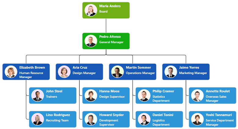
Note: Refer to the example for customizing a hierarchical org chart template.
Zooming and panning
Viewing a large organizational chart on a limited screen size can be quite difficult. In that case, we can use the zooming and panning support in the WPF Diagram control for a better view.
Pan and zoom using the keyboard
- Press and hold the Ctrl and Shift keys. The pointer will turn into a magnifying glass.
- Do any of the following:
• Click the left mouse button to enlarge the view.
• Click the right mouse button to reduce the view.
• Click and drag the left mouse button over a region you want to zoom into.
• Right-click and drag to pan the diagram.
Pan and zoom using the scroll wheel
Do any of the following:
- To scroll up or down, rotate the scroll wheel forward or backward.
- To scroll left or right, hold down the Shift key as you rotate the scroll wheel forward or backward.
- To zoom in or out, hold down the Ctrl key as you rotate the scroll wheel forward or backward.
Save and load the hierarchical organizational chart
The WPF Diagram control provides the flexibility to save your current work and resume working on it by loading the saved diagram back to the diagram canvas. To do so, refer to the loading and saving diagrams in WPF Diagram control documentation.
Export the hierarchical organizational chart
You can easily export the hierarchical chart to PDF format or an image format (JPEG, PNG, BMP, TIF, GIF, and more). To do so, refer to the Exporting feature in WPF Diagram control documentation.
GitHub reference
You can download the example for Creating a Hierarchical Org Chart Using the WPF Diagram Control demo on GitHub.
Conclusion
Thanks for reading! In this blog, we have seen how to create and customize a hierarchical organizational chart using the Syncfusion WPF Diagram control. With this, we can easily visualize and understand our organization’s structure! Try it out and leave feedback in the comments section below!
More built-in automatic layouts, such as flowcharts, hierarchical trees, and radial trees, are also available in the WPF Diagram control. To explore them, refer to our help documentation on automatic layouts.
If you’re already a Syncfusion user, you can download the product setup from our website. Otherwise, you can download a free, 30-day trial.
For questions, you can contact us through our support forum, support portal, or feedback portal. We are always happy to assist you!


 No spam, just valuable updates.