
 Sarathkumar V
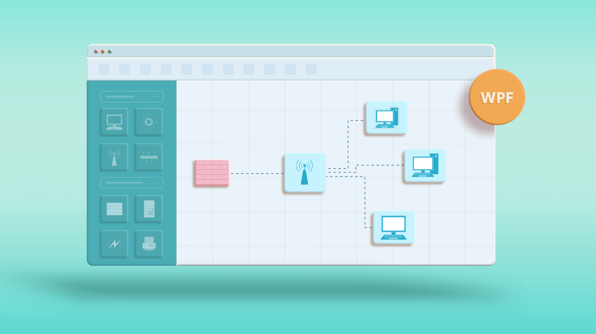
Do you have an application requirement to draw network diagrams? Are you looking for a network diagram designer? Designing your own network architecture diagram is faster and easier with a network diagram creator application built using our WPF Diagram control.
In this blog post, you will learn how to create your own network architecture diagram quickly and easily using an interactive user interface that supports drag-and-drop operations, copy, paste, import, export, pan, zoom, and more. We will see much of the rich feature set available in our WPF Diagram control that provides an excellent, intuitive user experience.
What is a network diagram?
A network diagram is a graphical representation of network architecture. It shows how computers and network devices (e.g., routers, hubs, switches, firewalls, etc.) are connected within a network and displays how information flows through it. This visual representation helps to track down network issues by studying how the devices are connected and interrelated.
Network diagram symbols
Since a network diagram is a graphical representation of an actual system, it relies on symbols to convey the meaning. The network diagram may include hundreds of different symbols. The standard network diagram symbols include firewall, server, mainframe, PC, laptop, switch, hub, router, cell phone, and more.
Turn complex ideas into clear visual diagrams with Syncfusion WPF Diagram. Build, edit, connect, and arrange diagram elements using built-in support for interactive editing, layouts, and customization.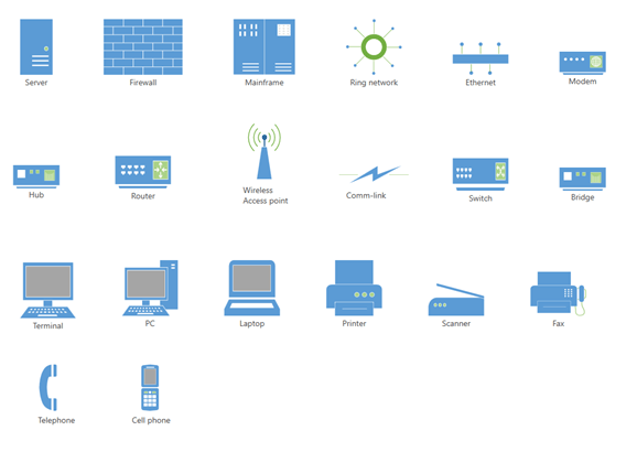
Creating reusable network diagram symbols
The WPF Diagram control provides a gallery of reusable symbols and diagram elements, called a stencil. The symbols can be dragged onto the diagramming page any number of times and in any place.
Let’s see how to create a stencil with our network diagram symbols. The stencil’s SymbolSource property is used to define the data source as a collection of objects (symbol, node, connector, etc.) that needs to be populated as symbols. The following code creates a stencil with network diagram symbols.
XAML:
<stencil:Stencil x:Name="stencil"
Grid.Row="1"
ExpandMode="ZeroOrMore"
SymbolFilters="{Binding Symbolfilters}" SelectedFilter="{Binding Selectedfilter}">
<stencil:Stencil.SymbolSource>
<local:SymbolCollection>
<!--Computers and Monitors-->
<viewmodel:CustomNode Name="PC" UnitHeight="140" UnitWidth="100" ContentTemplate="{StaticResource PCStencil}" Key="Computers and Monitors">
<!--Initialize the annotations-->
<Syncfusion:NodeViewModel.Annotations>
<!--Initialize the AnnotationCollection-->
<Syncfusion:AnnotationCollection>
<!--Initialize the Annotation editor view model-->
<Syncfusion:AnnotationEditorViewModel Constraints="Editable,Selectable,Resizable,Draggable" Margin="0,60,0,0"/>
</Syncfusion:AnnotationCollection>
</Syncfusion:NodeViewModel.Annotations>
</viewmodel:CustomNode>
<viewmodel:CustomNode Name="VirtualPC" UnitHeight="140" UnitWidth="100" ContentTemplate="{StaticResource VirtualPCStencil}" Key="Computers and Monitors">
<Syncfusion:NodeViewModel.Annotations>
<!--Initialize the AnnotationCollection-->
<Syncfusion:AnnotationCollection>
<!--Initialize the Annotation editor view model-->
<Syncfusion:AnnotationEditorViewModel Constraints="Editable,Selectable,Resizable,Draggable" Margin="0,60,0,0"/>
</Syncfusion:AnnotationCollection>
</Syncfusion:NodeViewModel.Annotations>
</viewmodel:CustomNode>
<viewmodel:CustomNode Name="Terminal" UnitHeight="150" UnitWidth="130" ContentTemplate="{StaticResource TerminalStencil}" Key="Computers and Monitors">
<Syncfusion:NodeViewModel.Annotations>
<!--Initialize the AnnotationCollection-->
<Syncfusion:AnnotationCollection>
<!--Initialize the Annotation editor view model-->
<Syncfusion:AnnotationEditorViewModel Constraints="Editable,Selectable,Resizable,Draggable" Margin="0,60,0,0"/>
</Syncfusion:AnnotationCollection>
</Syncfusion:NodeViewModel.Annotations>
</viewmodel:CustomNode>
<viewmodel:CustomNode Name="Wavelength" UnitHeight="140" UnitWidth="150" ContentTemplate="{StaticResource WavelengthStencil}" Key="Computers and Monitors">
<Syncfusion:NodeViewModel.Annotations>
<!--Initialize the AnnotationCollection-->
<Syncfusion:AnnotationCollection>
<!--Initialize the Annotation editor view model-->
<Syncfusion:AnnotationEditorViewModel Constraints="Editable,Selectable,Resizable,Draggable" Margin="0,35,0,0"/>
</Syncfusion:AnnotationCollection>
</Syncfusion:NodeViewModel.Annotations>
</viewmodel:CustomNode>
<viewmodel:CustomNode Name="DataPipe" UnitHeight="80" UnitWidth="120" ContentTemplate="{StaticResource DataPipeStencil}" Key="Computers and Monitors">
<Syncfusion:NodeViewModel.Annotations>
<!--Initialize the AnnotationCollection-->
<Syncfusion:AnnotationCollection>
<!--Initialize the Annotation editor view model-->
<Syncfusion:AnnotationEditorViewModel Constraints="Editable,Selectable,Resizable,Draggable" Margin="0,30,0,0"/>
</Syncfusion:AnnotationCollection>
</Syncfusion:NodeViewModel.Annotations>
</viewmodel:CustomNode>
<viewmodel:CustomNode Name="SlateDevice" UnitHeight="100" UnitWidth="130" ContentTemplate="{StaticResource SlateDivceStencil}" Key="Computers and Monitors">
<Syncfusion:NodeViewModel.Annotations>
<!--Initialize the AnnotationCollection-->
<Syncfusion:AnnotationCollection>
<!--Initialize the Annotation editor view model-->
<Syncfusion:AnnotationEditorViewModel Constraints="Editable,Selectable,Resizable,Draggable" Margin="0,60,0,0"/>
</Syncfusion:AnnotationCollection>
</Syncfusion:NodeViewModel.Annotations>
</viewmodel:CustomNode>
<viewmodel:CustomNode Name="TabletDevice" UnitHeight="130" UnitWidth="130" ContentTemplate="{StaticResource TabletDeviceStencil}" Key="Computers and Monitors">
<Syncfusion:NodeViewModel.Annotations>
<!--Initialize the AnnotationCollection-->
<Syncfusion:AnnotationCollection>
<!--Initialize the Annotation editor view model-->
<Syncfusion:AnnotationEditorViewModel Constraints="Editable,Selectable,Resizable,Draggable" Margin="0,60,0,0"/>
</Syncfusion:AnnotationCollection>
</Syncfusion:NodeViewModel.Annotations>
</viewmodel:CustomNode>
<viewmodel:CustomNode Name="Laptop" UnitHeight="140" UnitWidth="100" ContentTemplate="{StaticResource LaptopStencil}" Key="Computers and Monitors">
<Syncfusion:NodeViewModel.Annotations>
<!--Initialize the AnnotationCollection-->
<Syncfusion:AnnotationCollection>
<!--Initialize the Annotation editor view model-->
<Syncfusion:AnnotationEditorViewModel Constraints="Editable,Selectable,Resizable,Draggable" Margin="0,60,0,0"/>
</Syncfusion:AnnotationCollection>
</Syncfusion:NodeViewModel.Annotations>
</viewmodel:CustomNode>
<viewmodel:CustomNode Name="PDA" UnitHeight="150" UnitWidth="70" ContentTemplate="{StaticResource PDAStencil}" Key="Computers and Monitors">
<Syncfusion:NodeViewModel.Annotations>
<!--Initialize the AnnotationCollection-->
<Syncfusion:AnnotationCollection>
<!--Initialize the Annotation editor view model-->
<Syncfusion:AnnotationEditorViewModel Constraints="Editable,Selectable,Resizable,Draggable" Margin="0,60,0,0"/>
</Syncfusion:AnnotationCollection>
</Syncfusion:NodeViewModel.Annotations>
</viewmodel:CustomNode>
<viewmodel:CustomNode Name="CRTMonitor" UnitHeight="140" UnitWidth="120" ContentTemplate="{StaticResource CRTMonitorStencil}" Key="Computers and Monitors">
<Syncfusion:NodeViewModel.Annotations>
<!--Initialize the AnnotationCollection-->
<Syncfusion:AnnotationCollection>
<!--Initialize the Annotation editor view model-->
<Syncfusion:AnnotationEditorViewModel Constraints="Editable,Selectable,Resizable,Draggable" Margin="0,60,0,0"/>
</Syncfusion:AnnotationCollection>
</Syncfusion:NodeViewModel.Annotations>
</viewmodel:CustomNode>
<viewmodel:CustomNode Name="LCDMonitor" UnitHeight="140" UnitWidth="130" ContentTemplate="{StaticResource LCDMonitorStencil}" Key="Computers and Monitors">
<Syncfusion:NodeViewModel.Annotations>
<!--Initialize the AnnotationCollection-->
<Syncfusion:AnnotationCollection>
<!--Initialize the Annotation editor view model-->
<Syncfusion:AnnotationEditorViewModel Constraints="Editable,Selectable,Resizable,Draggable" Margin="0,60,0,0"/>
</Syncfusion:AnnotationCollection>
</Syncfusion:NodeViewModel.Annotations>
</viewmodel:CustomNode>
<viewmodel:CustomNode Name="Connector" UnitHeight="170" UnitWidth="130" ContentTemplate="{StaticResource DynamicConnectorStencil}" Key="Computers and Monitors">
</viewmodel:CustomNode>
</local:SymbolCollection>
</stencil:Stencil.SymbolSource>
<stencil:Stencil.SymbolGroups>
<stencil:SymbolGroups>
<!--Separate groups based on the key-->
<stencil:SymbolGroupProvider MappingName="Key"/>
</stencil:SymbolGroups>
</stencil:Stencil.SymbolGroups>
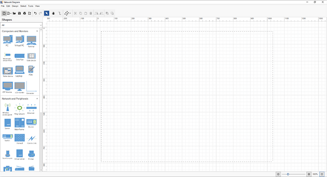
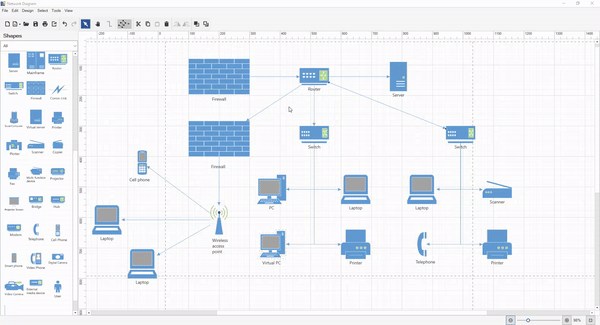
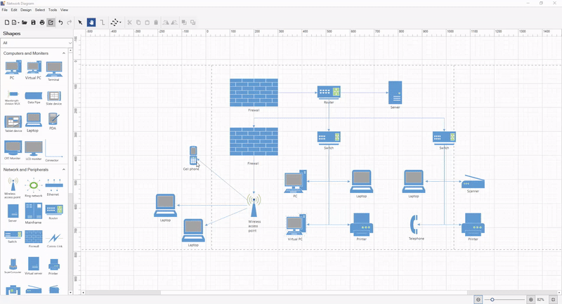
</stencil:Stencil>The following screenshot shows the collection of network diagram symbols in the created stencil.
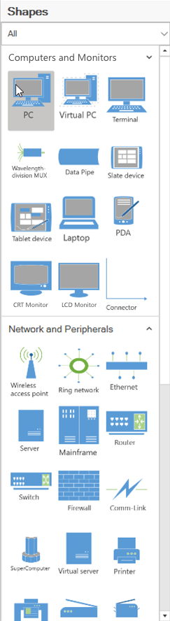
You can refer to this stencil documentation page for details about adding and grouping symbols, plus customizing the stencil appearance.
Creating a diagramming page
Now, we have set up reusable network diagram shapes in our Stencil. Using the following code example, let’s add the diagramming page we’ll create our network diagram on.
XAML:
<Syncfusion:SfDiagram x:Name="Diagram" Grid.Column="1"
DefaultConnectorType="{Binding DefaultConnectorType,Mode=TwoWay}"
PortVisibility="{Binding PortVisibility}"
Nodes="{Binding Nodes}"
Connectors="{Binding Connectors}"
ScrollSettings="{Binding ScrollSettings}"
PageSettings="{Binding PageSettings}"
VerticalRuler="{Binding VerticalRuler}"
HorizontalRuler="{Binding HorizontalRuler}"
PrintingService="{Binding PrintingService}"
Constraints="{Binding Constraints}"
Tool="{Binding Tool,Mode=TwoWay}"
DrawingTool="{Binding DrawingTool,Mode=TwoWay}"
SelectedItems="{Binding SelectedItems}"
ExportSettings="{Binding ExportSettings}"
SnapSettings="{Binding SnapSettings}"
DragEnterCommand="{Binding DragEnterCommand}"
DragOverCommand="{Binding DragOverCommand}"
ItemAddedCommand="{Binding ItemAddedCommand}"
DropCommand="{Binding DropCommand}"
ItemSelectedCommand="{Binding ItemSelectedCommand}"
ItemUnSelectedCommand="{Binding ItemUnSelectedCommand}"
ViewPortChangedCommand="{Binding ViewPortChangedCommand}"
AnnotationConstraints="{Binding AnnotationConstraints}"
Loaded="Diagram_Loaded">
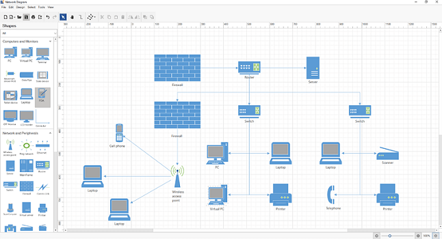
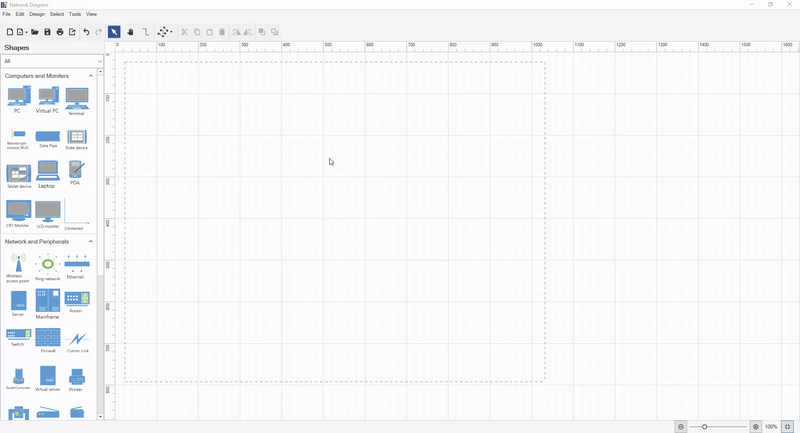
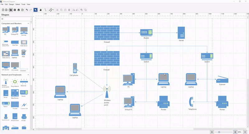
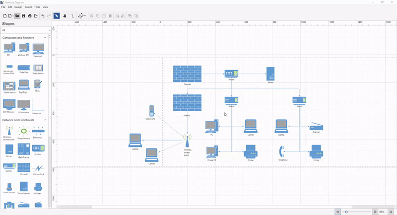
</Syncfusion:SfDiagram>The following screenshot shows the created diagramming page along with the network diagram symbols stencil.
You can refer to this Diagram documentation page for more details on how to add a diagramming page in your application and how to customize its appearance.
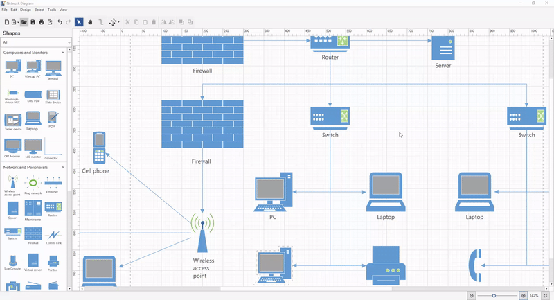
How to create a network diagram
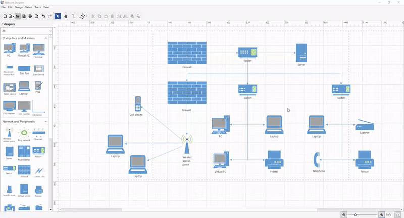
Now you can easily draw a network diagram by dragging and dropping the network diagram symbols from the stencil, arranging them on the page, and connecting them.
Add network diagram symbols
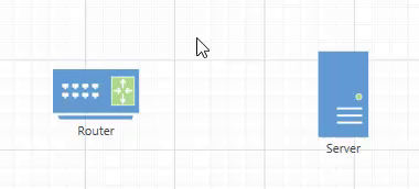
Start by dragging the symbols you need for each device onto the diagramming page from the Computers and Monitors and Network and Peripherals stencils. Arrange them in an order that makes it clear where the network origin and end points are, and how the various nodes are linked. People who read the diagram should be able to see where to start, and how to follow the connections.
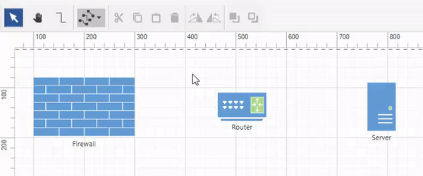
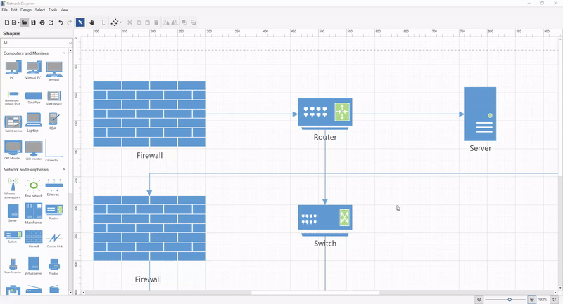
Add connections between devices
Each diagram symbol has Draw quick command which is visible when the symbol is selected. This quick command creates a connection from the symbol by clicking and dragging the connector and dropping it on another symbol.
You can refer to this quick command documentation page for more details on how to add or remove default and custom quick commands in your application and how to customize their appearance.
You can also create connectors by selecting the connector tool from the toolbar or from the Tools > Connector tool menu option. Now, click a symbol and drag a connector to another shape. When you are done, click the pointer tool on the toolbar to select the symbols.
Refer to the tools documentation page for more details about supported diagram tools.
Change connection line style
The WPF Diagram control provides three different types of connection lines: straight, orthogonal, and Bezier. You can change the connector type of a connector by selecting it and using the change connector type drop-down in the toolbar, or by using the Tools > Connectors menu option.
Refer to the connector types documentation page for more details on different types of connectors and how to change them in your application.
Add labels and data
To add text to a network symbol, double-click the symbol and start typing. To move the text, click and drag the text to the desired position.
Refer to annotation documentation page for more details on how to add labels in your application and customize their appearance.
Loading and saving a diagram
The Diagram control provides the flexibility to save your current work and resume it later by loading the saved diagram back to the diagram canvas. You can use Save button to save your current diagram to the local drive and use the Open button to load an existing diagram file from your local drive.
Refer to the load and save documentation pages for more details on how to integrate the WPF Diagram control’s load and save functionality in your application.
Print and export diagram
Once you have finished editing the network diagram, you can export it as an image or PDF document, or you can print it using a printer.
Print a diagram
You can print a diagram directly by clicking the Print button in the toolbar or by selecting the File > Print menu option.
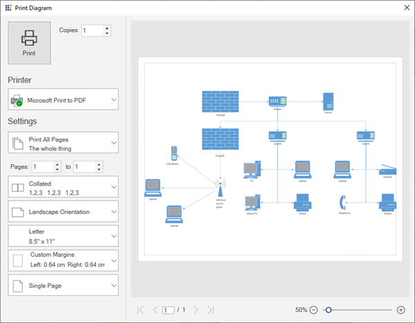
The following screenshot shows the Print Diagram dialog box along with the custom print options.
Refer to the printing documentation page for more details on how to configure diagram printing functionality in your application.
Export a diagram
You can save a diagram in PDF format, or you can save it as an image file (JPEG, PNG, BMP, TIF, GIF, and more). You can do this by clicking the Export button or selecting the File > Export menu option.
Refer to the exporting documentation page for more details on how to configure diagram exporting functionality in your application.
Pan and zoom
The WPF Diagram control provides support to pan and zoom the diagram in different ways.
Pan and zoom using the keyboard
- Hold down the Ctrl and Shift keys. The pointer will turn into a magnifying glass.
- Try the following techniques:
- Click the left mouse button to enlarge the view.
- Click the right mouse button to reduce the view.
- Click the left mouse button and drag a rectangle that contains a region you want to zoom into.
- Right-click and drag to pan the diagram.
Pan and zoom using the scroll wheel
Do any of the following:
- To scroll up or down, rotate the scroll wheel forward or backward.
- To scroll left or right, hold down Shift as you rotate the scroll wheel forward or backward.
- To zoom in or out, hold down Ctrl as you rotate the scroll wheel forward or backward.
 Zoom using the zoom controls
The zoom controls are in the status bar, below the diagramming page.
Clicking the zoom out and zoom in buttons change the zoom level of the diagram. The controls include a slider that sets the zoom level and a button to fit the page to the size of the current window.
Pan using the pan tool
You can pan the diagram by selecting the Pan tool from the toolbar or the Tools > Pan menu option and then clicking and dragging the mouse to pan the diagram.
Resources
You can download the source project for this network diagram designer from this GitHub location.
Conclusion
In this blog post, you have seen how to create a network diagram easily using a network diagram designer application that was created using the Syncfusion WPF Diagram library. Also, you have learned about connectors and labels, and about performing operations such as load, save, export, print, pan, and zoom with the created network diagram.
Similarly, you can create your own diagram creation application like an organization chart creator, a flow chart creator, or a logic circuit diagram using the Syncfusion WPF Diagram library. The library supports even more rich interactive features than just those demonstrated here, automatic layouts, and data binding from different data sources. To explore features in more depth, refer to our documentation.
If you’re already a Syncfusion user, you can download the product setup from our website. Otherwise, you can download a free, 30-day trial here.
If you have any questions, please let us know in the comments section below. You can also contact us through our support forums, Direct-Trac, or feedback portal. We are always happy to assist you!


 No spam, just valuable updates.